# Bamboo CSS Complete Documentation
> Bamboo CSS is a build-time, type-safe, zero-runtime CSS-in-JS framework. It prunes unused tokens, tree-shakes the runtime, and folds static styles into plain class strings.
This document contains the complete Bamboo CSS documentation, organized by category for easy navigation.
## Table of Contents
### Overview
- [Browser Support](#browser-support)
- [Frequently Asked Questions](#frequently-asked-questions)
- [Get started with Bamboo](#get-started-with-bamboo)
- [Why Bamboo](#why-bamboo)
### Installation
- [Using Angular](#using-angular)
- [Using Astro](#using-astro)
- [Bamboo CLI](#bamboo-cli)
- [Using Ember](#using-ember)
- [Using Gatsby](#using-gatsby)
- [Using Next.js](#using-next.js)
- [Using Nuxt](#using-nuxt)
- [Using PostCSS](#using-postcss)
- [Using Preact](#using-preact)
- [Using Qwik](#using-qwik)
- [Using React Router](#using-react-router)
- [Using Redwood](#using-redwood)
- [Using Remix](#using-remix)
- [Using Rsbuild](#using-rsbuild)
- [Using SolidJS](#using-solidjs)
- [Using Storybook](#using-storybook)
- [Using Svelte](#using-svelte)
- [Using Vite](#using-vite)
- [Using Vue](#using-vue)
### Concepts
- [Cascade Layers](#cascade-layers)
- [Color opacity modifier](#color-opacity-modifier)
- [Conditional Styles](#conditional-styles)
- [The extend keyword](#the-extend-keyword)
- [Global Styles](#global-styles)
- [Bamboo Integration Hooks](#bamboo-integration-hooks)
- [JSX Style Context](#jsx-style-context)
- [Merging Styles](#merging-styles)
- [Patterns](#patterns)
- [Recipes](#recipes)
- [Responsive Design](#responsive-design)
- [Slot Recipes](#slot-recipes)
- [Style props](#style-props)
- [Styled System](#styled-system)
- [Template Literals](#template-literals)
- [Virtual Color](#virtual-color)
- [Writing Styles](#writing-styles)
### Theming
- [Animation Styles](#animation-styles)
- [Layer Styles](#layer-styles)
- [Spec](#spec)
- [Using Bamboo Studio](#using-bamboo-studio)
- [Text Styles](#text-styles)
- [Tokens](#tokens)
- [Using Tokens](#using-tokens)
### Utilities
- [Background](#background)
- [Border](#border)
- [Display](#display)
- [Divide](#divide)
- [Effects](#effects)
- [Flex and Grid](#flex-and-grid)
- [Focus Ring](#focus-ring)
- [Gradients](#gradients)
- [Helpers](#helpers)
- [Interactivity](#interactivity)
- [Layout](#layout)
- [List](#list)
- [Outline](#outline)
- [Sizing](#sizing)
- [Spacing](#spacing)
- [SVG](#svg)
- [Tables](#tables)
- [Transforms](#transforms)
- [Transitions](#transitions)
- [Typography](#typography)
### Customization
- [Conditions](#conditions)
- [Config Functions](#config-functions)
- [Deprecations](#deprecations)
- [Customizing Patterns](#customizing-patterns)
- [Presets](#presets)
- [Theme](#theme)
- [Utilities](#utilities)
### Guides
- [Using Bamboo in a Component Library](#using-bamboo-in-a-component-library)
- [Debugging](#debugging)
- [Dynamic styling](#dynamic-styling)
- [Custom Font](#custom-font)
- [Minimal Setup](#minimal-setup)
- [Multi-Theme Tokens](#multi-theme-tokens)
- [Source Transformation](#source-transformation)
- [Static CSS Generator](#static-css-generator)
### Migration
- [Migrating from Panda CSS](#migrating-from-panda-css)
- [Migrating from Stitches](#migrating-from-stitches)
- [Migrating from Styled Components](#migrating-from-styled-components)
- [Migrating from Theme UI](#migrating-from-theme-ui)
### References
- [CLI Reference](#cli-reference)
- [Configuring Bamboo](#configuring-bamboo)
---
# Overview
## Browser Support
Learn about the browser support for Bamboo
Bamboo CSS is built with modern CSS features and uses [PostCSS](https://postcss.org/) to add support for older browsers.
Bamboo supports the latest, stable releases of major browsers that support the following features:
- [CSS Variables](https://caniuse.com/css-variables)
- [CSS Cascade Layers](https://caniuse.com/css-cascade-layers)
- Modern selectors, such as [`:where()`](https://caniuse.com/mdn-css_selectors_where) and
[`:is()`](https://caniuse.com/css-matches-pseudo)
## Browserlist
Based on the above criteria, the following browsers are supported:
```txt
>= 1%
last 1 major version
not dead
Chrome >= 99
Edge >= 99
Firefox >= 97
iOS >= 15.4
Safari >= 15.4
Android >= 115
Opera >= 73
```
## Polyfills
In event that you need to support older browsers, you can use the following polyfills in your PostCSS config:
- [autoprefixer](https://github.com/postcss/autoprefixer): Adds vendor prefixes to CSS rules using values from
[Can I Use](https://caniuse.com/).
- [postcss-cascade-layers](https://www.npmjs.com/package/@csstools/postcss-cascade-layers): Adds support for CSS Cascade
Layers.
Here is an example of a `postcss.config.js` file that uses these polyfills:
```js
module.exports = {
plugins: ['@bamboocss/dev/postcss', 'autoprefixer', '@csstools/postcss-cascade-layers'],
}
```
---
## Frequently Asked Questions
Frequently asked questions and how to resolve common issues
## How does Bamboo manage style conflicts ?
When you combine shorthand and longhand properties, Bamboo will resolve the styles in a predictable way. The shorthand
property will take precedence over the longhand property.
```jsx
import { css } from '../styled-system/css'
const styles = css({
paddingTop: '20px',
padding: '10px',
})
```
The styles generated at build time will look like this:
```css
@layer utilities {
.p_10px {
padding: 10px;
}
.pt_20px {
padding-top: 20px;
}
}
```
---
## Imported Image is not working in Vite App
This is a known limitation of Bamboo due to our static extraction approach.
> Think of it this way: there's no way for the compiler to know what the final asset URL will be since Vite controls it.
We recommend moving the imported `backgroundImage` to the `style` attribute.
```jsx
import myImageBackground from './my-image.png'
const Demo = () => {
return (
Hello World
)
}
```
---
## How to get Bamboo to work with Jest?
If you run into error messages like `SyntaxError: Unexpected token 'export'` when running Jest tests. Here's what you
can:
In your tsconfig, add
```json
{
"compilerOptions": {
"allowJs": true
}
}
```
In your Jest configuration, add the `ts-jest` transformer:
```ts
export default {
// ...
transform: {
'^.+\\.tsx?$': 'ts-jest',
'^.+\\.(ts|tsx|js|jsx)?$': 'ts-jest',
},
}
```
In your Bamboo config, set the `outExtension` to `js`:
```ts
export default defineConfig({
// ...
outExtension: 'js',
})
```
---
## HMR does not work when I use `tsconfig` paths?
Bamboo tries to automatically infer and read the custom paths defined in `tsconfig.json` file. However, there might be
scenarios where the hot module replacement doesn't work.
To fix this add the `importMap` option to your `bamboo.config.js` file, setting it's value to the specified `paths` in
your `tsconfig.json` file.
```json
// tsconfig.json
{
"compilerOptions": {
"baseUrl": "./src",
"paths": {
"@my-path/*": ["./styled-system/*"]
}
}
}
```
```js
// bamboo.config.js
module.exports = {
importMap: '@my-path',
}
```
This will ensure that the paths are resolved correctly, and HMR works as expected.
---
## HMR not triggered
If you are having issues with HMR not being triggered after a `bamboo.config.ts` change (or one of its
[dependencies](/docs/references/config#dependencies)), you can manually specify the files that should trigger a rebuild
by adding the following to your `bamboo.config.ts`:
```js filename="bamboo.config.ts"
import { defineConfig } from '@bamboocss/dev'
export default defineConfig({
// ...
dependencies: ['path/to/files/**.ts'],
})
```
---
## Why are my styles not applied?
Check that the [`@layer` rules](/docs/concepts/cascade-layers#layer-css) are set and the corresponding `.css` file is
included. [If you're not using `postcss`](/docs/installation/cli), ensure that `styled-system/styles.css` is imported
and that the `bamboo` command has been run (or is running with `--watch`).
---
## How can I debug the styles?
You can use the `bamboo debug` to debug design token extraction & css generated from files.
If the issue persists, you can try looking for it in the [issues](https://github.com/bamboocss/bamboo/issues). If you
can't find it, please create a minimal reproduction and submit
[a new github issue](https://github.com/bamboocss/bamboo/issues/new/choose) so we can help you.
---
## Why is my IDE not showing `styled-system` imports?
If you're not getting import autocomplete in your IDE, you may need to include the `styled-system` directory in your
tsconfig.json file.
---
## How do I get a type with each recipe properties?
You can get a [`config recipe`](/docs/concepts/recipes#config-recipe) properties types by using `XXXVariantProps`. Let's
say you have a `config recipe` named `button`, you can import its type like this:
```ts
import { button, type ButtonVariantProps } from '../styled-system/recipes'
```
---
You can get an [`atomic recipe`](/docs/concepts/recipes#atomic-recipe) properties types by using `RecipeVariantProps`.
Let's say you have a `atomic recipe` named `button`, you can get its type like this:
```ts
import { cva, type RecipeVariantProps } from '../styled-system/css'
export type ButtonVariantProps = RecipeVariantProps
```
---
## How do I split recipe props from the rest?
You can split recipe props by using `xxx.splitVariantProps`. Let's say you have a `recipe` named `button`, you can split
its props like this:
```tsx Button.tsx {8}
import { css, cx } from '../styled-system/css'
import { ButtonVariantProps, button } from '../styled-system/recipes'
interface ButtonProps extends ButtonVariantProps {
children: React.ReactNode
}
export function Button(props: ButtonProps) {
const { children, ...rest } = props
const [buttonProps, cssProps] = button.splitVariantProps(rest)
return
}
```
The same `xxx.splitVariantProps` method is available for both `config recipes` and `atomic recipes`.
---
## How do I reference a token value or css var?
You can reference a token value or it's associated css variable using the
[`token` function](/docs/theming/usage#vanilla-js). This function allows you to access and use the values stored in your
theme tokens at runtime.
```tsx
import { token } from '../styled-system/tokens'
function App() {
return (
)
}
```
---
## Should I commit the styled-system folder?
Just like the `node_modules` folder, you most likely don't want to commit the `styled-system` folder. It contains code
that is auto-generated and can be re-generated at any time.
---
## How is Bamboo CSS different from Panda CSS?
Bamboo CSS is a fork of Panda CSS v1, so the styling API is the same and [migrating](/docs/migration/panda) is mostly a
rename. What has changed since the fork is everything below: what gets shipped to the browser, what it costs at runtime,
and how quickly the build turns around.
Every number here was measured against this repository's own sandboxes and fixtures. Your project will differ — the
output-size wins in particular scale with the size of your design system rather than the size of your app.
### Less CSS
- [`pruneUnusedTokens`](/docs/references/config#pruneunusedtokens) drops token CSS variables nothing can reach. The
token layer declares every token in your theme while an app uses a fraction of them. On the `vite-ts` sandbox this
takes `styles.css` from 24,433 to 12,293 bytes — 6,398 to 3,504 gzipped.
- [`pruneUnusedKeyframes`](/docs/references/config#pruneunusedkeyframes) does the same for `@keyframes` rules a preset
declares and your app never animates.
Both are opt-in and change nothing until switched on.
### Less JavaScript
- The generated output now declares `sideEffects`, so a bundler can tree-shake the barrels. Previously
`import { Box } from 'styled-system/jsx'` retained every pattern module.
- The JSX property list is emitted once rather than twice. It carried the browser CSS properties and your project's
properties as two constants that the runtime immediately concatenated, with 285 entries appearing in both; the module
drops from 15,684 to 11,468 bytes.
Together a JSX barrel import goes from 41.2 KB to 30.1 KB minified, and 12.6 KB to 10.2 KB gzipped.
### A faster runtime
- `css()` and the pattern helpers memoize their class names on a structural hash confirmed by an exact comparison.
Repeated `css()` calls get roughly 4-5x faster, multi-argument calls about 4x, and the pattern helpers — which were
not memoized at all — about 1.3x. Class name output is unchanged.
- That cache is bounded. It previously grew for the lifetime of the process, which leaked in long-lived SSR.
- Copying styles now happens at the `raw()` boundary rather than on every merge, so the two places that need an
independent object pay for it instead of every caller.
- The JSX factory no longer memoizes its props. Both `useMemo` calls keyed off a rest-destructured object, so neither
could ever hit. About 3% on an unfolded tree.
- `splitProps` reads each key's descriptor on demand rather than building one for the whole object: 2.4-2.9x on plain
and frozen props. Accessor props, which is what Solid compiles to, keep the descriptor path.
### Optional zero-runtime output
[`@bamboocss/vite`](/docs/guides/source-transformation) rewrites statically-resolvable calls into the class string they
would have returned, so they cost nothing at runtime:
```tsx
// you write
export const title = css({ fontSize: 'lg', fontWeight: 'bold' })
// the bundle gets
export const title = 'fs_lg fw_bold'
```
It also collapses `styled.*` elements to the intrinsic tag they render, folds config recipes, pattern elements and a
static `as` prop, and follows named imports across files. CSS output is unchanged — only the JavaScript changes. It is
off by default, build-only, and reports how much of your source it managed to fold.
### Less HTML
[`cssMode: 'grouped'`](/docs/references/config#cssmode) emits one class per `css()` call rather than one per property,
so an element carrying a dozen atomic classes carries one instead.
Atomic CSS is a good default, but at scale it puts long class sequences into the markup and multiplies the declarations
the browser walks during style recalculation — a cost `hash` does not address, since it shortens class names rather than
reducing their count. Grouped trades some CSS duplication for the other side of that: a shared declaration is repeated
in every group instead of deduping into one class. Which way that goes depends on whether your bottleneck is the CSS
bundle or the HTML payload, so it is opt-in and atomic stays the default. It matters most under SSR and SSG, where the
HTML is rarely cached and lands on every initial render. The
[upstream proposal](https://github.com/chakra-ui/panda/pull/3531) has the benchmarks behind that.
### Faster builds
- The dependency graph resolves imports without initializing the TypeScript type checker, which was costing hundreds of
milliseconds on a cold build for what is only a filesystem question.
- Watch mode builds the stylesheet once per edit rather than once per affected file. Editing a shared style file with 60
importers previously ran the full optimize pipeline and wrote to disk 61 times.
- Editing a shared style file now re-parses the files importing it, so consumers stop emitting stale styles.
---
## How does Bamboo work?
When running `pnpm bamboo`, here's what's happening under the hood:
- **Load Bamboo context**:
- Find and evaluate app config, merge result with presets.
- Create bamboo context: prepare code generator from config, parse user's file as AST.
- **Generating artifacts**:
- Write lightweight JS runtime and types to output directory
- **Extracting used styles in app code**:
- Run parser on each user's file: identify and extract styles, compute CSS, write to styles.css.
---
## I'm seeing a "Could not resolve xxx" error with esbuild/tsdown. What should I do?
In such a case, check the [`outExtension`](/docs/references/config#outextension) in your `bamboo.config` and set it to
"js". This will ensure your modules are resolved correctly.
---
## Why does importing `styled` not exist?
You should use [`config.jsxFramework`](/docs/concepts/style-props#configure-jsx) when you need to import styled
components. You can then use the [`jsxFactory`](/references/config#jsxfactory) option to set the name of the factory
component.
---
## Why is my preset overriding the base one, even after adding it to the array?
You might have forgotten to include the `extend` keyword in your config. Without `extend`, your preset will completely
replace the base one, instead of merging with it.
---
## Why is my base condition not working in this example?
```ts
css({ color: { _base: 'red.600', _dark: 'white' } })
```
You used `_base` instead of `base`, there is no underscore `_`.
---
## What's the difference between using `defineConfig()` vs `definePreset()`
`defineConfig` is intended to be used in your app config, and will show you all the config keys that are available.
`definePreset` will only show you the config keys that will be merged into an app's config, the rest will be ignored.
---
## How can I completely override the default tokens?.
If you want to **completely override all** of the default presets theme tokens, you can omit the `extends` keyword from
your `theme` config object.
If you want to **keep some of the defaults**, you can install the `@bamboocss/preset-bamboo` package, import it, then
specifically pick what you need in there (or use the JS spread operator `...` and override the other keys).
---
## How do I make a design system / component library with Bamboo?
There is a detailed guide on how to do this [here](/docs/guides/component-library).
---
## Can I use dynamic styles with Bamboo?
Yes, you can use dynamic styles with Bamboo. More on that [here](/docs/guides/dynamic-styling#runtime-conditions).
---
## Can Bamboo resolve styles at build time instead of at runtime?
Yes, for the parts it can see. `@bamboocss/vite` rewrites statically-resolvable style calls into the class string they
would have returned, so those calls cost nothing on render:
```tsx
export const title = css({ fontSize: 'lg' })
export const title = 'fs_lg'
```
It covers `css()`, pattern and recipe calls, `styled.*` and pattern elements, and the static half of anything only
partly static. The CSS is unchanged; only the JavaScript is. Off by default and build-only — see
[Source Transformation](/docs/guides/source-transformation).
---
## Should I use atomic or config recipes ?
[Config recipes](/docs/concepts/recipes#config-recipe) are generated just in time, meaning that only the recipes and
variants you use will exist in the generated CSS, regardless of the number of recipes in the config.
This contrasts with [Atomic recipes](/docs/concepts/recipes#atomic-recipe) (cva), which generates all of the variants
regardless of what was used in your code. The reason for this difference is that all `config.recipes` are known at the
start of the bamboo process when we evaluate your config. In contrast, the CVA recipes are scattered throughout your
code. To get all of them and find their usage across your code, we would need to scan your app code multiple times,
which would not be ideal performance-wise.
When dealing with simple use cases, or if you need code colocation, or even avoiding dynamic styling, atomic recipes
shine by providing all style variants. Config recipes are preferred for design system components, delivering leaner CSS
with only the styles used. Choose according to your component needs.
---
## Why does the bamboo codegen command fail ?
If you run into any error related to "Transforming const to the configured target environment ("es5") is not supported
yet", update your tsconfig to use es6 or higher:
```json filename="tsconfig.json"
{
"compilerOptions": {
"target": "es6"
}
}
```
---
## How can I generate all possible CSS variants at build time?
While it's possible to generate all variants, even unused ones, by using
[`config.staticCss`](https://bamboocss.com/docs/guides/dynamic-styling#using-static-css), it's generally **not
recommended** to use it for more than a few values. However, keep in mind this approach compromises one of Bamboo's
strengths: lean, usage-based CSS generation.
---
## Can I use one-off media query and other at rules?
Yes, you can! You can apply one-off media queries and other at rules (such as `@container`, `@supports`) in your CSS as
shown below:
```javascript
css({
containerType: 'size',
'@media (min-width: 10px)': {
fontSize: 'xl',
color: 'blue.300',
},
'@container (min-width: 10px)': {
fontSize: '2xl',
color: 'green.300',
},
'@supports (display: flex)': {
fontSize: '3xl',
color: 'red.300',
},
})
```
---
## How can I prevent other libraries from overriding my styles?
You can use
[Layer Imports]()
to prevent other libraries from overriding your styles.
First of all you cast the css from the other library(s) to a css layer:
```css
@import url('bootstrap.css') layer(bootstrap);
@import url('ionic.css') layer(ionic);
```
Then update the default layer list to deprioritize the styles from the other library(s):
```css
@layer bootstrap, reset, base, token, recipes, utilities;
@layer ionic, reset, base, token, recipes, utilities;
```
---
## Get started with Bamboo
The universal design system solution for the web
Bamboo is a styling engine that generates styling primitives to author atomic CSS and recipes in a type-safe and
readable manner.
Bamboo combines the developer experience of CSS-in-JS and the performance of atomic CSS. It leverages static analysis to
scan your JavaScript and TypeScript files for JSX style props and function calls, generating styles on-demand (aka
Just-in-Time)
> TLDR; Bamboo is a CSS-in-JS engine that generates atomic CSS at build time (via CLI or PostCSS)
## How is this different from Panda CSS?
Bamboo CSS is a fork of [Panda CSS](https://panda-css.com/) v1, so the styling API is identical and
[migrating](/docs/migration/panda) is mostly a rename. What has changed since the fork is what reaches the browser and
what it costs:
- **Less CSS** — [`pruneUnusedTokens`](/docs/references/config#pruneunusedtokens) drops token variables nothing can
reach, taking `styles.css` from 24.4 KB to 12.3 KB on our own sandbox.
- **Less JavaScript** — the generated output declares `sideEffects` and stops emitting the JSX property list twice, so a
barrel import falls from 41.2 KB to 30.1 KB minified.
- **A faster runtime** — repeated `css()` calls are roughly 4-5x faster, and the class-name cache is bounded rather than
growing for the life of the process, which used to leak under long-lived SSR.
- **Optional zero runtime** — [`@bamboocss/vite`](/docs/guides/source-transformation) folds statically-resolvable
`css()` calls into plain class strings at build time.
- **Less HTML** — [`cssMode: 'grouped'`](/docs/references/config#cssmode) emits one class per `css()` call instead of
one per property, trading CSS duplication for shorter class attributes and faster style recalculation.
Every figure is measured against this repository's own sandboxes; the output-size wins scale with the size of your
design system rather than your app. The [full comparison](/docs/overview/faq#how-is-bamboo-css-different-from-panda-css)
has the rest.
## Installation
### General Guides
- [Bamboo CLI](/docs/installation/cli): The simplest way to use Bamboo is with the Bamboo CLI tool.
- [Using PostCSS](/docs/installation/postcss): (**Recommended**) Installing Bamboo as a PostCSS plugin is the
recommended way to integrate it with your project.
### Framework Guides
Start using Bamboo CSS in your JavaScript framework using our framework-specific guides that cover our recommended
approach.
## Next Steps
Get familiar with the core features and concepts in Bamboo.
## Acknowledgement
Bamboo CSS started as a fork of [Panda CSS](https://panda-css.com/).
---
## Why Bamboo
From the endless list of CSS-in-JS libraries, why should you choose Bamboo?
Runtime CSS-in-JS and style props are powerful features that allow developers to build dynamic UI components that are
composable, predictable, and easy to use. However, it comes at the cost of performance and runtime.
## Backstory
With the release of Server Components and the rise of server-first frameworks, most existing runtime CSS-in-JS styling
solutions (like emotion, styled-components) either can't work reliably, or can't work anymore. This new paradigm is a
huge win for performance, development, and user experience, however, it poses a new "Innovate or Die" challenge for
CSS-in-JS libraries.
> **Fun Fact:** Most CSS-in-JS libraries have a pinned issue on their GitHub repo about "Next app dir" or/and "Server
> Components" 😅, making the challenge even more obvious.
So, the question is, **is CSS-in-JS dead?** The answer is **no, but it needs to evolve!**
## The new era of CSS-in-JS
Bamboo is a new CSS-in-JS engine that aims to solve the challenges of CSS-in-JS in the server-first era. It provides
styling primitives to create, organize, and manage CSS styles in a type-safe and readable manner.
- **Static Analysis:** Bamboo uses static analysis to parse and analyze your styles at build time, and generate CSS
files that can be used in any JavaScript framework.
- **PostCSS:** After static analysis, Bamboo uses a set of PostCSS plugins to convert the parsed data to atomic css at
build time. **This makes Bamboo compatible with any framework that supports PostCSS.**
- **Codegen:** Bamboo generates a lightweight runtime JS code that is used to author styles. **Think of it as an
optimized function that joins key-value pairs of an object**. It doesn't generate styles in the browser nor inject
styles in the ``.
- **Type-Safety:** Bamboo combines `csstype` and auto-generated typings to provide type-safety for css properties and
design tokens.
- **Performance:** Bamboo uses a unique approach to generate atomic CSS files that are optimized for performance and
readability.
- **Developer Experience:** Bamboo provides a great developer experience with a rich set of features like recipes,
patterns, design tokens, JSX style props, and more.
- **Modern CSS**: Bamboo uses modern CSS features like cascade layers, css variables, modern selectors like `:where` and
`:is` in generated styles.
## When to use Bamboo?
### Styling engine
If you're building a JavaScript application with a framework that supports PostCSS, Bamboo is a great choice for you.
```jsx
import { css } from '../styled-system/css'
import { circle, stack } from '../styled-system/patterns'
function App() {
return (
John Doe
john@doe.com
)
}
```
> If your framework doesn't support PostCSS, you can use the [Bamboo CLI](/docs/installation/cli)
### Token generator
Bamboo has first-class support for design tokens. It provides a way to express raw and semantic tokens for your project.
The generator can be used to create a set of CSS variables for your design tokens.
```ts filename="bamboo.config.ts"
export default defineConfig({
emitTokensOnly: true,
theme: {
tokens: {
colors: {
gray50: { value: '#F9FAFB' },
gray100: { value: '#F3F4F6' },
},
},
semanticTokens: {
colors: {
primary: { value: '{colors.gray50}' },
success: {
value: { _light: '{colors.green500}', _dark: '{colors.green200}' },
},
},
},
},
})
```
Running the `bamboo codegen` will generate
```css filename="styled-system/tokens/index.css"
:root {
--colors-gray50: #f9fafb;
--colors-gray100: #f3f4f6;
--colors-primary: var(--colors-gray50);
--colors-success: var(--colors-green500);
}
[data-theme='dark'] {
--colors-primary: var(--colors-gray50);
--colors-success: var(--colors-green200);
}
```
Then you have a set of css variables that you can use in your project.
```css
@import '../styled-system/tokens/index.css';
.card {
background-color: var(--colors-gray50);
}
```
## When not to use Bamboo?
Bamboo isn't the right fit for your project if:
- You're building with HTML and CSS.
- You're using a template-based framework like PHP.
- You're looking for an absolute zero JS solution.
In these scenarios, we recommend that you use vanilla CSS (which is getting awesome by the day), or other utility based
CSS libraries.
---
# Installation
## Using Angular
Easily use Bamboo with Angular with our dedicated integration.
This guide shows you how to set up Bamboo CSS in an Angular project using PostCSS.
## Start a new project
### Create Vite project
To get started, we will need to create a new Angular project using the official
[scaffolding tool](https://angular.dev/tools/cli).
If you don't enter any parameter, the CLI will guide you through the process of creating a new Angular app.
```bash
ng new test-app
```
You will be asked a few questions, answer them as follows:
```bash
? Which stylesheet format would you like to use? CSS
? Do you want to enable Server-Side Rendering (SSR) and Static Site Generation (SSG/Prerendering)? No
```
### Install Bamboo
Install bamboo and create your `bamboo.config.ts` file.
{/* */}
```bash
pnpm install -D @bamboocss/dev
pnpm bamboo init
```
```bash
npm install -D @bamboocss/dev
npx bamboo init
```
```bash
yarn add -D @bamboocss/dev
yarn bamboo init
```
```bash
bun add -D @bamboocss/dev
bun bamboo init
```
{/* */}
### Configure PostCSS
Create a `postcss.config.json` file in the root of your project and add the following code:
```json filename="postcss.config.json"
{
"plugins": {
"@bamboocss/dev/postcss": {}
}
}
```
> You must use a JSON file for the PostCSS configuration, as the Angular CLI does not support JavaScript PostCSS
> configuration files.
### Update package.json scripts
Open your `package.json` file and update the `scripts` section as follows:
```diff {3} filename="package.json"
{
"scripts": {
+ "prepare": "bamboo codegen",
"ng": "ng",
"start": "ng serve",
"build": "ng build",
}
}
```
- `"prepare"` - script that will run Bamboo CSS CLI codegen before each build. Read more about
[codegen](/docs/references/cli#bamboo-codegen) in the CLI section.
> This step ensures that the bamboo output directory is regenerated after each dependency installation. So you can add
> the output directory to your `.gitignore` file and not worry about it.
### Configure the content
Make sure that all of the paths of your Angular components are included in the `include` section of the
`bamboo.config.ts` file.
```js {8,17} filename="bamboo.config.ts"
import { defineConfig } from '@bamboocss/dev'
export default defineConfig({
// Whether to use css reset
preflight: true,
// Where to look for your css declarations
include: ['./src/**/*.{js,jsx,ts,tsx}'],
// Files to exclude
exclude: [],
// The output directory for your css system
outdir: 'styled-system',
})
```
### Configure the entry CSS with layers
Add this code to an `src/index.css` file and import it in the root component of your project.
```css filename="src/index.css"
@layer reset, base, tokens, recipes, utilities;
```
## Start your build process
Run the following command to start your development server.
{/* */}
```bash
pnpm dev
```
```bash
npm run dev
```
```bash
yarn dev
```
```bash
bun dev
```
{/* */}
### Start using Bamboo
Now you can start using Bamboo CSS in your project. Here is the snippet of code that you can use in your
`src/app.component.ts` file.
```typescript filename="src/app.component.ts"
import { Component } from '@angular/core'
import { css } from '../styled-system/css'
@Component({
selector: 'app-root',
standalone: true,
template: ` `,
})
export class App {
redBg = css({ bg: 'red.400' })
}
```
---
## Using Astro
Easily use Bamboo with Astro with our dedicated integration.
This guide shows you how to set up Bamboo CSS in an Astro project using our dedicated integration.
## Setup
### Install Bamboo
Install bamboo and create your `bamboo.config.ts` file.
{/* */}
```bash
pnpm install -D @bamboocss/dev
pnpm bamboo init --postcss
```
```bash
npm install -D @bamboocss/dev
npx bamboo init --postcss
```
```bash
yarn add -D @bamboocss/dev
yarn bamboo init --postcss
```
```bash
bun add -D @bamboocss/dev
bun bamboo init --postcss
```
{/* */}
### Update package.json scripts
Open your `package.json` file and update the `scripts` section as follows:
```diff {3}
{
"scripts": {
+ "prepare": "bamboo codegen",
"dev": "astro dev",
"start": "astro start",
"build": "astro build",
"preview": "astro preview"
}
}
```
The `prepare` script that will run codegen after dependency installation. Read more about [codegen](/docs/references/cli#bamboo-codegen) in the CLI section.
> This step ensures that the bamboo output directory is regenerated after each dependency installation. So you can add
> the output directory to your `.gitignore` file and not worry about it.
### Configure the content
Add your bamboo config to your `bamboo.config.js` file, or wherever bamboo is configured in your project.
```js {6}
import { defineConfig } from '@bamboocss/dev'
export default defineConfig({
preflight: true,
// define the content to scan 👇🏻
include: ['./src/**/*.{ts,tsx,js,jsx,astro}', './pages/**/*.{ts,tsx,js,jsx,astro}'],
exclude: [],
outdir: 'styled-system',
})
```
### Configure the entry CSS with layers
Add the layer css code to the `src/index.css` file
```css filename="src/index.css"
@layer reset, base, tokens, recipes, utilities;
```
Then, import the `src/index.css` file in your page or layout file
```md filename="src/pages/index.astro"
---
import '../index.css';
---
```
### Update the postcss config
Astro requires a little change for the `postcss.config.[c]js`:
```diff {3} filename="postcss.config.js"
module.exports = {
- plugins: {
- '@bamboocss/dev/postcss': {}
- }
+ plugins: [require('@bamboocss/dev/postcss')()]
}
```
### Start your build process
Run your build process with `npm run dev` or whatever command is configured in your package.json file.
{/* */}
```bash
pnpm dev
```
```bash
npm run dev
```
```bash
yarn dev
```
```bash
bun dev
```
{/* */}
### Start using Bamboo
Use the generated style utilities in your code, and bamboo will extract them to the generated CSS file.
```jsx
---
import { css } from '../../styled-system/css';
---
Hello !
```
## Troubleshooting
If you're not getting import autocomplete in your IDE, you may need to include the `styled-system` directory in your
`tsconfig.json` file:
```json filename="tsconfig.json"
{
// ...
"include": ["src", "styled-system"]
}
```
---
## Bamboo CLI
An alternative way to use Bamboo is by running the Bamboo CLI tool.
This guide shows you how to use Bamboo as an alternative approach by running the Bamboo CLI tool.
### Install Bamboo
{/* */}
```bash
pnpm install -D @bamboocss/dev
pnpm bamboo init
```
```bash
npm install -D @bamboocss/dev
npx bamboo init
```
```bash
yarn add -D @bamboocss/dev
yarn bamboo init
```
```bash
bun add -D @bamboocss/dev
bun bamboo init
```
{/* */}
### Configure the content
Add the paths to all of your JavaScript or TypeScript code where you intend to use bamboo.
```js {5}
import { defineConfig } from '@bamboocss/dev'
export default defineConfig({
preflight: true,
include: ['./src/**/*.{ts,tsx,js,jsx}', './pages/**/*.{ts,tsx,js,jsx}'],
exclude: [],
outdir: 'styled-system',
})
```
### Update package.json scripts
Open your `package.json` file and update the `scripts` section as follows:
```diff {3}
{
"scripts": {
+ "prepare": "bamboo codegen",
}
}
```
The `prepare` script that will run codegen after dependency installation. Read more about
[codegen](/docs/references/cli#bamboo-codegen) in the CLI section.
> This step ensures that the bamboo output directory is regenerated after each dependency installation. So you can add
> the output directory to your `.gitignore` file and not worry about it.
### Import the generated CSS
For each Bamboo run, it emits the generated CSS at the `styled-system/styles.css` file path. Import this file at the
root component of your project.
```jsx {1}
import './styled-system/styles.css'
export function App() {
return
Page
}
```
### Start the Bamboo build process
Run the CLI tool to scan your JavaScript and TypeScript files for style properties and call expressions.
{/* */}
```bash
# Run it once
pnpm bamboo
# Run it in watch mode
pnpm bamboo --watch
```
```bash
# Run it once
npx bamboo
# Run it in watch mode
npx bamboo --watch
```
```bash
# Run it once
yarn bamboo
# Run it in watch mode
yarn bamboo --watch
```
```bash
# Run it once
bun bamboo
# Run it in watch mode
bun bamboo --watch
```
{/* */}
### Start using Bamboo
Use the generated style utilities in your code and bamboo will extract them to the generated CSS file. Then run your
build process.
```jsx
import { css } from './styled-system/css'
export function App() {
return
}
```
## Troubleshooting
If you're not getting import autocomplete in your IDE, you may need to include the `styled-system` directory in your
`tsconfig.json` file:
```json filename="tsconfig.json"
{
// ...
"include": ["src", "styled-system"]
}
```
---
## Using Ember
Easily use Bamboo with Ember with our dedicated integration.
This guide shows you how to set up Bamboo CSS in an Ember project using PostCSS.
## Start a new project
### Create Ember project
To get started, we will need to create a new Ember project using the `embroider` build system. We will name our project
`test-app` but you can name it whatever you want.
{/* */}
```bash
pnpm dlx ember-cli@latest new test-app --embroider --no-welcome --typescript --pnpm
```
```bash
npx ember-cli@latest new test-app --embroider --no-welcome --typescript
```
```bash
yarn dlx ember-cli@latest new test-app --embroider --no-welcome --typescript --yarn
```
```bash
bunx ember-cli@latest new test-app --embroider --no-welcome --typescript --skip-install
```
{/* */}
Enter the newly created directory:
```bash
cd test-app
```
### Install Bamboo
Install bamboo and its peer dependencies, as well as `postcss-loader`. Run the init command to generate the
`bamboo.config.ts` and `postcss.config.js` file.
{/* */}
```bash
pnpm install -D @bamboocss/dev postcss postcss-loader
pnpm bamboo init --postcss
```
```bash
npm install -D @bamboocss/dev postcss postcss-loader
npx bamboo init --postcss
```
```bash
yarn add -D @bamboocss/dev postcss postcss-loader
yarn bamboo init --postcss
```
```bash
bun add -D @bamboocss/dev postcss postcss-loader
bun bamboo init --postcss
```
{/* */}
### Enable PostCSS support
In your `ember-cli-build.js` file, configure PostCSS to process your CSS files.
```js {12-23} filename="ember-cli-build.js"
'use strict'
const EmberApp = require('ember-cli/lib/broccoli/ember-app')
module.exports = function (defaults) {
const app = new EmberApp(defaults, {
// Add options here
})
const { Webpack } = require('@embroider/webpack')
return require('@embroider/compat').compatBuild(app, Webpack, {
packagerOptions: {
webpackConfig: {
module: {
rules: [
{
test: /\.css$/i,
use: ['postcss-loader'],
},
],
},
},
},
// other options...
})
}
```
### Configure the PostCSS plugin
Add the `.embroider` folder to the allow list so the Bamboo PostCSS plugin picks up your app CSS files.
```js {4} filename="postcss.config.cjs"
module.exports = {
plugins: {
'@bamboocss/dev/postcss': {
allow: [/node_modules\/.embroider/],
},
},
}
```
### Update package.json scripts
Open the `package.json` file and update the `scripts` section as follows:
```diff {3} filename="package.json"
{
"scripts": {
+ "prepare": "bamboo codegen",
// ...
}
}
```
- `"prepare"` - script that will run Bamboo CSS CLI codegen before each build. Read more about
[codegen](/docs/references/cli#bamboo-codegen) in the CLI section.
> This step ensures that the bamboo output directory is regenerated after each dependency installation. So you can add
> the output directory to your `.gitignore` file and not worry about it.
### Configure the content
Make sure that all of the paths of your Ember components are included in the `include` section of the `bamboo.config.ts`
file. Set the `outdir` to the app folder so the code can be imported in your Ember app. Adjust the `importMap`
accordingly to reflect your app name.
```js {8,19-22} filename="bamboo.config.ts"
import { defineConfig } from '@bamboocss/dev'
export default defineConfig({
// Whether to use css reset
preflight: true,
// Where to look for your css declarations
include: ['./app/**/*.{js,ts,gjs,gts}'],
// Files to exclude
exclude: [],
// Useful for theme customization
theme: {
extend: {},
},
// The output directory for your css system
outdir: 'app/styled-system',
// Configure the import map to use your project name
importMap: 'test-app/styled-system',
})
```
### Configure the entry CSS with layers
Add this code to an `app/index.css` file.
```css filename="app/index.css"
@layer reset, base, tokens, recipes, utilities;
```
Next, import the file in your `app/app.ts` file.
```ts {5} filename="app/app.ts"
import Application from '@ember/application'
import Resolver from 'ember-resolver'
import loadInitializers from 'ember-load-initializers'
import config from 'test-app/config/environment'
import 'test-app/index.css'
export default class App extends Application {
modulePrefix = config.modulePrefix
podModulePrefix = config.podModulePrefix
Resolver = Resolver
}
loadInitializers(App, config.modulePrefix)
```
### Start your build process
Run the following command to start your development server.
{/* */}
```bash
pnpm start
```
```bash
npm run start
```
```bash
yarn start
```
```bash
bun start
```
{/* */}
### Start using Bamboo
Now you can start using Bamboo CSS in your project.
```ts filename="app/components/hello-bamboo.ts"
import Component from '@glimmer/component'
import { css } from 'test-app/styled-system/css'
export default class HelloBamboo extends Component {
style = css({ fontSize: '5xl', fontWeight: 'bold' })
}
```
```hbs filename="app/components/hello-bamboo.hbs"
{{outlet}}
```
> For the best developer experience, set up
> [template tag component authoring format](https://guides.emberjs.com/release/components/template-tag-format/) in
> Ember.
## Troubleshooting
If you're not getting import autocomplete in your IDE, you may need to include the `styled-system` directory in your
`tsconfig.json` file:
```json filename="tsconfig.json"
{
// ...
"include": ["app/styled-system"]
}
```
---
## Using Gatsby
Easily use Bamboo with Gatsby with our dedicated integration.
This guide shows you how to set up Bamboo CSS in a Gatsby project using PostCSS.
### Create Gatsby project
To get started, we will need to create a new Gatsby project. We will name our project `test-app` but you can name it
whatever you want.
If you don't enter any parameter, the CLI will guide you through the process of creating a new Gatsby app.
```bash
npm init gatsby
```
You will be asked a few questions, answer them as follows:
```
✔ What would you like to call your site? ... My Gatsby Site
✔ What would you like to name the folder where your site will be created? ... projects/ test-app
✔ Will you be using JavaScript or TypeScript? ... TypeScript
✔ Will you be using a CMS? ... No (or I'll add it later)
✔ Would you like to install a styling system? ... No (or I'll add it later)
✔ Would you like to install additional features with other plugins? ... No items were selected
```
Enter the newly created directory:
```bash
cd test-app
```
### Install Bamboo CSS
Install Bamboo CSS and `gatsby-plugin-postcss` to your project. After that run the `bamboo init` command to setup Bamboo
CSS in your project.
```bash
npm install -D @bamboocss/dev postcss gatsby-plugin-postcss
npx bamboo init --postcss
```
### Setup the Gatsby PostCSS plugin
Include the plugin in your `gatsby-config.ts` file. Check out the
[official documentation](https://www.gatsbyjs.com/plugins/gatsby-plugin-postcss/) for more information.
```ts {9} filename="gatsby-config.ts"
import type { GatsbyConfig } from 'gatsby'
const config: GatsbyConfig = {
siteMetadata: {
title: `My Gatsby Site`,
siteUrl: `https://www.yourdomain.tld`,
},
graphqlTypegen: true,
plugins: [`gatsby-plugin-postcss`],
}
export default config
```
### Update package.json scripts
Open your `package.json` file and update the `scripts` section as follows:
```diff {3} filename="package.json"
{
"scripts": {
+ "prepare": "bamboo codegen",
"develop": "gatsby develop",
"start": "gatsby develop",
"build": "gatsby build",
"serve": "gatsby serve",
"clean": "gatsby clean",
"typecheck": "tsc --noEmit"
}
}
```
- `"prepare"` - script that will run Bamboo CSS CLI codegen before each build. Read more about
[codegen](/docs/references/cli#bamboo-codegen) in the CLI section.
> This step ensures that the bamboo output directory is regenerated after each dependency installation. So you can add
> the output directory to your `.gitignore` file and not worry about it.
### Configure the content
Make sure that all of the paths of your React components are included in the `include` section of the `bamboo.config.ts`
file.
> If you use [GraphQL Typegen](/docs/how-to/local-development/graphql-typegen/), you'll need to update the `include` to
> avoid infinite loop due to generated `src/gatsby-types.d.ts`.
```js {6} filename="bamboo.config.ts"
import { defineConfig } from '@bamboocss/dev'
export default defineConfig({
preflight: true,
// Where to look for your css declarations
include: ['./src/pages/*.{js,jsx,ts,tsx}', './src/components/**/*.{js,jsx,ts,tsx}'],
exclude: [],
outdir: 'styled-system',
})
```
### Configure the entry CSS with layers
Create `src/styles/index.css` file and add the following content:
```css filename="src/styles/index.css"
@layer reset, base, tokens, recipes, utilities;
```
### Import the entry CSS
Create a `gatsby-browser.ts` file in the root of your project and add the following content:
```ts filename="gatsby-browser.ts"
import './src/styles/index.css'
```
### Start your build process
Run the following command to start your development server.
```bash
npm run develop
```
### Start using Bamboo
Now you can start using Bamboo CSS in your project. Here is the snippet of code that you can use in your
`src/pages/index.tsx` file.
```tsx {3,7} filename="src/pages/index.tsx"
import * as React from 'react'
import type { HeadFC, PageProps } from 'gatsby'
import { css } from '../../styled-system/css'
const IndexPage: React.FC = () => {
return
Hello 🎋!
}
export default IndexPage
export const Head: HeadFC = () => Home Page
```
## Troubleshooting
If you're not getting import autocomplete in your IDE, you may need to include the `styled-system` directory in your
`tsconfig.json` file:
```json filename="tsconfig.json"
{
// ...
"include": ["src", "styled-system"]
}
```
---
## Using Next.js
Easily use Bamboo with Next.js with our dedicated integration.
Setting up Bamboo CSS with Next.js is straightforward. Follow the steps below to get started.
If you don't have Next.js app installed, you can follow the [Create a Next.js app](#create-a-nextjs-app) section to
create a new Next.js app, otherwise you can skip to the [Install Bamboo CSS](#install-bamboo-css) section.
## Start a new project
You can chose between these two options to start a new project:
### Create a Next.js app
First, create a Next.js app using the official [Create Next App](https://nextjs.org/docs/api-reference/create-next-app)
CLI. We will name our project `test-app` but you can name it whatever you want.
If you don't enter any parameter, the CLI will guide you through the process of creating a new Next.js app.
{/* */}
```bash
pnpm dlx create-next-app@latest --use-pnpm
```
```bash
npx create-next-app@latest --use-npm
```
```bash
yarn dlx create-next-app@latest --use-yarn
```
```bash
bunx create next-app@latest --use-bun
```
{/* */}
You will be asked a few questions, answer them as follows:
{/* */}
```bash
✔ What is your project named? … test-app
✔ Would you like to use TypeScript with this project? … Yes
✔ Would you like to use ESLint with this project? … Yes
✔ Would you like to use Tailwind CSS with this project? … No
✔ Would you like to use `src/` directory with this project? … Yes
✔ Use App Router (recommended)? … Yes
✔ Would you like to customize the default import alias? … No
```
{/* */}
{/* */}
```bash
✔ What is your project named? … test-app
✔ Would you like to use TypeScript with this project? … Yes
✔ Would you like to use ESLint with this project? … Yes
✔ Would you like to use Tailwind CSS with this project? … No
✔ Would you like to use `src/` directory with this project? … Yes
✔ Use App Router (recommended)? … No
✔ Would you like to customize the default import alias? … No
```
{/* */}
Enter the newly created directory:
```bash
cd test-app
```
### Install Bamboo CSS
Install Bamboo CSS dependency using your favorite package manager.
{/* */}
```bash
pnpm install -D @bamboocss/dev
pnpm bamboo init --postcss
```
```bash
npm install -D @bamboocss/dev
npx bamboo init --postcss
```
```bash
yarn add -D @bamboocss/dev
yarn bamboo init --postcss
```
```bash
bun add -D @bamboocss/dev
bun bamboo init --postcss
```
{/* */}
`bamboo init --postcss` command will automatically create a `postcss.config.js` file at the root of your project with
the following code:
```js {3}
module.exports = {
plugins: {
'@bamboocss/dev/postcss': {},
},
}
```
For advanced configuration follow the Next.js PostCSS guide to set up a custom PostCSS configuration by referring to
this [link](https://nextjs.org/docs/pages/building-your-application/configuring/post-css#customizing-plugins).
### Update package.json scripts
Open your `package.json` file and update the `scripts` section as follows:
```diff {3}
{
"scripts": {
+ "prepare": "bamboo codegen",
"dev": "next dev",
"build": "next build",
"start": "next start",
"lint": "next lint"
}
}
```
The `prepare` script that will run codegen after dependency installation. Read more about
[codegen](/docs/references/cli#bamboo-codegen) in the CLI section.
> This step ensures that the bamboo output directory is regenerated after each dependency installation. So you can add
> the output directory to your `.gitignore` file and not worry about it.
### Configure the content
Make sure that all of the paths of your React components are included in the `include` section of the `bamboo.config.ts`
file.
```ts {7} filename="bamboo.config.ts"
import { defineConfig } from '@bamboocss/dev'
export default defineConfig({
// Whether to use css reset
preflight: true,
// Where to look for your css declarations
include: ['./src/components/**/*.{ts,tsx,js,jsx}', './src/app/**/*.{ts,tsx,js,jsx}'],
// Files to exclude
exclude: [],
// The output directory for your css system
outdir: 'styled-system',
})
```
```ts {7} filename="bamboo.config.ts"
import { defineConfig } from '@bamboocss/dev'
export default defineConfig({
// Whether to use css reset
preflight: true,
// Where to look for your css declarations
include: ['./src/components/**/*.{ts,tsx,js,jsx}', './src/pages/**/*.{ts,tsx,js,jsx}'],
// Files to exclude
exclude: [],
// The output directory for your css system
outdir: 'styled-system',
})
```
### Configure the entry CSS with layers
In your Next.js project, navigate to the `src/app` folder and open `globals.css` file. Replace all the content with
the following code:
In your Next.js project, navigate to the `src/styles` folder and open `globals.css` file. Replace all the content with
the following code:
```css
@layer reset, base, tokens, recipes, utilities;
```
> **Note:** Feel free to remove the `page.module.css` file as we don't need it
anymore.
> **Note:** Feel free to remove the `Home.module.css` file as we don't need it anymore.
### Import the entry CSS in your app
Make sure that you import the `globals.css` file in your `src/app/layout.tsx` file as follows:
```tsx {1} filename="./src/app/layout.tsx"
import './globals.css'
import type { Metadata } from 'next'
import localFont from 'next/font/local'
const geistSans = localFont({
src: './fonts/GeistVF.woff',
variable: '--font-geist-sans',
weight: '100 900',
})
const geistMono = localFont({
src: './fonts/GeistMonoVF.woff',
variable: '--font-geist-mono',
weight: '100 900',
})
export const metadata: Metadata = {
title: 'Create Next App',
description: 'Generated by create next app',
}
export default function RootLayout({
children,
}: Readonly<{
children: React.ReactNode
}>) {
return (
{children}
)
}
```
Make sure that you import the `globals.css` file in your `src/pages/_app.tsx` file as follows:
```tsx {1} filename="./src/pages/_app.tsx"
import '../styles/globals.css'
import type { AppProps } from 'next/app'
export default function App({ Component, pageProps }: AppProps) {
return
}
```
### Start using Bamboo
We will update the contents of `src/app/page.tsx` with the following snippet that uses Bamboo CSS:
We will update the contents of `src/pages/index.tsx` with the following snippet that uses Bamboo CSS:
```tsx
import { css } from '../../styled-system/css'
export default function Home() {
return
Hello 🎋!
}
```
### Start the development server
Run the following command to start the development server:
{/* */}
```bash
pnpm dev
```
```bash
npm run dev
```
```bash
yarn dev
```
```bash
bun dev
```
{/* */}
Open [http://localhost:3000](http://localhost:3000) with your browser to see the result.
## Troubleshooting
### I don't see any styles
Sometimes Next.js caches PostCSS generated styles and when that happens you need to clear the cache. To do that, delete
the `.next` folder and restart your development server.
You can also update you `package.json` scripts to delete the `.next` folder before each build:
```diff {3,4}
{
"scripts": {
- "dev": "next dev",
+ "dev": "rm -rf .next && next dev",
},
}
```
This is a known issue with Next.js and you can track the progress here:
- [vercel/next.js#39410](https://github.com/vercel/next.js/issues/39410)
- [vercel/next.js#48748](https://github.com/vercel/next.js/issues/48748)
- [vercel/next.js#47533](https://github.com/vercel/next.js/issues/47533)
### I don't see any import autocomplete in my IDE
If you're not getting import autocomplete in your IDE, you may need to include the `styled-system` directory in your
`tsconfig.json` file:
```json filename="tsconfig.json"
{
// ...
"include": ["src", "styled-system"]
}
```
### Codegen fails using es5
If you run into any error related to "Transforming const to the configured target environment ("es5") is not supported
yet", update your tsconfig to use es6 or higher:
```json filename="tsconfig.json"
{
"compilerOptions": {
"target": "es6"
}
}
```
---
## Using Nuxt
Easily use Bamboo with Nuxt with the vue integration.
Learn how to set up Bamboo CSS in a Nuxt project using PostCSS.
## Start a new project
### Create Nuxt project
To get started, we will need to create a new Nuxt project using npx.
{/* */}
```bash
npx nuxi@latest init test-app
```
```bash
pnpm dlx nuxi@latest init test-app
```
```bash
bunx nuxi@latest init test-app
```
{/* */}
Enter the newly created directory and install the dependencies.
{/* */}
```bash
cd test-app
pnpm install
```
```bash
cd test-app
npm install
```
```bash
cd test-app
yarn install
```
```bash
cd test-app
bun install
```
{/* */}
### Install Bamboo
Install bamboo and create your `bamboo.config.ts` file.
{/* */}
```bash
pnpm install -D @bamboocss/dev
pnpm bamboo init
```
```bash
npm install -D @bamboocss/dev
npx bamboo init
```
```bash
yarn add -D @bamboocss/dev
yarn bamboo init
```
```bash
bun add -D @bamboocss/dev
bun bamboo init
```
{/* */}
### Update package.json scripts
Open your `package.json` file and update the `scripts` section as follows:
```diff {3} filename="package.json"
{
"scripts": {
+ "prepare": "bamboo codegen",
"build": "nuxt build",
"dev": "nuxt dev",
"generate": "nuxt generate",
"preview": "nuxt preview"
}
}
```
- `"prepare"` - script that will run Bamboo CSS CLI codegen before each build. Read more about
[codegen](/docs/references/cli#bamboo-codegen) in the CLI section.
> This step ensures that the bamboo output directory is regenerated after each dependency installation. So you can add
> the output directory to your `.gitignore` file and not worry about it.
### Configure the content
Make sure that all of the paths of your Vue components are included in the `include` section of the `bamboo.config.ts`
file.
```js {8,17} filename="bamboo.config.ts"
import { defineConfig } from '@bamboocss/dev'
export default defineConfig({
// Whether to use css reset
preflight: true,
// Where to look for your css declarations
include: ['./app.vue', './components/**/*.{js,jsx,ts,tsx,vue}', './pages/**/*.{js,jsx,ts,tsx,vue}'],
// Files to exclude
exclude: [],
// The output directory for your css system
outdir: 'styled-system',
})
```
### Configure the entry CSS with layers
Add this code to an `assets/css/global.css` file.
```css filename="assets/css/global.css"
@layer reset, base, tokens, recipes, utilities;
```
### Configure Nuxt
Add the following configuration to the `nuxt.config.ts` file
```js {1-2,5-17} filename="nuxt.config.ts"
import { createResolver } from '@nuxt/kit'
const { resolve } = createResolver(import.meta.url)
export default defineNuxtConfig({
alias: {
'styled-system': resolve('./styled-system'),
},
css: ['@/assets/css/global.css'],
postcss: {
plugins: {
'@bamboocss/dev/postcss': {},
},
},
})
```
With the above we've performed the following:
- imported the global css file '@/assets/css/global.css' at the root of the system.
- created an alias that points to the `styled-system` directory.
- added bamboo into the postcss plugins section.
## Start your build process
Run the following command to start your development server.
{/* */}
```bash
pnpm dev
```
```bash
npm run dev
```
```bash
yarn dev
```
```bash
bun dev
```
{/* */}
### Start using Bamboo
Now you can start using Bamboo CSS in your project.
As an example here is a snippet of code for a `components/Demo.vue` file.
```xml filename="components/Demo.vue"
Hello 🎋!
```
---
## Using PostCSS
Installing Bamboo as a PostCSS plugin is the recommended way to integrate it with your project.
This guide shows you how to install Bamboo as a PostCSS plugin, which is the recommended way to integrate it with your
project.
### Install Bamboo
Install bamboo and create your `bamboo.config.ts` file.
{/* */}
```bash
pnpm install -D @bamboocss/dev postcss
pnpm bamboo init -p
```
```bash
npm install -D @bamboocss/dev postcss
npx bamboo init -p
```
```bash
yarn add -D @bamboocss/dev postcss
yarn bamboo init -p
```
```bash
bun add -D @bamboocss/dev postcss
bun bamboo init -p
```
{/* */}
### Add Bamboo to your PostCSS config
Add bamboo to your `postcss.config.cjs` file, or wherever PostCSS is configured in your project.
```js
module.exports = {
plugins: {
'@bamboocss/dev/postcss': {},
},
}
```
### Configure the content
Add your bamboo config to your `bamboo.config.js` file, or wherever bamboo is configured in your project.
```js {5}
import { defineConfig } from '@bamboocss/dev'
export default defineConfig({
preflight: true,
include: ['./src/**/*.{ts,tsx,js,jsx}', './pages/**/*.{ts,tsx,js,jsx}'],
exclude: [],
outdir: 'styled-system',
})
```
### Update package.json scripts
Open your `package.json` file and update the `scripts` section as follows:
```diff {3}
{
"scripts": {
+ "prepare": "bamboo codegen",
}
}
```
The `prepare` script will run codegen after dependency installation. Read more about
[codegen](/docs/references/cli#bamboo-codegen) in the CLI section.
> This step ensures that the bamboo output directory is regenerated after each dependency installation. So you can add
> the output directory to your `.gitignore` file and not worry about it.
### Configure the entry CSS with layers
Add this code to an `index.css` file which is going to be the root css of your project.
```css
@layer reset, base, tokens, recipes, utilities;
```
### Start your build process
Run your build process by feeding the [root css](#configure-the-entry-css-with-layers) to PostCSS in your preferred way.
{/* */}
```bash
postcss -o output.css index.css
```
```js
const postcss = require("postcss");
const fs = require("fs");
fs.readFile("index.css", (err, css) => {
postcss()
.process(css, { from: "index.css", to: "output.css" })
.then((result) => {
console.log(result.css);
});
});
```
{/* */}
> If you're using a framework, PostCSS is probably already integrated with your build process. Check our other guides or
> the documentation of your framework to see how to configure PostCSS.
### Start using Bamboo
Use the generated style utilities in your code and bamboo will extract them to the generated CSS file.
```jsx
import { css } from './styled-system/css'
export function App() {
return
}
```
## Troubleshooting
If you're not getting import autocomplete in your IDE, you may need to include the `styled-system` directory in your
`tsconfig.json` file:
```json filename="tsconfig.json"
{
// ...
"include": ["src", "styled-system"]
}
```
---
## Using Preact
Easily use Bamboo with Preact with our dedicated integration.
This guide shows you how to set up Bamboo CSS in a Preact project using PostCSS.
## Start a new project
### Create Vite project
To get started, we will need to create a new Preact project using `typescript` template.
{/* */}
```bash
npx preact-cli create typescript test-app
cd test-app
```
```bash
npx preact-cli create typescript test-app --yarn
cd test-app
```
{/* */}
### Install Bamboo
Install bamboo and create your `bamboo.config.ts` file.
{/* */}
```bash
npm install -D @bamboocss/dev
npx bamboo init --postcss
```
```bash
yarn add -D @bamboocss/dev
yarn bamboo init --postcss
```
{/* */}
### Update package.json scripts
Open your `package.json` file and update the `scripts` section as follows:
```diff {3} filename="package.json"
{
"scripts": {
+ "prepare": "bamboo codegen",
"build": "cross-env NODE_OPTIONS=--openssl-legacy-provider preact build",
"serve": "sirv build --cors --single",
"dev": "cross-env NODE_OPTIONS=--openssl-legacy-provider preact watch",
"lint": "eslint src",
"test": "jest"
}
}
```
- `"prepare"` - script that will run Bamboo CSS CLI codegen before each build. Read more about
[codegen](/docs/references/cli#bamboo-codegen) in the CLI section.
> This step ensures that the bamboo output directory is regenerated after each dependency installation. So you can add
> the output directory to your `.gitignore` file and not worry about it.
### Configure the content
Make sure that all of the paths of your Preact components are included in the `include` section of the
`bamboo.config.ts` file.
```js {6} filename="bamboo.config.ts"
import { defineConfig } from '@bamboocss/dev'
export default defineConfig({
preflight: true,
// Where to look for your css declarations
include: ['./src/**/*.{js,jsx,ts,tsx}', './pages/**/*.{js,jsx,ts,tsx}'],
exclude: [],
outdir: 'styled-system',
})
```
### Configure the entry CSS with layers
Add this code to an `src/style/index.css` file imported in the root component of your project.
```css filename="src/style/index.css"
@layer reset, base, tokens, recipes, utilities;
```
## Start your build process
Run the following command to start your development server.
{/* */}
```bash
npm run dev
```
```bash
yarn dev
```
{/* */}
### Start using Bamboo
Now you can start using Bamboo CSS in your project. Here is the snippet of code that you can use in your
`src/routes/home/index.tsx` file.
```tsx filename="src/routes/home/index.tsx"
import { h } from 'preact'
import { css } from '../../../styled-system/css'
const Home = () => {
return
Hello 🎋!
}
export default Home
```
## Troubleshooting
If you're not getting import autocomplete in your IDE, you may need to include the `styled-system` directory in your
`tsconfig.json` file:
```json filename="tsconfig.json"
{
// ...
"include": ["src", "styled-system"]
}
```
---
## Using Qwik
Easily use Bamboo with Qwik with our dedicated integration.
Learn how to set up Bamboo CSS in a Qwik project using PostCSS.
## Start a new project
### Create Qwik project
To get started, we will need to create a new Qwik project using `typescript` template.
{/* */}
```bash
npm create qwik@latest
```
```bash
pnpm create qwik@latest
```
```bash
yarn create qwik
```
```bash
bun create qwik@latest
```
{/* */}
### Install and Configure Bamboo
Qwik provies an official script that installs bamboo and configures it for you.
{/* */}
```bash
npm run qwik add bamboocss
```
```bash
pnpm qwik add bamboocss
```
```bash
yarn qwik add bamboocss
```
```bash
bun qwik add bamboocss
```
{/* */}
## Start your build process
Run the following command to start your development server.
{/* */}
```bash
npm run dev
```
```bash
pnpm dev
```
```bash
yarn dev
```
```bash
bun dev
```
{/* */}
### Start using Bamboo
Now you can start using Bamboo CSS in your project.
```tsx filename="src/routes/layout.tsx"
import { component$, Slot } from '@builder.io/qwik'
import { routeLoader$ } from '@builder.io/qwik-city'
import { css } from 'styled-system/css'
export const useServerTimeLoader = routeLoader$(() => {
return {
date: new Date().toISOString(),
}
})
export default component$(() => {
return (
)
})
```
## Troubleshooting
If you're not getting import autocomplete in your IDE, you may need to include the `styled-system` directory in your
`tsconfig.json` file:
```json filename="tsconfig.json"
{
// ...
"include": ["src", "styled-system"]
}
```
---
## Using React Router
Easily use Bamboo with React Router with our dedicated integration.
This guide will show you how to set up Bamboo CSS in a React Router project using PostCSS.
## Start a new project
### Create project
To get started, we will need to create a new React Router project using the official
[Create React Router](https://reactrouter.com/start/framework/installation) CLI. In this guide, we will use TypeScript.
If you don't enter any parameter, the CLI will guide you through the process of creating a new React Router app.
{/* */}
```bash
pnpm dlx create-react-router@latest
```
```bash
npx create-react-router@latest
```
```bash
yarn dlx create-react-router@latest
```
```bash
bunx create-react-router@latest
```
{/* */}
You will be asked a few questions, answer these as follows:
```sh
? Where should we create your new project? test-app
? Install dependencies? No
```
> **Note:** You should decline the dependency installation step as we will install dependencies together with Bamboo
> CSS.
### Install Bamboo
Install bamboo and create your `bamboo.config.ts` file.
{/* */}
```bash
pnpm install -D @bamboocss/dev
pnpm bamboo init --postcss
```
```bash
npm install -D @bamboocss/dev
npx bamboo init --postcss
```
```bash
yarn add -D @bamboocss/dev
yarn bamboo init --postcss
```
```bash
bun add -D @bamboocss/dev
bun bamboo init --postcss
```
{/* */}
### Update package.json scripts
Open your `package.json` file and update the `scripts` section as follows:
```diff {3} filename="package.json"
{
"scripts": {
+ "prepare": "bamboo codegen",
"build": "cross-env NODE_ENV=production react-router build",
"dev": "react-router dev",
"start": "cross-env NODE_ENV=production react-router-serve ./build/server/index.js",
"typecheck": "react-router typegen && tsc"
},
}
```
- `"prepare"` - script that will run Bamboo CSS CLI codegen before each build. Read more about
[codegen](/docs/references/cli#bamboo-codegen) in the CLI section.
> This step ensures that the bamboo output directory is regenerated after each dependency installation. So you can add
> the Bamboo CSS output directory to your `.gitignore` file and not worry about it.
### Configure the content
Make sure that all of the paths of your React Router components are included in the `include` section of the
`bamboo.config.ts` file.
```ts {5,8,11} filename="bamboo.config.ts"
import { defineConfig } from '@bamboocss/dev'
export default defineConfig({
// Whether to use css reset
preflight: true,
// Where to look for your css declarations
include: ['./app/**/{**,.client,.server}/**/*.{js,jsx,ts,tsx}'],
// Files to exclude
exclude: [],
// The output directory for your css system
outdir: 'styled-system',
})
```
### Replace TailwindCSS with BambooCSS
Update the `vite.config.ts` file to use BambooCSS instead of TailwindCSS.
```ts {3,10} filename="vite.config.ts"
import { reactRouter } from '@react-router/dev/vite'
import autoprefixer from 'autoprefixer'
import bamboocss from '@bamboocss/dev/postcss'
import { defineConfig } from 'vite'
import tsconfigPaths from 'vite-tsconfig-paths'
export default defineConfig({
css: {
postcss: {
plugins: [bamboocss, autoprefixer],
},
},
plugins: [reactRouter(), tsconfigPaths()],
})
```
### Configure the entry CSS with layers
Create a new file `app/app.css` and add the following content:
```css filename="app/app.css"
@layer reset, base, tokens, recipes, utilities;
```
### Update the root component
Import the `app.css` file in your `app/root.tsx` file and add the `styles` variable to the `links` function.
Please note the `?url` query parameter in the `import` statement. This is required by Vite to generate the correct path
to the CSS file.
```tsx {4,8} filename="app/root.tsx"
import { isRouteErrorResponse, Links, Meta, Outlet, Scripts, ScrollRestoration } from 'react-router'
import type { Route } from './+types/root'
import stylesheet from './app.css?url'
export const links: LinksFunction = () => [
// ...
{ rel: 'stylesheet', href: stylesheet },
]
export function Layout({ children }: { children: React.ReactNode }) {
return (
{children}
)
}
```
### Start your build process
Run the following command to start your development server.
{/* */}
```bash
pnpm dev
```
```bash
npm run dev
```
```bash
yarn dev
```
```bash
bun dev
```
{/* */}
### Start using Bamboo
Now you can start using Bamboo CSS in your project. Here is the snippet of code that you can use in your
`app/routes/home.tsx` file.
```tsx filename="app/routes/home.tsx"
import type { Route } from './+types/home'
import { css } from 'styled-system/css'
export function meta({}: Route.MetaArgs) {
return [{ title: 'New React Router App' }, { name: 'description', content: 'Welcome to React Router!' }]
}
export default function Home() {
return (
Welcome to the home page
)
}
```
## Troubleshooting
If you're not getting import autocomplete in your IDE, you may need to include the `styled-system` directory in your
`tsconfig.json` file:
```json filename="tsconfig.json"
{
// ...
"include": ["app", "styled-system"]
}
```
---
## Using Redwood
Easily use Bamboo with Redwood.js with our dedicated integration.
This guide shows you how to set up Bamboo CSS in a Redwood project using PostCSS.
> Redwood uses `yarn` as its primary package manager.
## Start a new project
### Create Redwood project
To get started, we will need to create a new Redwood project using `typescript` template.
```bash
yarn create redwood-app app
```
Respond to the prompts as follows:
```bash
✔ Compatibility checks passed
✔ Select your preferred language · TypeScript
✔ Do you want to initialize a git repo? · no / Yes
✔ Enter a commit message · Initial commit
✔ Do you want to run yarn install? · no / Yes
✔ Project files created
✔ Initialized a git repo with commit message "Initial commit"
✔ Installed node modules
✔ Generated types
```
### Install Bamboo
Install bamboo and generate the `bamboo.config.ts` and `postcss.config.js` file.
```bash
cd web
yarn add -D @bamboocss/dev postcss postcss-loader
yarn bamboo init --postcss
```
### Move to config folder
Redwood uses a `config` folder for all of the configuration files. Move the `bamboo.config.ts` and `postcss.config.js`
files to the `config` folder.
```bash
mv bamboo.config.ts postcss.config.js config/
```
### Update configs
Update the postcss config file to use the `bamboo.config.ts` file.
```diff filename="web/config/postcss.config.js"
+ const path = require('path')
module.exports = {
plugins: {
"@bamboocss/dev/postcss": {
+ configPath: path.resolve(__dirname, 'bamboo.config.ts'),
},
},
}
```
Update the tsconfig file to include the `styled-system` folder.
```json {6} filename="web/tsconfig.json"
{
// ...
"compilerOptions": {
"paths": {
// ...
"styled-system/*": ["./styled-system/*"]
}
}
}
```
### Update package.json scripts
Open the `web/package.json` file and update the `scripts` section as follows:
```diff {3} filename="web/package.json"
{
"scripts": {
+ "prepare": "bamboo codegen"
}
}
```
- `"prepare"` - script that will run Bamboo CSS CLI codegen before each build. Read more about
[codegen](/docs/references/cli#bamboo-codegen) in the CLI section.
> This step ensures that the bamboo output directory is regenerated after each dependency installation. So you can add
> the output directory to your `.gitignore` file and not worry about it.
### Configure the content
Make sure that all of the paths of your Redwood components are included in the `include` section of the
`bamboo.config.ts` file.
```js {5} filename="web/config/bamboo.config.ts"
import { defineConfig } from '@bamboocss/dev'
export default defineConfig({
preflight: true,
include: ['./src/**/*.{js,jsx,ts,tsx}'],
exclude: [],
outdir: 'styled-system',
})
```
### Configure the entry CSS with layers
Add this code to an `src/style/index.css` file imported in the root component of your project.
```css filename="web/src/index.css"
@layer reset, base, tokens, recipes, utilities;
```
## Start your build process
Run the following command to start your development server.
```bash
yarn rw dev
```
### Start using Bamboo
Now you can start using Bamboo CSS in your project.
```tsx filename="web/src/pages/HomePage/HomePage.tsx"
import { css } from 'styled-system/css'
import { stack } from 'styled-system/patterns'
import { Link, routes } from '@redwoodjs/router'
import { MetaTags } from '@redwoodjs/web'
const HomePage = () => {
return (
<>
HomePage
Hello World
>
)
}
export default HomePage
```
## Troubleshooting
If you're not getting import autocomplete in your IDE, you may need to include the `styled-system` directory in your
`tsconfig.json` file:
```json filename="web/tsconfig.json"
{
// ...
"include": ["src", "styled-system"]
}
```
---
## Using Remix
How to use Bamboo with Remix with our dedicated integration.
This guide will show you how to set up Bamboo CSS in a Remix project using PostCSS.
## Start a new project
### Create Remix project
To get started, we will need to create a new Remix project using the official
[Create Remix](https://remix.run/docs/en/main/start/quickstart) CLI. In this guide, we will use TypeScript.
If you don't enter any parameter, the CLI will guide you through the process of creating a new Remix app.
{/* */}
```bash
pnpm dlx create-remix@latest
```
```bash
npx create-remix@latest
```
```bash
yarn dlx create-remix@latest
```
```bash
bunx create-remix@latest
```
{/* */}
You will be asked a few questions, answer these as follows:
```sh
? Where should we create your new project? test-app
? Install dependencies? No
```
> **Note:** You should decline the dependency installation step as we will install dependencies together with Bamboo
> CSS.
### Install Bamboo
Install bamboo and create your `bamboo.config.ts` file.
{/* */}
```bash
pnpm install -D @bamboocss/dev
pnpm bamboo init --postcss
```
```bash
npm install -D @bamboocss/dev
npx bamboo init --postcss
```
```bash
yarn add -D @bamboocss/dev
yarn bamboo init --postcss
```
```bash
bun add -D @bamboocss/dev
bun bamboo init --postcss
```
{/* */}
### Update package.json scripts
Open your `package.json` file and update the `scripts` section as follows:
```diff {3} filename="package.json"
{
"scripts": {
+ "prepare": "bamboo codegen",
"build": "remix build",
"dev": "remix dev",
"start": "remix-serve build",
"typecheck": "tsc"
}
}
```
- `"prepare"` - script that will run Bamboo CSS CLI codegen before each build. Read more about
[codegen](/docs/references/cli#bamboo-codegen) in the CLI section.
> This step ensures that the bamboo output directory is regenerated after each dependency installation. So you can add
> the Bamboo CSS output directory to your `.gitignore` file and not worry about it.
### Configure the content
Make sure that all of the paths of your Remix components are included in the `include` section of the `bamboo.config.ts`
file.
```js {5, 11} filename="bamboo.config.ts"
import { defineConfig } from '@bamboocss/dev'
export default defineConfig({
// Whether to use css reset
preflight: true,
// Where to look for your css declarations
include: ['./app/routes/**/*.{ts,tsx,js,jsx}', './app/components/**/*.{ts,tsx,js,jsx}'],
// Files to exclude
exclude: [],
// The output directory for your css system
outdir: 'styled-system',
})
```
### Configure the entry CSS with layers
Create a new file `app/index.css` and add the following content:
```css filename="app/index.css"
@layer reset, base, tokens, recipes, utilities;
```
Import the `index.css` file in your `app/root.tsx` file and add the `styles` variable to the `links` function.
Please note the `?url` query parameter in the `import` statement. This is required by Vite to generate the correct path
to the CSS file.
```tsx filename="app/root.tsx" {4,6}
import type { LinksFunction } from '@remix-run/node'
import { Links, LiveReload, Meta, Outlet, Scripts, ScrollRestoration } from '@remix-run/react'
import styles from './index.css?url'
export const links: LinksFunction = () => [{ rel: 'stylesheet', href: styles }]
export default function App() {
return (
)
}
```
### Start your build process
Run the following command to start your development server.
{/* */}
```bash
pnpm dev
```
```bash
npm run dev
```
```bash
yarn dev
```
```bash
bun dev
```
{/* */}
### Start using Bamboo
Now you can start using Bamboo CSS in your project. Here is the snippet of code that you can use in your
`app/routes/_index.tsx` file.
```tsx filename="app/routes/_index.tsx"
import type { MetaFunction } from '@remix-run/node'
import { css } from 'styled-system/css'
export const meta: MetaFunction = () => {
return [{ title: 'New Remix App' }, { name: 'description', content: 'Welcome to Remix!' }]
}
export default function Index() {
return
Hello 🎋!
}
```
## Troubleshooting
If you're not getting import autocomplete in your IDE, you may need to include the `styled-system` directory in your
`tsconfig.json` file:
```json filename="tsconfig.json"
{
// ...
"include": ["src", "styled-system"]
}
```
If your app doesn't reload when making changes to the `bamboo.config.ts` file, consider adding `watchPaths` in your
remix config file.
```js filename="remix.config.js"
export default {
// ...
watchPaths: ['bamboo.config.ts'],
}
```
---
## Using Rsbuild
Easily use Bamboo with Rsbuild, React and Typescript with our dedicated integration.
This guide shows you how to set up Bamboo CSS in a Rsbuild project using PostCSS.
## Start a new project
### Create Rsbuild project
To get started, we will need to create a new Rsbuild project using `react-ts` template.
{/* */}
```bash
pnpm create rsbuild@latest --dir test-app --template react-ts
cd test-app
pnpm install
```
```bash
npm create rsbuild@latest --dir test-app -- --template react-ts
cd test-app
npm install
```
```bash
yarn create rsbuild@latest --dir test-app --template react-ts
cd test-app
yarn
```
```bash
bun create rsbuild@latest --dir test-app --template react-ts
cd test-app
bun install
```
{/* */}
### Install Bamboo
Install bamboo and create your `bamboo.config.ts` file.
{/* */}
```bash
pnpm install -D @bamboocss/dev
pnpm bamboo init --postcss
```
```bash
npm install -D @bamboocss/dev
npx bamboo init --postcss
```
```bash
yarn add -D @bamboocss/dev
yarn bamboo init --postcss
```
```bash
bun add -D @bamboocss/dev
bun bamboo init --postcss
```
{/* */}
### Update package.json scripts
Open your `package.json` file and update the `scripts` section as follows:
```diff {5} filename="package.json"
{
"scripts": {
"build": "rsbuild build",
"dev": "rsbuild dev --open",
+ "prepare": "bamboo codegen",
"preview": "rsbuild preview"
}
}
```
- `"prepare"` - script that will run Bamboo CSS CLI codegen before each build. Read more about
[codegen](/docs/references/cli#bamboo-codegen) in the CLI section.
> This step ensures that the bamboo output directory is regenerated after each dependency installation. So you can add
> the output directory to your `.gitignore` file and not worry about it.
### Configure the content
Make sure that all of the paths of your React components are included in the `include` section of the `bamboo.config.ts`
file.
```js {8} filename="bamboo.config.ts"
import { defineConfig } from '@bamboocss/dev'
export default defineConfig({
// Whether to use css reset
preflight: true,
// Where to look for your css declarations
include: ['./src/**/*.{js,jsx,ts,tsx}', './pages/**/*.{js,jsx,ts,tsx}'],
// Files to exclude
exclude: [],
// Generates JSX utilities with options of React, Preact, Qwik, Solid, Vue
jsxFramework: 'react',
// The output directory for your css system
outdir: 'styled-system',
})
```
### Configure the entry CSS with layers
Add this code to an `src/App.css` file imported in the root component of your project.
```css filename="src/App.css"
@layer reset, base, tokens, recipes, utilities;
```
## Start your build process
Run the following command to start your development server.
{/* */}
```bash
pnpm dev
```
```bash
npm run dev
```
```bash
yarn dev
```
```bash
bun dev
```
{/* */}
### Start using Bamboo
Now you can start using Bamboo CSS in your project. Here is the snippet of code that you can use in your `src/App.tsx`
file.
```tsx filename="src/App.tsx"
import { css } from '../styled-system/css'
function App() {
return
Hello 🎋!
}
export default App
```
## Troubleshooting
If you're not getting import autocomplete in your IDE, you may need to include the `styled-system` directory in your
`tsconfig.json` file:
```json filename="tsconfig.json"
{
// ...
"include": ["src", "styled-system"]
}
```
---
## Using SolidJS
Easily use Bamboo with SolidJS with our dedicated integration.
This guide will show you how to set up Bamboo CSS in a Solid.js project using PostCSS.
## Start a new project
### Create Vite project
To get started, we will need to create a new SolidJS project using `solidjs/templates/ts` template.
{/* */}
```bash
pnpm dlx degit solidjs/templates/ts test-app
cd test-app
pnpm install
```
```bash
npx degit solidjs/templates/ts test-app
cd test-app
npm install
```
```bash
yarn dlx degit solidjs/templates/ts test-app
cd test-app
yarn
```
```bash
bunx degit solidjs/templates/ts test-app
cd test-app
bun install
```
{/* */}
### Install Bamboo
Install bamboo and create your `bamboo.config.ts` file.
{/* */}
```bash
pnpm install -D @bamboocss/dev
pnpm bamboo init --postcss
```
```bash
npm install -D @bamboocss/dev
npx bamboo init --postcss
```
```bash
yarn add -D @bamboocss/dev
yarn bamboo init --postcss
```
```bash
bun add -D @bamboocss/dev
bun bamboo init --postcss
```
{/* */}
### Update package.json scripts
Open your `package.json` file and update the `scripts` section as follows:
```diff {3} filename="package.json"
{
"scripts": {
+ "prepare": "bamboo codegen",
"dev": "vite",
"build": "tsc && vite build",
"lint": "eslint src --ext ts,tsx --report-unused-disable-directives --max-warnings 0",
"preview": "vite preview"
}
}
```
- `"prepare"` - script that will run Bamboo CSS CLI codegen before each build. Read more about
[codegen](/docs/references/cli#bamboo-codegen) in the CLI section.
> This step ensures that the bamboo output directory is regenerated after each dependency installation. So you can add
> the output directory to your `.gitignore` file and not worry about it.
### Configure the content
Make sure that all of the paths of your SolidJS components are included in the `include` section of the
`bamboo.config.ts` file.
```ts {8,17} filename="bamboo.config.ts"
import { defineConfig } from '@bamboocss/dev'
export default defineConfig({
// Whether to use css reset
preflight: true,
// Where to look for your css declarations
include: ['./src/**/*.{js,jsx,ts,tsx}', './pages/**/*.{js,jsx,ts,tsx}'],
// Files to exclude
exclude: [],
// The output directory for your css system
outdir: 'styled-system',
})
```
### Configure the entry CSS with layers
Add this code to an `src/index.css` file imported in the root component of your project.
```css filename="src/index.css"
@layer reset, base, tokens, recipes, utilities;
```
> **Note:** Feel free to remove `src/App.module.css` file as we don't need it anymore, and make sure to remove the
> import from the `src/App.tsx` file.
## Start your build process
Run the following command to start your development server.
{/* */}
```bash
pnpm dev
```
```bash
npm run dev
```
```bash
yarn dev
```
```bash
bun dev
```
{/* */}
### Start using Bamboo
Now you can start using Bamboo CSS in your project. Here is the snippet of code that you can use in your `src/App.tsx`
file.
```tsx filename="src/App.tsx"
import type { Component } from 'solid-js'
import { css } from '../styled-system/css'
const App: Component = () => {
return
Hello 🎋!
}
export default App
```
## Troubleshooting
If you're not getting import autocomplete in your IDE, you may need to include the `styled-system` directory in your
`tsconfig.json` file:
```json filename="tsconfig.json"
{
// ...
"include": ["src", "styled-system"]
}
```
---
## Using Storybook
Easily use Bamboo with Storybook with our dedicated integration.
Learn how to set up Bamboo CSS in a Storybook project using PostCSS.
## Setup
We are assuming that you already have a project set up with a framework like React, Vue or Svelte.
### Install Storybook
Storybook needs to be installed into a project that is already set up with a framework. It will not work on an empty
project.
{/* */}
```bash
pnpm dlx storybook@latest init
```
```bash
npx storybook@latest init
```
```bash
yarn dlx storybook@latest init
```
```bash
bunx storybook@latest init
```
{/* */}
### Install Bamboo
Install bamboo and create your `bamboo.config.ts` file.
{/* */}
```bash
pnpm install -D @bamboocss/dev
pnpm bamboo init --postcss
```
```bash
npm install -D @bamboocss/dev
npx bamboo init --postcss
```
```bash
yarn add -D @bamboocss/dev
yarn bamboo init --postcss
```
```bash
bun add -D @bamboocss/dev
bun bamboo init --postcss
```
{/* */}
If you are using Storybook with the Vite builder, you will have to update your PostCSS config file to use the array
syntax for the plugins instead of the object syntax. Simply change `postcss.config.[c]js`:
```diff filename="postcss.config.js"
module.exports = {
- plugins: {
- '@bamboocss/dev/postcss': {}
- }
+ plugins: [require('@bamboocss/dev/postcss')()]
}
```
### Update package.json scripts
Open your `package.json` file and update the `scripts` section as follows:
```diff {3} filename="web/package.json"
{
"scripts": {
+ "prepare": "bamboo codegen"
}
}
```
- `"prepare"` - script that will run Bamboo CSS CLI codegen before each build. Read more about
[codegen](/docs/references/cli#bamboo-codegen) in the CLI section.
> This step ensures that the bamboo output directory is regenerated after each dependency installation. So you can add
> the output directory to your `.gitignore` file and not worry about it.
### Configure the content
Make sure that all of the paths of your Storybook components are included in the `include` section of the
`bamboo.config.ts` file.
```ts {7} filename="bamboo.config.ts"
import { defineConfig } from '@bamboocss/dev'
export default defineConfig({
// Whether to use css reset
preflight: true,
// Where to look for your css declarations
include: ['./src/**/*.{js,jsx,ts,tsx}', './pages/**/*.{js,jsx,ts,tsx}', './stories/**/*.{js,jsx,ts,tsx}'],
// Files to exclude
exclude: [],
// The output directory for your css system
outdir: 'styled-system',
})
```
### Configure the entry CSS with layers
Locate your main CSS file and add the following layers:
```css filename="src/index.css"
@layer reset, base, tokens, recipes, utilities;
```
### Import the CSS in your Storybook config
Locate your `.storybook/preview.ts` file and import the CSS file.
In this example CSS file is located in the `src` folder.
```ts {1} filename=".storybook/preview.ts"
import '../src/index.css'
import type { Preview } from '@storybook/react'
const preview: Preview = {
parameters: {
actions: { argTypesRegex: '^on[A-Z].*' },
controls: {
matchers: {
color: /(background|color)$/i,
date: /Date$/,
},
},
},
}
export default preview
```
### Start the Storybook server
Run the following command to start your Storybook server.
{/* */}
```bash
pnpm storybook
```
```bash
npm run storybook
```
```bash
yarn storybook
```
```bash
bun storybook
```
{/* */}
### Start using Bamboo
Now you can start using Bamboo CSS in Storybook.
Here is the example of a Button component and its corresponding Storybook story:
```tsx filename="src/stories/Button.tsx"
import { ReactNode } from 'react'
import { css } from '../../styled-system/css'
export interface IButtonProps {
children: ReactNode
}
export const Button = ({ children }: IButtonProps) => {
return (
)
}
```
```tsx filename="src/stories/Button.stories.tsx"
import type { Meta, StoryObj } from '@storybook/react'
import { css } from '../../styled-system/css'
import { Button } from './Button'
const meta = {
title: 'Example/Button',
component: Button,
tags: ['autodocs'],
decorators: [
(Story) => (
),
],
} satisfies Meta
export default meta
type Story = StoryObj
export const Default: Story = {
args: {
children: 'Hello 🎋!',
},
}
```
## Configuring Dark Mode
To enable dark mode in Storybook, you can use the `@storybook/addon-themes` package.
```bash
pnpm add -D @storybook/addon-themes
```
Then, update your `.storybook/preview.ts` file to include the following:
```ts filename=".storybook/preview.ts"
import { withThemeByClassName } from '@storybook/addon-themes'
import type { Preview, ReactRenderer } from '@storybook/react'
const preview: Preview = {
// ...
decorators: [
withThemeByClassName({
themes: {
light: '',
dark: 'dark',
},
defaultTheme: 'light',
}),
],
}
export default preview
```
With that in place, you should see the light/dark switcher in Storybook's toolbar.
## Troubleshooting
### Cannot find postcss plugin
If you are having issues with the PostCSS plugin similar to `Cannot find module '@bamboocss/dev/postcss'`, update the
PostCSS config as follows:
```js filename="postcss.config.js"
module.exports = {
plugins: [require('@bamboocss/dev/postcss')],
}
```
### HMR not triggered
If you are having issues with HMR not being triggered after a `bamboo.config.ts` change (or one of its
[dependencies](/docs/references/config#dependencies), you can manually specify the files that should trigger a rebuild
by adding the following to your `bamboo.config.ts`:
```js filename="bamboo.config.ts"
import { defineConfig } from '@bamboocss/dev'
export default defineConfig({
// ...
dependencies: ['path/to/files/**.ts'],
})
```
### Styles in `args` is not generated
If you are having issues with your `args` not generating the expected CSS, it's probably because of:
- you didn't add a file glob for the Storybook files in your [`config.include`](/docs/references/config#include) like
`"./stories/**/*.{js,jsx,ts,tsx}"`
- you didn't wrap your `args` object (or some part of it) with the
[`.raw()` marker that helps Bamboo find style usage](https://bamboocss.com/docs/guides/dynamic-styling#alternative)
```tsx filename="stories/Button.stories.tsx"
import type { Meta, StoryObj } from '@storybook/react'
import { button } from '../../styled-system/recipes'
export const Funky: Story = {
// mark this as a button recipe usage
args: button.raw({
visual: 'funky',
shape: 'circle',
size: 'sm',
}),
}
```
### Some recipes styles are missing
If you are having issues with your config `recipes` or `slotRecipes` not generating the expected CSS, it's probably
because of:
- you didn't add a file glob for the Storybook files in your [`config.include`](/docs/references/config#include) like
`"./stories/**/*.{js,jsx,ts,tsx}"`
- you haven't used every recipes variants in your app, so you might want to pre-generate it (only for storybook usage)
with [`staticCss`](/docs/guides/static)
```tsx filename="bamboo.config.ts"
import { defineConfig } from '@bamboocss/dev'
export default defineConfig({
// ...
staticCss: {
recipes: '*',
},
})
```
---
## Using Svelte
Easily use Bamboo with Svelte with our dedicated integration.
This guide will show you how to set up Bamboo CSS in a Svelte project using PostCSS.
## Start a new project
### Create Svelte project
To get started, we will need to create a new Svelte project.
{/* */}
```bash
pnpm create svelte@latest test-app
```
```bash
npm create svelte@latest test-app
```
```bash
yarn create svelte@latest test-app
```
```bash
bun create svelte@latest test-app
```
{/* */}
You will be asked a few questions, answer them as follows:
```sh
┌ Welcome to SvelteKit!
│
◇ Which Svelte app template?
│ Skeleton project
│
◇ Add type checking with TypeScript?
│ Yes, using TypeScript syntax
│
◇ Select additional options (use arrow keys/space bar)
│ ◼ Add ESLint for code linting
│ ◼ Add Prettier for code formatting
│ ◻ Add Playwright for browser testing
│ ◻ Add Vitest for unit testing
│
└ Your project is ready!
```
Enter the newly created directory and install the dependencies.
{/* */}
```bash
cd test-app
pnpm install
```
```bash
cd test-app
npm install
```
```bash
cd test-app
yarn
```
```bash
cd test-app
bun install
```
{/* */}
### Install Bamboo
To install Bamboo and corresponding dependencies run the following commands:
{/* */}
```bash
pnpm install -D @bamboocss/dev
pnpm bamboo init --postcss
```
```bash
npm install -D @bamboocss/dev
npx bamboo init --postcss
```
```bash
yarn add -D @bamboocss/dev
yarn bamboo init --postcss
```
```bash
bun add -D @bamboocss/dev
bun bamboo init --postcss
```
{/* */}
### Update package.json scripts
Open your `package.json` file and update the `scripts` section as follows:
```json {3}
{
"scripts": {
"prepare": "bamboo codegen",
"dev": "vite dev",
"build": "vite build",
"preview": "vite preview",
"check": "svelte-kit sync && svelte-check --tsconfig ./tsconfig.json",
"check:watch": "svelte-kit sync && svelte-check --tsconfig ./tsconfig.json --watch",
"lint": "prettier --plugin-search-dir . --check . && eslint .",
"format": "prettier --plugin-search-dir . --write ."
}
}
```
This `"prepare"` script will run Bamboo CSS CLI codegen before each build. Read more about
[codegen](/docs/references/cli#bamboo-codegen) in the CLI section.
> This step ensures that the bamboo output directory is regenerated after each dependency installation. So you can add
> the output directory to your `.gitignore` file and not worry about it.
### Configure the content
Make sure that all of the paths of your Svelte components are included in the `include` section of the
`bamboo.config.ts` file.
```js {8} filename="bamboo.config.ts"
import { defineConfig } from '@bamboocss/dev'
export default defineConfig({
// Whether to use css reset
preflight: true,
// Where to look for your css declarations
include: ['./src/**/*.{js,ts,svelte}'],
// Files to exclude
exclude: [],
// The output directory for your css system
outdir: 'styled-system',
})
```
### Update Svelte config
To configure Svelte preprocess to use PostCSS and add Bamboo alias update the `svelte.config.js` file as follows:
```js {15} filename="svelte.config.js"
import adapter from '@sveltejs/adapter-auto'
import { vitePreprocess } from '@sveltejs/vite-plugin-svelte'
/** @type {import('@sveltejs/kit').Config} */
const config = {
// Consult https://kit.svelte.dev/docs/integrations#preprocessors
// for more information about preprocessors
preprocess: [vitePreprocess()],
kit: {
// adapter-auto only supports some environments, see https://kit.svelte.dev/docs/adapter-auto for a list.
// If your environment is not supported or you settled on a specific environment, switch out the adapter.
// See https://kit.svelte.dev/docs/adapters for more information about adapters.
adapter: adapter(),
alias: {
'styled-system': './styled-system/*',
},
},
}
export default config
```
### Update Vite config
To be able to import `styled-system` files in your Svelte components you will need to update the `vite.config.js` file
as follows:
```js {6-10} filename="vite.config.js"
import { sveltekit } from '@sveltejs/kit/vite'
import { defineConfig } from 'vite'
export default defineConfig({
plugins: [sveltekit()],
server: {
fs: {
allow: ['styled-system'],
},
},
})
```
If you’re using Storybook for a SvelteKit project, you need to replicate the same Vite server config changes. In your
.storybook folder, you likely have a `main.js` (or `vite.config.js` in older Storybook versions). Update it as follows:
```js filename="main.js"
import { defineConfig, mergeConfig } from 'vite'
/** @type { import('@storybook/sveltekit').StorybookConfig } */
const config = {
// other Storybook config...
viteFinal: async (config) => {
return mergeConfig(
config,
defineConfig({
server: {
fs: {
allow: ['styled-system'],
},
},
}),
)
},
}
export default config
```
### Configure the entry CSS with layers
Create the `app.css` file in the `src` directory and add the following content:
```css filename="src/app.css"
@layer reset, base, tokens, recipes, utilities;
```
### Import styles in the layout file
Create the `src/routes/+layout.svelte` file and add the following content:
```svelte {2} filename="src/routes/+layout.svelte"
```
### Start your build process
Run the following command to start your development server.
{/* */}
```bash
pnpm dev
```
```bash
npm run dev
```
```bash
yarn dev
```
```bash
bun dev
```
{/* */}
### Start using Bamboo
Now you can start using Bamboo CSS in your project. Here is the snippet of code that you can use in your
`src/routes/+page.svelte` file.
```svelte filename="src/routes/+page.svelte"
Hello 🎋!
```
## Troubleshooting
### Autocomplete not working
If you're not getting import autocomplete in your IDE, you may need to include the `styled-system` directory in your
TypeScript config. However, in Svelte your main `tsconfig.json` file is extending the autogenerated one. To extend it
without overriding the defaults adjust your `svelte.config.js` to include following entry:
```js filename="svelte.config.js"
import adapter from '@sveltejs/adapter-auto'
import { vitePreprocess } from '@sveltejs/vite-plugin-svelte'
/** @type {import('@sveltejs/kit').Config} */
const config = {
// ...
kit: {
// ...
typescript: {
config: (config) => {
config.include.push('../styled-system')
return config
},
},
},
}
export default config
```
---
## Using Vite
Easily use Bamboo with Vite, React and Typescript with our dedicated integration.
This guide will show you how to set up Bamboo CSS in a Vite project using PostCSS.
## Start a new project
### Create Vite project
To get started, we will need to create a new Vite project using `react-ts` template.
{/* */}
```bash
pnpm create vite test-app --template react-ts
cd test-app
pnpm install
```
```bash
npm create vite@latest test-app -- --template react-ts
cd test-app
npm install
```
```bash
yarn create vite test-app --template react-ts
cd test-app
yarn
```
```bash
bun create vite test-app --template react-ts
cd test-app
bun install
```
{/* */}
### Install Bamboo
Install bamboo and create your `bamboo.config.ts` file.
{/* */}
```bash
pnpm install -D @bamboocss/dev
pnpm bamboo init --postcss
```
```bash
npm install -D @bamboocss/dev
npx bamboo init --postcss
```
```bash
yarn add -D @bamboocss/dev
yarn bamboo init --postcss
```
```bash
bun add -D @bamboocss/dev
bun bamboo init --postcss
```
{/* */}
### Update package.json scripts
Open your `package.json` file and update the `scripts` section as follows:
```diff {3} filename="package.json"
{
"scripts": {
+ "prepare": "bamboo codegen",
"dev": "vite",
"build": "tsc && vite build",
"lint": "eslint src --ext ts,tsx --report-unused-disable-directives --max-warnings 0",
"preview": "vite preview"
}
}
```
- `"prepare"` - script that will run Bamboo CSS CLI codegen before each build. Read more about
[codegen](/docs/references/cli#bamboo-codegen) in the CLI section.
> This step ensures that the bamboo output directory is regenerated after each dependency installation. So you can add
> the output directory to your `.gitignore` file and not worry about it.
### Configure the content
Make sure that all of the paths of your React components are included in the `include` section of the `bamboo.config.ts`
file.
```js {8} filename="bamboo.config.ts"
import { defineConfig } from '@bamboocss/dev'
export default defineConfig({
// Whether to use css reset
preflight: true,
// Where to look for your css declarations
include: ['./src/**/*.{js,jsx,ts,tsx}', './pages/**/*.{js,jsx,ts,tsx}'],
// Files to exclude
exclude: [],
// Generates JSX utilities with options of React, Preact, Qwik, Solid, Vue
jsxFramework: 'react',
// The output directory for your css system
outdir: 'styled-system',
})
```
### Configure the entry CSS with layers
Add this code to an `src/index.css` file imported in the root component of your project.
```css filename="src/index.css"
@layer reset, base, tokens, recipes, utilities;
```
> **Note:** Feel free to remove `src/App.css` file as we don't need it anymore, and make sure to remove the import from
> the `src/App.tsx` file.
## Start your build process
Run the following command to start your development server.
{/* */}
```bash
pnpm dev
```
```bash
npm run dev
```
```bash
yarn dev
```
```bash
bun dev
```
{/* */}
### Start using Bamboo
Now you can start using Bamboo CSS in your project. Here is the snippet of code that you can use in your `src/App.tsx`
file.
```tsx filename="src/App.tsx"
import { css } from '../styled-system/css'
function App() {
return
Hello 🎋!
}
export default App
```
## Optional: fold static styles at build time
The setup above resolves styles at runtime — `css({ color: 'red.300' })` runs on every render and returns a class
string. The result is cached, but for a call whose arguments never change that work buys nothing.
`@bamboocss/vite` removes it. During a production build it rewrites statically-resolvable calls into the string they
would have returned:
```tsx
// you write
export const title = css({ fontSize: 'lg', fontWeight: 'bold' })
// the bundle gets
export const title = 'fs_lg fw_bold'
```
```bash
pnpm add -D @bamboocss/vite
```
```ts filename="vite.config.ts"
import { defineConfig } from 'vite'
import bamboocss from '@bamboocss/vite'
export default defineConfig({
plugins: [bamboocss({ transform: true })],
})
```
This does not replace the PostCSS setup above. The plugin emits no CSS — PostCSS stays responsible for the stylesheet,
and the CSS output is identical either way. Only the JavaScript changes. The fold is also **off by default**; you have
to pass `transform: true`.
Calls that cannot be resolved at build time are left alone and keep working as they do today, so this is safe to add to
an existing project. See [Source Transformation](/docs/guides/source-transformation) for exactly what folds, what does
not, and why.
## Troubleshooting
If you're not getting import autocomplete in your IDE, you may need to include the `styled-system` directory in your
`tsconfig.json` file:
```json filename="tsconfig.json"
{
// ...
"include": ["src", "styled-system"]
}
```
---
## Using Vue
Easily use Bamboo with Vue with our dedicated integration.
Learn how to set up Bamboo CSS in a Vue project using PostCSS.
## Start a new project
### Create Vite project
To get started, we will need to create a new Vue project using the official
[scaffolding tool](https://github.com/vuejs/create-vue).
If you don't enter any parameter, the CLI will guide you through the process of creating a new Vue app.
{/* */}
```bash
pnpm create vue@latest
```
```bash
npm create vue@latest
```
```bash
yarn create vue@latest
```
```bash
bun create vue@latest
```
{/* */}
You will be asked a few questions, answer them as follows:
```bash
Vue.js - The Progressive JavaScript Framework
✔ Project name: … test-app
✔ Add TypeScript? … Yes
✔ Add JSX Support? … Yes
✔ Add Vue Router for Single Page Application development? … No / Yes
✔ Add Pinia for state management? … No / Yes
✔ Add Vitest for Unit Testing? … No / Yes
✔ Add an End-to-End Testing Solution? › No
✔ Add ESLint for code quality? … No / Yes
✔ Add Prettier for code formatting? … No / Yes
```
Enter the newly created directory and install the dependencies.
{/* */}
```bash
cd test-app
pnpm install
```
```bash
cd test-app
npm install
```
```bash
cd test-app
yarn
```
```bash
cd test-app
bun install
```
{/* */}
### Install Bamboo
Install bamboo and create your `bamboo.config.ts` file.
{/* */}
```bash
pnpm install -D @bamboocss/dev
pnpm bamboo init --postcss
```
```bash
npm install -D @bamboocss/dev
npx bamboo init --postcss
```
```bash
yarn add -D @bamboocss/dev
yarn bamboo init --postcss
```
```bash
bun add -D @bamboocss/dev
bun bamboo init --postcss
```
{/* */}
### Update package.json scripts
Open your `package.json` file and update the `scripts` section as follows:
```diff {3} filename="package.json"
{
"scripts": {
+ "prepare": "bamboo codegen",
"dev": "vite",
"build": "run-p type-check build-only",
"preview": "vite preview",
"build-only": "vite build"
}
}
```
- `"prepare"` - script that will run Bamboo CSS CLI codegen before each build. Read more about
[codegen](/docs/references/cli#bamboo-codegen) in the CLI section.
> This step ensures that the bamboo output directory is regenerated after each dependency installation. So you can add
> the output directory to your `.gitignore` file and not worry about it.
### Configure the content
Make sure that all of the paths of your Vue components are included in the `include` section of the `bamboo.config.ts`
file.
```js {8, 17} filename="bamboo.config.ts"
import { defineConfig } from '@bamboocss/dev'
export default defineConfig({
// Whether to use css reset
preflight: true,
// Where to look for your css declarations
include: ['./src/**/*.{js,jsx,ts,tsx,vue}'],
// Files to exclude
exclude: [],
// The output directory for your css system
outdir: 'styled-system',
})
```
### Configure the entry CSS with layers
Add this code to an `src/index.css` file and import it in the root component of your project.
```css filename="src/index.css"
@layer reset, base, tokens, recipes, utilities;
```
## Start your build process
Run the following command to start your development server.
{/* */}
```bash
pnpm dev
```
```bash
npm run dev
```
```bash
yarn dev
```
```bash
bun dev
```
{/* */}
### Start using Bamboo
Now you can start using Bamboo CSS in your project. Here is the snippet of code that you can use in your `src/App.vue`
file.
```vue-html filename="src/App.vue"
Hello 🎋!
```
---
# Concepts
## Cascade Layers
CSS cascade layers refer to the order in which CSS rules are applied to an HTML element.
When multiple CSS rules apply to the same element, the browser uses the cascade to determine which rule should take
precedence. See the [MDN article](https://developer.mozilla.org/en-US/docs/Web/CSS/@layer) to learn more.
Bamboo takes advantage of the cascade to provide a more efficient and flexible way to organize styles. This allows you
to define styles in a modular way, using CSS rules that are scoped to specific components or elements.
## Layer Types
Bamboo supports five types of cascade layers out of the box:
- `@layer reset` - The reset layer is used to reset the default styles of HTML elements. This is used when
`preflight: true` is set in the config. You can also use this layer to add your own reset styles.
The generated CSS for the reset layer looks like this:
```css
@layer reset {
* {
box-sizing: border-box;
margin: 0;
padding: 0;
}
/* ... */
}
```
- `@layer base` - The base layer contains global styles defined in the `globalStyles` key in the config. You can also
use this layer to add your own global styles.
The generated CSS for the base layer looks like this:
```css
@layer base {
a {
color: #000;
text-decoration: none;
}
/* ... */
}
```
- `@layer recipes` - The recipes layer contains styles for recipes created within the config (aka config recipes). You
can also use this layer to add your own component styles.
The generated CSS for the recipes layer looks like this:
```css
@layer recipes {
.button {
/* ... */
}
.button--variant-primary {
/* ... */
}
/* ... */
}
```
- `@layer tokens` - The tokens layer contains css variables for tokens and semantic tokens. You can also use this layer
to add your own design tokens.
The generated CSS for the tokens layer looks like this:
```css
@layer tokens {
:root {
--color-primary: #000;
--color-secondary: #fff;
--color-tertiary: #ccc;
--shadow-sm: 0 0 0 1px rgba(0, 0, 0, 0.05);
}
/* ... */
}
```
- `@layer utilities` - Styles that are scoped to a specific utility class. These styles are only applied to elements
that have the utility class applied.
## Layer Order
The cascade layers are applied in the following order:
- `@layer utilities` (Highest priority)
- `@layer recipes`
- `@layer tokens`
- `@layer base`
- `@layer reset` (Lowest priority)
This means that styles defined in the `@layer utilities` will take precedence over styles defined in the
`@layer recipes`. This is useful when you want to override the default styles of a component.
## Layer CSS
The generated CSS in Bamboo is organized into layers. This allows you to define styles in a modular way, using CSS rules
that are scoped to specific components or elements.
Here's what the first line of the generated CSS looks like:
```css
@layer reset, base, tokens, recipes, utilities;
```
Adding this line to the top of your CSS file will determine the order in which the layers are applied. This is the most
exciting feature of CSS cascade layers.
## Customize layers
Bamboo lets you customize the cascade layers, so your project can coexist with other solutions. Learn more about
customizing layers [here](/docs/references/config#layers).
## Polyfills
In event that you need to support older browsers, you can use the following postcss plugin in your PostCSS config:
- [postcss-cascade-layers](https://www.npmjs.com/package/@csstools/postcss-cascade-layers): Adds support for CSS Cascade
Layers.
Here is an example of a `postcss.config.js` file that uses these polyfills:
```js
module.exports = {
plugins: ['@bamboocss/dev/postcss', '@csstools/postcss-cascade-layers'],
}
```
Since CSS `@layer`s have a lower priority than other CSS rules, this postcss plugin is also useful in cases where your
styles are being overridden by some other stylesheets that you're not in total control of, since it will remove the
`@layer` rules and still emulate their specificity.
---
## Color opacity modifier
How to dynamically set the opacity of a raw color or color token
Every utilities connected to the `colors` tokens in the `@bamboocss/preset-base` (included by default) can use the
[`color-mix`](https://developer.mozilla.org/en-US/docs/Web/CSS/color_value/color-mix) CSS function. This means for
example: `background`, `backgroundColor`, `color`, `border`, `borderColor`, etc.
This function allows you to mix two colors together, and we use it to change the opacity of a color using the
`{color}/{opacity}` syntax.
You can use it like this:
```ts
css({
bg: 'red.300/40',
color: 'white',
})
```
This will generate:
```css
@layer utilities {
.bg_red\.300\/40 {
--mix-background: color-mix(in srgb, var(--colors-red-300) 40%, transparent);
background: var(--mix-background, var(--colors-red-300));
}
.text_white {
color: var(--colors-white);
}
}
```
- If you're not using any opacity, the utility will **not** use `color-mix`
- The utility will automatically fallback to the original color if the `color-mix` function is not supported by the
browser.
- You can use any of the color tokens, and any of the opacity tokens.
---
The `utilities` transform function also receives a `utils` object that contains the `colorMix` function, so you can also
use it on your own utilities:
```ts
export default defineConfig({
utilities: {
background: {
shorthand: 'bg',
className: 'bg',
values: 'colors',
transform(value, args) {
const mix = args.utils.colorMix(value)
// This can happen if the value format is invalid (e.g. `bg: red.300/invalid` or `bg: red.300//10`)
if (mix.invalid) return { background: value }
return {
background: mix.value,
}
},
},
},
})
```
---
Here's a cool snippet (that we use internally !) that makes it easier to create a utility transform for a given
property:
```ts
import type { PropertyTransform } from '@bamboocss/types'
export const createColorMixTransform =
(prop: string): PropertyTransform =>
(value, args) => {
const mix = args.utils.colorMix(value)
if (mix.invalid) return { [prop]: value }
const cssVar = '--mix-' + prop
return {
[cssVar]: mix.value,
[prop]: `var(${cssVar}, ${mix.color})`,
}
}
```
then the same utility transform as above can be written like this:
```ts
export default defineConfig({
utilities: {
background: {
shorthand: "bg",
className: "bg",
values: "colors",
transform: createColorMixTransform("background"),
},
});
```
---
## Conditional Styles
Learn how to use conditional and responsive styles in Bamboo.
When writing styles, you might need to apply specific changes depending on a specific condition, whether it's based on
breakpoint, css pseudo state, media query or custom data attributes.
Bamboo allows you to write conditional styles, and provides common condition shortcuts to make your life easier. Let's
say you want to change the background color of a button when it's hovered. You can do it like this:
```jsx
```
## Overview
### Property based condition
This works great, but might be a bit verbose. You can apply the condition `_hover` directly to the `bg` property,
leading to a more concise syntax:
```diff
```
> Note: The `base` key is used to define the default value of the property, without any condition.
### Nested condition
Conditions in Bamboo can be nested, which means you can apply multiple conditions to a single property or another
condition.
Let's say you want to change the background color of a button when it's focused and hovered. You can do it like this:
```jsx
```
### Built-in conditions
Bamboo includes a set of common pseudo states that you can use to style your components:
- Pseudo Class: `_hover`, `_active`, `_focus`, `_focusVisible`, `_focusWithin`, `_disabled`
- Pseudo Element: `_before`, `_after`
- Media Query: `sm`, `md`, `lg`, `xl`, `2xl`
- Data Attribute Selector: `_horizontal`, `_vertical`, `_portrait`, `_landscape`
## Arbitrary selectors
What if you need a one-off selector that is not defined in your config's conditions? You can use the `css` function to
generate classes for arbitrary selectors:
```tsx
import { css } from '../styled-system/css'
const App = () => {
return (
*': { margin: '2' },
})}
/>
)
}
```
This also works with the supported at-rules (`@media`, `@layer`, `@container`, `@supports`, and `@page`):
```tsx
import { css } from '../styled-system/css'
const App = () => {
return (
)
}
```
## Pseudo Classes
### Hover, Active, Focus, and Disabled
You can style the hover, active, focus, and disabled states of an element using their `_` modifier:
```jsx
```
### First, Last, Odd, Even
You can style the first, last, odd, and even elements of a group using their `_` modifier:
```jsx
{items.map((item) => (
{item}
))}
```
You can also style even and odd elements using the `_even` and `_odd` modifier:
```jsx
{items.map((item) => (
{item}
))}
```
## Pseudo Elements
### Before and After
You can style the `::before` and `::after` pseudo elements of an element using their `_before` and `_after` modifier:
```jsx
Hello
```
#### Notes
- **Before and After**: Ensure you wrap the content value in double quotes.
- **Mixing with Conditions**: When using condition and pseudo elements, prefer to place the condition **before** the
pseudo element.
```jsx
css({
// This works ✅
_dark: { _backdrop: { color: 'red' } }
// This doesn't work ❌
_backdrop: { _dark: { color: 'red' } }
})
```
The reason `_backdrop: { _dark: { color: 'red' } }` doesn't work is because it generated an invalid CSS structure that
looks like:
```css
&::backdrop {
&.dark,
.dark & {
color: red;
}
}
```
### Placeholder
Style the placeholder text of any input or textarea using the `_placeholder` modifier:
```jsx
```
### File Inputs
Style the file input button using the `_file` modifier:
```jsx
```
## Media Queries
### Reduced Motion
Use the `_motionReduce` and `_motionSafe` modifiers to style an element based on the user's motion preference:
```jsx
Hello
```
### Color Scheme
The `prefers-color-scheme` media feature is used to detect if the user has requested the system use a light or dark
color theme.
Use the `_osLight` and `_osDark` modifiers to style an element based on the user's color scheme preference:
```jsx
Hello
```
Let's say your app is dark by default, but you want to allow users to switch to a light theme. You can do it like this:
```jsx
Hello
```
### Color Contrast
The `prefers-contrast` media feature is used to detect if the user has requested the system use a high or low contrast
theme.
Use the `_highContrast` and `_lessContrast` modifiers to style an element based on the user's color contrast preference:
```jsx
Hello
```
### Orientation
The `orientation` media feature is used to detect if the user has a device in portrait or landscape mode.
Use the `_portrait` and `_landscape` modifiers to style an element based on the user's device orientation:
```jsx
Hello
```
## Group Selectors
When you need to style an element based on its parent element's state or attribute, you can add the `group` class to the
parent element, and use any of the `_group*` modifiers on the child element.
```jsx
Hover me
```
This modifer for every pseudo class modifiers like `_groupHover`, `_groupActive`, `_groupFocus`, and `_groupDisabled`,
etc.
## Sibling Selectors
When you need to style an element based on its sibling element's state or attribute, you can add the `peer` class to the
sibling element, and use any of the `_peer*` modifiers on the target element.
```jsx
Hover me
I'll change by bg
```
> Note: This only works for when the element marked with `peer` is a previous siblings, that is, it comes before the
> element you want to start.
## Data Attribute
### LTR and RTL
You can style an element based on the direction of the text using the `_ltr` and `_rtl` modifiers:
```jsx
Hello
```
For this to work, you need to set the `dir` attribute on the parent element. In most cases,you can set this on the
`html` element.
> **Note:** Consider using logical css properties like `marginInlineStart` and `marginInlineEnd` instead their physical
> counterparts like `marginLeft` and `marginRight`. This will reduce the need to use the `_ltr` and `_rtl` modifiers.
### State
You can style an element based on its `data-{state}` attribute using the corresponding `_{state}` modifier:
```jsx
Hello
```
This also works for common states like `data-active`, `data-disabled`, `data-focus`, `data-hover`, `data-invalid`,
`data-required`, and `data-valid`.
```jsx
Hello
```
> Most of the `data-{state}` attributes typically mirror the corresponding browser pseudo class. For example,
> `data-hover` is equivalent to `:hover`, `data-focus` is equivalent to `:focus`, and `data-active` is equivalent to
> `:active`.
### Orientation
You can style an element based on its `data-orientation` attribute using the `_horizontal` and `_vertical` modifiers:
```jsx
Hello
```
## ARIA Attribute
You can style an element based on its `aria-{state}=true` attribute using the corresponding `_{state}` modifier:
```jsx
Hello
```
> Most of the `aria-{state}` attributes typically mirror the support ARIA states in the browser pseudo class. For
> example, `aria-checked=true` is styled with `_checked`, `aria-disabled=true` is styled with `_disabled`.
## Container queries
You can define container names and sizes in your theme configuration and use them in your styles.
```ts
export default defineConfig({
// ...
theme: {
extend: {
containerNames: ['sidebar', 'content'],
containerSizes: {
xs: '40em',
sm: '60em',
md: '80em',
},
},
},
})
```
The default container sizes in the `@bamboocss/preset-bamboo` preset are shown below:
```ts
export const containerSizes = {
xs: '320px',
sm: '384px',
md: '448px',
lg: '512px',
xl: '576px',
'2xl': '672px',
'3xl': '768px',
'4xl': '896px',
'5xl': '1024px',
'6xl': '1152px',
'7xl': '1280px',
'8xl': '1440px',
}
```
Then use them in your styles by referencing using `@/` syntax:
> The default container syntax is `@/`.
```ts
import { css } from '/styled-system/css'
function Demo() {
return (
)
}
```
This will generate the following CSS:
```css
.cq-type_inline-size {
container-type: inline-size;
}
@container (min-width: 60em) {
.\@\/sm:fs_md {
container-type: inline-size;
}
}
```
You can also named container queries:
```ts
import { cq } from 'styled-system/patterns'
function Demo() {
return (
)
}
```
## Reference
Here's a list of all the condition shortcuts you can use in Bamboo:
| Condition name | Selector |
| ---------------------- | ------------------------------------------------------------------------------------------------ |
| \_hover | `&:is(:hover, [data-hover])` |
| \_focus | `&:is(:focus, [data-focus])` |
| \_focusWithin | `&:focus-within` |
| \_focusVisible | `&:is(:focus-visible, [data-focus-visible])` |
| \_disabled | `&:is(:disabled, [disabled], [data-disabled], [aria-disabled=true])` |
| \_active | `&:is(:active, [data-active])` |
| \_visited | `&:visited` |
| \_target | `&:target` |
| \_readOnly | `&:is(:read-only, [data-read-only], [aria-readonly=true])` |
| \_readWrite | `&:read-write` |
| \_empty | `&:is(:empty, [data-empty])` |
| \_checked | `&:is(:checked, [data-checked], [aria-checked=true], [data-state="checked"])` |
| \_enabled | `&:enabled` |
| \_expanded | `&:is([aria-expanded=true], [data-expanded], [data-state="expanded"])` |
| \_highlighted | `&[data-highlighted]` |
| \_complete | `&[data-complete]` |
| \_incomplete | `&[data-incomplete]` |
| \_dragging | `&[data-dragging]` |
| \_before | `&::before` |
| \_after | `&::after` |
| \_firstLetter | `&::first-letter` |
| \_firstLine | `&::first-line` |
| \_marker | `&::marker, &::-webkit-details-marker` |
| \_selection | `&::selection` |
| \_file | `&::file-selector-button` |
| \_backdrop | `&::backdrop` |
| \_first | `&:first-child` |
| \_last | `&:last-child` |
| \_only | `&:only-child` |
| \_even | `&:nth-child(even)` |
| \_odd | `&:nth-child(odd)` |
| \_firstOfType | `&:first-of-type` |
| \_lastOfType | `&:last-of-type` |
| \_onlyOfType | `&:only-of-type` |
| \_peerFocus | `.peer:is(:focus, [data-focus]) ~ &` |
| \_peerHover | `.peer:is(:hover, [data-hover]) ~ &` |
| \_peerActive | `.peer:is(:active, [data-active]) ~ &` |
| \_peerFocusWithin | `.peer:focus-within ~ &` |
| \_peerFocusVisible | `.peer:is(:focus-visible, [data-focus-visible]) ~ &` |
| \_peerDisabled | `.peer:is(:disabled, [disabled], [data-disabled], [aria-disabled=true]) ~ &` |
| \_peerChecked | `.peer:is(:checked, [data-checked], [aria-checked=true], [data-state="checked"]) ~ &` |
| \_peerInvalid | `.peer:is(:invalid, [data-invalid], [aria-invalid=true]) ~ &` |
| \_peerExpanded | `.peer:is([aria-expanded=true], [data-expanded], [data-state="expanded"]) ~ &` |
| \_peerPlaceholderShown | `.peer:placeholder-shown ~ &` |
| \_groupFocus | `.group:is(:focus, [data-focus]) &` |
| \_groupHover | `.group:is(:hover, [data-hover]) &` |
| \_groupActive | `.group:is(:active, [data-active]) &` |
| \_groupFocusWithin | `.group:focus-within &` |
| \_groupFocusVisible | `.group:is(:focus-visible, [data-focus-visible]) &` |
| \_groupDisabled | `.group:is(:disabled, [disabled], [data-disabled], [aria-disabled=true]) &` |
| \_groupChecked | `.group:is(:checked, [data-checked], [aria-checked=true], [data-state="checked"]) &` |
| \_groupExpanded | `.group:is([aria-expanded=true], [data-expanded], [data-state="expanded"]) &` |
| \_groupInvalid | `.group:is(:invalid, [data-invalid], [aria-invalid=true]) &` |
| \_indeterminate | `&:is(:indeterminate, [data-indeterminate], [aria-checked=mixed], [data-state="indeterminate"])` |
| \_required | `&:is(:required, [data-required], [aria-required=true])` |
| \_valid | `&:is(:valid, [data-valid])` |
| \_invalid | `&:is(:invalid, [data-invalid], [aria-invalid=true])` |
| \_autofill | `&:autofill` |
| \_inRange | `&:is(:in-range, [data-in-range])` |
| \_outOfRange | `&:is(:out-of-range, [data-outside-range])` |
| \_placeholder | `&::placeholder, &[data-placeholder]` |
| \_placeholderShown | `&:is(:placeholder-shown, [data-placeholder-shown])` |
| \_pressed | `&:is([aria-pressed=true], [data-pressed])` |
| \_selected | `&:is([aria-selected=true], [data-selected])` |
| \_grabbed | `&:is([aria-grabbed=true], [data-grabbed])` |
| \_underValue | `&[data-state=under-value]` |
| \_overValue | `&[data-state=over-value]` |
| \_atValue | `&[data-state=at-value]` |
| \_default | `&:default` |
| \_optional | `&:optional` |
| \_open | `&:is([open], [data-open], [data-state="open"], :popover-open)` |
| \_closed | `&:is([closed], [data-closed], [data-state="closed"])` |
| \_fullscreen | `&:is(:fullscreen, [data-fullscreen])` |
| \_loading | `&:is([data-loading], [aria-busy=true])` |
| \_hidden | `&:is([hidden], [data-hidden])` |
| \_current | `&:is([aria-current=true], [data-current])` |
| \_currentPage | `&[aria-current=page]` |
| \_currentStep | `&[aria-current=step]` |
| \_today | `&[data-today]` |
| \_unavailable | `&[data-unavailable]` |
| \_rangeStart | `&[data-range-start]` |
| \_rangeEnd | `&[data-range-end]` |
| \_now | `&[data-now]` |
| \_topmost | `&[data-topmost]` |
| \_motionReduce | `@media (prefers-reduced-motion: reduce)` |
| \_motionSafe | `@media (prefers-reduced-motion: no-preference)` |
| \_print | `@media print` |
| \_landscape | `@media (orientation: landscape)` |
| \_portrait | `@media (orientation: portrait)` |
| \_dark | `.dark &` |
| \_light | `.light &` |
| \_osDark | `@media (prefers-color-scheme: dark)` |
| \_osLight | `@media (prefers-color-scheme: light)` |
| \_highContrast | `@media (forced-colors: active)` |
| \_lessContrast | `@media (prefers-contrast: less)` |
| \_moreContrast | `@media (prefers-contrast: more)` |
| \_ltr | `:where([dir=ltr], :dir(ltr)) &` |
| \_rtl | `:where([dir=rtl], :dir(rtl)) &` |
| \_scrollbar | `&::-webkit-scrollbar` |
| \_scrollbarThumb | `&::-webkit-scrollbar-thumb` |
| \_scrollbarTrack | `&::-webkit-scrollbar-track` |
| \_horizontal | `&[data-orientation=horizontal]` |
| \_vertical | `&[data-orientation=vertical]` |
| \_icon | `& :where(svg)` |
| \_starting | `@starting-style` |
| \_noscript | `@media (scripting: none)` |
| \_invertedColors | `@media (inverted-colors: inverted)` |
## Custom conditions
Bamboo lets you create your own conditions, so you're not limited to the ones in the default preset. Learn more about
customizing conditions [here](/docs/customization/conditions).
---
## The extend keyword
What is and how to to use the extend keyword
The `extend` keyword allows you to extend the default Bamboo configuration. It is useful when you want to add your own
customizations to Bamboo, without erasing the default `presets` values (`conditions`, `tokens`, `utilities`, etc).
It will (deeply) merge your customizations with the default ones, instead of replacing them.
The `extend` keyword allows you to extend the following parts of Bamboo:
- [conditions](/docs/customization/conditions)
- [theme](/docs/customization/theme)
- [recipes](/docs/concepts/recipes) (included in theme)
- [patterns](/docs/customization/patterns)
- [utilities](/docs/customization/utilities)
- [globalCss](/docs/concepts/writing-styles#global-styles)
- [staticCss](/docs/guides/static)
> These keys are all allowed in [presets](/docs/customization/presets).
## Example
After running the `bamboo init` command you should see something similar to this:
```ts
import { defineConfig } from '@bamboocss/dev'
export default defineConfig({
// ...
// Useful for theme customization
theme: {
extend: {}, // 👈 it's already there! perfect, now you just need to add your customizations in this object
},
// ...
})
```
Let's say you want to add a new color to the default theme. You can do it like this:
```ts
import { defineConfig } from '@bamboocss/dev'
export default defineConfig({
theme: {
extend: {
colors: {
primary: { value: '#ff0000' },
},
},
},
})
```
This will add a new color to the default theme, without erasing the other ones.
Now, let's say we want to create new property `br` that applies a border radius to an element.
```ts
import { defineConfig } from '@bamboocss/dev'
export default defineConfig({
utilities: {
extend: {
br: {
className: 'rounded', // css({ br: "sm" }) => rounded-sm
values: 'radii', // connect values to the radii tokens
transform(value) {
return { borderRadius: value }
},
},
},
},
})
```
What if this utility was coming from a preset (`@acme/my-preset`) ? You can extend any specific part, as it will be
deeply merged with the existing one:
```ts
import { defineConfig } from '@bamboocss/dev'
export default defineConfig({
presets: ['@acme/my-preset']
utilities: {
extend: {
br: {
className: 'br' // css({ br: "sm" }) => br-sm
}
}
}
})
```
## Removing something from a preset
Let's say you want to remove the `br` utility from the `@acme/my-preset` preset. You can do it like this:
```ts
import { defineConfig } from '@bamboocss/dev'
import myPreset from '@acme/my-preset'
const { br, ...utilities } = myPreset.utilities
export default defineConfig({
presets: ['@acme/my-preset']
utilities: {
extend: {
...utilities, // 👈 we still want the other utilities from this preset
// your customizations here
}
}
})
```
## Removing something from the base presets
Let's say you want to remove the `stack` pattern from the `@bamboocss/preset-base` preset (included by default).
You can pick only the parts that you need with and spread the rest, like this:
```ts
import bambooBasePreset from '@bamboocss/preset-base'
// omitting stack here
const { stack, ...bambooBasePresetPatterns } = bambooBasePreset.patterns
export default defineConfig({
presets: ['@bamboocss/preset-bamboo'], // 👈 we still want the tokens, breakpoints and textStyles from this preset
// ⚠️ we need to eject to prevent the `@bamboocss/preset-base` from being resolved
// https://bamboocss.com/docs/customization/presets#which-bamboo-presets-will-be-included-
eject: true,
patterns: {
extend: {
...bambooBasePresetPatterns,
// your customizations here
},
},
})
```
## Minimal setup
If you want to use Bamboo with the bare minimum, without any of the defaults, you can read more about it
[here](/docs/guides/minimal-setup)
## FAQ
### Why is my preset overriding the base one, even after adding it to the array?
You might have forgotten to include the `extend` keyword in your config. Without `extend`, your preset will completely
replace the base one, instead of merging with it.
---
## Global Styles
How to work with resets, global styles, and global CSS variables in Bamboo.
Bamboo groups global styles into reset and base layers so you can control defaults predictably and override them safely.
## Layers overview
- **@layer reset**: Preflight/reset styles, enabled with `preflight`.
- **@layer base**: Your additional global styles via `globalCss`.
> See also: [Cascade layers](/docs/concepts/cascade-layers)
## Reset (preflight)
Enable or scope the reset styles.
```ts filename="bamboo.config.ts"
import { defineConfig } from '@bamboocss/dev'
export default defineConfig({
preflight: true,
})
```
Scope and level:
```ts filename="bamboo.config.ts"
import { defineConfig } from '@bamboocss/dev'
export default defineConfig({
preflight: { scope: '.extension', level: 'element' },
})
```
## Exposed global CSS variables
These variables are used by the reset and defaults. Set them in `globalCss`:
- `--global-font-body`
- `--global-font-mono`
- `--global-color-border`
- `--global-color-placeholder`
- `--global-color-selection`
- `--global-color-focus-ring`
## Setting global styles (base)
Use `globalCss` to define additional global styles and set variables.
```ts filename="bamboo.config.ts"
import { defineConfig } from '@bamboocss/dev'
export default defineConfig({
// ...
globalCss: {
html: {
'--global-font-body': 'Inter, sans-serif',
'--global-font-mono': 'Mononoki Nerd Font, monospace',
'--global-color-border': 'colors.gray.400',
'--global-color-placeholder': 'rgba(0,0,0,0.5)',
'--global-color-selection': 'rgba(0,115,255,0.3)',
'--global-color-focus-ring': 'colors.blue.400',
},
},
})
```
### Theming patterns
You can set variables on `:root`, a `.dark` class, or via media queries.
```css
:root {
--global-color-border: oklch(0.8 0 0);
}
.dark {
--global-color-border: oklch(0.72 0 0);
}
@media (prefers-color-scheme: dark) {
:root {
--global-color-border: oklch(0.72 0 0);
}
}
```
## Custom global variables (`globalVars`)
Define additional global CSS variables or `@property` entries.
```ts filename="bamboo.config.ts"
import { defineConfig } from '@bamboocss/dev'
export default defineConfig({
globalVars: {
'--button-color': {
syntax: '',
inherits: false,
initialValue: 'blue',
},
},
})
```
> Keys from `globalVars` are suggestable in style objects and generated near your tokens at `cssVarRoot`.
## Troubleshooting
- **Global styles aren't applied:** Confirm `preflight` is enabled (if you expect reset), and ensure your selector
(`html`, `:root`, `.dark`, etc.) matches the element where variables are set.
- **Global styles are overridden by utilities or component styles:** Verify layer order and specificity. Ensure
`@layer reset` and `@layer base` are emitted before utilities. If you customize insertion or injection order (SSR,
framework plugins), preserve `@layer` order so globals are not overridden.
---
## Bamboo Integration Hooks
Leveraging hooks in Bamboo to create custom functionality.
Bamboo hooks can be used to add new functionality or modify existing behavior during certian parts of the compiler
lifecycle.
Hooks are mostly callbacks that can be added to the bamboo config via the `hooks` property, or installed via `plugins`.
Here are some examples of what you can do with hooks:
- modify the resolved config (`config:resolved`), like strip out tokens or keyframes.
- modify presets after they are resolved (`preset:resolved`), like removing specific tokens or theme properties from a
preset.
- tweak the design token or classname engine (`tokens:created`, `utility:created`), like prefixing token names, or
customizing the hashing function
- transform a source file to a `tsx` friendly syntax before it's parsed (`parser:before`) so that Bamboo can
automatically extract its styles usage
- create your own styles parser (`parser:before`, `parser:after`) using the file's content so that Bamboo could be used
with any templating language
- alter the generated JS and DTS code (`codegen:prepare`)
- modify the generated CSS (`cssgen:done`), allowing all kinds of customizations like removing the unused CSS variables,
etc.
- restrict `strictTokens` to a specific set of token categories, ex: only affect `colors` and `spacing` tokens and
therefore allow any value for `fontSizes` and `lineHeights`
## Examples
### Prefixing token names
This is especially useful when migrating from other css-in-js libraries, [like Stitches.](/docs/migration/stitches)
```ts
import { defineConfig } from '@bamboocss/dev'
export default defineConfig({
// ...
hooks: {
'tokens:created': ({ configure }) => {
configure({
formatTokenName: (path) => '$' + path.join('-'),
})
},
},
})
```
### Customizing the hash function
When using the [`hash: true`](/docs/concepts/writing-styles) config property, you can customize the function used to
hash the classnames.
```ts
export default defineConfig({
// ...
hash: true,
hooks: {
'utility:created': ({ configure }) => {
configure({
toHash: (paths, toHash) => {
const stringConds = paths.join(':')
const splitConds = stringConds.split('_')
const hashConds = splitConds.map(toHash)
return hashConds.join('_')
},
})
},
},
})
```
### Modifying the config
Here's an example of how to leveraging the provided `utils` functions in the `config:resolved` hook to remove the
`stack` pattern from the resolved config.
```ts
import { defineConfig } from '@bamboocss/dev'
export default defineConfig({
// ...
hooks: {
'config:resolved': ({ config, utils }) => {
return utils.omit(config, ['patterns.stack'])
},
},
})
```
### Modifying presets
You can use the `preset:resolved` hook to modify presets after they are resolved. This is useful for customizing or
filtering out parts of a preset.
```ts
import { defineConfig } from '@bamboocss/dev'
export default defineConfig({
// ...
hooks: {
'preset:resolved': ({ utils, preset, name }) => {
if (name === '@bamboocss/preset-bamboo') {
return utils.omit(preset, ['theme.tokens.colors', 'theme.semanticTokens.colors'])
}
return preset
},
},
})
```
### Configuring JSX extraction
Use the `matchTag` / `matchTagProp` functions to customize the way Bamboo extracts your JSX.
This can be especially useful when working with libraries that have properties that look like CSS properties but are not
and should be ignored.
Let's see a Radix UI example where the `Select.Content` component has a `position` property that should be ignored:
```js
// Here, the `position` property will be extracted because `position` is a valid CSS property, but we don't want that
```
```ts
export default defineConfig({
// ...
hooks: {
'parser:before': ({ configure }) => {
configure({
// ignore the Select.Content entirely
matchTag: (tag) => tag !== 'Select.Content',
// ...or specifically ignore the `position` property
matchTagProp: (tag, prop) => tag === 'Select.Content' && prop !== 'position',
})
},
},
})
```
### Remove unused variables from final css
Here's an example of how to transform the generated css in the `cssgen:done` hook.
```ts file="bamboo.config.ts"
import { defineConfig } from '@bamboocss/dev'
import { removeUnusedCssVars } from './remove-unused-css-vars'
import { removeUnusedKeyframes } from './remove-unused-keyframes'
export default defineConfig({
// ...
hooks: {
'cssgen:done': ({ artifact, content }) => {
if (artifact === 'styles.css') {
return removeUnusedCssVars(removeUnusedKeyframes(content))
}
},
},
})
```
Get the snippets for the removal logic from our Github Sandbox in the
[remove-unused-css-vars](https://github.com/bamboocss/bamboo/blob/main/sandbox/vite-ts/remove-unused-css-vars.ts) and
[remove-unused-keyframes](https://github.com/bamboocss/bamboo/blob/main/sandbox/vite-ts/remove-unused-keyframes.ts)
files.
> Note: Using this means you can't use the JS function [`token.var`](/docs/guides/dynamic-styling#using-tokenvar) (or
> [token(xxx)](/docs/guides/dynamic-styling#using-token) where `xxx` is the path to a
> [semanticToken](/docs/theming/tokens#semantic-tokens)) from `styled-system/tokens` as the CSS variables will be
> removed based on the usage found in the generated CSS
## Sharing hooks
Hooks can be shared as a snippet or as a `plugin`. Plugins are currently simple objects that contain a `name` associated
with a `hooks` object with the same structure as the `hooks` object in the config.
> Plugins differ from `presets` as they can't be extended, but they will be called in sequence in the order they are
> defined in the `plugins` array, with the user's config called last.
```ts
import { defineConfig } from '@bamboocss/dev'
export default defineConfig({
// ...
plugins: [
{
name: 'token-format',
hooks: {
'tokens:created': ({ configure }) => {
configure({
formatTokenName: (path) => '$' + path.join('-'),
})
},
},
},
],
})
```
## Reference
```ts
export interface BambooHooks {
/**
* Called when the config is resolved, after all the presets are loaded and merged.
* This is the first hook called, you can use it to tweak the config before the context is created.
*/
'config:resolved': (args: ConfigResolvedHookArgs) => MaybeAsyncReturn
/**
* Called when a preset is resolved, allowing you to modify it before it's merged into the config.
*/
'preset:resolved': (args: PresetResolvedHookArgs) => MaybeAsyncReturn
/**
* Called when the token engine has been created
*/
'tokens:created': (args: TokenCreatedHookArgs) => MaybeAsyncReturn
/**
* Called when the classname engine has been created
*/
'utility:created': (args: UtilityCreatedHookArgs) => MaybeAsyncReturn
/**
* Called when the Bamboo context has been created and the API is ready to be used.
*/
'context:created': (args: ContextCreatedHookArgs) => void
/**
* Called when the config file or one of its dependencies (imports) has changed.
*/
'config:change': (args: ConfigChangeHookArgs) => MaybeAsyncReturn
/**
* Called after reading the file content but before parsing it.
* You can use this hook to transform the file content to a tsx-friendly syntax so that Bamboo's parser can parse it.
* You can also use this hook to parse the file's content on your side using a custom parser, in this case you don't have to return anything.
*/
'parser:before': (args: ParserResultBeforeHookArgs) => string | void
/**
* Called after the file styles are extracted and processed into the resulting ParserResult object.
* You can also use this hook to add your own extraction results from your custom parser to the ParserResult object.
*/
'parser:after': (args: ParserResultAfterHookArgs) => void
/**
* Called right before writing the codegen files to disk.
* You can use this hook to tweak the codegen files before they are written to disk.
*/
'codegen:prepare': (args: CodegenPrepareHookArgs) => MaybeAsyncReturn
/**
* Called after the codegen is completed
*/
'codegen:done': (args: CodegenDoneHookArgs) => MaybeAsyncReturn
/**
* Called right before adding the design-system CSS (global, static, preflight, tokens, keyframes) to the final CSS
* Called right before writing/injecting the final CSS (styles.css) that contains the design-system CSS and the parser CSS
* You can use it to tweak the CSS content before it's written to disk or injected through the postcss plugin.
*/
'cssgen:done': (args: CssgenDoneHookArgs) => string | void
}
```
---
## JSX Style Context
JSX Style Context provides an ergonomic way to style compound components with slot recipes.
It uses a context-based approach to distribute recipe styles across multiple child components, making it easier to style
headless UI libraries like Ark UI, and Radix UI.
## Atomic Slot Recipe
- Create a slot recipe using the `sva` function
- Pass the slot recipe to the `createStyleContext` function
- Use the `withProvider` and `withContext` functions to create compound components
```tsx
// components/ui/card.tsx
import { sva } from 'styled-system/css'
import { createStyleContext } from 'styled-system/jsx'
const card = sva({
slots: ['root', 'label'],
base: {
root: {},
label: {},
},
variants: {
size: {
sm: { root: {} },
md: { root: {} },
},
},
defaultVariants: {
size: 'sm',
},
})
const { withProvider, withContext } = createStyleContext(card)
const Root = withProvider('div', 'root')
const Label = withContext('label', 'label')
export const Card = {
Root,
Label,
}
```
Then you can use the `Root` and `Label` components to create a card.
```tsx
// app/page.tsx
import { Card } from './components/ui/card'
export default function App() {
return (
Hello
)
}
```
## Config Slot Recipe
The `createStyleContext` function can also be used with slot recipes defined in the `bamboo.config.ts` file.
- Pass the config recipe to the `createStyleContext` function
- Use the `withProvider` and `withContext` functions to create compound components
```tsx
// components/ui/card.tsx
import { card } from '../styled-system/recipes'
import { createStyleContext } from 'styled-system/jsx'
const { withProvider, withContext } = createStyleContext(card)
const Root = withProvider('div', 'root')
const Label = withContext('label', 'label')
export const Card = {
Root,
Label,
}
```
Then you can use the `Root` and `Label` components to create a card.
```tsx
// app/page.tsx
import { Card } from './components/ui/card'
export default function App() {
return (
Hello
)
}
```
## createStyleContext
This function is a factory function that returns three functions: `withRootProvider`, `withProvider`, and `withContext`.
### withRootProvider
Creates the root component that provides the style context. Use this when the root component **does not render an
underlying DOM element**.
```tsx
import { Dialog } from '@ark-ui/react'
//...
const DialogRoot = withRootProvider(Dialog.Root)
```
### withProvider
Creates a component that both provides context and applies the root slot styles. Use this when the root component
**renders an underlying DOM element**.
> **Note:** It requires the root `slot` parameter to be passed.
```tsx
import { Avatar } from '@ark-ui/react'
//...
const AvatarRoot = withProvider(Avatar.Root, 'root')
```
### withContext
Creates a component that consumes the style context and applies slot styles. It does not accept variant props directly,
but gets them from context.
```tsx
import { Avatar } from '@ark-ui/react'
//...
const AvatarImage = withContext(Avatar.Image, 'image')
const AvatarFallback = withContext(Avatar.Fallback, 'fallback')
```
### unstyled prop
Every component created with `createStyleContext` supports the `unstyled` prop to disable styling. It is useful when you
want to opt-out of the recipe styles.
- When applied the root component, will disable all styles
- When applied to a child component, will disable the styles for that specific slot
```tsx
// Removes all styles
// Removes only the styles for the image slot
```
## Guides
### Config Recipes
The rules of config recipes still applies when using `createStyleContext`. Ensure the name of the final component
matches the name of the recipe.
> If you want to use a custom name, you can configure the recipe's `jsx` property in the `bamboo.config.ts` file.
```tsx
// recipe name is "card"
import { card } from '../styled-system/recipes'
const { withRootProvider, withContext } = createStyleContext(card)
const Root = withRootProvider('div')
const Header = withContext('header', 'header')
const Body = withContext('body', 'body')
// The final component name must be "Card"
export const Card = {
Root,
Header,
Body,
}
```
### Default Props
Use `defaultProps` option to provide default props to the component.
```tsx
const { withContext } = createStyleContext(card)
export const CardHeader = withContext('header', 'header', {
defaultProps: {
role: 'banner',
},
})
```
---
## Merging Styles
Learn how to merge multiple styles without conflicts.
## Merging `css` objects
You can merge multiple style objects together using the `css` function.
```js
import { css } from 'styled-system/css'
const style1 = {
bg: 'red',
color: 'white',
}
const style2 = {
bg: 'blue',
}
const className = css(style1, style2) // => 'bg_blue text_white'
```
In some cases though, the style object might not be colocated in the same file as the component. In this case, you can
use the `css.raw` function to preserve the original style object.
> All `.raw(...)` signatures are identity functions that return the same value as the input, but serve as a hint to the
> compiler that the value is a style object.
```js
// style.js
import { css } from 'styled-system/css'
export const style1 = css.raw({
bg: 'red',
color: 'white',
})
// component.js
import { css } from 'styled-system/css'
import { style1 } from './style.js'
const style2 = css.raw({
bg: 'blue',
})
const className = css(style1, style2) // => 'bg_blue text_white'
```
## Spreading `css.raw` objects
> **Added in v1.6.1**
You can also spread `css.raw` objects within style declarations. This is particularly useful for reusing styles in
nested selectors, conditions, and complex compositions:
### Child selectors
```js
import { css } from 'styled-system/css'
const baseStyles = css.raw({ margin: 0, padding: 0 })
const component = css({
'& p': { ...baseStyles, fontSize: '1rem' },
'& h1': { ...baseStyles, fontSize: '2rem' },
})
```
### Nested conditions
```js
import { css } from 'styled-system/css'
const interactive = css.raw({ cursor: 'pointer', transition: 'all 0.2s' })
const card = css({
_hover: {
...interactive,
_dark: { ...interactive, color: 'white' },
},
})
```
## Merging `cva` + `css` styles
The same technique can be used to merge an atomic `cva` recipe and a style object.
```js
import { css, cx, cva } from 'styled-system/css'
const overrideStyles = css.raw({
bg: 'red',
color: 'white',
})
const buttonStyles = cva({
base: {
bg: 'blue',
border: '1px solid black',
},
variants: {
size: {
small: { fontSize: '12px' },
},
},
})
const className = css(
// returns the resolved style object
buttonStyles.raw({ size: 'small' }),
// add the override styles
overrideStyles,
)
// => 'bg_red border_1px_solid_black color_white font-size_12px'
```
## Merging `sva` + `css` styles
The same technique can be used to merge an atomic `sva` recipe and a style object.
```js
import { css, sva } from 'styled-system/css'
const overrideStyles = css.raw({
bg: 'red',
color: 'white'
})
const buttonStyles = sva({
slots: ['root']
base: {
root: {
bg: 'blue',
border: '1px solid black'
}
},
variants: {
size: {
root: {
small: { fontSize: '12px' }
}
}
}
})
// returns the resolved style object for all slots
const { root } = buttonStyles.raw({ size: 'small' })
const className = css(
root,
// add the override styles
overrideStyles
)
// => 'bg_red border_1px_solid_black color_white font-size_12px'
```
## Merging config recipe and style object
Due to the fact that the generated styles of a config recipe are saved in the `@layer recipe` cascade layer, they can be
overridden with any atomic styles. Use the `cx` function to achieve that.
> The `utilties` layer has more precedence than the `recipe` layer.
```js
import { css, cx } from 'styled-system/css'
import { button } from 'styled-system/recipes'
const className = cx(
// returns the resolved class name: `button button--size-small`
button({ size: 'small' }),
// add the override styles
css({ bg: 'red' }), // => 'bg_red'
)
// => 'button button--size-small bg_red'
```
## Merging within JSX component
Using these techniques, you can apply them to a component by exposing a `css` prop and merge with local styles.
> **Note:** For this to work, Bamboo requires that you set `jsxFramework` config option to `react`
```jsx
const cardStyles = css.raw({
bg: 'red',
color: 'white',
})
function Card({ title, description, css: cssProp }) {
return (
// merge the `cardStyles` with the `cssProp` passed in
)
}
```
### cq (Container Query)
To make it easier to use container queries, we've added a new `cq` pattern to `@bamboocss/preset-base`. It is used to
apply styles based on the width of the container.
The `cq` function accepts the following properties:
- `name`: The name of the container query, Maps to the
[`containerName` CSS property](https://developer.mozilla.org/en-US/docs/Web/CSS/container-name).
- `type`: The type of the container query. Maps to the
[`containerType` CSS property](https://developer.mozilla.org/en-US/docs/Web/CSS/container-type). Defaults to
`inline-size`.
```ts
import { cq } from 'styled-system/patterns'
function Demo() {
return (
)
}
```
You can also named container queries:
```tsx
// 1 - Define container conditions
export default defineConfig({
// ...
theme: {
containerNames: ['sidebar', 'content'],
containerSizes: {
xs: '40em',
sm: '60em',
md: '80em',
},
},
})
```
```tsx
// 2 - Automatically generate container query pattern
import { cq } from 'styled-system/patterns'
function Demo() {
return (
)
}
```
Read more about container queries [here](/docs/concepts/conditional-styles#container-queries).
## Usage with JSX
To use the pattern in JSX, you need to set the `jsxFramework` property in the config. When this is set, Bamboo will emit
files for JSX elements based on the framework.
Every pattern can be used as a JSX element and imported from the `/jsx` entrypoint. By default, the pattern name is the
function name in PascalCase. You can override both the component name (with the `jsx` config property) and the element
rendered (with the `jsxElement` config property).
Learn more about pattern customization [here](/docs/customization/patterns).
```tsx
import { VStack, Center } from '../styled-system/jsx'
function App() {
return (

First
Second
Third
4
)
}
```
### Advanced JSX Tracking
We recommend that you use the pattern functions in most cases, in design systems there might be a need to compose
existing components to create new components.
To track the usage of the patterns in these cases, you'll need to add the `jsx` hint for the pattern config
```js {12} filename="button.pattern.ts"
import { definePattern } from '@bamboocss/dev'
const scrollable = definePattern({
// ...
// Add the jsx hint to track the usage of the pattern in JSX, you can also use a regex to match multiple components
jsx: ['Scrollable', 'PageScrollable'],
})
```
Then you can create a new component that uses the `PageScrollable` component and Bamboo will track the usage of the
`scrollable` pattern as well.
```tsx
const PageScrollable = (props: ButtonProps) => {
const { children, size } = props
return (
{children}
)
}
```
---
## Recipes
Bamboo provides a way to write CSS-in-JS with better performance, developer experience, and composability.
Recipes are a way to create multi-variant styles with a type-safe runtime API.
A recipe consists of four properties:
- `base`: The base styles for the component
- `variants`: The different visual styles for the component
- `compoundVariants`: The different combinations of variants for the component
- `defaultVariants`: The default variant values for the component
> **Credit:** This API was inspired by [Stitches](https://stitches.dev/),
> [Vanilla Extract](https://vanilla-extract.style/), and [Class Variance Authority](https://cva.style/).
[Comparison table between the different types of recipes here: "Should I use atomic or config recipes ?"](/docs/concepts/recipes#should-i-use-atomic-or-config-recipes-)
## Atomic Recipe (or cva)
Atomic recipes are a way to create multi-variant atomic styles with a type-safe runtime API.
They are defined using the `cva` function which was inspired by [Class Variance Authority](https://cva.style/). The
`cva` function which takes an object as its argument.
> **Note:** `cva` is not the same as [Class Variance Authority](https://cva.style/). The `cva` from Bamboo is a
> purpose-built function for creating atomic recipes that are connected to your design tokens and utilities.
### Defining the recipe
```jsx
import { cva } from '../styled-system/css'
const button = cva({
base: {
display: 'flex',
},
variants: {
visual: {
solid: { bg: 'red.200', color: 'white' },
outline: { borderWidth: '1px', borderColor: 'red.200' },
},
size: {
sm: { padding: '4', fontSize: '12px' },
lg: { padding: '8', fontSize: '24px' },
},
},
})
```
### Using the recipe
The returned value from the `cva` function is a function that can be used to apply the recipe to a component. Here's an
example of how to use the `button` recipe:
```jsx
import { button } from './button'
const Button = () => {
return
}
```
When a recipe is created, Bamboo will extract and generate CSS for every variant and compoundVariant `css` ahead of
time, as atomic classes.
```css
@layer utilities {
.d_flex {
display: flex;
}
.bg_red_200 {
background-color: #fed7d7;
}
.color_white {
color: #fff;
}
.border_width_1px {
border-width: 1px;
}
/* ... */
}
```
### Setting the default variants
The `defaultVariants` property is used to set the default variant values for the recipe. This is useful when you want to
apply a variant by default. Here's an example of how to use `defaultVariants`:
```jsx
import { cva } from '../styled-system/css'
const button = cva({
base: {
display: 'flex',
},
variants: {
visual: {
solid: { bg: 'red.200', color: 'white' },
outline: { borderWidth: '1px', borderColor: 'red.200' },
},
size: {
sm: { padding: '4', fontSize: '12px' },
lg: { padding: '8', fontSize: '24px' },
},
},
defaultVariants: {
visual: 'solid',
size: 'lg',
},
})
```
### Compound Variants
Compound variants are a way to combine multiple variants together to create more complex sets of styles. They are
defined using the `compoundVariants` property , which takes an array of objects as its argument. Each object in the
array represents a set of conditions that must be met in order for the corresponding styles to be applied.
Here's an example of how to use `compoundVariants` in Bamboo:
```js
import { cva } from '../styled-system/css'
const button = cva({
base: {
padding: '8px 16px',
borderRadius: '4px',
fontSize: '16px',
fontWeight: 'bold',
},
variants: {
size: {
small: {
fontSize: '14px',
padding: '4px 8px',
},
medium: {
fontSize: '16px',
padding: '8px 16px',
},
large: {
fontSize: '18px',
padding: '12px 24px',
},
},
color: {
primary: {
backgroundColor: 'blue',
color: 'white',
},
secondary: {
backgroundColor: 'gray',
color: 'black',
},
},
disabled: {
true: {
opacity: 0.5,
cursor: 'not-allowed',
},
},
},
// compound variants
compoundVariants: [
// apply when both small size and primary color are selected
{
size: 'small',
color: 'primary',
css: {
border: '2px solid blue',
},
},
// apply when both large size and secondary color are selected and the button is disabled
{
size: 'large',
color: 'secondary',
disabled: true,
css: {
backgroundColor: 'lightgray',
color: 'darkgray',
border: 'none',
},
},
// apply when both small or medium size, and secondary color variants are applied
{
size: ['small', 'medium'],
color: 'secondary',
css: {
fontWeight: 'extrabold',
},
},
],
})
```
Here's an example usage of the `button` recipe:
```jsx
import { button } from './button'
const Button = () => {
// will apply size: small, color: primary, css: { border: '2px solid blue' }
return
}
```
Overall, using compound variants allows you to create more complex sets of styles that can be applied to your components
based on multiple conditions.
By combining simple variants together in this way, you can create a wide range of visual styles without cluttering up
your code with lots of conditional logic.
### TypeScript Guide
Bamboo provides two type utilities for inferring the variant types of a recipe: `RecipeVariant` and
`RecipeVariantProps`.
Use `RecipeVariant` to infer the raw variant type of a recipe. Each variant key is required.
```tsx
import { cva, type RecipeVariant } from '../styled-system/css'
const buttonStyle = cva({
base: {
color: 'red',
textAlign: 'center',
},
variants: {
size: {
small: {
fontSize: '1rem',
},
large: {
fontSize: '2rem',
},
},
},
})
export type ButtonVariants = RecipeVariant
// { size: 'small' | 'large' }
```
Use `RecipeVariantProps` when you want to use the recipe in JSX and need type safety for the variants as optional props.
```tsx
import { styled } from '../styled-system/jsx'
import { cva, type RecipeVariantProps } from '../styled-system/css'
const buttonStyle = cva({
base: {
color: 'red',
textAlign: 'center',
},
variants: {
size: {
small: {
fontSize: '1rem',
},
large: {
fontSize: '2rem',
},
},
},
})
export type ButtonVariants = RecipeVariantProps
// { size?: 'small' | 'large' | undefined } | undefined
```
### Usage in JSX
You can create a JSX component from any existing atomic recipe by using the `styled` function from the `/jsx`
entrypoint.
The `styled` function takes the element type as its first argument, and the recipe as its second argument.
> Make sure to add the `jsxFramework` option to your `bamboo.config` file, and run `bamboo codegen` to generate the JSX
> entrypoint.
```js
import { cva } from '../styled-system/css'
import { styled } from '../styled-system/jsx'
const buttonStyle = cva({
base: {
color: 'red',
textAlign: 'center',
},
variants: {
size: {
small: {
fontSize: '1rem',
},
large: {
fontSize: '2rem',
},
},
},
})
const Button = styled('button', buttonStyle)
```
Then you can use the component in JSX
```jsx
```
## Config Recipe
Config recipes are extracted and generated just in time, this means regardless of the number of recipes in the config,
only the recipes and variants you use will exist in the generated CSS.
The config recipe takes the following additional properties:
- `className`: The name of the recipe. Used in the generated class name
- `jsx`: An array of JSX components that use the recipe. Defaults to the uppercase version of the recipe name
- `description`: An optional description of the recipe (used in the js-doc comments)
> As of v0.9, the `name` property is removed in favor of `className`
### Defining the recipe
To define a config recipe, import the `defineRecipe` helper function
```jsx filename="button.recipe.ts"
import { defineRecipe } from '@bamboocss/dev'
export const buttonRecipe = defineRecipe({
className: 'button',
description: 'The styles for the Button component',
base: {
display: 'flex',
},
variants: {
visual: {
funky: { bg: 'red.200', color: 'white' },
edgy: { border: '1px solid {colors.red.500}' },
},
size: {
sm: { padding: '4', fontSize: '12px' },
lg: { padding: '8', fontSize: '40px' },
},
shape: {
square: { borderRadius: '0' },
circle: { borderRadius: 'full' },
},
},
defaultVariants: {
visual: 'funky',
size: 'sm',
shape: 'circle',
},
})
```
### Adding recipe to config
To add the recipe to the config, you’d need to add it to the `theme.recipes` object.
```jsx filename="bamboo.config.ts"
import { defineConfig } from '@bamboocss/dev'
import { buttonRecipe } from './button.recipe'
export default defineConfig({
//...
jsxFramework: 'react',
theme: {
extend: {
recipes: {
button: buttonRecipe,
},
},
},
})
```
### Generate JS code
This generates a recipes folder the specified `outdir` which is `styled-system` by default. If Bamboo doesn’t
automatically generate your CSS file, you can run the `bamboo codegen` command.
You only need to import the recipes into the component files where you need to use them.
### Using the recipe
To use the recipe, you can import the recipe from the `/recipes` entrypoint and use it in your component. Bamboo
tracks the usage of the recipe and only generates CSS of the variants used in your application.
```js
import { button } from '../styled-system/recipes'
function App() {
return (
)
}
```
The generated css is registered under the `recipe` [cascade layer](/docs/concepts/cascade-layers.mdx) with the class
name that matches the recipe-variant name pattern `--`.
> **Technical Notes 📝:** Only the recipe and variants used in your application are generated. Not more!
```css
@layer recipes {
@layer base {
.button {
font-size: var(--font-sizes-lg);
}
}
.button--visual-funky {
background-color: var(--colors-red-200);
color: var(--colors-white);
}
.button--size-lg {
padding: var(--space-8);
font-size: var(--font-sizes-40px);
}
}
```
### Responsive and Conditional variants
Recipes created in the config have a **special** feature; they can be applied based on a specific breakpoints or
conditions.
Here's how to tweak the size variant of the button recipe based on breakpoints.
```jsx
import { button } from '../styled-system/recipes'
function App() {
return (
)
}
```
> In most cases, we don't recommend applying conditional variants inline. Ideally, you might want to render different
> views for your responsive breakpoints.
### TypeScript Guide
Every recipe ships a type interface for its accepted variants. You can import them from the `styled-system/recipes`
entrypoint.
For the button recipe, we can import the `ButtonVariants` type like so:
```ts
import React from 'react'
import type { ButtonVariants } from '../styled-system/recipes'
type ButtonProps = ButtonVariants & {
children: React.ReactNode
}
```
### Usage in JSX
Layer recipes can be consumed directly in your custom JSX components. Bamboo will automatically track the usage of the
recipe if the component name matches the recipe name.
For example, if your recipe is called `button` and you create a `Button` component from it, Bamboo will automatically
track the usage of the variant properties.
```tsx
import React from 'react'
import { button, type ButtonVariants } from '../styled-system/recipes'
type ButtonProps = ButtonVariants & {
children: React.ReactNode
}
const Button = (props: ButtonProps) => {
const { children, size } = props
return (
)
}
const App = () => {
return (
)
}
```
### Advanced JSX Tracking
We recommend that you use the recipe functions in most cases, in design systems there might be a need to compose
existing components (like Button) to create new components.
To track the usage of the recipes in these cases, you'll need to add the `jsx` hint for the recipe config
```js {12} filename="button.recipe.ts"
import { defineRecipe } from '@bamboocss/dev'
const button = defineRecipe({
base: {
color: 'red',
fontSize: '1.5rem',
},
variants: {
// ...
},
// Add the jsx hint to track the usage of the recipe in JSX, you can use regex to match multiple components
jsx: ['Button', 'PageButton'],
})
```
Then you can create a new component that uses the `Button` component and Bamboo will track the usage of the `button`
recipe as well.
```tsx
const PageButton = (props: ButtonProps) => {
const { children, size } = props
return (
)
}
```
#### Extending a preset recipe
If you're using a recipe from a preset, you can still extend it in your config.
```js
import { defineConfig } from '@bamboocss/dev'
export default defineConfig({
//...
jsxFramework: 'react',
theme: {
extend: {
recipes: {
button: {
className: 'something-else', // 👈 override the className
base: {
color: 'red', // 👈 replace some part of the recipe
fontSize: '1.5rem', // or add new styles
},
variants: {
// ... // 👈 add or extend new variants
},
jsx: ['Button', 'PageButton'], // 👈 extend the jsx tracking hint
},
},
},
},
})
```
Learn more about the [extend](/docs/concepts/extend.md) keyword.
## Methods and Properties
Both atomic and config recipe ships a helper methods and properties that can be used to get information about the
recipe.
- `variantKeys`: An array of the recipe variant keys
- `variantMap`: An object of the recipe variant keys and their values
- `splitVariantProps`: A function that takes an object as its argument and returns an array containing the recipe
variant props and the rest of the props
```js
import { cva } from '../styled-system/css'
const buttonRecipe = cva({
base: {
color: 'red',
fontSize: '1.5rem',
},
variants: {
size: {
sm: {
fontSize: '1rem',
},
md: {
fontSize: '2rem',
},
},
},
})
buttonRecipe.variantKeys
// => ['size']
buttonRecipe.variantMap
// => { size: ['sm', 'md'] }
buttonRecipe.splitVariantProps({ size: 'sm', onClick() {} })
// => [{ size: 'sm'}, { onClick() {} }]
```
These methods and properties are useful when creating custom components or writing Storybook stories for your recipes.
Here's a Storybook example.
```tsx filename="button.stories.tsx"
import { Button, buttonRecipe } from './components/button'
export default {
title: 'Button',
component: Button,
argTypes: {
size: {
control: {
type: 'select',
options: buttonRecipe.variantMap.size,
},
},
},
}
export const Demo = {
render: (args) => ,
}
```
## Best Practices
- Leverage css variables in the base styles as much as possible. Makes it easier to theme the component with JS
- Don't mix styles by writing complex selectors. Separate concerns and group them in logical variants
- Use the `compoundVariants` property to create more complex sets of styles
## Limitations
- Recipes created from `cva` cannot have responsive or conditional values. Only layer recipes can have responsive or
conditional values.
- Due to static nature of Bamboo, it's not possible to track the usage of the recipes in all cases. Here are some of use
cases that Bamboo won't be able to track the usage of the recipe variants:
**When you change the name of the variant prop in the JSX component**
In below example, the `size` prop is renamed to `buttonSize`
```tsx
const Button = ({ buttonSize, children }) => {
return (
)
}
```
**When you use the recipe in a custom component that is not named as per the recipe name, Bamboo won't be able to
track the usage of the recipe variants.**
In below example, the component name `Button` is renamed to `Random` and we are using `button` recipe.
```tsx
const Random = ({ size, children }) => {
return (
)
}
```
- When using `compoundVariants` in the recipe, you're not able to use responsive values in the variants.
```tsx
const button = defineRecipe({
base: {
color: 'red',
fontSize: '1.5rem',
},
variants: {
size: {
sm: {
fontSize: '1rem',
},
md: {
fontSize: '2rem',
},
},
},
// this will disable responsive values for the variants
compoundVariants: [
{
size: 'sm',
visual: 'funky',
css: {
color: 'blue',
},
},
{
size: 'md',
visual: 'funky',
css: {
color: 'green',
},
},
],
})
```
## Static CSS
Bamboo provides a way to generate `static CSS` for your recipes. This is useful when you want to generate CSS for a
recipe without using the recipe in your code or if you use dynamic styling that Bamboo can't keep track of.
More information about static CSS can be found [here](/docs/guides/static.md#generating-recipes).
## Should I use atomic or config recipes ?
[Config recipes](/docs/concepts/recipes#config-recipe) are generated just in time, meaning that only the recipes and
variants you use will exist in the generated CSS, regardless of the number of recipes in the config.
This contrasts with [Atomic recipes](/docs/concepts/recipes#atomic-recipe-or-cva) (cva), which generates all of the
variants regardless of what was used in your code. The reason for this difference is that all `config.recipes` are known
at the start of the bamboo process when we evaluate your config.
In contrast, the CVA recipes are scattered throughout your code. To get all of them and find their usage across your
code, we would need to scan your app code multiple times, which would not be ideal performance-wise.
When dealing with simple use cases, or if you need code colocation, or even avoiding dynamic styling, atomic recipes
shine by providing all style variants. Config recipes are preferred for design system components, delivering leaner CSS
with only the styles used. Choose according to your component needs.
| | Config recipe | Atomic recipe (cva) |
| ------------------------------------------------------ | ------------------------------------------------------------------------------------------------------------------------------------------------------------------------------------------------------------------------- | -------------------------------------------------------------------------------------------------------------------------------------------------------------------------------------------------------------------- |
| Can both use any theme tokens, utilities or conditions | ✅ yes | ✅ yes |
| Are generated just in time (JIT) based on usage | ✅ yes, only the recipe variants found in your code will be generated | ❌ no, all variants found in your `cva` recipes will always be generated |
| Can be shared in a preset | ✅ yes, you can include it in your `preset.theme.recipes` | ❌ no |
| Can be applied responsively | ✅ yes, `button({ size: { base: 'sm', md: 'lg' } })` | ❌ no, only the styles in the recipe can be responsive |
| Can be colocated in your markup code | ❌ no, they must be defined or imported in your `bamboo.config` | ✅ yes, you can place it anywhere in your app |
| Generate atomic classes | ❌ no, a specific className will be generated using your `recipe.className` | ✅ yes |
| Can be composed/merged at runtime | ❌ no, a specific className will be generated using your `recipe.className`, [you need to use `cx` to add each recipe classes](https://bamboocss.com/docs/concepts/merging-styles#merging-config-recipe-and-style-object) | ✅ [yes, you can use the `.raw` function (ex: `button.raw({ size: "md" })`) to get the atomic style object and merge them all in a `css(xxx, yyy, zzz)` call](/docs/concepts/merging-styles#merging-cva--css-styles) |
---
## Responsive Design
How to write mobile responsive designs in your CSS in Bamboo
Responsive design is a fundamental aspect of modern web development, allowing websites and applications to adapt
seamlessly to different screen sizes and devices.
Bamboo provides a comprehensive set of responsive utilities and features to facilitate the creation of responsive
layouts. It lets you do this through conditional styles for different breakpoints.
Let's say you want to change the font weight of a text on large screens, you can do it like this:
```jsx
Text
```
> Bamboo uses a mobile-first breakpoint system and leverages min-width media queries `@media(min-width)` when you write
> responsive styles.
Bamboo provides five breakpoints by default:
```ts
const breakpoints = {
sm: '640px',
md: '768px',
lg: '1024px',
xl: '1280px',
'2xl': '1536px',
}
```
## Overview
### Property based modifier
Bamboo allows you apply the responsive condition directly to a style property, resulting in a more concise syntax:
```diff
Text
```
### The Array syntax
Bamboo also accepts arrays as values for responsive styles. Pass the corresponding value for each breakpoint in the
array. Using our previous code as an example:
```jsx
Text
```
> We're leaving the corresponding values of the unused breakpoints `md` and `lg` as undefined.
### Targeting a breakpoint range
By default, styles assigned to a specific breakpoint will be effective at that breakpoint and will persist as applied
styles at larger breakpoints.
If you wish to apply a utility exclusively when a particular range of breakpoints is active, Bamboo offers properties
that restrict the style to that specific range. To construct the property, combine the minimum and maximum breakpoints
using the "To" notation in camelCase format.
Let's say we want to apply styles between the `md` and `xl` breakpoints, we use the `mdToXl` property:
```jsx
Text
```
> This text will only be bold in `md`, `lg` and `xl` breakpoints.
### Targeting a single breakpoint
To target a single breakpoint, you can easily achieve this by simply adding the suffix "Only" to the breakpoint name in
camelCase format.
Let's say we want to apply styles only in the `lg` breakpoint, we use the `lgOnly` property:
```jsx
Text
```
### Customizing Breakpoints
When encountering certain scenarios, it may become necessary to establish custom breakpoints tailored to your
application's needs. It is advisable to utilize commonly used aliases such as `sm`, `md`, `lg`, and `xl` for this
purpose.
In order to define custom breakpoints, you can easily accomplish this by passing them as an object within your Bamboo
config.
> Note: Make sure that the CSS units of your breakpoints are consistent. Use either all pixels (`px`) or all `em`, but
> do not mix them.
```js filename="bamboo.config.ts"
import { defineConfig } from '@bamboocss/dev'
export default defineConfig({
// ...
theme: {
extend: {
breakpoints: {
sm: '640px',
md: '768px',
lg: '1024px',
xl: '1280px',
'2xl': '1536px',
},
},
},
})
```
### Hiding elements by breakpoint
If you need to limit the visibility of an element to any breakpoint, Bamboo provides
[display utilities](/docs/utilities/display) to help you achieve this.
---
## Slot Recipes
Learn how to style multiple parts components with slot recipes.
When using `cva` or `defineRecipe` might be enough for simple cases, slot recipes are a better fit for more complex
cases.
A slot recipe consists of these properties:
- `slots`: An array of component parts to style
- `base`: The base styles per slot
- `variants`: The different visual styles for each slot
- `defaultVariants`: The default variant for the component
- `compoundVariants`: The compound variant combination and style overrides for each slot.
> **Credit:** This API was inspired by multipart components in
> [Chakra UI](https://chakra-ui.com/docs/styled-system/component-style) and slot variants in
> [Tailwind Variants](https://tailwind-variants.org)
[See the comparison table between atomic recipes (`cva`) and `config recipes` here.](/docs/concepts/recipes#should-i-use-atomic-or-config-recipes-)
The same comparison applies to `sva` and `slot recipes`.
## Atomic Slot Recipe (or sva)
The `sva` function is a shorthand for creating a slot recipe with atomic variants. It takes the same arguments as `cva`
but returns a slot recipe instead.
### Defining the Recipe
```jsx filename="checkbox.recipe.ts"
import { sva } from '../styled-system/css'
const checkbox = sva({
slots: ['root', 'control', 'label'],
base: {
root: { display: 'flex', alignItems: 'center', gap: '2' },
control: { borderWidth: '1px', borderRadius: 'sm' },
label: { marginStart: '2' },
},
variants: {
size: {
sm: {
control: { width: '8', height: '8' },
label: { fontSize: 'sm' },
},
md: {
control: { width: '10', height: '10' },
label: { fontSize: 'md' },
},
},
},
defaultVariants: {
size: 'sm',
},
})
```
### Using the recipe
The returned value from `sva` is a function that can be used to apply the recipe for each component part. Here's an
example of how to use the `checkbox` recipe:
```jsx filename="Checkbox.tsx"
import { css } from '../styled-system/css'
import { checkbox } from './checkbox.recipe'
const Checkbox = () => {
const classes = checkbox({ size: 'sm' })
return (
)
}
```
When a slot recipe is created, Bamboo will pre-generate the css of all the possible combinations of variants and
compound variants as atomic classes.
```css
@layer utilities {
.border_width_1px {
border-width: 1px;
}
.rounded_sm {
border-radius: var(--radii-sm);
}
.margin_start_2 {
margin-inline-start: var(--spacing-2);
}
.w_8 {
width: var(--sizing-8);
}
.h_8 {
height: var(--sizing-8);
}
.font_size_sm {
font-size: var(--fontSizes-sm);
}
.w_10 {
width: var(--sizing-10);
}
.h_10 {
height: var(--sizing-10);
}
.font_size_md {
font-size: var(--fontSizes-md);
}
/* ... */
}
```
### Compound Variants
Compound variants are a way to apply style overrides to a slot based on the combination of variants.
Let's say you want to apply a different border color to the checkbox control based on its `size` and the `isChecked`
variant, here's how to do it:
```jsx filename="checkbox.recipe.ts" {14-22}
import { sva } from '../styled-system/css'
const checkbox = sva({
slots: ['root', 'control', 'label'],
base: {...},
variants: {
size: {
sm: {...},
md: {...}
},
isChecked: {
true: { control: {}, label: {} }
}
},
compoundVariants: [
{
size: 'sm',
isChecked: true,
css: {
control: { borderColor: 'green.500' }
}
}
],
defaultVariants: {...}
})
```
### Targeting slots
You can set an optional `className` property in the `sva` config which can be used to target slots in the DOM.
> Each slot will contain a `${className}__${slotName}` class in addition to the atomic styles.
Let's say you want to apply a different border color to the button text directly from the `root` slot. Here's how you
would do it:
```tsx
import { sva } from '../styled-system/css'
const button = sva({
className: 'btn',
slots: ['root', 'text'],
base: {
root: {
bg: 'blue.500',
_hover: {
// v--- 🎯 this will target the `text` slot
'& .btn__text': {
color: 'white',
},
},
},
},
})
```
> Note: This doesn't work when you have the `hash: true` option in your bamboo config. We recommend using `data-x`
> selectors to target slots.
### TypeScript Guide
Bamboo provides a `RecipeVariantProps` type utility that can be used to infer the variant properties of a slot recipe.
This is useful when you want to use the recipe in JSX and want to get type safety for the variants.
```tsx
import { sva, type RecipeVariantProps } from '../styled-system/css'
const checkbox = sva({...})
export type CheckboxVariants = RecipeVariantProps
// => { size?: 'sm' | 'md', isChecked?: boolean }
```
### Usage in JSX
Unlike the atomic recipe or `cva`, slot recipes are not meant to be used directly in the `styled` factory since it
returns an object of classes instead of a single class.
```jsx
import { css } from '../styled-system/css'
import { styled } from '../styled-system/jsx'
import { checkbox, type CheckboxVariants } from './checkbox.recipe'
// ❌ Won't work
const Checkbox = styled('label', checkbox)
// ✅ Works
const Checkbox = (props: CheckboxVariants) => {
const classes = checkbox(props)
return (
)
}
```
### Styling JSX Compound Components
Compound components are a great way to create reusable components for better composition. Slot recipes play nicely with
this pattern and requires a context provider for the component.
> **Note:** This is an advanced topic and you don't need to understand it to use slot recipes. If you use React, be
> aware that context require adding 'use client' to the top of the file.
Let's say you want to design a Checkbox component that can be used like this:
```jsx
Checkbox Label
```
First, create a shared context for ths styles
```jsx filename="style-context.tsx"
'use client'
import { createContext, forwardRef, useContext } from 'react'
export const createStyleContext = (recipe) => {
const StyleContext = createContext(null)
const withProvider = (Component, part) => {
const Comp = forwardRef((props, ref) => {
const [variantProps, rest] = recipe.splitVariantProps(props)
const styles = recipe(variantProps)
return (
)
})
Comp.displayName = Component.displayName || Component.name
return Comp
}
const withContext = (Component, part) => {
if (!part) return Component
const Comp = forwardRef((props, ref) => {
const styles = useContext(StyleContext)
return
})
Comp.displayName = Component.displayName || Component.name
return Comp
}
return { withProvider, withContext }
}
```
> Note: For the TypeScript version of this file, refer to
> [create-style-context.tsx](https://github.com/cschroeter/park-ui/blob/main/website/src/lib/create-style-context.tsx)
> in Park UI
Then, use the context to create compound components connected to the recipe
```jsx filename="Checkbox.tsx"
import { createStyleContext } from './style-context'
import { checkbox } from './checkbox.recipe'
const { withProvider, withContext } = createStyleContext(checkbox)
// 👇🏻 points to the root slot
const Root = withProvider('label', 'root')
// 👇🏻 points to the control slot
const Control = withContext('div', 'control')
// 👇🏻 points to the label slot
const Label = withContext('span', 'label')
const Checkbox = { Root, Control, Label }
```
## Config Slot Recipe
Config slot recipes are very similar atomic recipes except that they use well-defined classNames and store the styles in
the `recipes` cascade layer.
The config slot recipe takes the following additional properties:
- `className`: The name of the recipe. Used in the generated class name
- `jsx`: An array of JSX components that use the recipe. Defaults to the uppercase version of the recipe name
- `description`: An optional description of the recipe (used in the js-doc comments)
### Defining the recipe
To define a config slot recipe, import the `defineSlotRecipe` function
```jsx filename="checkbox.recipe.ts"
import { defineSlotRecipe } from '@bamboocss/dev'
export const checkboxRecipe = defineSlotRecipe({
className: 'checkbox',
description: 'The styles for the Checkbox component',
slots: ['root', 'control', 'label'],
base: {
root: { display: 'flex', alignItems: 'center', gap: '2' },
control: { borderWidth: '1px', borderRadius: 'sm' },
label: { marginStart: '2' },
},
variants: {
size: {
sm: {
control: { width: '8', height: '8' },
label: { fontSize: 'sm' },
},
md: {
control: { width: '10', height: '10' },
label: { fontSize: 'md' },
},
},
},
defaultVariants: {
size: 'sm',
},
})
```
### Adding recipe to config
To add the recipe to the config, you’d need to add it to the `slotRecipes` property of the `theme`
```jsx filename="bamboo.config.ts"
import { defineConfig } from '@bamboocss/dev'
import { checkboxRecipe } from './checkbox.recipe'
export default defineConfig({
//...
jsxFramework: 'react',
theme: {
extend: {
slotRecipes: {
checkbox: checkboxRecipe,
},
},
},
})
```
### Generate JS code
This generates a recipes folder the specified `outdir` which is `styled-system` by default. If Bamboo doesn’t
automatically generate your CSS file, you can run the `bamboo codegen` command.
You only need to import the recipes into the component files where you need to use them.
### Using the recipe
To use the recipe, you can import the recipe from the `/recipes` entrypoint and use it in your component. Bamboo
tracks the usage of the recipe and only generates CSS of the variants used in your application.
```js
import { css } from '../styled-system/css'
import { checkbox } from '../styled-system/recipes'
const Checkbox = () => {
const classes = checkbox({ size: 'sm' })
return (
)
}
```
The generated css is registered under the `recipe` [cascade layer](/docs/concepts/cascade-layers.mdx) with the class
name that matches the recipe-slot-variant name pattern `__--`.
```css
@layer recipes {
@layer base {
.checkbox__root {
display: flex;
align-items: center;
gap: var(--space-2);
}
.checkbox__control {
border-width: var(--border-widths-1px);
border-radius: var(--radii-sm);
}
.checkbox__label {
margin-start: var(--space-2);
}
}
.checkbox__control--size-sm {
width: var(--space-8);
height: var(--space-8);
}
.checkbox__label--size-sm {
font-size: var(--font-sizes-sm);
}
.checkbox__control--size-md {
width: var(--space-10);
height: var(--space-10);
}
.checkbox__label--size-md {
font-size: var(--font-sizes-md);
}
}
```
### TypeScript Guide
Every slot recipe ships a type interface for its accepted variants. You can import them from the `styled-system/recipes`
entrypoint.
For the checkbox recipe, we can import the `CheckboxVariants` type like so:
```ts
import React from 'react'
import type { CheckboxVariants } from '../styled-system/recipes'
type CheckboxProps = CheckboxVariants & {
children: React.ReactNode
value?: string
onChange?: (value: string) => void
}
```
### `defineParts`
It can be useful when you want to have the equivalent of a slot recipe without needing to split the class names bindings
and instead just having a className that handles children on 1 DOM element.
It pairs well with [ZagJs](https://zagjs.com/) and [Ark-UI](https://ark-ui.com/)
Let's refactor the previous example to use parts instead of slots:
```ts
import { defineParts, definetRecipe } from '@bamboocss/dev'
const parts = defineParts({
root: { selector: '& [data-part="root"]' },
control: { selector: '& [data-part="control"]' },
label: { selector: '& [data-part="label"]' },
})
export const checkboxRecipe = defineRecipe({
className: 'checkbox',
description: 'A checkbox style',
base: parts({
root: { display: 'flex', alignItems: 'center', gap: '2' },
control: { borderWidth: '1px', borderRadius: 'sm' },
label: { marginStart: '2' },
}),
variants: {
size: {
sm: parts({
control: { width: '8', height: '8' },
label: { fontSize: 'sm' },
}),
md: parts({
control: { width: '10', height: '10' },
label: { fontSize: 'md' },
}),
},
},
defaultVariants: {
size: 'sm',
},
})
```
---
## Style props
Build UIs quickly by passing css properties as "props" to your components.
While you can get very far by using the `className` prop and function from Bamboo, style props provide a more ergonomic
way of expressing styles.
Bamboo will extract the style props through static analysis and generate the CSS at build time.
> If you use Chakra UI, Styled System, or Theme UI, you'll feel right at home right away 😊
```jsx
import { css } from '../styled-system/css'
import { styled } from '../styled-system/jsx'
// The className approach
const Button = ({ children }) => (
)
// The style props approach
const Button = ({ children }) => (
{children}
)
```
## Configure JSX
Using JSX style props is turned off by default in Bamboo, but you can opt-in to this feature by using the `jsxFramework`
property in the bamboo config.
> ⚠️ Bamboo will not extract style props from JSX elements if you don't set the `jsxFramework` property. This is to
> avoid unnecessary work for projects that don't use JSX.
### Choose Framework
JSX is a JavaScript syntax extension that allows you to write HTML-like code directly within your JavaScript code and is
supported by most popular frameworks. Bamboo supports JSX style props in React, Preact, Vue 3, Qwik and Solid.js.
```js filename="bamboo.config.ts"
import { defineConfig } from '@bamboocss/dev'
export default defineConfig({
// ...
jsxFramework: 'react',
})
```
### Generate JSX runtime
Next, you need to run `bamboo codegen` to generate the JSX runtime for your framework.
{/* */}
```bash
pnpm bamboo codegen --clean
```
```bash
npm bamboo codegen --clean
```
```bash
yarn bamboo codegen --clean
```
```bash
bun bamboo codegen --clean
```
{/* */}
That's it! You can now use JSX style props in your components.
## Using Style Props
### JSX Element
Style props are just CSS properties that you can pass to your components as props. With the JSX runtime, you can use
`styled.` syntax to create supercharged JSX elements that support style props.
```jsx
import { styled } from '../styled-system/jsx'
const Button = ({ children }) => (
{children}
)
```
### Property Renaming
Due to the static nature of Bamboo, you can't rename properties at runtime.
```tsx filename="App.tsx"
import { Circle, CircleProps } from '../styled-system/jsx'
type Props = {
circleSize?: CircleProps['size']
}
const CustomCircle = (props: Props) => {
const { circleSize = '3' } = props
return (
)
}
// ...
const App = () => {
return (
// In this case, you should keep the `size` naming
)
}
```
The same principles apply to all style props, recipe variants, and pattern props.
If you still need to rename properties at runtime, you can use `config.staticCss` as an escape-hatch to pre-generate
the CSS anyway for the properties you need.
### Recipe
You can use recipe variants as JSX props to quickly change the styles of your components, as long as
[you're tracking those components in your recipe config](/docs/concepts/recipes#advanced-jsx-tracking).
```tsx
import { styled } from '../styled-system/jsx'
import { button, type ButtonVariantProps } from '../styled-system/recipes'
const Button = (props: ButtonVariantProps) =>
const App = () =>
```
## Factory Function
You can also use the `styled` function to create a styled component from any component or JSX intrinsic element (like
"a", "button").
```jsx
import { styled } from '../styled-system/jsx'
import { Button } from 'component-library'
const StyledButton = styled(Button)
const App = () => (
Button
)
```
> You can configure the `styled` function name using the [`config.jsxFactory`](/docs/references/config#jsxfactory)
> option.
### Factory Recipe
You can define a recipe for your component using the `styled` function. This is useful when you want to create a
component that has a specific set of style props.
```jsx
import { styled } from '../styled-system/jsx'
const Button = styled('button', {
base: {
py: '2',
px: '4',
rounded: 'md',
},
variants: {
variant: {
primary: {
bg: 'blue.500',
color: 'white',
},
secondary: {
bg: 'gray.500',
color: 'white',
},
},
},
})
const App = () => (
)
```
### Factory Options
There's a few options you can pass to the `styled` function to customize the behavior of the generated component.
```ts
interface FactoryOptions {
dataAttr?: boolean
defaultProps?: TProps
shouldForwardProp?(prop: string, variantKeys: string[]): boolean
}
```
#### `dataAttr`
Setting `dataAttr` to true will add a `data-recipe="{recipeName}"` attribute to the element with the recipe name. This
is useful for testing and debugging.
```jsx
import { styled } from '../styled-system/jsx'
import { button } from '../styled-system/recipes'
const Button = styled('button', button, { dataAttr: true })
const App = () =>
// =>
```
#### `defaultProps`
allows you to skip writing wrapper components just to set a few props. It also allows you to locall override the default
variants or base styles of a recipe.
```jsx
import { styled } from '../styled-system/jsx'
import { button } from '../styled-system/recipes'
const Button = styled('button', button, {
defaultProps: {
variant: 'secondary',
px: '10px',
},
})
const App = () =>
// =>
```
#### `shouldForwardProp`
Used to customize which props are forwarded to the underlying element. By default, all props except recipe variants and
style props are forwarded.
For example, you could use it to integrate with [Framer Motion](https://www.framer.com/motion/).
```jsx
import { styled } from '../styled-system/jsx'
import { button } from '../styled-system/recipes'
import { motion, isValidMotionProp } from 'framer-motion'
const StyledMotion = styled(
motion.div,
{},
{
shouldForwardProp: (prop, variantKeys) =>
isValidMotionProp(prop) || (!variantKeys.includes(prop) && !isCssProperty(prop)),
},
)
```
### Unstyled prop
All styled components accept an `unstyled` prop that allows you to disable the recipe styles. This is useful when you
want to use a component's structure but apply completely custom styling.
```jsx
import { styled } from '../styled-system/jsx'
import { button } from '../styled-system/recipes'
const Button = styled('button', button)
const App = () => (
<>
{/* With recipe styles */}
{/* Without recipe styles, but inline styles still work */}
>
)
```
### Reducing the allowed style props
You can reduce the allowed JSX properties on the factory using
[`config.jsxStyleProps`](/docs/references/config#jsxstyleprops):
- When set to 'all', all style props are allowed.
- When set to 'minimal', only the `css` prop is allowed.
- When set to 'none', no style props are allowed and therefore the `jsxFactory` will not be usable as a component:
- `` and `styled("div")` aren't valid
- but the recipe usage is still valid `styled("div", { base: { color: "red.300" }, variants: { ...} })`
> Removing style props (from `all` to either `minimal` or `none`) will reduce the size of the generated code due to not
> having to check which props are style props at runtime.
## JSX Patterns
Patterns are common layout patterns like `stack`, `grid`, `circle` that can be used to speed up your css. Think of them
as a way to avoid repetitive layout styles.
All the patterns provided by Bamboo are available as JSX components.
> Learn more about the [patterns](/docs/customization/patterns) we provide.
```jsx
import { Stack, Circle } from '../styled-system/jsx'
const App = () => (
4
)
```
## Making your own styled components
To make a custom JSX component that accepts style props, Use the `splitCssProps` function to split style props from
other component props.
> For this to work correctly, set the `jsxFramework` to the framework you're using in your bamboo config.
```tsx
import { splitCssProps } from '../styled-system/jsx'
import type { HTMLStyledProps } from '../styled-system/types'
export function Component(props: HTMLStyledProps<'div'>) {
const [cssProps, restProps] = splitCssProps(props)
const { css: cssProp, ...styleProps } = cssProps
const className = css({ display: 'flex', height: '20', width: '20' }, styleProps, cssProp)
return
}
// Usage
function App() {
return Click me
}
```
## TypeScript
Bamboo provides type definitions for all the style props that are supported by the JSX runtime.
You can use these types to get type safety in your components.
### Style Object
Use the `JsxStyleProps` to get the types of the style object that is compatible with JSX elements.
```tsx
import { styled } from '../styled-system/jsx'
import type { JsxStyleProps } from '../styled-system/types'
interface ButtonProps {
color?: JsxStyleProps['color']
}
const Button = (props: ButtonProps) => {
return
}
```
### Style Props
Use the `HTMLStyledProps` type to get the types of an element in addition to the style props.
```tsx {2}
import { styled } from '../styled-system/jsx'
import type { HTMLStyledProps } from '../styled-system/jsx'
type ButtonProps = HTMLStyledProps<'button'>
const Button = (props: ButtonProps) => {
return
}
```
### Variant Props
Use the `StyledVariantProps` type to extract the variants from a styled component.
```tsx {2}
import { styled } from '../styled-system/jsx'
import type { StyledVariantProps } from '../styled-system/jsx'
const Button = styled('button', {
base: { color: 'black' },
variants: {
state: {
error: { color: 'red' },
success: { color: 'green' },
},
},
})
type ButtonVariantProps = StyledVariantProps
// ^ { state?: 'error' | 'success' | undefined }
```
### Patterns
Every pattern provided by Bamboo has a corresponding type that you can use to get type safety in your components.
```tsx {2}
import { Stack } from '../styled-system/jsx'
import type { StackProps } from '../styled-system/jsx'
```
---
## Styled System
What is the styled-system folder and how does it work?
While Bamboo generates your CSS at **build-time** using static extraction, we still need a lightweight runtime to
transform the CSS-in-JS syntax (either [`object`](/docs/concepts/writing-styles#atomic-styles) or
[`template-literal`](/docs/concepts/template-literals)) to class names strings. This is where the `styled-system` folder
comes in.
When running the `bamboo` or `bamboo codegen` commands, the [`config.outdir`](/docs/references/config#outdir) will be
used as output path to generate the `styled-system` in.
This is the core of what the `styled-system` does:
```ts
css({ color: 'blue.300' }) // => "text_blue_300"
```
Since Bamboo doesn't rely on any bundler's (`vite`, `webpack`, etc) plugin, there is no code transformation happening to
convert the CSS-in-JS syntax to class names at compile-time. This is why we need a lightweight runtime to do that.
The same principles applies to `patterns`, `recipes` and even `jsx` components, as they all use the `css` function under
the hood.
If you look inside your `styled-system` folder, you should see the main entrypoints for the runtime:
Feel free to explore the files inside the `styled-system` folder to get a better understanding of how it works in
details!
> Note: The `styled-system` folder is not meant to be edited manually. It is generated by Bamboo and should be treated
> as a build artifact. This also means you don't need to commit it to your repository.
## How does it work?
When running the `bamboo` command or with the postcss plugin, here's what's happening under the hood:
1. **Load Bamboo context**:
- Find and evaluate app config, merge result with presets.
- Create bamboo context: prepare code generator from config, parse user's file as AST.
2. **Generating artifacts**:
- Write lightweight JS runtime and types to output directory
3. **Extracting used styles in app code**:
- Run parser on each user's file: identify and extract styles, compute CSS, write to styles.css.
That `2. Generating artifacts` step is where the `styled-system` folder is generated, using the resolved config that
contains all your tokens, patterns, recipes, utilities etc. We generate a tailored runtime for your app, so that it only
contains enough code (and types!) to support the styles you're using.
## Pre-rendering
If you use some way to pre-render your components to static HTML, for example using Astro or RSC, the `styled-system`
functions like `css` and others will be removed at build-time and replaced by the generated class names, so that you
don't have to ship the runtime to your users.
---
## Template Literals
Bamboo allows you to write styles using template literals.
Writing styles using template literals provides a similar experience to
[styled-components](https://styled-components.com/) and [emotion](https://emotion.sh/), except that Bamboo generates
atomic class names instead of a single unique class name.
> Emitting atomic class names allows Bamboo to generate smaller CSS bundles.
Bamboo provides two functions to write template literal styles: `css` and `styled`.
## Getting started
To use template literals, you need to set the `syntax` option in your `bamboo.config.ts` file to `templateLiteral`:
```ts
// bamboo.config.ts
export default defineConfig({
// ...
syntax: 'template-literal', // required
jsxFramework: 'react', // required for JSX utilities, e.g. `styled`
})
```
Then run the codegen command to generate the functions:
```sh
bamboo codegen --clean
```
## The `css` function
This the basic way of writing template styles. It converts the template literal into a set of atomic class name which
you can pass to the `className` prop of an element.
```js
import { css } from '../styled-system/css'
const className = css`
font-size: 16px;
font-weight: bold;
`
function Heading() {
return
This is a title
}
// =>
```
Here's what the emitted atomic CSS looks like:
```css
.font-size_16px {
font-size: 16px;
}
.font-weight_bold {
font-weight: bold;
}
```
## The `styled` tag
The `styled` tag allows you to create a component with encapsulated styles. It's similar to the `styled-components` or
`emotion` library.
```js
import { styled } from '../styled-system/jsx'
// Create a styled component
const Heading = styled.h1`
font-size: 16px;
font-weight: bold;
`
function Demo() {
// Use the styled component
return This is a title
}
// =>
This is a title
```
Here's what the emitted atomic CSS looks like:
```css
.font-size_16px {
font-size: 16px;
}
.font-weight_bold {
font-weight: bold;
}
```
## Nested styles
You can nest selectors, pseudo-elements and pseudo-selectors.
```js
const Button = styled.button`
color: black;
&:hover {
color: blue;
}
`
```
Using css nesting syntax, pseudo-elements, pseudo-selectors and combinators are also supported:
```js
const Demo = styled.div`
color: black;
&::after {
content: '🎋';
}
& + & {
background: yellow;
}
&.bordered {
border: 1px solid black;
}
.parent & {
color: red;
}
`
```
Nested media and container queries are also supported:
```js
const Demo = styled.div`
color: black;
@media (min-width: 200px) {
color: blue;
}
@container (min-width: 200px) {
color: red;
}
`
```
## Hashing class names
In some cases, it might be useful to shorten the class names by hashing them. Set the `hash: true` option in your
`bamboo.config.ts` file to enable this. This will generate shorter class names but will make it harder to debug.
To achieve this, set the `hash` option in your `bamboo.config.ts` file to `true`:
```ts
// bamboo.config.ts
export default defineConfig({
// ...
hash: true, // optional
})
```
> Run the `codegen` command to regenerate the functions with hashing enabled.
When hashing is enabled, the class names will go from this:
```css
.font-size_16px {
font-size: 16px;
}
.font-weight_bold {
font-weight: bold;
}
```
To a unique six character hash regardless of the length of the selector or the number of declarations:
```css
.adfg5r {
font-size: 16px;
}
.bsdf35 {
font-weight: bold;
}
```
## Using tokens
Use the `token()` function or `{}` syntax in your template literals to reference design tokens in your styles. Bamboo
will automatically generate the corresponding CSS variables.
```js
import { css } from '../styled-system/css'
const className = css`
font-size: {fontSizes.md};
font-weight: token(fontWeights.bold, 700);
`
```
## Caveats
The object literal syntax is the recommended way of writing styles. But, if you stick with the template literal syntax,
there are some caveats to be aware of:
- Patterns and recipes are not generated
- Dynamic interpolation or component targeting is not supported
- Lack of autocompletion for tokens within the template literal Our
[Eslint plugin](https://github.com/bamboocss/bamboo/blob/main/packages/eslint-plugin/docs/rules/no-invalid-token-paths.md)
can help you overcome this by detecting invalid tokens
- JSX Style props are not supported
---
## Virtual Color
Bamboo allows you to create a virtual color or color placeholder in your project.
The `colorPalette` property is how you create virtual colors.
```js
import { css } from '../styled-system/css'
const className = css({
colorPalette: 'blue',
bg: 'colorPalette.100',
_hover: {
bg: 'colorPalette.200',
},
})
```
This will translate to the `blue.100` background color and `blue.200` background color on hover.
Virtual colors are useful when creating easily customizable components.
## Using with recipes
You can also use virtual colors with recipes.
```js
import { css, cva, cx } from '../styled-system/css'
const button = cva({
base: {
padding: 4,
// you can also specify a default colorPalette in the `base` recipe key
// colorPalette: 'blue',
// ^^^^^^^^^^^^^^^^^^^^
},
variants: {
variant: {
primary: { color: 'colorPalette.500' },
},
},
defaultVariants: { variant: 'primary' },
})
```
## Using with different color modes
You can also use virtual colors with different conditions, such as color modes.
```js
import { css, cva, cx } from '../styled-system/css'
const someButton = cva({
base: { padding: 4 },
variants: {
variant: {
primary: {
bg: { base: 'colorPalette.500', _dark: 'colorPalette.200' },
color: { base: 'white', _dark: 'gray.900' },
},
},
},
defaultVariants: { variant: 'primary' },
})
export const App = () => {
return (
<>
>
)
}
```
## Semantic Virtual Colors
Semantic virtual colors gives you an ability to create a virtual color organized by category, variant and state.
Hierarchically organized virtual colors are useful when creating easily customizable components.
```js
const theme = {
extend: {
semanticTokens: {
colors: {
button: {
dark: {
value: 'navy',
},
light: {
DEFAULT: {
value: 'skyblue',
},
accent: {
DEFAULT: {
value: 'cyan',
},
secondary: {
value: 'blue',
},
},
},
},
},
},
},
}
```
You can now use the root `button` color palette and its values directly:
```tsx
import { css } from '../styled-system/css'
export const App = () => {
return (
)
}
```
Or you can use any deeply nested property (e.g. `button.light.accent`) as a root color palette:
```tsx
import { css } from '../styled-system/css'
export const App = () => {
return (
)
}
```
> **Note**: Nested tokens require glob patterns in the `colorPalette` config (e.g., `'button.*'`) to generate proper CSS
> variables.
## Pregenerated Virtual Colors
Use the `staticCss` option in the config to pre-generate values for the `colorPalette` property.
This is useful when you want to use a color palette that can be changed at runtime (e.g. in Storybook knobs).
> Learn more about [static css generation](/docs/guides/static).
```tsx
export default defineConfig({
staticCss: {
css: [
{
properties: { colorPalette: ['red', 'blue'] },
},
],
},
})
```
Then in your code, you can design components that use the `colorPalette` property:
```tsx
import { css } from '../styled-system/css'
function ButtonShowcase() {
const [colorPalette, setColorPalette] = useState('red')
return (
)
}
```
## Configuration
By default, color palette generation is enabled and includes all colors defined in your theme.
You can control which colors are used to generate color palettes by configuring the `colorPalette` property in your
theme.
### Disable Color Palette
To completely disable color palette generation, set `enabled` to `false`:
```ts filename="bamboo.config.ts"
import { defineConfig } from '@bamboocss/dev'
export default defineConfig({
theme: {
colorPalette: {
enabled: false,
},
},
})
```
### Include Specific Colors
To generate color palettes for only specific colors, use the `include` option:
```ts filename="bamboo.config.ts"
import { defineConfig } from '@bamboocss/dev'
export default defineConfig({
theme: {
colorPalette: {
include: ['gray', 'blue', 'red'],
},
},
})
```
This will only generate color palettes for `gray`, `blue`, and `red` colors, even if you have other colors defined in
your theme.
**Glob patterns** are supported for nested tokens:
```ts filename="bamboo.config.ts"
colorPalette: {
include: ['gray.*', 'blue.*'] // Includes all nested tokens
}
```
### Exclude Specific Colors
To exclude certain colors from color palette generation, use the `exclude` option:
```ts filename="bamboo.config.ts"
import { defineConfig } from '@bamboocss/dev'
export default defineConfig({
theme: {
colorPalette: {
exclude: ['yellow', 'orange'],
},
},
})
```
This will generate color palettes for all colors except `yellow` and `orange`.
### Combination of Options
You can combine the `enabled`, `include`, and `exclude` options as needed:
```ts filename="bamboo.config.ts"
import { defineConfig } from '@bamboocss/dev'
export default defineConfig({
theme: {
colorPalette: {
enabled: true,
include: ['gray', 'blue', 'red', 'green'],
exclude: ['red'], // This will override the include for 'red'
},
},
})
```
In this example, color palettes will be generated for `gray`, `blue`, and `green`, but not for `red` (since it's
excluded).
## Nested Semantic Tokens
If nested tokens show as raw paths (e.g., `colors.base.accent`) instead of CSS variables, use glob patterns:
```ts filename="bamboo.config.ts"
semanticTokens: {
colors: {
button: {
primary: {
DEFAULT: { value: '{colors.blue.500}' },
hover: { value: '{colors.blue.600}' }
}
}
}
},
colorPalette: {
include: ['button.*'] // Include all nested paths
}
```
Usage:
```tsx
className={css({
colorPalette: 'button.primary',
bg: 'colorPalette',
_hover: { bg: 'colorPalette.hover' }
})}
```
---
## Writing Styles
Bamboo generates the utilities you need to style your components with confidence.
Using the object syntax is a fundamental approach to writing styles in Bamboo. It not only provides a type-safe style
authoring experience, but also improves readability and ensures a consistent experience with style overrides.
## Atomic Styles
When you write styles in Bamboo, it generates a modern atomic stylesheet that is automatically scoped to the
`@layer utilities` cascade layer.
The atomic stylesheets approach offers several advantages, such as improved code maintainability and reusability, as
well as a smaller overall CSS footprint.
Bamboo exposes a `css` function that can be used to author styles. It accepts a style object and returns a className
string.
```jsx
import { css } from '../styled-system/css'
const styles = css({
backgroundColor: 'gainsboro',
borderRadius: '9999px',
fontSize: '13px',
padding: '10px 15px'
})
// Generated className:
// --> bg_gainsboro rounded_9999px fs_13px p_10px_15px
Hello World
```
The styles generated at build time end up like this:
```css
@layer utilities {
.bg_gainsboro {
background-color: gainsboro;
}
.rounded_9999px {
border-radius: 9999px;
}
.fs_13px {
font-size: 13px;
}
.p_10px_15px {
padding: 10px 15px;
}
}
```
### Shorthand Properties
Bamboo provides shorthands for common css properties to help improve the speed of development and reduce the visual
density of your style declarations.
Properties like `borderRadius`, `backgroundColor`, and `padding` can be swapped to their shorthand equivalent `rounded`,
`bg`, and `p`.
```jsx
import { css } from '../styled-system/css'
// BEFORE - Good
const styles = css({
backgroundColor: 'gainsboro',
borderRadius: '9999px',
fontSize: '13px',
padding: '10px 15px',
})
// AFTER - Better
const styles = css({
bg: 'gainsboro',
rounded: '9999px',
fontSize: '13px',
p: '10px 15px',
})
```
> Shorthands are documented alongside their respective properties in the [utilities](/docs/utilities/background)
> section.
### Type safety
Bamboo is built with TypeScript and provides type safety for all style properties and shorthands. Most of the style
properties are connected to either the native CSS properties or their respective token value defined as defined in the
`theme` object.
```ts
import { css } from '../styled-system/css'
// ⤵ you'll get autocomplete for colors
const styles = css({ bg: '|' })
```
> You can also enable the `strictTokens: true` setting in the Bamboo configuration. This allows only token values and
> prevents the use of custom or raw CSS values.
- `config.strictTokens` will only affect properties that have config tokens, such as `color`, `bg`, `borderColor`, etc.
- `config.strictPropertyValues` will throw for properties that do not have config tokens, such as `display`, `content`,
`willChange`, etc. when the value is not a predefined CSS value.
> In both cases, you can use the `[xxx]` escape-hatch syntax to use custom or raw CSS values without TypeScript errors.
#### strictTokens
With `config.strictTokens` enabled, you can only use token values in your styles. This prevents the use of custom or raw
CSS values.
```ts filename="bamboo.config.ts"
import { css } from '../styled-system/css'
css({ bg: 'red' }) // ❌ Error: "red" is not a valid token value
css({ fontSize: '123px' }) // ❌ Error: "123px" is not a valid token value
css({ bg: 'red.400' }) // ✅ Valid
css({ fontSize: '[123px]' }) // ✅ Valid, since `[123px]` is using the escape-hatch syntax
css({ content: 'abc' }) // ✅ Valid, since `content` isn't bound to a config token
```
For one-off styles, you can always use the escape-hatch syntax `[xxx]` to use custom or raw CSS values without
TypeScript errors.
```ts filename="bamboo.config.ts"
import { css } from '../styled-system/css'
css({ bg: '[red]' }) // ✅ Valid, since `[red]` is using the escape-hatch syntax
css({ fontSize: '[123px]' }) // ✅ Valid, since `[123px]` is using the escape-hatch syntax
```
#### strictPropertyValues
With `config.strictPropertyValues` enabled, you can only use valid CSS values for properties that do have a predefined
list of values in your styles. This prevents the use of custom or raw CSS values.
```ts filename="bamboo.config.ts"
css({ display: 'flex' }) // ✅ Valid
css({ display: 'block' }) // ✅ Valid
css({ display: 'abc' }) // ❌ will throw since 'abc' is not part of predefined values of 'display'
css({ pos: 'absolute123' }) // ❌ will throw since 'absolute123' is not part of predefined values of 'position'
css({ display: '[var(--btn-display)]' }) // ✅ Valid, since `[var(--btn-display)]` is using the escape-hatch syntax
css({ content: '""' }) // ✅ Valid, since `content` does not have a predefined list of values
css({ flex: '0 1' }) // ✅ Valid, since `flex` does not have a predefined list of values
```
The `config.strictPropertyValues` option will only be applied to this exhaustive list of properties:
```ts
type StrictableProps =
| 'alignContent'
| 'alignItems'
| 'alignSelf'
| 'all'
| 'animationComposition'
| 'animationDirection'
| 'animationFillMode'
| 'appearance'
| 'backfaceVisibility'
| 'backgroundAttachment'
| 'backgroundClip'
| 'borderCollapse'
| 'border'
| 'borderBlock'
| 'borderBlockEnd'
| 'borderBlockStart'
| 'borderBottom'
| 'borderInline'
| 'borderInlineEnd'
| 'borderInlineStart'
| 'borderLeft'
| 'borderRight'
| 'borderTop'
| 'borderBlockEndStyle'
| 'borderBlockStartStyle'
| 'borderBlockStyle'
| 'borderBottomStyle'
| 'borderInlineEndStyle'
| 'borderInlineStartStyle'
| 'borderInlineStyle'
| 'borderLeftStyle'
| 'borderRightStyle'
| 'borderTopStyle'
| 'boxDecorationBreak'
| 'boxSizing'
| 'breakAfter'
| 'breakBefore'
| 'breakInside'
| 'captionSide'
| 'clear'
| 'columnFill'
| 'columnRuleStyle'
| 'contentVisibility'
| 'direction'
| 'display'
| 'emptyCells'
| 'flexDirection'
| 'flexWrap'
| 'float'
| 'fontKerning'
| 'forcedColorAdjust'
| 'isolation'
| 'lineBreak'
| 'mixBlendMode'
| 'objectFit'
| 'outlineStyle'
| 'overflow'
| 'overflowX'
| 'overflowY'
| 'overflowBlock'
| 'overflowInline'
| 'overflowWrap'
| 'pointerEvents'
| 'position'
| 'resize'
| 'scrollBehavior'
| 'touchAction'
| 'transformBox'
| 'transformStyle'
| 'userSelect'
| 'visibility'
| 'wordBreak'
| 'writingMode'
```
## Nested Styles
Bamboo provides different ways of nesting style declarations. You can use the native css nesting syntax, or the built-in
pseudo props like `_hover` and `_focus`. Pseudo props are covered more in-depth in the next section.
### Native CSS Nesting
Bamboo supports the native css nesting syntax. You can use the `&` selector to create nested styles.
> **Important:** It is required to use the "&" character when nesting styles.
```jsx
```
You can also target children and siblings using the `&` syntax.
```jsx
```
We recommend not using descendant selectors as they can lead to specificity issues when managing style overrides.
Colocating styles directly on the element is the preferred way of writing styles in Bamboo.
### Using Pseudo Props
Bamboo provides a set of pseudo props that can be used to create nested styles. The pseudo props are prefixed with an
underscore `_` to avoid conflicts with the native pseudo selectors.
For example, to create a hover style, you can use the `_hover` pseudo prop.
```jsx
```
> See the [pseudo props](/docs/concepts/conditional-styles#reference) section for a list of all available pseudo props.
## Global styles
Global styles are useful for applying additional global resets or font faces. Use the `globalCss` property in the
`bamboo.config.ts` file to define global styles.
Global styles are inserted at the top of the stylesheet and are scoped to the `@layer base` cascade layer.
> For resets, global variables, theming patterns, and more examples, see [Global styles](/docs/concepts/global-styles).
```js filename="bamboo.config.ts"
import { defineConfig, defineGlobalStyles } from '@bamboocss/dev'
const globalCss = defineGlobalStyles({
'html, body': {
color: 'gray.900',
lineHeight: '1.5',
},
})
export default defineConfig({
// ...
globalCss,
})
```
The styles generated at build time will look like this:
```css
@layer base {
html,
body {
color: var(--colors-gray-900);
line-height: 1.5;
}
}
```
## Style Composition
### Merging styles
Passing multiple styles to the `css` function will deeply merge the styles, allowing you to override styles in a
predictable way.
```jsx
import { css } from '../styled-system/css'
const result = css({ mx: '3', paddingTop: '4' }, { mx: '10', pt: '6' })
// ^? result = "mx_10 pt_6"
```
To design a component that supports style overrides, you can provide the `css` prop as a style object, and it'll be
merged correctly.
```tsx filename="src/components/Button.tsx"
import { css } from '../styled-system/css'
export const Button = ({ css: cssProp = {}, children }) => {
const className = css({ display: 'flex', alignItems: 'center', color: 'black' }, cssProp)
return
}
```
Then you can use the `Button` component like this:
```tsx filename="src/app/page.tsx"
import { Button } from './Button'
export default function Page() {
return (
)
}
```
---
You can use this approach as well with the `{cvaFn}.raw`, `{svaFn.raw}` and `{patternFn}.raw` functions, allowing style
objects to be merged as expected in any situation.
**Pattern Example:**
```tsx filename="src/components/Button.tsx"
import { hstack } from '../styled-system/patterns'
import { css } from '../styled-system/css'
export const Button = ({ css: cssProp = {}, children }) => {
// using the flex pattern
const hstackProps = hstack.raw({
border: '1px solid',
_hover: { color: 'blue.400' },
})
// merging the styles
const className = css(hstackProps, cssProp)
return
}
```
**CVA Example:**
```tsx filename="src/components/Button.tsx"
import { css, cva } from '../styled-system/css'
const buttonRecipe = cva({
base: { display: 'flex', fontSize: 'lg' },
variants: {
variant: {
primary: { color: 'white', backgroundColor: 'blue.500' },
},
},
})
export const Button = ({ css: cssProp = {}, children }) => {
const className = css(
// using the button recipe
buttonRecipe.raw({ variant: 'primary' }),
// adding style overrides (internal)
{ _hover: { color: 'blue.400' } },
// adding style overrides (external)
cssProp,
)
return
}
```
**SVA Example:**
```tsx filename="src/components/Button.tsx"
import { css, sva } from '../styled-system/css'
const checkbox = sva({
slots: ['root', 'control', 'label'],
base: {
root: { display: 'flex', alignItems: 'center', gap: '2' },
control: { borderWidth: '1px', borderRadius: 'sm' },
label: { marginStart: '2' },
},
variants: {
size: {
sm: {
control: { width: '8', height: '8' },
label: { fontSize: 'sm' },
},
md: {
control: { width: '10', height: '10' },
label: { fontSize: 'md' },
},
},
},
defaultVariants: {
size: 'sm',
},
})
export const Checkbox = ({ rootProps, controlProps, labelProps }) => {
// using the checkbox recipe
const slotStyles = checkbox.raw({ size: 'md' })
return (
)
}
// Usage
const App = () => {
return (
)
}
```
### Classname concatenation
Bamboo provides a simple `cx` function to join classnames. It accepts a list of classnames and returns a string.
```jsx
import { css, cx } from '../styled-system/css'
const styles = css({
borderWidth: '1px',
borderRadius: '8px',
paddingX: '12px',
paddingY: '24px',
})
const Card = ({ className, ...props }) => {
const rootClassName = cx('group', styles, className)
return
}
```
### Hashing
When debugging or previewing DOM elements in the browser, the length of the generated atomic `className` can get quite
long, and a bit annoying. If you prefer to have terser classnames, use the `hash` option to enable className and css
variable name hashing.
```ts filename="bamboo.config.ts"
import { defineConfig } from '@bamboocss/dev'
export default defineConfig({
// ...
hash: true,
})
```
> You might need to generate a new code artifact by running `bamboo codegen --clean`
When you write a style like this:
```jsx
import { css } from '../styled-system/css'
const styles = css({
display: 'flex',
flexDirection: 'row',
_hover: {
bg: 'red.50',
},
})
```
The hash generated css will look like:
```css
.fPSBzf {
display: flex;
}
.ksWBqx {
flex-direction: row;
}
.btpEVp:is(:hover, [data-hover]) {
background: var(--bINrJX);
}
```
> We recommend that you use this in production builds only, as it can make debugging a bit harder.
## Important styles
Applying important styles works just like CSS
```js
css({
color: 'red !important',
})
```
You can also apply important using just the exclamation syntax `!`
```js
css({
color: 'red!',
})
```
## TypeScript
Use the `SystemStyleObject` type if you want to type your styles.
```ts {2}
import { css } from '../styled-system/css'
import type { SystemStyleObject } from '../styled-system/types'
const styles: SystemStyleObject = {
color: 'red',
}
```
## Property conflicts
When you combine shorthand and longhand properties, Bamboo will resolve the styles in a predictable way. The shorthand
property will take precedence over the longhand property.
```jsx
import { css } from '../styled-system/css'
const styles = css({
paddingTop: '20px'
padding: "10px",
})
```
The styles generated at build time will look like this:
```css
@layer utilities {
.p_10px {
padding: 10px;
}
.pt_20px {
padding-top: 20px;
}
}
```
## Global vars
You can use the `globalVars` property to define global
[CSS variables](https://developer.mozilla.org/en-US/docs/Web/CSS/--*) or custom CSS
[`@property`](https://developer.mozilla.org/en-US/docs/Web/CSS/@property) definitions.
Bamboo will automatically generate the corresponding CSS variables and suggest them in your style objects.
> They will be generated in the [`cssVarRoot`](/docs/references/config#cssvarroot) near your tokens.
This can be especially useful when using a 3rd party library that provides custom CSS variables, like a popper library
that exposes a `--popper-reference-width`.
```ts filename="bamboo.config.ts"
import { defineConfig } from '@bamboocss/dev'
export default defineConfig({
// ...
globalVars: {
'--popper-reference-width': '4px',
// you can also generate a CSS @property
'--button-color': {
syntax: '',
inherits: false,
initialValue: 'blue',
},
},
})
```
> Note: Keys defined in `globalVars` will be available as a value for _every_ utilities, as they're not bound to token
> categories.
```ts
import { css } from '../styled-system/css'
const className = css({
'--button-color': 'colors.red.300',
// ^^^^^^^^^^^^ will be suggested
backgroundColor: 'var(--button-color)',
// ^^^^^^^^^^^^^^^^^^ will be suggested
})
```
---
# Theming
## Animation Styles
Define reusable animation css properties.
Animation styles focus solely on animations, allowing you to orchestrate animation properties.
## Defining Animation Styles
Animation styles are defined in the `animationStyles` property of the theme.
Here's an example of an animation style:
```js filename="animation-styles.ts"
import { defineAnimationStyles } from '@bamboocss/dev'
export const animationStyles = defineAnimationStyles({
'slide-fade-in': {
value: {
transformOrigin: 'var(--transform-origin)',
animationDuration: 'fast',
'&[data-placement^=top]': {
animationName: 'slide-from-top, fade-in',
},
'&[data-placement^=bottom]': {
animationName: 'slide-from-bottom, fade-in',
},
'&[data-placement^=left]': {
animationName: 'slide-from-left, fade-in',
},
'&[data-placement^=right]': {
animationName: 'slide-from-right, fade-in',
},
},
},
})
```
> **Good to know:** The `value` property maps to style objects that will be applied to the element.
## Update the Config
To use the animation styles, we need to update the `config` object in the `bamboo.config.ts` file.
```js filename="bamboo.config.ts"
import { defineConfig } from '@bamboocss/dev'
import { animationStyles } from './animation-styles'
export default defineConfig({
theme: {
extend: {
animationStyles,
},
},
})
```
This should automatically update the generated theme with the specified `animationStyles`. If this doesn't happen, you
can run the `bamboo codegen` command.
## Using Animation Styles
Now we can use the `animationStyle` property in our components.
```jsx
import { css } from '../styled-system/css'
function App() {
return (
This is an element with slide-fade-in animation style.
)
}
```
Take advantage of it in your conditions:
```ts
export const popoverSlotRecipe = defineSlotRecipe({
slots: anatomy.keys(),
base: {
content: {
_open: {
animationStyle: 'scale-fade-in',
},
_closed: {
animationStyle: 'scale-fade-out',
},
},
},
})
```
## Nesting animation styles
Animation styles support nested structures with a special `DEFAULT` key. This allows you to create variants of an
animation style while having a default fallback.
When you define a `DEFAULT` key within a nested animation style, you can reference the parent key directly to use the
default value.
```js filename="bamboo.config.ts"
export default defineConfig({
theme: {
extend: {
animationStyles: {
fade: {
DEFAULT: {
value: {
animationName: 'fade-in',
animationDuration: '300ms',
animationTimingFunction: 'ease-in-out',
},
},
slow: {
value: {
animationName: 'fade-in',
animationDuration: '600ms',
animationTimingFunction: 'ease-in-out',
},
},
fast: {
value: {
animationName: 'fade-in',
animationDuration: '150ms',
animationTimingFunction: 'ease-in-out',
},
},
},
},
},
},
})
```
Now you can use the default fade animation or specific speed variants:
```jsx
import { css } from '../styled-system/css'
function App() {
return (
Default fade speed
Slow fade
Fast fade
)
}
```
## Best Practices
### Avoid Overuse
To ensure the performance and readability of your design system, avoid overusing animations. Use them sparingly to
enhance user experience without overwhelming the user.
### Consistent Naming Conventions
We recommend using consistent naming conventions for animation styles. Here are common ideas on how to name animation
styles:
- Based on the type of animation (`slide`, `fade`, `bounce`)
- Based on the direction or trigger (`slide-from-top`, `fade-in`, `bounce-on-click`)
- Descriptive or functional names that explain the style's intended use (`modal-open`, `button-hover`, `alert-show`)
By following these guidelines, you can create a clear and maintainable animation system in your design.
---
## Layer Styles
Define reusable container styles properties.
Layer styles provide a way to create consistent and visually appealing elements.
- Color or text color
- Background color
- Border width and border color
- Box shadow
- Opacity
## Defining layer styles
Layer styles are defined in the `layerStyles` property of the theme.
Here's an example of a layer style:
```js filename="layer-styles.ts"
import { defineLayerStyles } from '@bamboocss/dev'
const layerStyles = defineLayerStyles({
container: {
description: 'container styles',
value: {
background: 'gray.50',
border: '2px solid',
borderColor: 'gray.500',
},
},
})
```
> **Good to know:** The `value` property maps to style objects that will be applied to the element.
## Update the config
To use the layer styles, we need to update the `config` object in the `bamboo.config.ts` file.
```js filename="bamboo.config.ts"
import { defineConfig } from '@bamboocss/dev'
import { layerStyles } from './layer-styles'
export default defineConfig({
theme: {
extend: {
layerStyles,
},
},
})
```
This should automatically update the generated theme the specified `layerStyles`. If this doesn't happen, you can run
the `bamboo codegen` command.
## Using layer styles
Now we can use `layerStyle` property in our components.
```jsx
import { css } from '../styled-system/css'
function App() {
return
This is inside a container style
}
```
## Nesting layer styles
Layer styles support nested structures with a special `DEFAULT` key. This allows you to create variants of a layer style
while having a default fallback.
When you define a `DEFAULT` key within a nested layer style, you can reference the parent key directly to use the
default value.
```js filename="bamboo.config.ts"
export default defineConfig({
theme: {
extend: {
layerStyles: {
card: {
DEFAULT: {
value: {
background: 'white',
border: '1px solid',
borderColor: 'gray.200',
borderRadius: 'md',
boxShadow: 'sm',
},
},
elevated: {
value: {
background: 'white',
border: 'none',
borderRadius: 'lg',
boxShadow: 'lg',
},
},
outlined: {
value: {
background: 'transparent',
border: '2px solid',
borderColor: 'gray.300',
borderRadius: 'md',
boxShadow: 'none',
},
},
},
},
},
},
})
```
Now you can use the default card style or specific variants:
```jsx
import { css } from '../styled-system/css'
function App() {
return (
Default card style
Elevated card
Outlined card
)
}
```
---
## Spec
Document your design system in Bamboo.
A spec is a readable JSON representation of the theme structure in your bamboo config. They're designed to be used for
**documentation purposes** in your own docs websites and Storybook. Some common use cases:
- Document tokens in your theme (colors, spacing, fonts, etc.)
- Showcase the recipes and slot recipes (include their variants and default variants)
- Document the typography styles and layer styles
## Spec Command
To create the spec files, run the following command in your terminal:
```bash
pnpm bamboo spec
```
Learn more about the spec CLI flags [here](/docs/references/cli#spec)
## Spec Output
The spec command generates a set of JSON files that represent your entire design system. Here's an example of the output
structure:
```sh
styled-system/
└── specs/ # Generated documentation-ready spec files
├── animation-styles.json # Animation style presets (empty if none defined)
├── color-palette.json # List of palette names (blue, teal, etc.)
├── conditions.json # Condition selectors (_hover, _focus, ...)
├── keyframes.json # Keyframe definitions (spin, ping, ...)
├── layer-styles.json # Layer style definitions (card, overlay, ...)
├── patterns.json # Pattern definitions + their properties
├── recipes.json # Component recipes + variants + defaults
├── semantic-tokens.json # Semantic tokens with conditions (base, dark, etc.)
├── text-styles.json # Text style definitions (xs, sm, md, ...)
└── tokens.json # Raw design tokens grouped by category
```
Below is a breakdown of what each file contains and how it can be used.
### `tokens.json`
#### Structure
This file contains an array of raw design tokens grouped by category
```json
{
"type": "tokens",
"data": [
{
"type": "colors",
"values": [
{
"name": "purple.800",
"value": "#6b21a8",
"cssVar": "var(--colors-purple-800)"
}
],
"tokenFunctionExamples": ["token('colors.purple.800')", "token.var('colors.purple.800')"],
"functionExamples": ["css({ color: 'purple.800' })"],
"jsxExamples": [""]
}
]
}
```
Each token in the `values` array includes:
- **name**: token key (e.g., 2xs, md, primary)
- **value**: resolved CSS value (e.g., "1rem", "#F6E458")
- **cssVar**: the generated CSS custom property
- **tokenFunctionExamples**: examples of how to use the token in the `token` function
- **functionExamples**: examples of how to use the token in the `css` function
- **jsxExamples**: examples of how to use the token in JSX
#### Usage
Here's an example of how to document color tokens:
```tsx
import { grid } from 'styled-system/patterns'
import tokens from 'styled-system/specs/tokens.json'
const Demo = () => {
const colors = tokens.data.find((token) => token.type === 'colors')
return (
{colors?.values.map((color) => (
{color.name}
{color.value}
))}
)
}
```
Your color token documentation should look similar to this:
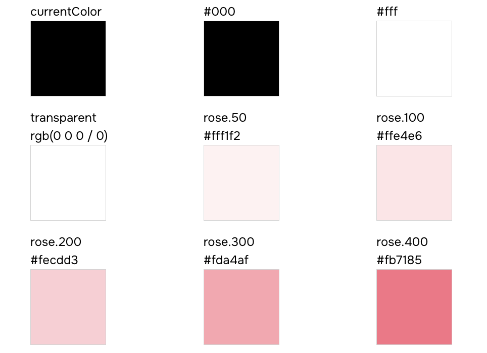
### `semantic-tokens.json`
#### Structure
This file contains an array of semantic token definitions grouped by category, with conditional values for different
modes (e.g., light/dark).
```json
{
"type": "semantic-tokens",
"data": [
{
"type": "colors",
"values": [
{
"name": "bg",
"values": [
{ "value": "{colors.white}", "condition": "base" },
{ "value": "{colors.dark}", "condition": "dark" }
],
"cssVar": "var(--colors-bg)"
}
],
"tokenFunctionExamples": ["token('colors.bg')", "token.var('colors.bg')"],
"functionExamples": ["css({ color: 'bg' })"],
"jsxExamples": [""]
}
]
}
```
Each semantic token in the `values` array includes:
- **name**: the semantic token key (e.g., `bg`, `fg.muted`, `accent`)
- **values**: an array of conditional mappings, each with:
- **value**: the resolved token reference (e.g., `{colors.white}`)
- **condition**: the condition name (e.g., `base`, `dark`)
- **cssVar**: the generated CSS custom property
- **tokenFunctionExamples**: examples of how to use the token in the `token` function
- **functionExamples**: examples of how to use the token in the `css` function
- **jsxExamples**: examples of how to use the token in JSX
#### Usage
Here's an example of how to document semantic color tokens with their conditional values:
```tsx
import semanticTokens from 'styled-system/specs/semantic-tokens.json'
const Demo = () => {
const colors = semanticTokens.data.find((token) => token.type === 'colors')
return (
{colors?.values.map((token) => (
{token.name}
{token.cssVar}
{token.values.map(({ condition, value }) => (
{condition}
{value}
))}
))}
)
}
```
### `recipes.json`
#### Structure
This file contains an array of recipe definitions for styling components with variant support.
```json
{
"type": "recipes",
"data": [
{
"name": "button",
"description": "A button style",
"variants": {
"shape": ["square", "circle"],
"color": ["main", "black", "white"],
"size": ["sm", "md", "lg"]
},
"defaultVariants": {
"shape": "square",
"color": "main",
"size": "md"
},
"functionExamples": ["button({ shape: 'square' })", "button({ color: 'main' })", "button({ size: 'sm' })"],
"jsxExamples": ["", "", ""]
}
]
}
```
Each recipe in the `data` array includes:
- **name**: the recipe name (e.g., `button`, `card`)
- **description**: optional description of what the recipe does
- **variants**: an object where each key is a variant name and each value is an array of allowed options
- **defaultVariants**: an object defining the default option for each variant
- **functionExamples**: examples of how to use the recipe function
- **jsxExamples**: examples of how to use the recipe in JSX
#### Usage
Here's an example of how to document a button recipe within a table:
```tsx
import recipes from 'styled-system/specs/recipes.json'
const Demo = () => {
const buttonRecipe = recipes.data.find((recipe) => recipe.name === 'button')
const defaultVariants = buttonRecipe?.defaultVariants || {}
return (
{(options as string[]).map((option) => (
{option}
))}
{defaultVariants[key as keyof typeof defaultVariants] || 'none'}
))}
)
}
```
Your button recipe documentation should look similar to this:

### `color-palette.json`
Contains a list of all color names defined in your palette.
- `values` — an array of color keys (e.g., `"blue"`, `"teal"`, `"pink"` and more).
- Does not contain the color scales (e.g., 500, 600); it only lists the available palette names.
- Optional examples: `functionExamples` and `jsxExamples`
### `text-styles.json`
#### Structure
This file contains an array of text style definitions for typography presets.
```json
{
"type": "text-styles",
"data": [
{
"name": "xl",
"functionExamples": ["css({ textStyle: 'xl' })"],
"jsxExamples": [""]
}
]
}
```
Each text style in the `data` array includes:
- **name**: the text style name (e.g., `xs`, `sm`, `md`, `lg`, `xl`, `2xl`)
- **functionExamples**: examples of how to use the text style in the `css` function
- **jsxExamples**: examples of how to use the text style in JSX
#### Usage
Here's an example of how to document text styles with a visual preview:
```tsx
import textStyles from 'styled-system/specs/text-styles.json'
const Demo = () => {
return (
{textStyles.data.map((style) => (
{style.name}
The quick brown fox jumps over the lazy dog
))}
)
}
```
### `layer-styles.json`
#### Structure
This file contains an array of layer style definitions for visual presets (backgrounds, shadows, borders, etc.).
```json
{
"type": "layer-styles",
"data": [
{
"name": "offShadow",
"functionExamples": ["css({ layerStyle: 'offShadow' })"],
"jsxExamples": [""]
}
]
}
```
Each layer style in the `data` array includes:
- **name**: the layer style name (e.g., `card`, `overlay`, `offShadow`)
- **functionExamples**: examples of how to use the layer style in the `css` function
- **jsxExamples**: examples of how to use the layer style in JSX
#### Usage
Here's an example of how to document layer styles with a visual preview:
```tsx
import layerStyles from 'styled-system/specs/layer-styles.json'
const Demo = () => {
return (
{layerStyles.data.map((style) => (
{style.name}
))}
)
}
```
### `animation-styles.json`
Contains an array of animation style entries. Each entry includes:
- `name` — the animation preset name
- Animation properties such as `duration`, `timingFunction`, etc.
- Optional examples: `functionExamples` and `jsxExamples`
If no animation styles are configured in your `bamboo.config.ts` file , this file will contain an empty data array.
### `keyframes.json`
#### Structure
This file contains an array of keyframe definitions for CSS animations.
```json
{
"type": "keyframes",
"data": [
{
"name": "spin",
"functionExamples": ["css({ animationName: 'spin' })", "css({ animation: 'spin 1s ease-in-out infinite' })"],
"jsxExamples": ["", ""]
}
]
}
```
Each keyframe in the `data` array includes:
- **name**: the keyframe name (e.g., `spin`, `ping`, `pulse`, `bounce`, `fade-in`)
- **functionExamples**: examples of how to use the keyframe in the `css` function
- **jsxExamples**: examples of how to use the keyframe in JSX
#### Usage
Here's an example of how to document keyframes with animated previews:
```tsx
import keyframes from 'styled-system/specs/keyframes.json'
const Demo = () => {
return (
{keyframes.data.map((keyframe) => (
{keyframe.name}
))}
)
}
```
### `patterns.json`
#### Structure
This file contains an array of pattern definitions for layout utilities.
```json
{
"type": "patterns",
"data": [
{
"name": "flex",
"jsx": "Flex",
"properties": [
{ "name": "align", "type": "SystemProperties['alignItems']" },
{ "name": "justify", "type": "SystemProperties['justifyContent']" },
{ "name": "direction", "type": "SystemProperties['flexDirection']" },
{ "name": "wrap", "type": "SystemProperties['flexWrap']" }
],
"functionExamples": ["flex({ align: 'center' })", "flex({ justify: 'space-between' })"],
"jsxExamples": ["", ""]
}
]
}
```
Each pattern in the `data` array includes:
- **name**: the pattern function name (e.g., `flex`, `grid`, `stack`, `center`)
- **jsx**: the JSX component name for the pattern (e.g., `Flex`, `Grid`, `Stack`)
- **properties**: an array of pattern-specific props, each with:
- **name**: the prop name (e.g., `align`, `justify`, `gap`)
- **type**: the TypeScript type for the prop
- **defaultValue**: optional default value for the prop
- **functionExamples**: examples of how to use the pattern function
- **jsxExamples**: examples of how to use the pattern in JSX
#### Usage
Here's an example of how to document patterns with their properties:
```tsx
import patterns from 'styled-system/specs/patterns.json'
const Demo = () => {
return (
)
}
```
### `conditions.json`
Contains an array of condition entries. Each entry includes:
- `name` — the condition key used in style objects (e.g.,`_hover`, `_focus`, `_focusWithin`)
- `value` — the CSS selector or media query that the condition maps to
- Optional examples: `functionExamples` and `jsxExamples`
## FAQs
### Can I edit the spec files directly?
**No.** The spec files are **generated** files—you should **not** edit your design tokens, recipes, or theme directly in
these files. All configuration changes must be made in your `bamboo.config.ts` file. The spec files exist purely for
documentation and visualization purposes.
---
## Using Bamboo Studio
Document your design system visually using Bamboo Studio.
### Bamboo Studio
Bamboo Studio is a visual interface for exploring and understanding your entire design system. It provides a read-only
view of your tokens, semantic tokens, recipes, patterns, conditions, and more.
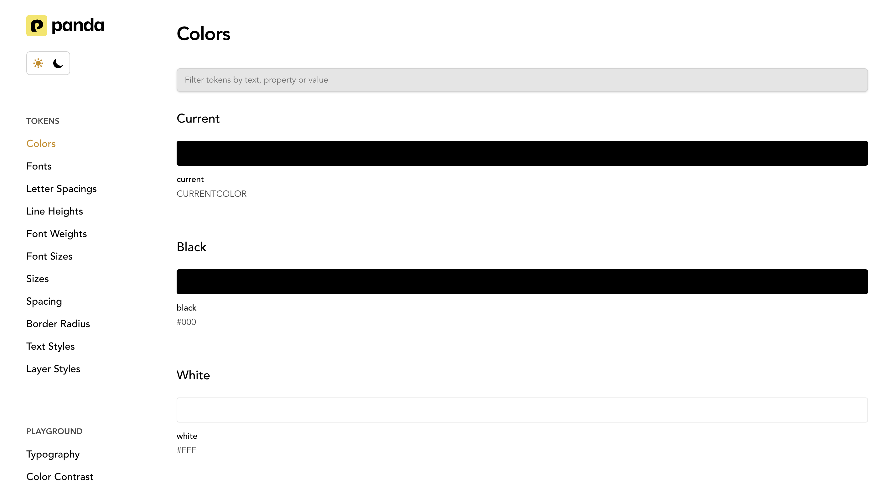
If you don't want to manually generate spec files or build a documentation website, Bamboo Studio is the easiest option.
- Studio does not require you to run pnpm bamboo spec.
- Studio generates and visualizes your design system automatically.
- Studio acts as a fully-featured documentation tool without writing any documentation code.
> Spec files are primarily for custom documentation setups and Storybook integrations. Bamboo Studio is for teams who
> want instant documentation.
## Bamboo Studio Setup
To use bamboo studio, first install it:
```bash
pnpm i @bamboocss/studio
```
Next, launch it locally using:
```bash
pnpm bamboo studio
```
This starts a local server and launches an interactive dashboard showing all your design system elements. Since Studio
reads your theme configuration directly, any changes to your `bamboo.config.ts` will appear automatically the next time
you run it.
You can also deploy the studio as a standalone design system portal for your team.
---
## Text Styles
Define reusable typography css properties.
Text styles allows you to define textual css properties. The common properties are:
- The font family, weight, size
- Line height
- Letter spacing
- Text Decoration (strikethrough and underline)
- Text Transform (uppercase, lowercase, and capitalization)
## Defining text styles
Text styles are defined in the `textStyles` property of the theme.
Here's an example of a text style:
```js filename="text-styles.ts"
import { defineTextStyles } from '@bamboocss/dev'
export const textStyles = defineTextStyles({
body: {
description: 'The body text style - used in paragraphs',
value: {
fontFamily: 'Inter',
fontWeight: '500',
fontSize: '16px',
lineHeight: '24px',
letterSpacing: '0',
textDecoration: 'None',
textTransform: 'None',
},
},
})
```
> **Good to know:** The `value` property maps to style objects that will be applied to the text.
## Update the config
To use the text styles, we need to update the `config` object in the `bamboo.config.ts` file.
```js filename="bamboo.config.ts"
import { defineConfig } from '@bamboocss/dev'
import { textStyles } from './text-styles'
export default defineConfig({
theme: {
extend: {
textStyles,
},
},
})
```
This should automatically update the generated theme the specified `textStyles`. If this doesn't happen, you can run the
`bamboo codegen` command.
## Using text styles
Now we can use `textStyle` property in our components.
```jsx
import { css } from '../styled-system/css'
function App() {
return
This is a paragraph from Bamboo with the body text style.
}
```
## Nesting text styles
Text styles support nested structures with a special `DEFAULT` key. This allows you to create variants of a text style
while having a default fallback.
When you define a `DEFAULT` key within a nested text style, you can reference the parent key directly to use the default
value.
```js filename="bamboo.config.ts"
export default defineConfig({
theme: {
extend: {
textStyles: {
heading: {
DEFAULT: {
value: {
fontFamily: 'Inter',
fontWeight: 'bold',
fontSize: '1.5rem',
lineHeight: '1.2',
},
},
h1: {
value: {
fontFamily: 'Inter',
fontWeight: 'bold',
fontSize: '2.5rem',
lineHeight: '1.1',
},
},
h2: {
value: {
fontFamily: 'Inter',
fontWeight: 'bold',
fontSize: '2rem',
lineHeight: '1.15',
},
},
},
},
},
},
})
```
Now you can use the default heading style or specific variants:
```jsx
import { css } from '../styled-system/css'
function App() {
return (
Main Title
Subtitle
Uses DEFAULT variant
)
}
```
## Best Practices
### Avoid layout properties
To ensure the consistency of your design system, avoid applying layout properties (like margin, padding, etc.) or color
properties (background, colors, etc.) to the text styles.
### Naming conventions
We recommend using the same text style names used by designers on your team. Here are common ideas on how to name text
styles:
- Sized-based naming system (`xs`, `sm`, `md`, `lg`, `xl`)
- Semantic naming system that corresponds to respective html tags in production (`caption`, `paragraph`, `h1`, `h2`)
- Descriptive or functional naming system that explains the style's intended use (`alert`, `modal-header`,
`button-label`)
---
## Tokens
Design tokens are the platform-agnostic way to manage design decisions in your application or website.
Design tokens provide a platform-agnostic way to manage design decisions through key-value pairs that describe
fundamental visual styles.
> Design tokens in Bamboo are largely influenced by the [W3C Token Format](https://tr.designtokens.org/format/).
A design token consists of the following properties:
- `value`: The value of the token. This can be any valid CSS value.
- `description`: An optional description of what the token can be used for.
## Core Tokens
Tokens are defined in the `bamboo.config` file under the `theme` key
```js filename="bamboo.config.ts"
import { defineConfig } from '@bamboocss/dev'
export default defineConfig({
theme: {
// 👇🏻 Define your tokens here
extend: {
tokens: {
colors: {
primary: { value: '#0FEE0F' },
secondary: { value: '#EE0F0F' },
},
fonts: {
body: { value: 'system-ui, sans-serif' },
},
},
},
},
})
```
> ⚠️ Token values need to be nested in an object with a `value` key. This is to allow for additional properties like
> `description` and more in the future.
After defining tokens, you can use them in authoring components and styles.
```jsx
import { css } from '../styled-system/css'
function App() {
return (
Hello World
)
}
```
You can also add an optional description to your tokens. This will be used in the autogenerate token documentation.
```js {8}
import { defineConfig } from '@bamboocss/dev'
export default defineConfig({
theme: {
tokens: {
colors: {
danger: {
value: '#EE0F0F',
description: 'Color for errors',
},
},
},
},
})
```
## Semantic Tokens
Semantic tokens are tokens that are designed to be used in a specific context. In most cases, the value of a semantic
token references to an existing token.
> To reference a value in a semantic token, use the `{}` syntax.
For example, assuming we've defined the following tokens:
- `red` and `green` are raw tokens that define the color red and green.
- `danger` and `success` are semantic tokens that reference the `red` and `green` tokens.
```js
import { defineConfig } from '@bamboocss/dev'
export default defineConfig({
theme: {
tokens: {
colors: {
red: { value: '#EE0F0F' },
green: { value: '#0FEE0F' },
},
},
semanticTokens: {
colors: {
danger: { value: '{colors.red}' },
success: { value: '{colors.green}' },
},
},
},
})
```
> ⚠️ Semantic Token values need to be nested in an object with a `value` key. This is to allow for additional properties
> like `description` and more in the future.
Semantic tokens can also be changed based on the [conditions](/docs/concepts/conditional-styles) like light and dark
modes.
For example, if you want a color to change automatically based on light or dark mode.
```js
import { defineConfig } from '@bamboocss/dev'
export default defineConfig({
// ...
theme: {
semanticTokens: {
colors: {
danger: {
value: { base: '{colors.red}', _dark: '{colors.darkred}' },
},
success: {
value: { base: '{colors.green}', _dark: '{colors.darkgreen}' },
},
},
},
},
})
```
> NOTE 🚨: The conditions used in semantic tokens must be an at-rule or parent selector
> [condition](/docs/concepts/conditional-styles#reference).
## Token Nesting
Tokens can be nested to create a hierarchy of tokens. This is useful when you want to group tokens together.
> Tip: You can use the `DEFAULT` key to define the default value of a nested token.
```js
import { defineConfig } from '@bamboocss/dev'
export default defineConfig({
// ...
theme: {
semanticTokens: {
colors: {
bg: {
DEFAULT: { value: '{colors.gray.100}' },
muted: { value: '{colors.gray.100}' },
},
},
},
},
})
```
This allows the use of the `bg` token in the following ways:
```jsx
import { css } from '../styled-system/css'
function App() {
return (
Hello World
)
}
```
## Token Types
Bamboo supports the following token types:
### Colors
Colors have meaning and support the purpose of the content, communicating things like hierarchy of information, and
states. It is mostly defined as a string value or reference to other tokens.
```jsx
const theme = {
tokens: {
colors: {
red: { 100: { value: '#fff1f0' } },
},
},
}
```
### Gradients
Gradient tokens represent a smooth transition between two or more colors. Its value can be defined as a string or a
composite value.
```ts
type Gradient =
| string
| {
type: 'linear' | 'radial'
placement: string | number
stops:
| Array<{
color: string
position: number
}>
| Array
}
```
```jsx
const theme = {
tokens: {
gradients: {
// string value
simple: { value: 'linear-gradient(to right, red, blue)' },
// composite value
primary: {
value: {
type: 'linear',
placement: 'to right',
stops: ['red', 'blue'],
},
},
},
},
}
```
### Sizes
Size tokens represent the width and height of an element. Its value is defined as a string.
```jsx
const theme = {
tokens: {
sizes: {
sm: { value: '12px' },
},
},
}
```
> Size tokens are typically used in `width`, `height`, `min-width`, `max-width`, `min-height`, `max-height` properties.
### Spacings
Spacing tokens represent the margin and padding of an element. Its value is defined as a string.
```jsx
const theme = {
tokens: {
spacing: {
sm: { value: '12px' },
},
},
}
```
> Spacing tokens are typically used in `margin`, `padding`, `gap`, and `{top|right|bottom|left}` properties.
### Fonts
Font tokens represent the font family of a text element. Its value is defined as a string or an array of strings.
```jsx
const theme = {
tokens: {
fonts: {
body: { value: 'Inter, sans-serif' },
heading: { value: ['Roboto Mono', 'sans-serif'] },
},
},
}
```
> Font tokens are typically used in `font-family` property.
### Font Sizes
Font size tokens represent the size of a text element. Its value is defined as a string.
```jsx
const theme = {
tokens: {
fontSizes: {
sm: { value: '12px' },
},
},
}
```
> Font size tokens are typically used in `font-size` property.
### Font Weights
Font weight tokens represent the weight of a text element. Its value is defined as a string.
```jsx
const theme = {
tokens: {
fontWeights: {
bold: { value: '700' },
},
},
}
```
> Font weight tokens are typically used in `font-weight` property.
### Letter Spacings
Letter spacing tokens represent the spacing between letters in a text element. Its value is defined as a string.
```jsx
const theme = {
tokens: {
letterSpacings: {
wide: { value: '0.1em' },
},
},
}
```
> Letter spacing tokens are typically used in `letter-spacing` property.
### Line Heights
Line height tokens represent the height of a line of text. Its value is defined as a string.
```jsx
const theme = {
tokens: {
lineHeights: {
normal: { value: '1.5' },
},
},
}
```
> Line height tokens are typically used in `line-height` property.
### Radii
Radii tokens represent the radius of a border. Its value is defined as a string.
```jsx
const theme = {
tokens: {
radii: {
sm: { value: '4px' },
},
},
}
```
> Radii tokens are typically used in `border-radius` property.
### Borders
A border is a line surrounding a UI element. You can define them as string values or as a composite value
```jsx
const theme = {
tokens: {
borders: {
// string value
subtle: { value: '1px solid red' },
// string value with reference to color token
danger: { value: '1px solid {colors.red.400}' },
// composite value
accent: { value: { width: '1px', color: 'red', style: 'solid' } },
},
},
}
```
> Border tokens are typically used in `border`, `border-top`, `border-right`, `border-bottom`, `border-left`, `outline`
> properties.
### Border Widths
Border width tokens represent the width of a border. Its value is defined as a string.
```jsx
const theme = {
tokens: {
borderWidths: {
thin: { value: '1px' },
thick: { value: '2px' },
medium: { value: '1.5px' },
},
},
}
```
### Shadows
Shadow tokens represent the shadow of an element. Its value is defined as single or multiple values containing a string
or a composite value.
```ts
type CompositeShadow = {
offsetX: number
offsetY: number
blur: number
spread: number
color: string
inset?: boolean
}
type Shadow = string | CompositeShadow | string[] | CompositeShadow[]
```
```jsx
const theme = {
tokens: {
shadows: {
// string value
subtle: { value: '0 1px 2px 0 rgba(0, 0, 0, 0.05)' },
// composite value
accent: {
value: {
offsetX: 0,
offsetY: 4,
blur: 4,
spread: 0,
color: 'rgba(0, 0, 0, 0.1)',
},
},
// multiple string values
realistic: {
value: ['0 1px 2px 0 rgba(0, 0, 0, 0.05)', '0 1px 4px 0 rgba(0, 0, 0, 0.1)'],
},
},
},
}
```
> Shadow tokens are typically used in `box-shadow` property.
### Easings
Easing tokens represent the easing function of an animation or transition. Its value is defined as a string or an array
of values representing the cubic bezier.
```jsx
const theme = {
tokens: {
easings: {
// string value
easeIn: { value: 'cubic-bezier(0.4, 0, 0.2, 1)' },
// array value
easeOut: { value: [0.4, 0, 0.2, 1] },
},
},
}
```
> Ease tokens are typically used in `transition-timing-function` property.
### Opacity
Opacity tokens help you set the opacity of an element.
```js
const theme = {
tokens: {
opacity: {
50: { value: 0.5 },
},
},
}
```
> Opacity tokens are typically used in `opacity` property.
### Z-Index
This token type represents the depth of an element's position on the z-axis.
```jsx
const theme = {
tokens: {
zIndex: {
modal: { value: 1000 },
},
},
}
```
> Z-index tokens are typically used in `z-index` property.
### Assets
Asset tokens represent a url or svg string. Its value is defined as a string or a composite value.
```ts
type CompositeAsset = { type: 'url' | 'svg'; value: string }
type Asset = string | CompositeAsset
```
```js
const theme = {
tokens: {
assets: {
logo: {
value: { type: 'url', value: '/static/logo.png' },
},
checkmark: {
value: { type: 'svg', value: '' },
},
},
},
}
```
> Asset tokens are typically used in `background-image` property.
### Durations
Duration tokens represent the length of time in milliseconds an animation or animation cycle takes to complete. Its
value is defined as a string.
```jsx
const theme = {
tokens: {
durations: {
fast: { value: '100ms' },
},
},
}
```
> Duration tokens are typically used in `transition-duration` and `animation-duration` properties.
### Animations
Animation tokens represent a keyframe animation. Its value is defined as a string value.
```jsx
const theme = {
tokens: {
animations: {
spin: {
value: 'spin 1s linear infinite',
},
},
},
}
```
> Animation tokens are typically used in `animation` property.
### Aspect Ratios
Aspect ratio tokens represent the aspect ratio of an element. Its value is defined as a string.
```js
const theme = {
tokens: {
aspectRatios: {
'1:1': { value: '1 / 1' },
'16:9': { value: '16 / 9' },
},
},
}
```
### Cursor
Cursor tokens define the style of the mouse pointer when it hovers over a specific element or area. These tokens
represent the visual behavior of interactions, indicating actions such as clickable areas, draggable elements, or
loading states. Their value is defined as a string.
```js
const theme = {
tokens: {
cursor: {
click: { value: 'pointer' },
disabled: { value: 'not-allowed' },
// custom value
custom: { value: 'url(cursor.svg), auto' },
},
},
}
```
## Token Helpers
To help defining tokens in a type-safe way, you can use the tokens
[Config Functions](/docs/customization/config-functions#token-creators).
## CSS variables
The generated CSS variables will be scoped using the `cssVarRoot` selector defined in the config.
```js
import { defineConfig } from '@bamboocss/dev'
export default defineConfig({
cssVarRoot: ':where(:root, :host)',
// ...
})
```
This will generate a CSS file similar to the following:
```css
:where(:root, :host) {
--colors-primary: #0fee0f;
--colors-secondary: #ee0f0f;
/* ... */
}
```
You can also define type-safe CSS variables using [globalVars](/docs/concepts/writing-styles#property-conflicts).
---
## Using Tokens
There are various ways to consume Bamboo tokens depending on your need at that point in time.
Learn the various ways to consume Bamboo tokens in your project.
## Style Properties
The recommended way to consume your tokens is in the `css` function or style props.
```jsx
import { css } from '../styled-system/css'
const App = () => (
)
```
## Composite values
Some CSS properties like `border`, `box-shadow` allow you to specify multiple properties in its value. Bamboo allows you
to reference tokens in these composite values by using either the `token()` string function (similar to the JS
equivalent) or the token reference syntax `{path.to.token}` (similar to the semantic tokens equivalent).
The `token()` function is useful when you need to provide a fallback value. The token reference syntax is useful when
you don't need a fallback value or prefer using a more concise syntax.
{/* */}
```js
import { css } from '../styled-system/css'
const className = css({ border: '1px solid token(colors.red.400)' })
```
You can also provide a fallback value.
```js
import { css } from '../styled-system/css'
const className = css({ border: '1px solid token(colors.red.400, red)' })
```
```js
import { css } from '../styled-system/css'
const className = css({ border: '1px solid {colors.red.400}' })
```
{/* */}
You can also use it in media queries or any other CSS at-rule.
{/* */}
```js
import { css } from '../styled-system/css'
const className = css({
'@media screen and (min-width: token(sizes.4xl))': {
color: 'green.400'
}
})
```
```js
import { css } from '../styled-system/css'
const className = css({
'@media screen and (min-width: {sizes.4xl})': {
color: 'green.400'
}
})
```
{/* */}
## Vanilla JS
Use the generated `token` function to query design tokens in your project. This is useful if you need direct access to
your design tokens in the `style` attribute or when using CSS-in-JS libraries like `styled-components` or
`@emotion/styled`
> This approach is useful for incrementally adopting Bamboo in existing projects or
> [dynamic styling](/docs/guides/dynamic-styling#using-token)
### Style Attribute
```tsx filename="src/App.tsx"
import { token } from '../styled-system/tokens'
function App() {
return (
)
}
```
Each of your design tokens will be available in the generated `/tokens` folder. It looks like this:
```js filename="styled-system/tokens.ts"
const tokens = {
// ...
'colors.blue.200': {
value: '#bfdbfe',
variable: 'var(--colors-blue-200)',
},
// ...
}
```
- The `token()` function returns the raw value of the token.
- The `token.var()` function returns the CSS custom property used to reference the token.
Both functions are typesafe and expect a known dot-separated token path, they also accept a fallback value as a second
argument.
Using the example above, `token('colors.blue.200')` would return `#bfdbfe` and `token.var('colors.blue.200')` would
return `var(--colors-blue-200)`.
### Styled Components
```tsx
import styled from 'styled-components'
const Button = styled.button`
background: ${token('colors.blue.200')};
`
```
### Emotion
```tsx
import styled from '@emotion/styled'
const Button = styled.button`
background: ${token('colors.blue.200')};
`
```
---
# Utilities
## Background
Bamboo provides the following utilities or style properties for styling background colors, gradients, and images.
Use these utilities to style background colors, gradients, and images.
## Background Colors
```jsx
// with alpha
```
| Prop | CSS Property | Token Category |
| ---------------------------- | ------------------ | -------------- |
| `bg`, `background` | `background` | `colors` |
| `bgColor`, `backgroundColor` | `background-color` | `colors` |
| `bgGradient` | `background-image` | `gradients` |
## Background Gradients
Properties to create a background gradient based on color stops.
```jsx
```
Background and text gradients can be connected to design tokens. Here's how to define a gradient token in your theme.
```ts
const theme = {
tokens: {
gradients: {
// string value
simple: { value: 'linear-gradient(to right, red, blue)' },
// composite value
primary: {
value: {
type: 'linear',
placement: 'to right',
stops: ['red', 'blue'],
},
},
},
},
}
```
These tokens can be used in the `bgGradient` or `textGradient` properties.
```jsx
```
| Prop | CSS Property | Token Category |
| -------------- | ------------------ | -------------- |
| `bgGradient` | `background-image` | `gradients` |
| `textGradient` | `background-image` | `gradients` |
| `gradientFrom` | `--gradient-from` | `colors` |
| `gradientTo` | `--gradient-to` | `colors` |
| `gradientVia` | `--gradient-via` | `colors` |
## Background Position
Properties for controlling the src and position of a background image.
```jsx
```
| Prop | CSS Property | Token Category |
| -------------------------------------- | ------------------- | -------------- |
| `bgPosition`, `backgroundPosition` | `background-image` | none |
| `bgPositionX`, `backgroundPositionX` | `background-image` | none |
| `bgPositionY`, `backgroundPositionY` | `background-image` | none |
| `bgAttachment` ,`backgroundAttachment` | `background-size` | none |
| `bgClip`, `backgroundClip` | `background-size` | none |
| `bgOrigin`, `backgroundOrigin` | `background-size` | none |
| `bgImage`, `backgroundImage` | `background-size` | assets |
| `bgRepeat`, `backgroundRepeat` | `background-repeat` | none |
| `bgBlendMode`, `backgroundBlendMode` | `background-size` | none |
| `bgSize`, `backgroundSize` | `background-size` | none |
---
## Border
Bamboo's border utilities.
Bamboo provides CSS properties for styling borders.
## Compound Properties
The border compound property maps to the `borders` token category.
| Prop | CSS Property | Token Category |
| ----------------------------------- | ------------------- | -------------- |
| `border` | `border` | `borders` |
| `borderX` , `borderInline` | `borderInline` | `borders` |
| `borderY` , `borderBlock` | `borderBlock` | `borders` |
| `borderStart` , `borderInlineStart` | `borderInlineStart` | `borders` |
| `borderEnd` , `borderInlineEnd` | `borderInlineEnd` | `borders` |
## Border Radius
### All sides
```jsx
// shorthand
```
### Specific sides
Use the `border{Left|Right|Top|Bottom}Radius` properties, or the shorthand equivalent to apply border radius on a
specific side of an element.
```jsx
// shorthand
// shorthand
```
### Specific corners
Use the `border{Top|Bottom}{Left|Right}Radius` properties, or the shorthand equivalent to round a specific corner.
```jsx
// shorthand
```
| Prop | CSS Property | Token Category |
| ---------------------------------------- | ----------------------------------- | -------------- |
| `rounded`,`borderRadius` | `border-radius` | `radii` |
| `roundedTopLeft`,`borderTopLeftRadius` | `border-top-left-radius` | `radii` |
| `roundedTopRight`,`borderTopRight` | `border-top-right-radius` | `radii` |
| `roundedBottomRight`,`borderBottomRight` | `border-bottom-right-radius` | `radii` |
| `roundedBottomLeft`,`borderBottomLeft` | `border-bottom-left-radius` | `radii` |
| `roundedTop`,`borderTopRadius` | `border-top-{left+right}-radius` | `radii` |
| `roundedRight`,`borderRightRadius` | `border-{top+bottom}-right-radius` | `radii` |
| `roundedBottom`,`borderBottomRadius` | `border-bottom-{left+right}-radius` | `radii` |
| `roundedLeft`,`borderLeftRadius` | `border-{top+bottom}-left-radius` | `radii` |
### Logical Properties
Bamboo also provides the logical properties for border radius, which map to corresponding physical properties based on
the document's writing mode.
> For example, `borderStartRadius` will map to `border-left-radius` in LTR mode, and `border-right-radius` in RTL mode.
```jsx
// shorthand
```
| Prop | CSS Property | Token Category |
| -------------------------------------------- | --------------------------------- | -------------- |
| `roundedStartStart`,`borderStartStartRadius` | `border-start-start-radius` | `radii` |
| `roundedStartEnd`,`borderStartEndRadius` | `border-start-end-radius` | `radii` |
| `roundedStart`,`borderStartRadius` | `border-{start+end}-start-radius` | `radii` |
| `roundedEndStart`,`borderEndStartRadius` | `border-end-start-radius` | `radii` |
| `roundedEndEnd`,`borderEndEndRadius` | `border-end-end-radius` | `radii` |
| `roundedEnd` ,`borderEndRadius` | `border-{start+end}-end-radius` | `radii` |
## Border Width
### All sides
```jsx
```
### Specific sides
Use the `border{Left|Right|Top|Bottom}Width` properties, to apply border width on a specific side of an element.
```jsx
```
| Prop | CSS Property |
| ------------------------------------ | --------------------------- |
| `borderWidth` | `border-width` |
| `borderTopWidth` | `border-top-width` |
| `borderLeftWidth` | `border-left-width` |
| `borderRightWidth` | `border-right-width` |
| `borderBottomWidth` | `border-bottom-width` |
| `borderXWidth` , `borderInlineWidth` | `border-{left+right}-width` |
| `borderYWidth` , `borderBlockWidth` | `border-{top+bottom}-width` |
### Logical Properties
Bamboo also provides the logical properties for border width, which map to corresponding physical properties based on
the document's writing mode.
> For example, `borderStartWidth` will map to `border-left-width` in LTR mode, and `border-right-width` in RTL mode.
```jsx
```
| Prop | CSS Property |
| --------------------------------------------- | -------------------------- |
| `borderStartWidth` , `borderInlineStartWidth` | `border-{start+end}-width` |
| `borderEndWidth` , `borderInlineEndWidth` | `border-{start+end}-width` |
## Border Color
The border color utilities are used to set the border color of an element. It references the `colors` token category.
### All sides
```jsx
```
### Specific sides
Use the `border{Left|Right|Top|Bottom}Color` properties to apply border color on a specific side of an element.
```jsx
```
| Prop | CSS Property | Token Category |
| ------------------- | --------------------- | -------------- |
| `borderColor` | `border-color` | `colors` |
| `borderTopColor` | `border-top-color` | `colors` |
| `borderLeftColor` | `border-left-color` | `colors` |
| `borderRightColor` | `border-right-color` | `colors` |
| `borderBottomColor` | `border-bottom-color` | `colors` |
### Logical Properties
Bamboo also provides the logical properties for border color, which map to corresponding physical properties based on
the document's writing mode.
> For example, `borderInlineStartColor` will map to `border-left-color` in LTR mode, and `border-right-color` in RTL
> mode.
```jsx
```
| Prop | CSS Property | Token Category |
| --------------------------------------------- | -------------------------- | -------------- |
| `borderStartColor` , `borderInlineStartColor` | `border-{start+end}-color` | `colors` |
| `borderEndColor` , `borderInlineEndColor` | `border-{start+end}-color` | `colors` |
| `borderXColor`, `borderInlineColor` | `border-inline-color` | `colors` |
| `borderYColor`, `borderBlockColor` | `border-block-color` | `colors` |
---
## Display
Bamboo provides style properties for styling display of an element
Bamboo provides utilities and style properties for styling display of an element.
## Display Property
```jsx
```
## Hiding Elements
Bamboo provides shortcut properties for hiding elements from and below a specific breakpoint.
### Hide From
```jsx
```
### Hide Below
```jsx
```
| Prop | CSS Property | Token Category |
| ----------- | ------------ | -------------- |
| `hideFrom` | `display` | `breakpoints` |
| `hideBelow` | `display` | `breakpoints` |
---
## Divide
Bamboo provides style properties for for dividing elements
Bamboo provides utilities and style properties for dividing elements.
## Divide X
```jsx
```
## Divide Y
```jsx
```
## Divide Color
```jsx
```
## Divide Style
```jsx
```
---
## Effects
Bamboo provides utilities or style properties for applying various visual effects to elements.
Bamboo offers a range of utilities and style properties for applying visual effects to elements. These effects include
opacity, shadows, blending modes, filters, and more.
## Opacity
```jsx
```
| Prop | CSS Property | Token Category |
| --------- | ------------ | -------------- |
| `opacity` | `opacity` | `opacity` |
## Box Shadow
Apply box shadows to elements.
```jsx
```
| Prop | CSS Property | Token Category |
| ------------- | ---------------- | -------------- |
| `boxShadow` | `box-shadow` | `shadows` |
| `shadow` | `box-shadow` | `shadows` |
| `shadowColor` | `--shadow-color` | `colors` |
## Mix Blend Mode
Control the blending mode of an element.
```jsx
```
| Prop | CSS Property | Token Category |
| -------------- | ---------------- | -------------- |
| `mixBlendMode` | `mix-blend-mode` | none |
## Filter
Apply various filters to elements.
```jsx
```
| Prop | CSS Property | Token Category |
| ------------ | --------------- | -------------- |
| `filter` | `filter` | none |
| `blur` | `--blur` | `blurs` |
| `brightness` | `--brightness` | none |
| `contrast` | `--contrast` | none |
| `grayscale` | `--grayscale` | none |
| `hueRotate` | `--hue-rotate` | none |
| `invert` | `--invert` | none |
| `saturate` | `--saturate` | none |
| `sepia` | `--sepia` | none |
| `dropShadow` | `--drop-shadow` | `dropShadows` |
## Backdrop Filter
Apply filters to the backdrop of an element.
```jsx
```
| Prop | CSS Property | Token Category |
| -------------------- | ----------------------- | -------------- |
| `backdropFilter` | `backdrop-filter` | none |
| `backdropBlur` | `--backdrop-blur` | `blurs` |
| `backdropBrightness` | `--backdrop-brightness` | none |
| `backdropContrast` | `--backdrop-contrast` | none |
| `backdropGrayscale` | `--backdrop-grayscale` | none |
| `backdropHueRotate` | `--backdrop-hue-rotate` | none |
| `backdropInvert` | `--backdrop-invert` | none |
| `backdropOpacity` | `--backdrop-opacity` | none |
| `backdropSaturate` | `--backdrop-saturate` | none |
| `backdropSepia` | `--backdrop-sepia` | none |
---
## Flex and Grid
Bamboo provides a set of utilities and style properties for flexible box layout (Flex) and grid layout (Grid). These utilities are designed to make it easy to create responsive and dynamic layouts in your application.
Bamboo provides a set of utilities and style properties for flexible box layout (Flex) and grid layout (Grid). These
utilities are designed to make it easy to create responsive and dynamic layouts in your application.
## Flex
Flex utilities are designed to control the layout and behavior of flex containers and items.
### Flex Basis
The `flexBasis` utility sets the initial main size of a flex item, distributing the available space along the main axis.
It supports `spacing` tokens and fractional literal values like “1/2”, “2/3", etc.
```jsx
```
### Flex
The `flex` utility defines the flexibility of a flex container or item. Supported values:
| Value | |
| --------- | ---------- |
| `1` | `1 1 0%` |
| `auto` | `1 1 auto` |
| `initial` | `0 1 auto` |
| `none` | `none` |
### Flex Direction
The `flexDirection` utility sets the direction of the main axis in a flex container. It's shorthand is `flexDir`.
```jsx
```
## Grid
Grid utilities offer control over various grid layout properties, providing a powerful system for creating layouts with
rows and columns.
### Grid Template Columns
The `gridTemplateColumns` utility defines the columns of a grid container.
```jsx
```
### Grid Template Rows
The `gridTemplateRows` utility defines the rows of a grid container.
```jsx
```
---
## Focus Ring
Style focus states with accessibility-first focus ring utilities.
Focus rings are essential for accessibility, helping users identify which element currently has keyboard focus. Bamboo
provides comprehensive focus ring utilities that work with both regular focus and focus-visible states.
## Focus Ring Variants
The `focusRing` utility applies focus styles using the `&:is(:focus, [data-focus])` selector and supports four variants:
```jsx
// Outside focus ring (default 2px offset)
// Inside focus ring (no offset, with border)
// Mixed focus ring (semi-transparent with border)
// No focus ring
```
## Focus Visible Ring
The `focusVisibleRing` utility only applies focus styles during keyboard navigation using the
`&:is(:focus-visible, [data-focus-visible])` selector:
```jsx
```
### Focus Ring vs. Focus Visible Ring
The Focus Visible Ring functions similarly to the Focus Ring, but with a key difference: it only applies focus indicator
styles when an element receives keyboard focus.
This ensures that the focus ring is visible only when navigating via keyboard, improving accessibility without affecting
mouse interactions.
## Customization
You can customize focus ring appearance with additional utilities:
```jsx
```
| Prop | CSS Property | Token Category | Description |
| ------------------ | ---------------- | -------------- | ------------------------ |
| `focusRing` | Multiple | Enum | Focus ring variant |
| `focusVisibleRing` | Multiple | Enum | Keyboard-only focus ring |
| `focusRingColor` | `outline-color` | `colors` | Focus ring color |
| `focusRingWidth` | `outline-width` | `borderWidths` | Focus ring thickness |
| `focusRingStyle` | `outline-style` | `borderStyles` | Focus ring style |
| `focusRingOffset` | `outline-offset` | `spacing` | Distance from element |
### Ring Color
To change the focus ring color for a specific component, use the `focusRingColor` prop:
```jsx
```
## Global Ring Color
You can set a global focus ring color by defining the CSS custom property:
```ts
// bamboo.config.ts
import { defineConfig } from '@bamboocss/dev'
export default defineConfig({
globalCss: {
html: {
'--global-color-focus-ring': '#3b82f6',
},
},
})
```
### Ring Width
To change the focus ring width for a specific component, use the `focusRingWidth` prop:
```jsx
```
### Ring Style
To change the focus ring style for a specific component, use the `focusRingStyle` prop:
```jsx
```
This color will be used as the default for all focus rings unless overridden by the `focusRingColor` prop.
## Examples
### Basic Focus Ring
```jsx
import { css } from '../styled-system/css'
function Button({ children }) {
return (
)
}
```
### Keyboard-Only Focus Ring
```jsx
import { css } from '../styled-system/css'
function Input({ ...props }) {
return (
)
}
```
### Custom Focus Ring
```jsx
import { css } from '../styled-system/css'
function CustomButton({ children }) {
return (
)
}
```
---
## Gradients
Create smooth color transitions with linear, radial, and conic gradient utilities.
| Property | Shorthand | CSS Property | Description |
| -------------------- | ------------ | ------------------ | ------------------------------ |
| `backgroundLinear` | `bgLinear` | `background-image` | Apply linear gradient effects |
| `backgroundRadial` | `bgRadial` | `background-image` | Apply radial gradient effects |
| `backgroundConic` | `bgConic` | `background-image` | Apply conic gradient effects |
| `backgroundGradient` | `bgGradient` | `background-image` | Apply linear gradient (alias) |
| `textGradient` | - | `background-image` | Apply gradient to text |
| `gradientFrom` | - | `--gradient-from` | Define starting gradient color |
| `gradientTo` | - | `--gradient-to` | Define ending gradient color |
| `gradientVia` | - | `--gradient-via` | Define middle gradient color |
## Examples
### Linear gradients
Use the `bgLinear` utility to create a linear gradient with a direction.
```tsx
css({ bgLinear: 'to-r', gradientFrom: 'cyan.500', gradientTo: 'blue.500' })
css({ bgLinear: 'to-t', gradientFrom: 'sky.500', gradientTo: 'indigo.500' })
css({
bgLinear: 'to-bl',
gradientFrom: 'violet.500',
gradientTo: 'fuchsia.500',
})
css({ bgLinear: '65deg', gradientFrom: 'purple.500', gradientTo: 'pink.500' })
```
### Radial gradients
Build circular color transitions that radiate outward from a center point:
```tsx
css({
bgRadial: 'in srgb',
gradientFrom: 'pink.400',
gradientFromPosition: '40%',
gradientTo: 'fuchsia.700',
})
css({
bgRadial: 'at 50% 75%',
gradientFrom: 'sky.200',
gradientVia: 'blue.400',
gradientTo: 'indigo.900',
gradientToPosition: '90%',
})
css({
bgRadial: 'at 25% 25%',
gradientFrom: 'white',
gradientTo: 'zinc.900',
gradientToPosition: '75%',
})
```
### Conic gradients
Create sweeping color transitions that rotate around a central point:
```jsx
css({
boxSize: '24',
rounded: 'full',
bgConic: 'in srgb',
gradientFrom: 'blue.600',
gradientTo: 'sky.400',
gradientToPosition: '50%',
})
css({
boxSize: '24',
rounded: 'full',
bgConic: 'from 180deg',
gradientFrom: 'blue.600',
gradientVia: 'blue.50',
gradientTo: 'blue.600',
})
css({
boxSize: '24',
rounded: 'full',
bgConic: 'in oklch decreasing hue',
gradientFrom: 'violet.700',
gradientVia: 'lime.300',
gradientTo: 'violet.700',
})
```
### Controlling color stops
Define which colors appear in your gradient using `gradientFrom`, `gradientVia`, and `gradientTo`:
```jsx
css({
bgLinear: 'to-r',
gradientFrom: 'indigo.500',
gradientVia: 'purple.500',
gradientTo: 'pink.500',
})
```
### Positioning color stops
Control exactly where each color appears along the gradient using position utilities:
```jsx
css({
bgLinear: 'to-r',
gradientFrom: 'indigo.500',
gradientFromPosition: '10%',
gradientVia: 'sky.500',
gradientViaPosition: '30%',
gradientTo: 'emerald.500',
gradientToPosition: '90%',
})
```
### Text gradients
Apply colorful gradient effects to typography using `textGradient`:
```jsx
css({
textGradient: 'to-r',
gradientFrom: 'purple.400',
gradientTo: 'pink.400',
fontSize: '4xl',
fontWeight: 'bold',
})
```
### Custom gradient values
Use bracket notation to create gradients with arbitrary values:
```jsx
css({
bgLinear: '25deg',
gradientFrom: 'red.50%',
gradientVia: 'yellow.60%',
gradientTo: 'lime.90%',
gradientToPosition: 'teal.100%',
})
```
### Responsive gradients
Apply different gradient styles at different breakpoints using responsive objects:
```jsx
css({
gradientFrom: { base: 'purple.400', md: 'yellow.500' },
})
```
---
## Helpers
Bamboo CSS offers utility classes to enhance accessibility and aid in debugging.
## Screen Reader-Only Content
The srOnly utility class hides content visually while keeping it accessible to screen readers. It is particularly useful
when you want to provide information to screen readers without displaying it on the screen.
```jsx
Accessible only to screen readers
```
## Debug
The debug utility class applies styles to aid in debugging by adding outlines to elements. This can be helpful during
development to visually inspect the layout and structure of your components.
```jsx
Debugging outline applied
```
---
## Interactivity
Bamboo CSS provides a variety of utility classes to enhance interactivity and user experience on your web applications.
These utilities cover aspects such as accent color, caret color, scrolling behavior, scrollbar customization, scroll
margins and paddings, scroll snapping, touch actions, and user selection.
## Accent Color
The `accentColor` utility class sets the accent color of an element. It supports `colors` tokens.
```jsx
Accent color applied
```
## Caret Color
The `caretColor` utility class sets the color of the text cursor (caret) in an input or textarea. It supports `colors`
tokens.
```jsx
```
## Scrollbar
The `scrollbar` utility allows customization of scrollbar appearance. It supports `visible` and `hidden` values which
respectively show or hide the scrollbar.
```jsx
Scrollbar hidden
```
## Scroll Margin
Scroll margin utilities set margins around scroll containers.
```jsx
```
### Scroll Snap Type
Supported values
| Value | |
| ------ | ------------------------------------ |
| `none` | `none` |
| `x` | `x var(--scroll-snap-strictness)` |
| `y` | `y var(--scroll-snap-strictness)` |
| `both` | `both var(--scroll-snap-strictness)` |
---
## Layout
Bamboo provides style properties for styling layout of an element
Bamboo provides style properties for styling layout of an element.
## Aspect Ratio
Use the `aspectRatio` utilities to set the desired aspect ratio of an element.
Values can reference the `aspectRatios` token category.
```jsx
```
> This uses the native CSS property `aspect-ratio` which is might not supported in all browsers. Consider using the
> [`AspectRatio` pattern](/docs/concepts/patterns#aspect-ratio) instead
## Position
Use the `position` utilities to set the position of an element.
```jsx
// shorthand
```
## Top / Right / Bottom / Left
Use the `top`, `right`, `bottom` and `left` utilities to set the position of an element.
Values can reference the `spacing` token category.
```jsx
```
| Prop | CSS Property | Token Category |
| -------- | ------------ | -------------- |
| `top` | `top` | `spacing` |
| `right` | `right` | `spacing` |
| `bottom` | `bottom` | `spacing` |
| `left` | `left` | `spacing` |
### Logical Properties
Use the `inset{Start|End}` utilities to set the position of an element based on the writing mode.
> For example, `insetStart` will set the `left` property in `ltr` mode and `right` in `rtl` mode.
```jsx
```
| Prop | CSS Property | Token Category |
| ----------------------------------------- | -------------------- | -------------- |
| `start`, `insetStart`, `insetInlineStart` | `inset-inline-start` | `spacing` |
| `end` , `insetEnd`, `insetInlineEnd` | `inset-inline-end` | `spacing` |
| `insetX`, `insetInline` | `inset-inline` | `spacing` |
| `insetY`, `insetBlock` | `inset-inline` | `spacing` |
## Container Query
You can define container names and sizes in your theme configuration and use them in your styles.
[Read more.](/docs/concepts/conditional-styles#container-queries)
| Prop | CSS Property | Token Category |
| --------------- | --------------- | ---------------- |
| `containerName` | `containerName` | `containerNames` |
---
## List
Bamboo provides utilities for customizing list styles.
## List Style Image
Use a custom image as the list marker. It supports the `assets` token category.
```js filename="bamboo.config.ts"
const theme = {
tokens: {
assets: {
star: {
value: { type: 'svg', value: '' },
},
},
},
}
```
```jsx
```
---
## Outline
Bamboo provides utilities for customizing outlines.
## Compound Property
Set the width, color, and style of the outline.
```jsx
// shorthand
```
| Prop | CSS Property | Token Category |
| ------------------ | ------------ | -------------- |
| `ring` , `outline` | `outline` | `borders` |
## Outline Width
Change the width of the outline.
```jsx
// shorthand
```
| Prop | CSS Property | Token Category |
| ---------------------------- | --------------- | -------------- |
| `ringWidth` , `outlineWidth` | `outline-width` | `borderWidths` |
## Outline Color
Change the color of the outline.
```jsx
// shorthand
```
| Prop | CSS Property | Token Category |
| -------------- | --------------- | -------------- |
| `outlineColor` | `outline-color` | `colors` |
## Outline Offset
Adjust the space between the outline and the element.
```jsx
// shorthand
```
| Prop | CSS Property | Token Category |
| --------------- | ---------------- | -------------- |
| `outlineOffset` | `outline-offset` | `spacing` |
---
## Sizing
Style properties for controlling the size of an element.
## Width
Use the `width` or `w` property to set the width of an element.
```jsx
// shorthand
```
### Fractional width
Use can set fractional widths using the `width` or `w` property.
Values can be within the following ranges:
- Thirds: `1/3` to `2/3`
- Fourths: `1/4` to `3/4`
- Fifths: `1/5` to `4/5`
- Sixths: `1/6` to `5/6`
- Twelfths: `1/12` to `11/12`
```jsx
// shorthand
// shorthand
```
### Max width
Use the `maxWidth` or `maxW` property to set the maximum width of an element.
```jsx
// shorthand
```
### Min width
Use the `minWidth` or `minW` property to set the minimum width of an element.
```jsx
// shorthand
```
| Prop | CSS Property | Token Category |
| ------------------ | ------------ | -------------- |
| `w`, `width` | `width` | `sizes` |
| `maxW`, `maxWidth` | `max-width` | `sizes` |
| `minW`, `minWidth` | `min-width` | `sizes` |
## Height
Use the `height` or `h` property to set the height of an element.
```jsx
// shorthand
```
### Fractional height
Use can set fractional heights using the `height` or `h` property.
Values can be within the following ranges:
- Thirds: `1/3` to `2/3`
- Fourths: `1/4` to `3/4`
- Fifths: `1/5` to `4/5`
- Sixths: `1/6` to `5/6`
```jsx
// shorthand
```
### Relative heights
You can use the modern relative height values `dvh`, `svh`, `lvh`.
```jsx
// shorthand
```
### Max height
Use the `maxHeight` or `maxH` property to set the maximum height of an element.
```jsx
// shorthand
```
### Min height
Use the `minHeight` or `minH` property to set the minimum height of an element.
```jsx
// shorthand
```
| Prop | CSS Property | Token Category |
| ------------------- | ------------ | -------------- |
| `h`, `height` | `height` | `sizes` |
| `maxH`, `maxHeight` | `max-height` | `sizes` |
| `minH`, `minHeight` | `min-height` | `sizes` |
### Size
Use the `boxSize` property to set the width and height of an element.
```jsx
```
| Prop | CSS Property | Token Category |
| --------- | --------------- | -------------- |
| `boxSize` | `width, height` | `sizes` |
---
## Spacing
Style properties for controlling the padding of an element.
## Padding
### All sides
Use the `padding` property to apply padding on all sides of an element
```jsx
// shorthand
```
### Specific sides
Use the `padding{Left|Right|Top|Bottom}` to apply padding on one side of an element
```jsx
// shorthand
// shorthand
```
### Horizontal and Vertical padding
Use the `padding{X|Y}` properties to apply padding on the horizontal and vertical axis of an element
```jsx
// shorthand
// shorthand
```
| Prop | CSS Property | Token Category |
| --------------------- | ---------------- | -------------- |
| `p`,`padding` | `padding` | `spacing` |
| `pl`, `paddingLeft` | `padding-left` | `spacing` |
| `pr`, `paddingRight` | `padding-right` | `spacing` |
| `pt`, `paddingTop` | `padding-top` | `spacing` |
| `pb`, `paddingBottom` | `padding-bottom` | `spacing` |
| `px`, `paddingX` | `padding-inline` | `spacing` |
| `py`, `paddingY` | `padding-block` | `spacing` |
### Logical properties
Use the `padding{Start|End}` properties to apply padding on the logical axis of an element based on the text direction.
```jsx
// shorthand
// shorthand
```
| Prop | CSS Property | Token Category |
| -------------------- | ---------------------- | -------------- |
| `ps`, `paddingStart` | `padding-inline-start` | `spacing` |
| `pe`, `paddingEnd` | `padding-inline-end` | `spacing` |
## Margin
### All sides
Use the `margin` property to apply margin on all sides of an element
```jsx
// shorthand
```
### Specific sides
Use the `margin{Left|Right|Top|Bottom}` to apply margin on one side of an element
```jsx
// shorthand
// shorthand
```
### Horizontal and Vertical margin
Use the `margin{X|Y}` properties to apply margin on the horizontal and vertical axis of an element
```jsx
// shorthand
// shorthand
```
| Prop | CSS Property | Token Category |
| -------------------- | --------------- | -------------- |
| `m`,`margin` | `margin` | `spacing` |
| `ml`, `marginLeft` | `margin-left` | `spacing` |
| `mr`, `marginRight` | `margin-right` | `spacing` |
| `mt`, `marginTop` | `margin-top` | `spacing` |
| `mb`, `marginBottom` | `margin-bottom` | `spacing` |
| `mx`, `marginX` | `margin-left` | `spacing` |
| `my`, `marginY` | `margin-top` | `spacing` |
### Logical properties
Use the `margin{Start|End}` properties to apply margin on the logical axis of an element based on the text direction.
```jsx
// shorthand
// shorthand
```
| Prop | CSS Property | Token Category |
| ------------------- | --------------------- | -------------- |
| `ms`, `marginStart` | `margin-inline-start` | `spacing` |
| `me`, `marginEnd` | `margin-inline-end` | `spacing` |
---
## SVG
Bamboo provides utilities for styling SVG elements.
## Fill
Change the fill color of an SVG element.
```jsx
```
| Prop | CSS Property | Token Category |
| ------ | ------------ | -------------- |
| `fill` | `fill` | `colors` |
## Stroke
Change the stroke color of an SVG element.
```jsx
```
| Prop | CSS Property | Token Category |
| -------- | ------------ | -------------- |
| `stroke` | `stroke` | colors |
## Stroke Width
Change the stroke width of an SVG element.
```jsx
```
| Prop | CSS Property | Token Category |
| ------------- | -------------- | -------------- |
| `strokeWidth` | `stroke-width` | borderWidths |
---
## Tables
Bamboo provides utilities for styling tables.
## Border Spacing
Control the border-spacing property of a table.
```jsx
```
| Prop | CSS Property | Token Category |
| --------------- | ---------------- | -------------- |
| `borderSpacing` | `border-spacing` | `spacing` |
## Border Spacing X
Control the horizontal border-spacing property of a table.
```jsx
```
| Prop | CSS Property | Token Category |
| ---------------- | ---------------- | -------------- |
| `borderSpacingX` | `border-spacing` | `spacing` |
## Border Spacing Y
Control the vertical border-spacing property of a table.
```jsx
```
| Prop | CSS Property | Token Category |
| ---------------- | ---------------- | -------------- |
| `borderSpacingY` | `border-spacing` | `spacing` |
---
## Transforms
Bamboo provides utilities for transforming elements.
## Scale
Control the scale property. Supported value is `auto`
```jsx
// => 'var(--scale-x) var(--scale-y)'
```
### Scale X
Control the scaleX property.
```jsx
// => --scale-x: 1.3;
```
### Scale Y
Control the scaleY property.
```jsx
// => --scale-y: 0.4;
```
## Translate
Control the translate property. Supported value is `auto`
```jsx
// => 'var(--translate-x) var(--translate-y)'
```
### Translate X
Control the translateX property.
```jsx
// => --translate-x: 50%;
// shorthand
```
### Translate Y
Control the translateY property.
```jsx
// => --translate-y: -40%;
// shorthand
```
---
## Transitions
Bamboo provides utilities for defining and customizing transitions.
## Transition
A shorthand utility for defining common transition sets.
Values are `all`, `common`, `colors`, `opacity`, `shadow`, `transform`.
```jsx
```
| Prop | CSS Property | Token Category |
| -------------------------- | ---------------------------- | -------------- |
| `transitionTimingFunction` | `transition-timing-function ` | `easings` |
| `transitionDelay` | `transition-delay ` | `durations` |
| `transitionDuration` | `transition-duration ` | `durations` |
## Animation
Control the animation property. It supports the `animations` token category.
```jsx
```
| Prop | CSS Property | Token Category |
| ---------------- | ----------------- | -------------- |
| `animation` | `animation-name ` | animations |
| `animationName` | `animation-name ` | animationName |
| `animationDelay` | `animation-delay ` | durations |
---
## Typography
Bamboo's typography utilities.
Bamboo provides utilities and style properties for styling text.
## Font Properties
```jsx
```
| Prop | CSS Property | Token Category |
| --------------------- | ----------------------- | ---------------- |
| `fontFamily` | `font-family` | `fonts` |
| `fontSize` | `font-size` | `fontSizes` |
| `fontWeight` | `font-weight` | `fontWeights` |
| `letterSpacing` | `letter-spacing` | `letterSpacings` |
| `lineHeight` | `line-height` | `lineHeights` |
| `textDecorationColor` | `text-decoration-color` | `colors` |
| `textEmphasisColor` | `text-emphasis-color` | `colors` |
| `textIndent` | `text-indent` | `spacing` |
| `textShadow` | `text-shadow` | `shadows` |
## Line Clamp (Truncation)
How to truncate multi-line text
```jsx
```
| Prop | Config |
| ----------- | ------------ |
| `textStyle` | `textStyles` |
---
# Customization
## Conditions
Learn how to customize conditions in your Bamboo config
Conditions allow you to apply different styles and behaviors based on specific conditions or states. They provide a way
to target specific elements or apply styles in response to certain events or conditions.
## Creating a condition
To create a condition, you can use the conditions property in the config. Let's say we want to create a `groupHover`
pseudo condition that applies styles to an element when a parent container with the `group` role is hovered.
```ts filename="bamboo.config.ts"
import { defineConfig } from '@bamboocss/dev'
export default defineConfig({
conditions: {
extend: {
groupHover: '[role=group]:where(:hover, [data-hover]) &',
},
},
})
```
> ⚠️ The `&` character is mandatory, it is a placeholder for the current selector. It will be replaced with the actual
> selector when the condition is used. It has to be used either at the beginning or at the end of the condition.
Then you can run the following command to generate the conditions JS code:
{/* */}
```bash
pnpm bamboo codegen
```
```bash
npm bamboo codegen
```
```bash
yarn bamboo codegen
```
```bash
bun bamboo codegen
```
{/* */}
Now, we can use the `groupHover` condition in our components.
```jsx
import { css } from '../styled-system/css'
function App() {
return (
)
}
```
## Customizing Built-in Conditions
You can extend the [default conditions](/docs/concepts/conditional-styles#reference) by using the `conditions.extend`
property in the config.
```ts filename="bamboo.config.ts"
import { defineConfig } from '@bamboocss/dev'
export default defineConfig({
conditions: {
extend: {
// Extend the default `dark` condition
dark: '.dark &, [data-theme="dark"] &',
},
},
})
```
Then you can run the following command to update the conditions JS code:
{/* */}
```bash
pnpm bamboo codegen
```
```bash
npm bamboo codegen
```
```bash
yarn bamboo codegen
```
```bash
bun bamboo codegen
```
{/* */}
## Using tokens
You can also use tokens in your conditions, and they will be resolved to their actual values:
```tsx
import { defineConfig } from '@bamboocss/dev'
export default defineConfig({
conditions: {
extend: {
mq: '@media (min-width: token(sizes.4xl))',
size2: '&[data-size=token(spacing.2)]',
},
},
})
```
## Mixed conditions
You can also use mixed conditions (nested at-rules/selectors) under a single condition name:
```tsx
import { defineConfig } from '@bamboocss/dev'
export default defineConfig({
conditions: {
extend: {
supportHover: ['@media (hover: hover) and (pointer: fine)', '&:hover'],
},
},
})
```
```ts
import { css } from '../styled-system/css'
css({
_supportHover: {
color: 'red',
},
})
```
will generate the following CSS:
```css
@media (hover: hover) and (pointer: fine) {
&:hover {
color: red;
}
}
```
## Multi-block conditions
Sometimes you need a single condition to generate multiple independent CSS blocks, each with its own at-rule. For
example, you might want hover feedback on desktop (pointer devices) and active/press feedback on touch devices.
Use the object syntax with `@slot` markers to define multi-block conditions. Each path from the root of the object to a
`@slot` value becomes an independent CSS block:
```tsx
import { defineConfig } from '@bamboocss/dev'
export default defineConfig({
conditions: {
extend: {
hoverActive: {
'@media (hover: hover)': {
'&:is(:hover, [data-hover])': '@slot',
},
'@media (hover: none)': {
'&:is(:active, [data-active])': '@slot',
},
},
},
},
})
```
```ts
import { css } from '../styled-system/css'
css({
_hoverActive: {
bg: 'red',
},
})
```
will generate the following CSS:
```css
@media (hover: hover) {
.hoverActive\:bg_red:is(:hover, [data-hover]) {
background: red;
}
}
@media (hover: none) {
.hoverActive\:bg_red:is(:active, [data-active]) {
background: red;
}
}
```
This is also useful for any scenario where a single condition needs to apply the same styles across multiple independent
at-rule blocks. Objects with a single `@slot` path behave identically to the [mixed conditions](#mixed-conditions) array
syntax.
## Container queries
Read more about how to define type-safe container queries [here](/docs/concepts/conditional-styles#container-queries)
## Minimal setup
If you want to use Bamboo with the bare minimum, without any of the defaults, you can read more about it
[here](/docs/guides/minimal-setup)
---
## Config Functions
Functions to expose types for your config.
Config functions help define and provide type information for your configuration. These utilities enhance code
readability, enforce consistency, and ensure robust type checking.
## Config Creators
To help defining config in a type-safe way, you can use the following helpers:
### `defineConfig`
Function for [config](/docs/references/config) definitions.
```ts filename="bamboo.config.ts"
import { defineConfig } from '@bamboocss/dev'
export default defineConfig({
theme: {},
include: ['src/**/*.{js,jsx,ts,tsx}'],
})
```
### `defineRecipe`
Function for [recipe](/docs/concepts/recipes#config-recipe) definitions.
```ts
import { defineRecipe } from '@bamboocss/dev'
export const buttonRecipe = defineRecipe({
className: 'button',
description: 'The styles for the Button component',
base: {
display: 'flex',
},
variants: {
visual: {
funky: { bg: 'red.200', color: 'white' },
edgy: { border: '1px solid {colors.red.500}' },
},
},
defaultVariants: {
visual: 'funky',
size: 'sm',
},
})
```
### `defineSlotRecipe`
Function for [slot recipe](/docs/concepts/slot-recipes#config-slot-recipe) definitions.
```ts
import { defineSlotRecipe } from '@bamboocss/dev'
export const checkboxRecipe = defineSlotRecipe({
className: 'checkbox',
description: 'The styles for the Checkbox component',
slots: ['root', 'control', 'label'],
base: {
root: { display: 'flex', alignItems: 'center', gap: '2' },
control: { borderWidth: '1px', borderRadius: 'sm' },
label: { marginStart: '2' },
},
variants: {
size: {
sm: {
control: { width: '8', height: '8' },
label: { fontSize: 'sm' },
},
md: {
control: { width: '10', height: '10' },
label: { fontSize: 'md' },
},
},
},
defaultVariants: {
size: 'sm',
},
})
```
### `defineParts`
It can be useful when you want to have the equivalent of a slot recipe without needing to split the class names bindings
and instead just having a className that handles children on 1 DOM element.
It pairs well with [ZagJs](https://zagjs.com/) and [Ark-UI](https://ark-ui.com/)
Let's refactor the previous example to use parts instead of slots:
```ts
import { defineParts, definetRecipe } from '@bamboocss/dev'
const parts = defineParts({
root: { selector: '& [data-part="root"]' },
control: { selector: '& [data-part="control"]' },
label: { selector: '& [data-part="label"]' },
})
export const checkboxRecipe = defineRecipe({
className: 'checkbox',
description: 'A checkbox style',
base: parts({
root: { display: 'flex', alignItems: 'center', gap: '2' },
control: { borderWidth: '1px', borderRadius: 'sm' },
label: { marginStart: '2' },
}),
variants: {
size: {
sm: parts({
control: { width: '8', height: '8' },
label: { fontSize: 'sm' },
}),
md: parts({
control: { width: '10', height: '10' },
label: { fontSize: 'md' },
}),
},
},
defaultVariants: {
size: 'sm',
},
})
```
### `definePattern`
Function for [pattern](/docs/customization/patterns) definitions.
```ts
import { definePattern } from '@bamboocss/dev'
const visuallyHidden = definePattern({
transform(props) {
return {
srOnly: true,
...props,
}
},
})
```
### `definePreset`
Function for [preset](/docs/customization/presets#creating-a-preset) definitions.
```ts
import { definePreset } from '@bamboocss/dev'
export const bambooPreset = definePreset({
theme: {
extend: {
tokens: {
colors: { primary: { value: 'blue.500' } },
},
},
},
})
```
### `definePlugin`
Function for [plugin](/docs/references/config#plugins) definitions.
```ts
import { definePlugin } from '@bamboocss/dev'
export const plugin = definePlugin({
name: 'token-format',
hooks: {
'tokens:created': ({ configure }) => {
configure({
formatTokenName: (path) => '$' + path.join('-'),
})
},
},
})
```
### `defineKeyframes`
Function for [keyframes](/docs/customization/theme#keyframes) definitions.
```ts
import { defineKeyframes } from '@bamboocss/dev'
export const keyframes = defineKeyframes({
fadeIn: {
'0%': { opacity: '0' },
'100%': { opacity: '1' },
},
})
```
### `defineGlobalStyles`
Function for [global styles](/docs/concepts/writing-styles#global-styles) definitions.
```ts
import { defineGlobalStyles } from '@bamboocss/dev'
const globalCss = defineGlobalStyles({
'html, body': {
color: 'gray.900',
lineHeight: '1.5',
},
})
```
### `defineUtility`
Function for [utility](/docs/customization/utilities) definitions.
```ts
import { defineUtility } from '@bamboocss/dev'
export const br = defineUtility({
className: 'rounded',
values: 'radii',
transform(value) {
return { borderRadius: value }
},
})
```
### `defineTextStyles`
Function for [text styles](/docs/theming/text-styles) definitions.
```ts
import { defineTextStyles } from '@bamboocss/dev'
export const textStyles = defineTextStyles({
body: {
description: 'The body text style - used in paragraphs',
value: {
fontFamily: 'Inter',
fontWeight: '500',
fontSize: '16px',
lineHeight: '24',
letterSpacing: '0',
textDecoration: 'None',
textTransform: 'None',
},
},
})
```
### `defineLayerStyles`
Function for [layer styles](/docs/theming/layer-styles) definitions.
```ts
import { defineLayerStyles } from '@bamboocss/dev'
const layerStyles = defineLayerStyles({
container: {
description: 'container styles',
value: {
background: 'gray.50',
border: '2px solid',
borderColor: 'gray.500',
},
},
})
```
### `defineStyles`
Function for style definitions.
This comes in handy when you want to define reusable styles in the config.
E.g. a set of styles to be used in multiple variants within a [recipe](/docs/concepts/recipes#config-recipe).
```ts {3, 14, 18} filename="recipes/button.ts"
import { defineRecipe, defineStyles } from '@bamboocss/dev'
const buttonVisualStyles = defineStyles({
borderRadius: 'lg',
boxShadow: 'sm',
})
export const buttonRecipe = defineRecipe({
// ...
variants: {
visual: {
funky: {
bg: 'red.200',
color: 'white',
...buttonVisualStyles,
},
edgy: {
border: '1px solid {colors.red.500}',
...buttonVisualStyles,
},
},
},
})
```
## Token Creators
To help defining tokens in a type-safe way, you can use the following helpers:
### `defineTokens`
```ts
import { defineTokens } from '@bamboocss/dev'
const theme = {
tokens: defineTokens({
colors: {
primary: { value: '#ff0000' },
},
}),
}
```
You can also use this function to define tokens in a separate file:
```ts filename="tokens/colors.ts"
import { defineTokens } from '@bamboocss/dev'
export const colors = defineTokens.colors({
primary: { value: '#ff0000' },
})
```
### `defineSemanticTokens`
```ts
import { defineSemanticTokens } from '@bamboocss/dev'
const theme = {
semanticTokens: defineSemanticTokens({
colors: {
primary: {
value: { _light: '{colors.blue.400}', _dark: '{colors.blue.200}' },
},
},
}),
}
```
You can also use this function to define tokens in a separate file:
```ts filename="tokens/colors.semantic.ts"
import { defineSemanticTokens } from '@bamboocss/dev'
export const colors = defineSemanticTokens.colors({
primary: {
value: { _light: '{colors.blue.400}', _dark: '{colors.blue.200}' },
},
})
```
---
## Deprecations
Deprecating tokens, utilities, patterns and config recipes.
Deprecations are mostly relevant for large teams that want to deprecate certain utilities, patterns, recipes, or tokens
before removing them from the codebase.
## Deprecating a Utility
To deprecate a utility, set the `deprecated` property to `true` in the `utility` object.
```ts filename="bamboo.config.ts"
import { defineConfig } from '@bamboocss/dev'
export default defineConfig({
utilities: {
ta: {
deprecated: true,
transform(value) {
return { textAlign: value }
},
},
},
})
```
## Deprecating a Token
To deprecate a token, set the `deprecated` property to `true` in the `token` object.
```ts filename="bamboo.config.ts"
import { defineConfig } from '@bamboocss/dev'
export default defineConfig({
theme: {
tokens: {
spacing: {
lg: { value: '8px', deprecated: true },
},
},
},
})
```
## Deprecating a Pattern
To deprecate a pattern, set the `deprecated` property to true in the `pattern` definition.
```ts filename="bamboo.config.ts"
import { defineConfig } from '@bamboocss/dev'
export default defineConfig({
patterns: {
customStack: {
deprecated: true,
},
},
})
```
## Deprecating a Recipe
To deprecate a recipe, set the `deprecated` property to true in the `recipe` definition.
```ts filename="bamboo.config.ts"
import { defineConfig } from '@bamboocss/dev'
export default defineConfig({
theme: {
recipes: {
btn: {
deprecated: true,
},
},
},
})
```
## Custom Deprecation Messages
You can also provide a custom deprecation message by setting the `deprecated` property to a string. i.e. the migration
message.
```ts filename="bamboo.config.ts"
import { defineConfig } from '@bamboocss/dev'
export default defineConfig({
theme: {
tokens: {
colors: {
primary: { value: 'blue.500', deprecated: 'use `blue.600` instead' },
},
},
},
})
```
```ts filename="bamboo.config.ts"
import { defineConfig } from '@bamboocss/dev'
export default defineConfig({
theme: {
recipes: {
btn: {
deprecated: 'will be removed in v2.0',
},
},
},
})
```
---
## Customizing Patterns
Bamboo provides the ability to customize the built-in patterns, as well as creating your own custom patterns. This is useful to create your own layout pattern abstractions that can be used in your application.
Bamboo allows you to customize built-in patterns and create custom patterns for reusable layout abstractions.
A pattern accepts the following parameters:
- `description` - The description of the pattern.
- `properties` - The list of properties that the pattern accepts.
- `defaultValues` - The default values for the properties. This is useful when you want to provide a default value for a
property.
- `transform` - The function that accepts the properties and returns a css object.
- `jsx` - The name of the JSX component that will be generated (when `jsxFramework` is set). Defaults to the pascal-case
version of the pattern name.
- `jsxElement` - The actual JSX element that will be rendered (when `jsxFramework` is set). Defaults to `div`.
- `blocklist` - The list of properties that are not allowed to be used in the pattern. Can be used to ensure strict
typings when using the pattern.
- `strict` - Whether to only generate types for the specified properties. This will disallow css properties.
## Creating a Pattern
To create a pattern, you can use the `patterns` property in the config. Let's say we want to create a "Scrollable"
pattern that applies preset styles to a container that allows for scrolling.
```js
const config = {
patterns: {
extend: {
scrollable: {
description: 'A container that allows for scrolling',
defaultValues: {
direction: 'vertical',
hideScrollbar: true,
},
properties: {
// The direction of the scroll
direction: { type: 'enum', value: ['horizontal', 'vertical'] },
// Whether to hide the scrollbar
hideScrollbar: { type: 'boolean' },
},
// disallow the `overflow` property (in TypeScript)
blocklist: ['overflow'],
transform(props) {
const { direction, hideScrollbar, ...rest } = props
return {
overflow: 'auto',
height: direction === 'horizontal' ? '100%' : 'auto',
width: direction === 'vertical' ? '100%' : 'auto',
scrollbarWidth: hideScrollbar ? 'none' : 'auto',
WebkitOverflowScrolling: 'touch',
'&::-webkit-scrollbar': {
display: hideScrollbar ? 'none' : 'auto',
},
...rest,
}
},
},
},
},
}
```
Then you can run the following command to generate the pattern JS code:
{/* */}
```bash
pnpm bamboo codegen
```
```bash
npm bamboo codegen
```
```bash
yarn bamboo codegen
```
```bash
bun bamboo codegen
```
{/* */}
Now you can import the pattern and use it in your application:
```js
import { scrollable } from '../styled-system/patterns'
const App = () => {
return (
Scrollable content
)
}
```
## Customizing Built-in Patterns
You can extend the [default patterns](/docs/concepts/patterns#predefined-patterns) by using the `patterns.extend`
property in the config.
```ts filename="bamboo.config.ts"
import { defineConfig } from '@bamboocss/dev'
export default defineConfig({
patterns: {
extend: {
// Extend the default `flex` pattern
flex: {
properties: {
// only allow row and column
direction: { type: 'enum', value: ['row', 'column'] },
jsx: ['Flex', 'CustomFlex'], // 👈 match the `CustomFlex` component to this pattern
},
},
},
},
})
```
Then you can run the following command to update the pattern JS code:
{/* */}
```bash
pnpm bamboo codegen
```
```bash
npm bamboo codegen
```
```bash
yarn bamboo codegen
```
```bash
bun bamboo codegen
```
{/* */}
## Minimal setup
If you want to use Bamboo with the bare minimum, without any of the defaults, you can read more about it
[here](/docs/guides/minimal-setup)
---
## Presets
Creating your own reusable preset for utilities and theme
By default, any configuration you add in your own `bamboo.config.js` file is smartly merged with the
[default configuration](#), allowing you to override or extend specific parts of the configuration.
You can specify a preset in your `bamboo.config.js` file by using the `presets` option:
```js
import { defineConfig } from '@bamboocss/dev'
export default defineConfig({
presets: ['@acmecorp/bamboo-preset'],
})
```
## Creating a preset
Presets are also valid Bamboo configuration objects, taking a similar shape to the configuration you would add in your
`bamboo.config.ts` file.
> **Note:** Every preset must have a unique name.
```js
// my-preset.js
import { definePreset } from '@bamboocss/dev'
export default definePreset({
name: 'my-preset',
theme: {
tokens: {
colors: {
rose: {
50: { value: '#fff1f2' },
// ...
800: { value: '#9f2233' },
},
},
},
},
})
```
You can then use this preset in your `bamboo.config.ts` file:
```js
// bamboo.config.ts
import { defineConfig } from '@bamboocss/dev'
import myPreset from './my-preset'
export default defineConfig({
presets: [myPreset],
})
```
The available keys for a preset are:
- [`conditions`](/docs/concepts/conditional-styles)
- [`globalCss`](/docs/concepts/writing-styles#global-styles)
- [`globalFontface`](/docs/guides/fonts#global-font-face)
- [`patterns`](/docs/concepts/patterns)
- [`staticCss`](/docs/guides/static)
- [`theme`](/docs/customization/theme)
- [`utilities`](/docs/customization/utilities)
### Asynchronous presets
There are cases where you need to perform logic to determine the content of your preset, you'd call functions to do
this. In cases where they're asynchronous; bamboo allows promises, given that they resolve to a valid preset object.
```js
// my-preset.js
export default async function myPreset() {
const roseColors = await getRoseColors()
return definePreset({
name: 'my-preset',
theme: {
tokens: {
colors: {
rose: roseColors,
},
},
},
})
}
```
You can then use this preset in your `bamboo.config.ts` file:
```js
// bamboo.config.ts
import { defineConfig } from '@bamboocss/dev'
import myPreset from './my-preset'
export default defineConfig({
presets: [myPreset()],
})
```
## Which bamboo presets will be included ?

- `@bamboocss/preset-base`: ALWAYS included if NOT using `eject: true`
- `@bamboocss/preset-bamboo`: only included by default if you haven't specified the `presets` config option, otherwise
you'll have to include that preset by yourself like so:
```ts
import bambooPreset from '@bamboocss/preset-bamboo'
import { defineConfig } from '@bamboocss/dev'
export default defineConfig({
// ...
presets: [bambooPreset, myCustomPreset],
})
```
## Minimal setup
If you want to use Bamboo with the bare minimum, without any of the defaults, you can read more about it
[here](/docs/guides/minimal-setup)
---
## Theme
Customizing the default theme
Bamboo comes with a default theme that is used to generate the utilities for your project. You can customize this theme
to match your design requirements.
## Breakpoints
Use the `breakpoints` key in the `theme` section of your Bamboo config file to customize the default breakpoints.
```ts filename="bamboo.config.ts"
import { defineConfig } from '@bamboocss/dev'
export default defineConfig({
theme: {
extend: {
breakpoints: {
'3xl': '1800px',
},
},
},
})
```
Bamboo ships with the following breakpoints by default:
## Tokens
### Colors
Use the `colors` key in the `token` section of your Bamboo config file to customize the default color values.
> We recommend using numeric ranges from `50` to `900`
```ts filename="bamboo.config.ts"
import { defineConfig } from '@bamboocss/dev'
export default defineConfig({
theme: {
extend: {
tokens: {
colors: {
brand: { value: '#EA8433' },
},
},
},
},
})
```
Bamboo comes with a handful of colors picked from the amazing Tailwind color palette
### Spacing
Use the `spacing` key in the theme section of your Bamboo config file to customize the default spacing values.
```ts filename="bamboo.config.ts"
import { defineConfig } from '@bamboocss/dev'
export default defineConfig({
theme: {
extend: {
tokens: {
spacing: {
gutter: { value: '32px' },
},
},
},
},
})
```
Bamboo ships with the following spacing tokens by default:
### Border Radius
Use the `radii` key in the theme section of your Bamboo config file to customize the default border radius values.
### Shadows
Use the `shadows` key in the theme section of your Bamboo config file to customize the default box shadows values.
Bamboo ships with the following shadows by default:
### Sizing
Use the `sizes` key in the theme section of your Bamboo config file to customize the default sizing values.
```ts filename="bamboo.config.ts"
import { defineConfig } from '@bamboocss/dev'
export default defineConfig({
theme: {
extend: {
tokens: {
sizes: {
icon: { value: '24px' },
},
},
},
},
})
```
Bamboo ships with the following sizing tokens by default, in addition with the values from the default Bamboo
[spacing](#spacing) tokens:
### Fonts
Use the `fonts` key in the theme object to customize the default font families.
```ts filename="bamboo.config.ts"
import { defineConfig } from '@bamboocss/dev'
export default defineConfig({
theme: {
extend: {
tokens: {
fonts: {
marketing: { value: 'Inter Variable' },
},
},
},
},
})
```
Bamboo ships with the following font families tokens by default:
### Font Sizes
Use the `fontSizes` key in the theme object to customize the default font sizes.
```ts filename="bamboo.config.ts"
import { defineConfig } from '@bamboocss/dev'
export default defineConfig({
theme: {
extend: {
tokens: {
fontSizes: {
big: { value: '80px' },
},
},
},
},
})
```
Bamboo ships with the following font size tokens by default:
## Keyframes
Use the `keyframes` key in the `theme` section of your Bamboo config file to customize the default keyframes.
```ts filename="bamboo.config.ts"
import { defineConfig } from '@bamboocss/dev'
export default defineConfig({
theme: {
extend: {
keyframes: {
fadein: {
'0%': { opacity: '0' },
'100%': { opacity: '1' },
},
fadeout: {
'0%': { opacity: '1' },
'100%': { opacity: '0' },
},
},
},
},
})
```
Bamboo ships with the following keyframes by default:
## Minimal setup
If you want to use Bamboo with the bare minimum, without any of the defaults, you can read more about it
[here](/docs/guides/minimal-setup)
---
## Utilities
The utility API is a way to create your own CSS properties, map existing properties to a set of values or tokens.
The utility API enables you to create custom CSS properties and map existing properties to specific values or tokens.
It's like building your own type-safe version of Chakra UI, Tailwind (in JS), or Styled System.
Bamboo comes with a set of utilities out of the box. You can customize them, or add your own.
Here are the properties you need to define or customize a utility:
- `className` : The className the property maps to
- `shorthand`: The shorthand or alias version of the property
- `values`: The possible values the property can have. Could be a token category, or an enum of values, string, number,
or boolean.
- `transform`: A function that converts the value to a valid css object
## Creating a custom utility
Let's say we want to create new property `br` that applies a border radius to an element.
```ts filename="bamboo.config.ts"
import { defineConfig } from '@bamboocss/dev'
export default defineConfig({
utilities: {
extend: {
br: {
className: 'rounded', // css({ br: "sm" }) => rounded-sm
values: 'radii', // connect values to the radii tokens
transform(value) {
return { borderRadius: value }
},
},
},
},
})
```
Then you can run the following command to generate the pattern JS code:
{/* */}
```bash
pnpm bamboo codegen
```
```bash
npm bamboo codegen
```
```bash
yarn bamboo codegen
```
```bash
bun bamboo codegen
```
{/* */}
Now, we can use the `br` property in our components.
```jsx
import { css } from '../styled-system/css'
function App() {
return
}
```
or use in JSX style props
```jsx
import { styled } from '../styled-system/jsx'
function App() {
return
}
```
### Using enum values
Let's say we want to create a new property `borderX` that applies a limited set of inline border to an element and
automatically applies the border color.
```ts filename="bamboo.config.ts"
import { defineConfig } from '@bamboocss/dev'
export default defineConfig({
utilities: {
extend: {
borderX: {
values: ['1px', '2px', '4px'],
shorthand: 'bx', // `bx` or `borderX` can be used
transform(value, { token }) {
return {
borderInlineWidth: value,
borderColor: token('colors.red.200'), // read the css variable for red.200
}
},
},
},
},
})
```
Now, we can use the `borderX` or `bx` property in our components.
```jsx
import { css } from '../styled-system/css'
function App() {
return
}
```
### Using mapped values
```ts filename="bamboo.config.ts"
import { defineConfig } from '@bamboocss/dev'
export default defineConfig({
utilities: {
extend: {
borderX: {
values: { small: '2px', medium: '5px' },
shorthand: 'bx',
transform(value, { token }) {
return {
borderTopWidth: value,
borderTopColor: token('colors.gray.400'),
}
},
},
},
},
})
```
### Using boolean values
```ts filename="bamboo.config.ts"
import { defineConfig } from '@bamboocss/dev'
export default defineConfig({
utilities: {
extend: {
truncate: {
className: 'truncate',
values: { type: 'boolean' },
transform(value) {
if (!value) return {}
return {
overflow: 'hidden',
textOverflow: 'ellipsis',
whiteSpace: 'nowrap',
}
},
},
},
},
})
```
## Minimal setup
If you want to use Bamboo with the bare minimum, without any of the defaults, you can read more about it
[here](/docs/guides/minimal-setup)
---
# Guides
## Using Bamboo in a Component Library
How to set up Bamboo in a component library
When creating a component library that uses Bamboo which can be used in a variety of different projects, you have four
options:
1. Ship a Bamboo [preset](/docs/customization/presets)
2. Ship a static CSS file
3. Use Bamboo as external package, and ship the src files
4. Use Bamboo as external package, and ship the build info file
> In the examples below, we use `tsdown` as the build tool. You can use any other build tool.
## Recommendations
- If your library code shouldn't be published on npm and App code uses Bamboo, use
[ship build info](#ship-the-build-info-file) approach
- If your app code doesn't use Bamboo, use the [static css](#ship-a-static-css-file) file approach
- If your app code lives in a monorepo, use the [include src files](#include-the-src-files) approach
- If your library code doesn't ship components but only ships tokens, patterns or recipes, use the
[ship preset](#ship-a-bamboo-preset) approach
> ⚠️ If you use the `include src files` or `ship build info` approach, you might also need to ship a `preset` if your
> library code has any custom tokens, patterns or recipes.
## Ship a Bamboo Preset
This is the simplest approach. You can include the token, semantic tokens, text styles, etc. within a preset and consume
them in your projects.
**Library code**
```tsx filename="src/index.ts"
import { definePreset } from '@bamboocss/dev'
export const acmePreset = definePreset({
theme: {
extend: {
tokens: {
colors: { primary: { value: 'blue.500' } },
},
},
},
})
```
Build the preset code
```bash
pnpm tsdown src/index.ts
```
**App code**
```tsx filename="bamboo.config.ts"
import { acmePreset } from '@acme-org/bamboo-preset'
import { defineConfig } from '@bamboocss/dev'
export default defineConfig({
//...
presets: ['@bamboocss/dev/presets', acmePreset],
})
```
> Adding a preset will remove the default theme from Bamboo. To add it back, you need to include the
> `@bamboocss/dev/presets` preset.
## Ship a Static CSS File
This approach involves extracting the static css of your library at build time. Then you can import the CSS file in your
app code.
**Library code**
```tsx filename="src/index.tsx"
import { css } from '../styled-system/css'
export function Button({ children }) {
return (
)
}
```
Then you can build the library code and generate the static CSS file:
```bash
# build the library code
tsdown src/index.tsx
# generate the static CSS file
bamboo cssgen --outfile dist/styles.css
```
Finally, don't forget to include the [cascade layers](/docs/concepts/cascade-layers) as well in your app code:
**App code**
```tsx filename="src/App.tsx"
import { Button } from '@acme-org/design-system'
import './main.css'
export function App() {
return
}
```
**main.css**
```css filename="src/main.css"
@layer reset, base, tokens, recipes, utilities;
@import url('@acme-org/design-system/dist/styles.css');
/* Your own styles here */
```
This approach comes with a few downsides:
- You can't customize the styles since the css is already generated
- You might need add the [prefix](/docs/references/config#prefix) option to avoid className conflicts
```tsx filename="bamboo.config.ts"
import { defineConfig } from '@bamboocss/dev'
export default defineConfig({
//...
prefix: 'acme',
})
```
- You might have duplicate CSS classes when using multiple atomic css libraries
## Use Bamboo as external package
### Summary
- create a Bamboo [preset](/docs/customization/presets) so that you (and your users) can share the same design system
tokens
- create a workspace package for your outdir (`@acme-org/styled-system`) and use that package name as the `importMap` in
your app code
- have your component library (`@acme-org/components`) use the `@acme-org/styled-system` package as external
---
Let's make a dedicated workspace package for your `outdir`:
1. Create a new directory `packages/styled-system` (or any other name)
2. Install `@bamboocss/dev` as a dev dependency
3. Run the `bamboo init` command in there to generate a `bamboo.config.ts` file, don't forget to set the `jsxFramework`
if needed
4. [optional] you might want to install and import your [preset](/docs/customization/presets) in this `bamboo.config.ts`
file as well
5. Run the [`bamboo emit-pkg`](/docs/references/cli#emit-pkg) command to set the entrypoints in
[`exports`](https://nodejs.org/api/packages.html#exports)
This should look similar to this:
```json
{
"name": "@acme-org/styled-system",
"version": "1.0.0",
"exports": {
"./css": {
"types": "./css/index.d.ts",
"require": "./css/index.mjs",
"import": "./css/index.mjs"
},
"./tokens": {
"types": "./tokens/index.d.ts",
"require": "./tokens/index.mjs",
"import": "./tokens/index.mjs"
},
"./types": {
"types": "./types/index.d.ts",
"require": "./types/index.mjs",
"import": "./types/index.mjs"
},
"./patterns": {
"types": "./patterns/index.d.ts",
"require": "./patterns/index.mjs",
"import": "./patterns/index.mjs"
},
"./recipes": {
"types": "./recipes/index.d.ts",
"require": "./recipes/index.mjs",
"import": "./recipes/index.mjs"
},
"./jsx": {
"types": "./jsx/index.d.ts",
"require": "./jsx/index.mjs",
"import": "./jsx/index.mjs"
},
"./styles.css": "./styles.css"
},
"devDependencies": {
"@bamboocss/dev": "^1.4.2",
"@types/react": "19.2.2",
"react": "^19.2.0"
},
"peerDependencies": {
"react": ">=19"
}
}
```
> Notice that we've included the `react` and its corresponding `@types/react` in the `devDependencies` and
> `peerDependencies`. This is to ensure the types are correctly set up in the `styled-system` package.
Going forward, you'll now import the functions from the `@acme-org/styled-system` monorepo package.
```tsx
import { css } from '@acme-org/styled-system/css'
export function Button({ children }) {
return (
)
}
```
**App code**
Install the newly created `@acme-org/styled-system` package in your app code.
```bash
pnpm add @acme-org/styled-system
```
Configure the `importMap` in your `bamboo.config.ts` to match the `name` field of your outdir `package.json`. This will
inform Bamboo which imports belong to the `styled-system`.
```tsx filename="bamboo.config.ts"
import { defineConfig } from '@bamboocss/dev'
export default defineConfig({
//...
importMap: '@acme-org/styled-system',
outdir: 'styled-system',
})
```
Mark the `@acme-org/styled-system` as an external package in your library build tool. This ensures that the generated JS
runtime code is imported only once, avoiding duplication.
```bash
tsdown src/index.tsx --external @acme-org/styled-system
```
### Include the src files
Include the `src` directory from the library code in the bamboo config.
```tsx {6} filename="bamboo.config.ts"
import { defineConfig } from '@bamboocss/dev'
export default defineConfig({
//...
include: ['../@acme-org/design-system/src/**/*.tsx', './src/**/*.{ts,tsx}'],
importMap: '@acme-org/styled-system',
outdir: 'styled-system',
})
```
### Ship the build info file
This approach is similar to the previous one, but instead of shipping the source code, you ship the Bamboo build info
file. This will have **the exact same end-result** as adding the sources files in the `include`, but it will allow you
not to ship the source code.
The build info file is a JSON file that **only** contains the information about the static extraction result, you still
need to ship your app build/dist by yourself. It can be used by Bamboo to generate CSS classes without the need for
parsing the source code.
Generate the build info file:
```bash
bamboo ship --outfile dist/bamboo.buildinfo.json
```
**App code**
Install the newly created `@acme-org/styled-system` package in your app code.
```bash
pnpm add @acme-org/styled-system
```
Configure the `importMap` in your `bamboo.config.ts` to match the `name` field of your outdir `package.json`. This will
inform Bamboo which imports belong to the `styled-system`.
```tsx filename="bamboo.config.ts"
import { defineConfig } from '@bamboocss/dev'
export default defineConfig({
//...
importMap: '@acme-org/styled-system',
outdir: 'styled-system',
})
```
Will allow imports like:
```tsx
import { css } from '@acme-org/styled-system/css'
import { button } from '@acme-org/styled-system/recipes'
```
Next, you need to include the build info file from the library code in the bamboo config.
```tsx {6} filename="bamboo.config.ts"
import { defineConfig } from '@bamboocss/dev'
export default defineConfig({
//...
include: ['./node_modules/@acme-org/design-system/dist/bamboo.buildinfo.json', './src/**/*.{ts,tsx}'],
importMap: '@acme-org/styled-system',
outdir: 'styled-system',
})
```
## FAQ
### Why should my component library use an external package `styled-system`?
By de-coupling the component library from the `styled-system`, your users can share the same runtime code between your
library and their app code.
```tsx filename="component-lib/src/button.tsx"
import { css } from '@acme-org/styled-system/css'
export function Button({ children, css: cssProp }) {
return (
)
}
```
```tsx filename="app/src/App.tsx"
import { Button } from '@acme-org/design-system'
import { css } from '@acme-org/styled-system/css'
export function App() {
return
}
```
Marking the `styled-system` as an external package in your build tool means that the generated JS runtime code (the
`css` function is the example above) is imported only once, avoiding duplication.
### How do I use the `@acme-org/styled-system` package ?
You can use your monorepo workspace package `@acme-org/styled-system` just like any other dependency in your app or
component library code.
```bash
pnpm add @acme-org/styled-system
```
Set the `importMap` in your `bamboo.config.ts` to that same package name. This will inform Bamboo which imports belong
to the `styled-system`.
```tsx filename="bamboo.config.ts"
import { defineConfig } from '@bamboocss/dev'
export default defineConfig({
//...
importMap: '@acme-org/styled-system',
})
```
Then you can import the functions from the `@acme-org/styled-system` monorepo package.
```tsx
import { css } from '@acme-org/styled-system/css'
export function Button({ children }) {
return (
)
}
```
### How to override tokens used by the `@acme-org/styled-system` package?
You can override the tokens used by the `@acme-org/styled-system` package by extending the `theme` in your
`bamboo.config.ts` file.
```tsx filename="bamboo.config.ts"
import { defineConfig } from '@bamboocss/dev'
export default defineConfig({
//...
presets: ['@acme-org/preset']
theme: {
extend: {
tokens: {
colors: { primary: { value: 'blue.500' } }
}
}
}
})
```
## Troubleshooting
- When using `tsdown` or any other build tool for your component library, if you run into a module resolution error that
looks similar to `ERROR: Could not resolve "../styled-system/xxx"`. Consider setting the `outExtension`in the bamboo
config to`js`
- If you use Yarn PnP, you might need to set the `nodeLinker: node-modules` in the `.yarnrc.yml` file.
---
## Debugging
How can I debug my styles or profile the extraction process?
## bamboo debug
Bamboo's built-in debug command helps you see which files are processed, what styles are generated, and your final
config.
By default it will scan and output debug files for the entire project depending on your `include` and `exclude` options
from your config file.
{/* */}
```bash
pnpm bamboo debug
# You can also debug a specific file or folder
# using the optional glob argument
pnpm bamboo debug src/components/Button.tsx
pnpm bamboo debug "./src/components/**"
```
```bash
npx bamboo debug
# # You can also debug a specific file or folder
# using the optional glob argument
npx bamboo debug src/components/Button.tsx
npx bamboo debug "./src/components/**"
```
```bash
yarn bamboo debug
# # You can also debug a specific file or folder
# using the optional glob argument
yarn bamboo debug src/components/Button.tsx
yarn bamboo debug "./src/components/**"
```
```bash
bun bamboo debug
# # You can also debug a specific file or folder
# using the optional glob argument
bun bamboo debug src/components/Button.tsx
bun bamboo debug "./src/components/**"
```
{/* */}
This would generate a `debug` folder in your `config.outdir` folder with the following structure:
The `config.json` file will contain the resolved config result, meaning the output after merging config presets in your
own specific options.
It can be useful to check if your config contains everything you expect for your app to be working, such as tokens or
recipes.
`*.ast.json` files will look like:
```json
[
{
"name": "css",
"type": "object",
"data": [
{
"transitionProperty": "all",
"opacity": "0.5",
"border": "1px solid",
"borderColor": "black",
"color": "gray.600",
"_hover": {
"color": "gray.900"
},
"rounded": "md",
"p": "1.5",
"_dark": {
"borderColor": "rgba(255, 255, 255, 0.1)",
"color": "gray.400",
"_hover": {
"color": "gray.50"
}
}
}
],
"kind": "CallExpression",
"line": 13,
"column": 9
}
]
```
And the `.css` file associated would just contain the styles generated from the extraction process on that file only.
## BAMBOO_DEBUG env variable
You can prefix any of the Bamboo CLI command with the `BAMBOO_DEBUG` environment variable to show debug logs.
```bash
BAMBOO_DEBUG=* pnpm bamboo
```
This can be useful to check if a specific file is being processed or not, or if a specific function/component has been
extracted.
```
❯ BAMBOO_DEBUG=* pnpm bamboo cssgen
🎋 debug [config:path] /my-app/bamboo.config.ts
🎋 debug [ast:import] Found import { css } in /my-app/src/theme.tsx
🎋 debug [ast:Icon] { kind: 'component' }
🎋 debug [ast:css] { kind: 'function' }
🎋 debug [hrtime] Parsed /my-app/src/theme.tsx (9.66ms)
🎋 debug [ast:import] Found import { css } in /my-app/src/components/button.tsx
🎋 debug [ast:Button] { kind: 'component' }
🎋 debug [ast:css] { kind: 'function' }
🎋 debug [ast:Anchor] { kind: 'component' }
🎋 debug [hrtime] Parsed /my-app/src/components/button.tsx (4.51ms)
🎋 debug [ast:import] No import found in /my-app/src/constants.ts
🎋 debug [hrtime] Parsed /my-app/src/constants.ts (4.23ms)
🎋 debug [ast:import] Found import { css } in /my-app/src/index.tsx
🎋 debug [ast:css] { kind: 'function' }
```
## Performance profiling
If Bamboo is taking too long to process your files, you can use the `--cpu-prof` with the `bamboo`, `bamboo cssgen`,
`bamboo codegen` and `bamboo debug` commands to generate a flamegraph of the whole process, which will allow you (or us
as maintainers) to see which part of the process is taking the most time.
This will generate a `bamboo-{command}-{timestamp}.cpuprofile` file in the current working directory, which can be
opened in tools like [Speedscope](https://www.speedscope.app/)
```bash
pnpm bamboo --cpu-prof
```
## FAQ
### Why are my styles not applied?
Check that the [`@layer` rules](/docs/concepts/cascade-layers#layer-css) are set and the corresponding `.css` file is
included. [If you're not using `postcss`](/docs/installation/cli), ensure that `styled-system/styles.css` is imported
and that the `bamboo` command has been run (or is running with `--watch`).
### Some CSS is missing when using absolute imports
This can happen when `tsconfig` (with `paths` or `baseUrl`) or with package.json
[`#imports`](https://nodejs.org/api/packages.html#subpath-imports). Bamboo tries to automatically infer and read the
custom paths defined in `tsconfig.json` file. However, there might be scenarios that won't work.
To fix this add the `importMap` option to your `bamboo.config.js` file, setting it's value to match the way you import
the `outdir` modules.
```app.tsx
// app.tsx
import { css } from "~/styled-system/css"
// tsconfig.json paths
// -> importMap: "~/styled-system"
import { css } from "styled-system/css"
// tsconfig.json baseUrl
// -> importMap: "styled-system"
import { css } from "@my-monorepo/ui-kit/css"
// monorepo workspace package
// -> importMap: "@my-monorepo/ui-kit"
import { css } from "#styled-system/css"
// package.json#imports
// -> importMap: "#styled-system
```
```js
// bamboo.config.js
export default defineConfig({
importMap: '~/styled-system',
})
```
This will ensure that the paths are resolved correctly, and HMR works as expected.
---
### How can I debug the styles?
You can use the `bamboo debug` to debug design token extraction & css generated from files.
If the issue persists, you can try looking for it in the [issues](https://github.com/bamboocss/bamboo/issues). If you
can't find it, please create a minimal reproduction and submit
[a new github issue](https://github.com/bamboocss/bamboo/issues/new/choose) so we can help you.
---
### Why is my IDE not showing `styled-system` imports?
If you're not getting import autocomplete in your IDE, you may need to include the `styled-system` directory in your
tsconfig.json file.
### HMR does not work when I use `tsconfig` paths?
Bamboo tries to automatically infer and read the custom paths defined in `tsconfig.json` file. However, there might be
scenarios where the hot module replacement doesn't work.
To fix this add the `importMap` option to your `bamboo.config.js` file, setting it's value to the specified `paths` in
your `tsconfig.json` file.
```json
// tsconfig.json
{
"compilerOptions": {
"baseUrl": "./src",
"paths": {
"@my-path/*": ["./styled-system/*"]
}
}
}
```
```js
// bamboo.config.js
module.exports = {
importMap: '@my-path',
}
```
This will ensure that the paths are resolved correctly, and HMR works as expected.
---
## The postcss plugin sometimes seems slow or runs too frequently
This is mostly specific to the host bundler (`vite`, `webpack` etc) you're using, it is up to them to decide when to run
the postcss plugin again, and sometimes it can be more than needed for your usage. We do our best to cache the results
of the postcss plugin by checking if the filesystem or your config have actually changed, but sometimes it might not be
enough.
In those rare cases, you might want to swap to using the [CLI](/docs/installation/cli) instead, as it will always be
more performant than the postcss alternative since we directly watch for filesystem changes and only run the
extract/codegen steps when needed.
If you want to keep the convenience of having just one command to run, you can use something like `concurrently` for
that:
```json file="package.json"
{
"scripts": {
"dev": "concurrently \"next dev\" \"bamboo --watch\""
}
}
```
---
## Dynamic styling
How to manage dynamic styling in Bamboo
While Bamboo is mainly focused on the statically analyzable styles, you might need to handle dynamic styles in your
project.
> We recommend that you **avoid relying on runtime values for your styles** . Consider using recipes, css variables or
> `data-*` attributes instead.
Here are some ways you can handle dynamic styles in Bamboo:
## Runtime values
Using a value that is not statically analyzable at build-time will not work in Bamboo due to the inability to determine
the style values.
```tsx filename="App.tsx"
import { useState } from 'react'
import { css } from '../styled-system/css'
const App = () => {
const [color, setColor] = useState('red.300')
return (
)
}
```
The example above will not work because Bamboo can't determine the value of `color` at build-time. Here are some ways to
fix this:
### Using Static CSS
Bamboo supports a [`staticCss`](/docs/guides/static) option in the config you can use to pre-generate some styles ahead
of time.
```tsx filename="bamboo.config.ts"
import { defineConfig } from '@bamboocss/dev'
export default defineConfig({
staticCss: {
css: [
{
properties: {
// ✅ Good: Pre-generate the styles for the color
color: ['red.300'],
},
},
],
},
})
```
```tsx filename="Button.tsx"
import { useState } from 'react'
import { styled } from '../styled-system/jsx'
export const Button = () => {
const [color, setColor] = useState('red.300')
// ✅ Good: This will work because `red.300` is pre-generated using `staticCss` config
return
}
```
### Using `token()`
The `token()` function is generated by Bamboo and contains an object of all tokens by dot-path, allowing you to query
for token's raw value at runtime.
```tsx filename="App.tsx"
import { useState } from 'react'
import { css } from '../styled-system/css'
import { token } from '../styled-system/tokens'
const Component = (props) => {
return (
Dynamic color with runtime value
)
}
// App.tsx
const App = () => {
const [runtimeColor, setRuntimeColor] = useState('pink.300')
return
}
```
### Using `token.var()`
You could also directly use the `token.var()` function to get a reference to the underlying CSS custom property for a
given token:
```tsx filename="App.tsx"
import { useState } from 'react'
import { token } from '../styled-system/tokens'
const Component = (props) => {
return (
Dynamic color with runtime value
)
}
const App = () => {
const [runtimeColor, setRuntimeColor] = useState('yellow.300')
return
}
```
## JSX Style Props
Bamboo supports forwarding JSX style properties to any element in your codebase.
For example, let's say we create a Card component that accepts a `color` prop:
```tsx filename="Card.tsx"
import { styled } from '../styled-system/jsx'
const Card = (props) => {
return
}
```
Then you add more style props to the Card component in a different file:
```tsx filename="App.tsx"
const App = () => {
return (
Some content
)
}
```
As long as all prop-value pairs are statically extractable, Bamboo will automatically generate the CSS, so avoid using
runtime values:
```tsx filename="App.tsx"
import { useState } from 'react'
const App = () => {
const [color, setColor] = useState('blue.300')
// ❌ Avoid: Bamboo can't determine the value of color at build-time
return (
Some content
)
}
```
## Property Renaming
Due to the static nature of Bamboo, you can't rename properties at runtime.
```tsx filename="App.tsx"
import { Circle, CircleProps } from '../styled-system/jsx'
type Props = {
circleSize?: CircleProps['size']
}
const CustomCircle = (props: Props) => {
const { circleSize = '3' } = props
return (
)
}
```
In this case, you need to use the `size` prop.
### Alternative
As of v0.8, we added a new `{fn}.raw()` method to css, patterns and recipes. This function is an identity function and
only serves as a hint for the compiler to extract the css.
It can be useful, for example, in Storybook args or custom react props.
```tsx filename="App.tsx"
// mark the object as valid css for the extractor
```
```tsx
export const Funky: Story = {
// mark this as a button recipe usage
args: button.raw({
visual: 'funky',
shape: 'circle',
size: 'sm',
}),
}
```
### Enhanced `css.raw` spreading
> **Added in v1.6.1**
You can also spread `css.raw` objects within nested selectors and conditions for better style composition:
```tsx filename="App.tsx"
import { css } from '../styled-system/css'
const baseStyles = css.raw({ margin: 0, padding: 0 })
const interactive = css.raw({ cursor: 'pointer', transition: 'all 0.2s' })
const component = css({
// Spreading in child selectors
'& p': { ...baseStyles, fontSize: '1rem' },
// Spreading in nested conditions
_hover: {
...interactive,
_dark: { ...interactive, color: 'white' },
},
})
```
## Static expressions
Bamboo supports static expressions in your styles, as long as they are statically analyzable.
### Static Composition
You can compose different style objects together using the `css.raw()` function.
```tsx filename="App.tsx"
import { css } from 'styled-system/css'
const paragraphSpacingStyle = css.raw({
'& p': { marginBlockEnd: '1em' },
})
export const proseCss = css.raw({
'& h1': paragraphSpacingStyle,
})
```
This will result in the following CSS:
```css
/* ... */
@layer utilities {
.\[\&_p\]\:mb_1em p,
.\[\&_h1\]\:\[\&_p\]\:mb_1em h1 p {
margin-block-end: 1em;
}
}
```
### Static Expressions
Bamboo supports the use of functions to generate the style objects as long they are statically analyzable.
You can only use functions that are defined in the ECMAScript spec such as `Math`, `Object`, `Array`, etc, to support
the evaluation of basic expressions like this:
```ts
import { cva } from '.bamboo/css'
const getVariants = () => {
const spacingTokens = Object.entries({
sm: 'token(spacing.1)',
md: 'token(spacing.2)',
})
// Generate variants programmatically
const variants = spacingTokens.map(([variant, token]) => [variant, { paddingX: token }])
return Object.fromEntries(variants)
}
const baseStyle = cva({
variants: {
variant: getVariants(),
},
})
```
This will generate the following variants object:
```json
{
"sm": { "paddingX": "token(spacing.1)" },
"md": { "paddingX": "token(spacing.2)" }
}
```
And the following CSS
```css
@layer utilities {
.px_token\(spacing\.1\) {
padding-inline: var(--spacing-1);
}
.px_token\(spacing\.2\) {
padding-inline: var(--spacing-2);
}
}
```
## Runtime conditions
Even though we recommend that you first look for better alternatives (such as using
[recipe variants](/docs/concepts/recipes)), you may still occasionally need runtime conditions.
When encountering a runtime condition, Bamboo will first try to resolve it statically. If it can't, it will fallback to
the generating the corresponding CSS for each possible branches.
```tsx
import { useState } from 'react'
import { css } from '../styled-system/css'
import { Stack } from '../styled-system/jsx'
const App = () => {
const [isHovered, setIsHovered] = useState(false)
return (
)
}
```
Since none of the conditions above are statically extractable, Bamboo will generate css for all possible code path,
resulting in a css that looks like this:
```css
/* ... */
@layer utilities {
.hover\:text_red\.100:where(:hover, [data-hover]) {
color: var(--colors-red-100);
}
.text_red\.200 {
color: var(--colors-red-200);
}
.hover\:text_red\.300:where(:hover, [data-hover]) {
color: var(--colors-red-300);
}
@media screen and (min-width: 768px) {
.hover\:md\:text_red\.400:where(:hover, [data-hover]) {
color: var(--colors-red-400);
}
}
.text_red\.500 {
color: var(--colors-red-500);
}
.text_red\.600 {
color: var(--colors-red-600);
}
}
/* ... */
```
## Referenced values
Although you should have your styles inlined most of the time, maybe you want to store a value in a variable and re-use
in multiple places. This should be fine as long as you keep it statically analyzable.
Here's a short list of things to avoid:
- Variables that are not defined in the same file
- Variables resulting from a function call (e.g. `const color = getColor()`)
> If you don't know what value a variable holds with a quick glance, Bamboo won't be able to either.
```tsx
import { css } from '../styled-system/css'
// ✅ Good: All values are statically extractable
const mainColor = 'red.300'
const sizes = { sm: '12px', md: '16px', '2xl': '42px' }
const App = () => {
return (
)
}
```
### Runtime reference on known objects
Using a more complex but still common example :
```tsx
import { useState } from 'react'
import { css } from '../styled-system/css'
const colorByType = {
primary: 'red.300',
secondary: 'blue.300',
tertiary: 'green.300',
}
const Section = () => {
const [type, setType] = useState('primary')
// ❌ Avoid: since only "gray.100" is statically extractable here
// This will not work as expected, the color CSS won't be generated
return ❌ Will not be extracted
}
```
Even though `colorByType` is statically analyzable, Bamboo does not _yet_ support this kind of automatic extraction
fallback. This is the perfect opportunity to use the [recipes](/docs/concepts/recipes).
```tsx
import { useState } from 'react'
import { cva } from '../styled-system/cva'
const sectionRecipe = cva({
base: { color: 'gray.100' },
variants: {
type: {
primary: { color: 'red.300' },
secondary: { color: 'blue.300' },
tertiary: { color: 'green.300' },
},
},
})
const Section = () => {
const [type, setType] = useState('primary')
// ✅ Good: This will work as expected
return ✅ With a recipe
}
```
Not only did you get the same end result, but you also got a more readable and maintainable code !
You can now :
- add more variants to your recipe
- add more properties
- use a shorthand or a condition
All of this with complete type-safety and without having to make drastic changes to the component.
> Note that you can also [integrate this recipe directly into your theme](/docs/concepts/recipes) if you want to only
> generate the CSS that you use, among other things
## Summary
### What you can do
```tsx
// ✅ Good: Conditional styles
// ✅ Good: Arbitrary value
// ✅ Good: Arbitrary selector
span": { color: "red.100" } }} />
// ✅ Good: Runtime value (with config.`staticCss`)
const Button = () => {
const [color, setColor] = useState('red.300')
return
}
// ✅ Good: Runtime condition
// ✅ Good: Referenced value
```
### What you can't do
```tsx
// ❌ Avoid: Runtime value (without config.`staticCss`)
const Button = () => {
const [color, setColor] = useState('red.300')
return
}
// ❌ Avoid: Referenced value (not statically analyzable or from another file)
const CustomCircle = (props) => {
const { circleSize = '3' } = props
return (
)
}
```
---
## Custom Font
How to use custom fonts in your project.
Adding custom fonts to your application or website is a typical requirement for projects. Bamboo recommends using custom
fonts through CSS variables for consistency.
## Setup
### Next.js
Next.js provides a built-in automatic self-hosting for any font file by using the `next/font` module. It allows you to
conveniently use all Google Fonts and any local font with performance and privacy in mind.
Here's an example of how to load a local "Mona Sans" font and a Google Font "Fira Code" in your Next.js project.
```js filename="styles/font.ts"
import { Fira_Code } from 'next/font/google'
import localFont from 'next/font/local'
export const MonaSans = localFont({
src: '../fonts/Mona-Sans.woff2',
display: 'swap',
variable: '--font-mona-sans',
})
export const FiraCode = Fira_Code({
weight: ['400', '500', '700'],
display: 'swap',
subsets: ['latin'],
variable: '--font-fira-code',
})
```
> Ideally, you should load the font in the layout file.
Next, you need to add the font variables to your HTML document. You can do this using either the App Router or the Pages
Router.
#### App Router
```jsx filename="app/layout.tsx"
import { FiraCode, MonaSans } from '../styles/font'
export default function Layout(props) {
const { children } = props
return (
{children}
)
}
```
> **Note 🚨:** By default, Next.js attaches the className for the fonts to the `` element, for bamboo to
> appropriately load fonts, update the code to attach the `className` to the `` element.
#### Pages Router
```jsx filename="pages/_app.tsx"
import { FiraCode, MonaSans } from '../styles/font'
export default function App({ Component, pageProps }) {
return (
<>
>
)
}
```
### Fontsource
[Fontsource](https://fontsource.org/) streamlines the process of integrating fonts into your web application.
To begin, install your desired font package:
```bash
pnpm add @fontsource-variable/fira-code
```
Next, import the font into your project:
```jsx
import '@fontsource-variable/fira-code'
```
Lastly, create a variable to use it as a token in the bamboo config
```css filename="styles/font.css"
:root {
--font-fira-code: 'Fira Code Variable', monospace;
}
```
### Vanilla CSS
You can leverage the native font-face CSS property to load custom fonts in your project.
```css
@font-face {
font-family: 'Mona Sans';
src: url('../fonts/Mona-Sans.woff2') format('woff2');
font-weight: 400;
font-style: normal;
font-display: swap;
}
```
Then alias the font names to css variables.
```css
:root {
--font-mona-sans: 'Mona Sans', sans-serif;
}
```
### Global Font Face
You can also define global font face in your bamboo config.
```js
export default defineConfig({
globalFontface: {
Fira: {
src: 'url(/fonts/fira.woff2) format("woff2")',
fontWeight: 400,
fontStyle: 'normal',
fontDisplay: 'swap',
},
},
})
```
You can also define multiple font sources for the same weight.
```js
export default defineConfig({
globalFontface: {
Fira: {
src: ['url(/fonts/fira.woff2) format("woff2")', 'url(/fonts/fira.woff) format("woff")'],
fontWeight: 400,
fontStyle: 'normal',
fontDisplay: 'swap',
},
},
})
```
You can also define multiple font weights.
```js
export default defineConfig({
globalFontface: {
Fira: [
{
src: 'url(/fonts/fira.woff2) format("woff2")',
fontWeight: 400,
fontStyle: 'normal',
fontDisplay: 'swap',
},
{
src: 'url(/fonts/fira-bold.woff2) format("woff2")',
fontWeight: 700,
fontStyle: 'normal',
fontDisplay: 'swap',
},
],
},
})
```
Then expose the font names to css variables.
```css
:root {
--font-fira-code: 'Fira Code Variable', monospace;
}
```
You can also use [globalVars](/docs/concepts/writing-styles#global-vars) in your bamboo config to define the variables.
```js
export default defineConfig({
globalVars: {
'--font-fira-code': 'Fira Code Variable, monospace',
},
})
```
## Update Bamboo Config
```js
export default defineConfig({
theme: {
extend: {
tokens: {
fonts: {
fira: { value: 'var(--font-fira-code), Menlo, monospace' },
mona: { value: 'var(--font-mona-sans), sans-serif' },
},
},
},
},
})
```
## Use the custom fonts
```jsx
import { css } from '../styled-system/css'
function Page() {
return (
Mona Sans
Fira Code
)
}
```
---
## Minimal Setup
How to set up Bamboo with the bare minimum.
The default Bamboo setup includes utilities and design tokens by default. In this guide, you'll see how to strip out the
defaults and start from scratch.
## Removing default tokens
To remove the default design tokens injected by Bamboo, set the `presets` key to an empty array:
```js
export default defineConfig({
// ...
presets: [],
})
```
This allows you to define your own tokens, without having to use the `extend` key in the theme.
```js
export default defineConfig({
// ...
theme: {
tokens: {
colors: {
primary: { value: '#ff0000' },
},
},
},
})
```
## Removing default utilities
Use the `eject: true` property to remove all the default utilities.
Bamboo doesn't automatically know which tokens are valid for which CSS properties, so it is necessary to tell Bamboo
that my tokens from the "colors" category are valid for the CSS property "color".
```js
export default defineConfig({
// ...
eject: true,
utilities: {
color: {
values: 'colors',
},
},
theme: {
tokens: {
colors: {
primary: { value: '#ff0000' },
},
},
},
})
```
This makes `
Text
` work as expected.
## Re-using Bamboo presets
Bamboo offers 2 presets:
- `@bamboocss/preset-base`: This is a relatively unopinionated set of utilities for mapping CSS properties to values
(almost everyone will want these)
You can use these presets by installing them via npm and adding them to your `presets` key:
```js
export default defineConfig({
// ...
presets: ['@bamboocss/preset-base'],
})
```
- `@bamboocss/preset-bamboo` as an opinionated set of tokens if you don't want to define your own colors/spacing/fonts
etc.
```js
export default defineConfig({
// ...
presets: ['@bamboocss/preset-bamboo'],
})
```
> Note: You don't need to install `@bamboocss/preset-base` or `@bamboocss/preset-bamboo`. Bamboo will automatically
> resolve them for you.
---
## Multi-Theme Tokens
Bamboo supports advance token definition beyond just light/dark mode; theming beyond just dark mode. You can define multi-theme tokens using nested conditions.
## Multi-Theme Tokens
Bamboo supports advance token definition beyond just light/dark mode; theming beyond just dark mode. You can define
multi-theme tokens using nested conditions.
Let's say your application supports a pink and blue theme, and each theme can have a light and dark mode. Let's see how
to model this in Bamboo.
We'll start by defining the following conditions for these theme and color modes:
```js
// bamboo.config.ts
const config = {
conditions: {
light: '[data-color-mode=light] &',
dark: '[data-color-mode=dark] &',
pinkTheme: '[data-theme=pink] &',
blueTheme: '[data-theme=blue] &',
},
}
```
> Conditions are a way to provide preset css selectors or media queries for use in your Bamboo project
Next, we'll define a `colors.text` semantic token for the pink and blue theme.
```js
// bamboo.config.ts
const theme = {
// ...
semanticTokens: {
colors: {
text: {
value: {
_pinkTheme: '{colors.pink.500}',
_blueTheme: '{colors.blue.500}',
},
},
},
},
}
```
Next, we'll modify `colors.text` to support light and dark color modes for each theme.
```js
// bamboo.config.ts
const theme = {
// ...
semanticTokens: {
colors: {
text: {
value: {
_pinkTheme: { base: '{colors.pink.500}', _dark: '{colors.pink.300}' },
_blueTheme: { base: '{colors.blue.500}', _dark: '{colors.blue.300}' },
},
},
},
},
}
```
Now, you can use the `text` token in your styles, and it will automatically change based on the theme and the color
scheme.
```jsx
// use pink and dark mode theme
Hello World
// use pink and light mode theme
Hello World
```
## Multi-Themes
The above example shows you how to define multi-theme tokens using nested conditions but you can also define clearly
separated themes using the `themes` property in the config.
This allows you to apply a `theme` on multiple tokens at once, using data attributes and CSS variables.
> Theme variants can be applied using the `data-bamboo-theme` attribute with the theme key as the value.
```ts
// bamboo.config.ts
import { defineConfig } from '@bamboocss/dev'
export default defineConfig({
// ...
// main theme
theme: {
extend: {
tokens: {
colors: {
text: { value: 'green' },
},
},
semanticTokens: {
colors: {
body: {
value: {
base: '{colors.green.600}',
_osDark: '{colors.green.400}',
},
},
},
},
},
},
// alternative theme variants
themes: {
primary: {
tokens: {
colors: {
text: { value: 'red' },
},
},
semanticTokens: {
colors: {
muted: { value: '{colors.red.200}' },
body: {
value: {
base: '{colors.red.600}',
_osDark: '{colors.red.400}',
},
},
},
},
},
secondary: {
tokens: {
colors: {
text: { value: 'blue' },
},
},
semanticTokens: {
colors: {
muted: { value: '{colors.blue.200}' },
body: {
value: {
base: '{colors.blue.600}',
_osDark: '{colors.blue.400}',
},
},
},
},
},
},
})
```
### Pregenerating themes
By default, no additional theme variant is generated, you need to specify the specific themes you want to generate in
`staticCss.themes` to include them in the CSS output.
```ts
// bamboo.config.ts
import { defineConfig } from '@bamboocss/dev'
export default defineConfig({
// ...
staticCss: {
themes: ['primary', 'secondary'],
},
})
```
This will generate the following CSS:
```css
@layer tokens {
:where(:root, :host) {
--colors-text: blue;
--colors-body: var(--colors-blue-600);
}
[data-bamboo-theme='primary'] {
--colors-text: red;
--colors-muted: var(--colors-red-200);
--colors-body: var(--colors-red-600);
}
@media (prefers-color-scheme: dark) {
:where(:root, :host) {
--colors-body: var(--colors-blue-400);
}
[data-bamboo-theme='primary'] {
--colors-body: var(--colors-red-400);
}
}
}
```
### Dynamically importing themes
An alternative way of applying a theme is by using the new `styled-system/themes` entrypoint where you can import the
themes expected CSS and apply them in your app.
> ℹ️ The `styled-system/themes` will always contain every themes (tree-shaken if not used), whereas `staticCss.themes`
> only applies to the CSS output.
Each theme has a corresponding JSON file with a similar structure:
```json
{
"name": "primary",
"id": "bamboo-themes-primary",
"css": "[data-bamboo-theme=primary] { ... }"
}
```
#### Dynamically import a theme using its name
```ts
import { getTheme } from '../styled-system/themes'
const theme = await getTheme('red')
// ^? {
// name: "red";
// id: string;
// css: string;
// }
```
#### Inject the theme styles into the DOM:
```ts
import { injectTheme } from '../styled-system/themes'
const theme = await getTheme('red')
injectTheme(document.documentElement, theme) // this returns the injected style element
```
#### SSR example with NextJS:
```tsx
// app/layout.tsx
import { cookies } from 'next/headers'
import './globals.css'
import { ThemeName, getTheme } from '../../styled-system/themes'
export default async function RootLayout({ children }: { children: React.ReactNode }) {
const store = cookies()
const themeName = store.get('theme')?.value as ThemeName
const theme = themeName && (await getTheme(themeName))
return (
{themeName && (
)}
{children}
)
}
```
```tsx
// app/page.tsx
'use client'
import { getTheme, injectTheme } from '../../styled-system/themes'
export default function Home() {
return (
<>
>
)
}
// Set a Cookie
function setCookie(cName: string, cValue: any, expDays: number) {
let date = new Date()
date.setTime(date.getTime() + expDays * 24 * 60 * 60 * 1000)
const expires = 'expires=' + date.toUTCString()
document.cookie = cName + '=' + cValue + '; ' + expires + '; path=/'
}
```
### Theme contract
Finally, you can create a theme contract to ensure that all themes have the same structure:
```ts
import { defineThemeContract } from '@bamboocss/dev'
const defineTheme = defineThemeContract({
tokens: {
colors: {
red: { value: '' }, // theme implementations must have a red color
},
},
})
defineTheme({
tokens: {
colors: {
// ^^^^ ❌ Property 'red' is missing in type '{}' but required in type '{ red: { value: string; }; }'
//
// ✅ fixed with
// red: { value: 'red' },
},
},
})
```
---
## Source Transformation
Fold static css() and pattern calls into literal class strings at build time
Bamboo resolves styles at runtime: `css({ color: 'red.300' })` runs on every render and returns a class string. The
result is cached, but the call still costs something — and for a call whose arguments never change, that cost buys
nothing.
Source transformation removes it. During a production build, `@bamboocss/vite` rewrites statically-resolvable calls into
the string they would have returned:
```tsx
// you write
export const title = css({ fontSize: 'lg', fontWeight: 'bold' })
// the bundle gets
export const title = 'fs_lg fw_bold'
```
The CSS is unchanged. Only the JavaScript changes.
## Setup
Install the plugin and add it to your Vite config. It is **off by default** — you have to ask for it.
```bash
pnpm add -D @bamboocss/vite
```
```ts
// vite.config.ts
import { defineConfig } from 'vite'
import bamboocss from '@bamboocss/vite'
export default defineConfig({
plugins: [bamboocss({ transform: true })],
})
```
This plugin does not emit CSS. Keep your existing PostCSS setup — it stays responsible for the stylesheet. The
plugin's only job is the fold.
## What folds
A call folds when every argument can be resolved at build time and the call evaluates to a class string.
```tsx
// ✅ literal styles
css({ color: 'red.300', padding: '4' })
// ✅ conditions, responsive values, conditional value maps
css({ color: 'red.300', _hover: { color: 'blue.500' } })
css({ fontSize: { base: 'sm', md: 'lg' } })
// ✅ several arguments — merged later-wins first, exactly as the runtime merges them
css({ color: 'red.300', padding: '2' }, { color: 'blue.500' })
// ✅ pattern calls
stack({ gap: '4', align: 'center' })
// ✅ config recipe calls, default and compound variants included
buttonStyle({ size: 'sm' })
// ✅ inside a JSX expression, which is still a call site
```
### JSX elements
A `styled.*` element collapses to the intrinsic tag it renders:
```tsx
// you write
hi
// the bundle gets
hi
```
This is the one that matters most at runtime. The factory runs `splitProps`, `css()` and `cx` for every element on every
render, inside a `forwardRef` component — folding removes all of it, including the component layer.
Measured on `sandbox/runtime-perf`, rendering fifty trees, warm: **3.2× faster** on a mixed tree, and **2.9×** on one
whose style props are all runtime-valued. The second is the weaker case and still the more interesting one — nothing
about those elements resolves at build time, so what folding removes there is the factory itself rather than the styles.
Both sides are warmed first, which is the conservative reading: the runtime's style memo is full, so this is the
steady-state win rather than the cold-start one, and cold start is where the gap is widest.
Props are handled the way the factory handles them. For a factory with no recipe attached, `defaultShouldForwardProp`
reduces to "css properties are consumed, everything else reaches the DOM unchanged", so `onClick` and `id` pass through
verbatim while `color` becomes part of the class. A static `className` is appended, in the position `cx` would have put
it.
A static `as` names the tag to fold to, rather than blocking the fold:
```tsx
hihi
```
It works for a component too — `as={Link}` folds to ``. `splitProps` keys off the factory's own
config rather than off what `as` points at, so the class and the forwarded props are the same whatever the tag becomes.
An `as` only known at runtime still bails.
An element bails if it carries anything else the factory gives extra meaning to: a spread, a dynamic style prop,
`unstyled`, `css`, `ref`, `key`, an explicit `children`, a dynamic `className`, or one of the `html*` props that
`normalizeHTMLProps` renames.
### Pattern elements
``, ``, `` and the rest fold too, and they save more than a `styled.*` element does. A pattern
component is a second layer: it splits its own props out, runs them through the pattern's transform, and hands the
result to `styled.`, which then does everything above. Folding collapses both layers at once.
```tsx
hi
hi
```
Pattern props and style props are both consumed; anything else passes through. `as` and a static `className` behave as
they do on a `styled.*` element.
Pattern elements only fold under the default `jsxStyleProps: 'all'`. Under `minimal` and `none` the pattern's styles
reach the factory through the `css` prop rather than being spread, which reverses which side wins when a prop is set in
both places.
`jsx: false` turns element folding off altogether — both `styled.*` and pattern elements — leaving call sites folding on
their own.
## What does not fold
Everything else is left byte-identical. A call Bamboo cannot fully resolve keeps its runtime behaviour.
```tsx
// ❌ a value only known at runtime
css({ color: tone })
// ❌ a spread of anything but an inline object literal
css({ color: 'red.300', ...rest })
// ❌ a computed key
css({ [key]: { color: 'red.300' } })
// ❌ several arguments where one is dynamic — later-wins across the whole object, so the
// static half cannot be hoisted out without reproducing the merge
css({ display: 'block' }, extra)
```
### Composed across files
A value imported from another module folds, as long as the extractor can resolve it statically:
```tsx
// styles.ts
export const button = css.raw({ display: 'inline-flex', padding: '4' })
// button.tsx
import { button } from './styles'
export const cls = css(button, { background: 'blue.500' })
// → "d_inline-flex p_4 bg_blue.500"
```
The same holds for plain exported objects, aliased imports, re-exports, and pure local helpers — including IIFEs:
```tsx
const pad = (n) => ({ padding: n })
css(pad('4')) // → "p_4"
```
When a fold reads from another module, the plugin registers that module as a watch dependency, so editing it
re-transforms the files that folded against it rather than leaving a stale literal behind.
The one cross-file shape that does **not** fold is an imported value spread inside a nested selector
(`css({ '& svg': { ...icon } })`). Extraction handles it and the CSS is still emitted — only the rewrite is declined,
for the spread reason below.
### Never folded
Three kinds of call never fold, because they do not evaluate to a class string at all:
- **`css.raw()`**, `recipe.raw()`, and `pattern.raw()` return a _style object_ so callers can compose them. Folding one
to a string would break every consumer.
- **`cva()` and `sva()`** return a function. Their definitions stay as they are.
- **`token()`** returns a token value, not a class.
### Why spreads are conservative
`{ ...base }` where `base` is a static local object _is_ resolvable, and Bamboo's extractor resolves it. But once the
extractor flattens a spread into its result, a spread it understood and a spread it silently skipped look identical —
both simply contribute keys, or fail to. Folding the second case would drop styles without any error.
Rather than guess, the fold declines any spread that is not an inline object literal.
## Partly static calls and elements
A single-argument `css()` call, or a `styled.*` element, does not have to be entirely static. The part that resolves
becomes a literal and the rest keeps its runtime call:
```tsx
css({ color: 'red.300', padding: p })
cx('c_red.300', css({ padding: p }))
```
The element still collapses to its intrinsic tag, so the factory goes with it.
A top-level ternary is neither half. Both its branches are known, so each resolves now and the choice becomes a ternary
between two literals:
```tsx
css({ margin: '2', color: isError ? 'red.500' : 'green.500' })
cx('m_2', isError ? 'c_red.500' : 'c_green.500')
```
Independent conditionals stay linear — two of them give two ternaries, not four combinations. One branch that does not
resolve makes the choice open-ended again, and the property goes back to the runtime. The ternary has to be written at
the call site: one reached through a variable stays where it was declared, so its condition is neither copied into a
scope that cannot see it nor re-evaluated on every call.
A value that resolves to nothing at all still lowers, because the class is the property's prefix plus whatever the value
holds — and the prefix is known now:
```tsx
css({ margin: '2', color: tone })
cx('m_2', cssLeaf('c_', 'color', tone))
```
This changes nothing about which classes have CSS behind them: `css()` already built the class from the value alone, so
a value the extractor never saw already produced a class with no rule. A responsive array, a condition object and any
non-scalar fall back to `css()` at runtime, and `null` produces no class. It applies to a top-level property; `hash` and
`cssMode: 'grouped'` decline it, since neither appends the value to a prefix.
Splitting is refused when two halves could produce a class for the same property, since `cx` concatenates without
resolving conflicts: a shorthand facing its longhand, a top-level `base` block, and multi-argument `css()`. A property
counts as static only if the extractor resolved every leaf _and_ accounted for everything the source declared, so a
dynamic array element, a nested dynamic value and a spread all keep their whole property at runtime. A ternary nested
inside a condition block stays there too — lowering it would mean carrying the condition's path into each branch.
Element splitting needs both `css` and `cx`, so a file that does not already import `css` is left alone. Turn splitting
off with `partial: false`.
## Knowing whether a call folded
A build prints a coverage summary when it finishes:
```txt
Folded 184/213 (86%) across 41/58 files — declined: dynamic=22 raw-call=5 not-imported=2
```
That is the number to watch. It tells you the transform ran, how much of the project it reached, and what the remainder
is waiting on — a project sitting at 40% `dynamic` is a different problem from one sitting at 40% `not-imported`. Turn
it off with `reportSummary: false`.
For per-file detail, turn on `reportSkipped` to have every declined call reported with a reason:
```ts
bamboocss({ transform: true, reportSkipped: true })
```
```txt
src/Button.tsx: dynamic=2 raw-call=1
```
The reasons are:
| Reason | Meaning |
| -------------------- | --------------------------------------------------------------- |
| `dynamic` | Some part of the arguments could not be resolved at build time. |
| `raw-call` | A `.raw()` call, which must keep returning a style object. |
| `not-foldable` | `cva`, `sva`, or `token` — cannot evaluate to a class string. |
| `unsupported-kind` | A slot recipe call, or a shape this phase does not handle. |
| `not-imported` | The callee is not a Bamboo import (see below). |
| `empty` | Resolved, but produced no class names. |
| `overlapping` | Nested inside another folded call. |
| `no-call-expression` | The call site could not be located in the source. |
`not-foldable` and `unsupported-kind` are deliberately separate. The first is permanent — `cva` and `sva` return
functions and `token` returns a value, so there is no class string to fold to. The second is a limitation of this phase,
such as a slot recipe, which resolves to one class per slot rather than to a single string.
You can also just read the output bundle: a folded call is a string literal, an unfolded one still says `css(`.
### `not-imported`, specifically
Bamboo's extractor matches style calls **by name** and does not require an import — a deliberate choice, since the worst
case for CSS extraction is a handful of unused rules. A source transform cannot be that relaxed: your own
`const css = (styles) => JSON.stringify(styles)` would otherwise be rewritten into a class string.
So the fold asks for more than the extractor does. The callee's name must be imported at file level, and no enclosing
scope may shadow it. A call that merely looks like a Bamboo call is reported as `not-imported` and left alone.
## Build only, and why
The plugin declares `apply: 'build'`. It does not run in `vite dev`.
Folding a module means re-parsing it with `ts-morph`. In a build that cost is paid once per module and amortizes across
the whole pass. Measured on `sandbox/vite-ts`, it is roughly **0.3 ms for a small component and 3 ms for a 147-line file
with 24 call sites** — the parse dominates, and the fold itself adds about 10% on top of it. For a 500-module app that
is somewhere under a second and a half added to a production build.
In dev the trade is bad in both directions: the same parse lands on every hot update, feeding a source file back into
the project invalidates cross-file resolutions that other modules memoized, and a dev bundle gains nothing from having
its style calls pre-resolved. So the transform stays where it pays for itself.
## What it does not do
- **It does not remove the runtime from your bundle.** Dropping `createCss` and the utility tables requires _every_ call
site in the module graph to fold, which realistically does not happen in an app with dynamic components. You get the
per-call CPU saving; the runtime still ships. Bundle size barely moves either way, and gzipped it moves slightly
against you — on `sandbox/runtime-perf`, -0.8% raw and +1.0% gzipped, because class literals are all distinct where
the repeated `css({ … })` calls they replace compressed almost to nothing.
- **It does not remove the now-unused import.** `import { css } from 'styled-system/css'` stays after its last call
folds. Bundlers tree-shake it.
- **It does not fold recipe elements.** A config recipe's `jsx` components — `` — keep their runtime
path, even though the equivalent `buttonStyle({ size: 'sm' })` call folds. `styled.*` and pattern elements are the two
element surfaces that fold. A recipe element is not counted in the coverage summary either, so a project using them
reads as having fewer sites than it has.
- **It does not fold slot recipe calls.** One resolves to a class per slot rather than to a single string, so there is
no single literal to substitute. Reported as `unsupported-kind`.
- **It only sees JSX written as JSX.** Element folding matches tags in the source, so an element already compiled to
`_jsx(...)` keeps its runtime path. A `css()` call _inside_ that output is still a call site and does fold.
## How it stays correct
The folded string is computed through the same runtime `css` your app would have called, rebuilt in-process from your
resolved config — so the substitution is behaviour-preserving by construction rather than by a reimplementation that
could drift.
That leaves one thing to verify, and the test suite verifies it: that every class in a folded string is backed by a rule
in the CSS the build emits. `packages/vite/__tests__` checks this across conditions, responsive values, `!important`,
multiline values, arbitrary values containing quotes and backslashes, shorthand and longhand conflicts, and
multi-argument merge order — plus a parity test asserting the emitted CSS is byte-identical whether or not folding ran.
---
## Static CSS Generator
Bamboo can be used to generate a static set of utility classes for your project.
This is useful if you want to use Bamboo in an HTML project or you want absolute zero runtime.
## Usage
To generate a static set of CSS classes, add them to your `bamboo.config.js` file:
```js
export default {
staticCss: {
// the css properties you want to generate
css: [],
// the recipes you want to generate
recipes: {},
},
}
```
The `static` property supports two properties:
- `css` - an array of CSS properties you want to generate with their `conditions`
- `recipes` - the component recipes you want to generate
## Generating CSS Properties
The `css` property is an array of CSS properties you want to generate with their `conditions`.
You can specify the following options:
- `properties`: the CSS properties you want to generate
- `conditions`: the CSS conditions or selectors you want to generate in addition to the default values. Values can be
`light, dark`, etc.
- `responsive`: whether or not to generate responsive classes
- `values`: the values you want to generate for the CSS property. When set to `*`, all values defined in the tokens will
be included. When set to an array, only the values in the array will be generated.
```js
export default {
staticCss: {
css: [
{
properties: {
margin: ['*'],
padding: ['*', '50px', '80px'],
},
responsive: true,
},
{
properties: {
color: ['*'],
backgroundColor: ['green.200', 'red.400'],
},
conditions: ['light', 'dark'],
},
],
},
}
```
## Generating Recipes
The `recipes` property is an object of component recipes you want to generate with their `conditions`.
```js
export default {
staticCss: {
recipes: {
button: [
{
size: ['sm', 'md'],
responsive: true,
},
{ variant: ['*'] },
],
// shorthand for all variants
tooltip: ['*'],
},
},
}
```
You can also directly specify a recipe's `staticCss` rules from inside a recipe config, e.g.:
```js
import { defineRecipe } from '@bamboocss/dev'
const card = defineRecipe({
className: 'card',
base: { color: 'white' },
variants: {
size: {
small: { fontSize: '14px' },
large: { fontSize: '18px' },
},
},
staticCss: [{ size: ['*'] }],
})
```
would be the equivalent of defining it inside the main config:
```js
import { defineConfig } from '@bamboocss/dev'
export default defineConfig({
// ...
staticCss: {
recipes: {
card: {
size: ['*'],
},
},
},
})
```
Or you could even generate the CSS for every config `recipe` / `slotRecipes` (and each of their variants):
```tsx filename="bamboo.config.ts"
import { defineConfig } from '@bamboocss/dev'
export default defineConfig({
// ...
staticCss: {
recipes: '*',
},
})
```
This is mostly useful for testing purposes with [`Storybook`](/docs/installation/storybook).
## Performance Considerations
Bamboo provides intelligent caching and memoization to optimize static CSS generation. However, **pre-generating large
numbers of styles can still impact build times**. It's important to be selective and only generate the styles you
actually need.
### Best Practices
**❌ Avoid: Generating every possible combination**
```js
export default {
staticCss: {
css: [
{
conditions: ['hover', 'focus', 'active', 'disabled'],
properties: {
// This expands to ALL tokens - very expensive!
color: ['*'],
backgroundColor: ['*'],
borderColor: ['*'],
width: ['*'],
height: ['*'],
// ... 20+ more properties with wildcards
},
},
],
},
}
```
**✅ Better: Only generate what you need**
```js
export default {
staticCss: {
css: [
{
conditions: ['_hover', '_focus'],
properties: {
// Only the colors you actually use
color: ['red.500', 'blue.500', 'gray.600'],
backgroundColor: ['white', 'gray.50', 'blue.50'],
borderColor: ['gray.200', 'blue.500'],
},
},
],
},
}
```
### When to Use Wildcards
Wildcards (`['*']`) are appropriate when:
- **Small token sets**: Properties with < 20 values (e.g., `fontWeight: ['*']`)
- **Critical utilities**: Styles you genuinely need in all variants
- **Testing scenarios**: Storybook or visual regression testing
### Use Responsive Selectively
The `responsive` property multiplies the number of generated classes by your breakpoints. Only enable it for properties
that genuinely need responsive behavior.
**❌ Avoid: Responsive for all properties**
```js
export default {
staticCss: {
css: [
{
// This generates classes for ALL breakpoints (sm, md, lg, xl, 2xl)
responsive: true,
properties: {
color: ['red.500', 'blue.500'],
backgroundColor: ['white', 'gray.50'],
fontWeight: ['400', '500', '600'],
borderRadius: ['sm', 'md', 'lg'],
},
},
],
},
}
```
**✅ Better: Responsive only for layout properties**
```js
export default {
staticCss: {
css: [
{
// Responsive for layout properties that change across breakpoints
responsive: true,
properties: {
display: ['none', 'block', 'flex'],
flexDirection: ['row', 'column'],
width: ['full', '1/2', '1/3'],
},
},
{
// No responsive needed for colors/typography that stay the same
properties: {
color: ['red.500', 'blue.500'],
fontWeight: ['400', '500', '600'],
},
},
],
},
}
```
Properties that commonly need `responsive: true`:
- Layout: `display`, `flexDirection`, `gridTemplateColumns`
- Sizing: `width`, `height`, `maxWidth`
- Spacing: `padding`, `margin`, `gap`
- Positioning: `position`, `top`, `left`
Properties that rarely need `responsive: true`:
- Colors: `color`, `backgroundColor`, `borderColor`
- Typography: `fontWeight`, `textDecoration`, `fontFamily`
- Effects: `boxShadow`, `opacity`, `cursor`
## Removing unused CSS
For an even smaller css output size, you can utilize [PurgeCSS](https://purgecss.com/) to treeshake and remove unused
CSS. This tool will analyze your template and match selectors against your CSS.
---
# Migration
## Migrating from Panda CSS
Migrate your project from Panda CSS to Bamboo CSS.
Bamboo CSS started as a fork of [Panda CSS](https://panda-css.com/), so unlike the other guides in this section this one
is not a rewrite. The styling API is the same: your style objects, recipes, patterns, conditions and tokens carry over
unchanged. What changes is the name of the package they come from.
For most projects this is a find-and-replace of `panda` with `bamboo`, plus a re-run of codegen.
## What stays the same
- `css`, `cva`, `sva`, `cx`, the pattern functions and the JSX factory — same names, same signatures.
- Recipes, slot recipes, variants, compound variants and default variants.
- Tokens, semantic tokens, conditions, breakpoints, themes, `staticCss`, cascade layers.
- The config shape. Every key you have in `panda.config.ts` is valid in `bamboo.config.ts`.
- The output directory. It still defaults to `styled-system`, so imports like `styled-system/css` do not move.
- `jsxFactory`, which still defaults to `styled`.
Because the generated output directory keeps its name and shape, the only imports you have to touch are the ones that
name the tool itself — the config file, the PostCSS plugin, and any direct `@pandacss/*` imports.
## Rename the packages
Every package moves from the `@pandacss` scope to `@bamboocss`. The ones a project normally depends on:
| Panda CSS | Bamboo CSS |
| ------------------------------- | -------------------------------- |
| `@pandacss/dev` | `@bamboocss/dev` |
| `@pandacss/types` | `@bamboocss/types` |
| `@pandacss/preset-base` | `@bamboocss/preset-base` |
| `@pandacss/preset-panda` | `@bamboocss/preset-bamboo` |
| `@pandacss/studio` | `@bamboocss/studio` |
| `@pandacss/postcss` | `@bamboocss/postcss` |
| `@pandacss/astro-plugin-studio` | `@bamboocss/astro-plugin-studio` |
The internal packages (`@pandacss/core`, `/node`, `/parser`, `/generator`, `/token-dictionary` and the rest) follow the
same rule if you import them directly.
The default preset is the one rename that is not a straight scope swap: `@pandacss/preset-panda` becomes
`@bamboocss/preset-bamboo`. If you never listed presets explicitly, the defaults are applied for you and there is
nothing to change.
## Step by step
### Swap the dependencies
{/* */}
```bash
pnpm remove @pandacss/dev
pnpm add -D @bamboocss/dev
```
```bash
npm uninstall @pandacss/dev
npm install -D @bamboocss/dev
```
```bash
yarn remove @pandacss/dev
yarn add -D @bamboocss/dev
```
```bash
bun remove @pandacss/dev
bun add -D @bamboocss/dev
```
{/* */}
### Rename the config file
`panda.config.ts` becomes `bamboo.config.ts`. Bamboo looks for `bamboo.config.{ts,js,mts,mjs}` and will not pick up a
file under the old name.
Update the import inside it, and the preset names if you listed them:
```ts
// bamboo.config.ts
import { defineConfig } from '@bamboocss/dev'
export default defineConfig({
presets: ['@bamboocss/preset-base', '@bamboocss/preset-bamboo'],
include: ['./src/**/*.{js,jsx,ts,tsx}'],
outdir: 'styled-system',
})
```
### Update the PostCSS config
```js
// postcss.config.cjs
module.exports = {
plugins: {
'@bamboocss/dev/postcss': {},
},
}
```
### Update your scripts
The CLI is `bamboo` (`bamboocss` also works). Every command keeps its name, so `panda codegen` becomes `bamboo codegen`,
`panda cssgen` becomes `bamboo cssgen`, and so on.
```json
{
"scripts": {
"prepare": "bamboo codegen"
}
}
```
### Regenerate the output directory
Delete the existing `styled-system` directory and generate it again, so nothing from the previous install is left
behind:
```bash
rm -rf styled-system
pnpm bamboo codegen
```
## Things that are easy to miss
- **`PANDA_DEBUG`** is now `BAMBOO_DEBUG`. See [Debugging](/docs/guides/debugging).
- **`jsxFactory: 'panda'`.** If you set this, the factory is imported under whatever name you choose, so `panda.div`
keeps working. Rename it only if you want to.
- **The ESLint plugin** is `@bamboocss/eslint-plugin`.
- **Editor and CI caches.** The TypeScript server holds on to the old `styled-system` types; restart it after
regenerating.
- **`.gitignore`.** If you generate `styled-system` in CI rather than committing it, the entry does not change, since
the directory name is the same.
## Worth a look once you have migrated
These are documented in full elsewhere, and none of them are required to get a migrated project building:
- [Source transformation](/docs/guides/source-transformation) — `@bamboocss/vite` folds statically-resolvable `css()`
and pattern calls into plain class strings at build time, so they cost nothing at runtime.
- [`pruneUnusedTokens`](/docs/references/config#pruneunusedtokens) — drops token CSS variables nothing can reach, which
is usually the largest single saving in render-blocking CSS.
- [Spec files](/docs/theming/spec) — generate a machine-readable description of your design system.
- [MCP server](/docs/ai/mcp-server) and [llms.txt](/docs/ai/llms-txt) — expose your design system to AI tooling.
## Getting help
If something does not carry over, check the [open issues](https://github.com/bamboocss/bamboo/issues) first. If you
cannot find it, please open [a new issue](https://github.com/bamboocss/bamboo/issues/new/choose) with a minimal
reproduction.
---
## Migrating from Stitches
Migrate your project from Stitches to Bamboo.
This guide helps you migrate from Stitches to Bamboo and understand the design differences between the libraries.
> **Disclaimer:** This isn't about comparing which one is best. Bamboo and Stitches are two different CSS-in-JS
> solutions with design decisions.
Here are some similarities between the two libraries.
- Bamboo uses the object literal syntax to define styles. It also supports the shorthand syntax for the `margin` and
`padding` properties.
- Bamboo supports the `variants`, `defaultVariants` and `compoundVariants` APIs.
- Bamboo supports design tokens and themes.
- Bamboo supports all the variants of nested selectors (attribute, class, pseudo, descendant, child, sibling selectors
and more). It also requires the use of the `&` to chain selectors.
Below are some of the differences between the two libraries.
## css function
In Stitches, the `css` function is used to author both regular style objects and variant style objects.
```tsx
import { css } from '@stitches/react'
// definition
const styles = css({
border: 'solid 1px red',
backgroundColor: 'transparent',
variants: {
variant: {
// ...
}
}
})
// usage
```
In Bamboo, the `css` function is only used to author atomic styles, and the `cva` function to create variant style
objects.
**The css function**
```tsx
import { css } from '../styled-system/css'
// definition
const styles = css({
border: 'solid 1px red',
backgroundColor: 'transparent'
})
// usage
```
**The cva function**
```tsx
import { cva } from '../styled-system/css'
// definition
const styles = cva({
base: {
border: 'solid 1px red',
backgroundColor: 'transparent'
},
variants: {
variant: {
// ...
}
}
})
// usage
```
## styled function
In Stitches, the `styled` function can be used to create components that are bound to both regular and variant styles
objects.
```tsx
import { styled } from '@stitches/react'
const Button = styled('button', {
// base styles
backgroundColor: 'gainsboro',
borderRadius: '9999px',
variants: {
// variant styles
},
})
```
In Bamboo, the base styles object needs to added to the `base` key.
```tsx
import { styled } from '../styled-system/jsx'
const Button = styled('button', {
// base styles
base: {
backgroundColor: 'gainsboro',
borderRadius: '9999px',
},
variants: {
// variant styles
},
})
```
In Stitches, the styled function generates a unique className for each variant.
```tsx
import { styled } from '@stitches/react'
const Button = styled('button', {})
// =>
```
In Bamboo, you can decide if you want unique classNames for the recipe or you want atomic classNames.
- **Atomic classes** using the `cva` function or defining the recipe inline in the `styled` function
```tsx
import { styled } from '../styled-system/jsx'
const Button = styled('button', {
base: {
backgroundColor: 'gainsboro',
borderRadius: '9999px',
},
})
// =>
```
- **Selector classes** by defining the recipe in the `bamboo.config.ts` file. This approach only generates the classes
and css for the variants that are used in the project.
```ts
import { defineConfig, defineRecipe } from '@bamboocss/dev'
const buttonStyle = defineRecipe({
className: 'button',
base: {
backgroundColor: 'gainsboro',
borderRadius: '9999px',
},
variants: {
// variant styles
},
})
export default defineConfig({
theme: {
extend: {
recipes: {
buttonStyle,
},
},
},
})
```
> You might need to run `bamboo codegen --clean` to generate the recipe functions.
```tsx
import { styled } from '../styled-system/jsx'
import { buttonStyle } from '../styled-system/recipes'
// create a styled component using the recipe function
const Button = styled('button', buttonStyle)
// or you can use directly in the JSX
// =>
```
## Responsive Styles
In Stitches, you configure breakpoints in the `media` key of the `createStitches` method, and use it via the
`@` syntax.
```ts
import { createStitches } from '@stitches/react'
// configure
const { styled, css } = createStitches({
media: {
bp1: '(min-width: 640px)',
bp2: '(min-width: 768px)',
},
})
// usage
const styles = css({
backgroundColor: 'gainsboro',
'@bp1': {
backgroundColor: 'tomato',
},
})
```
In Bamboo, you configure breakpoints in the `theme.breakpoints` key of the `bamboo.config` function
```ts
import { defineConfig } from '@bamboocss/dev'
export default defineConfig({
theme: {
extend: {
breakpoints: {
bp1: '640px',
bp2: '768px',
},
},
},
})
// usage
import { css } from '../styled-system/css'
const styles = css({
bg: 'gainsboro',
bp1: { bg: 'tomato' },
// or
margin: { base: '10px', bp1: '20px' },
})
```
In Stitches, you use the `@initial` keyword to target the base styles.
In Bamboo, you use the `base` key to target the base styles.
## Tokens and Theme
### Tokens
In Stitches, tokens are defined in the `theme` key of the `createStitches` method.
```ts
import { createStitches } from '@stitches/react'
const { styled, css } = createStitches({
theme: {
colors: {
gray100: 'hsl(206,22%,99%)',
gray200: 'hsl(206,12%,97%)',
},
},
space: {},
fonts: {},
})
// usage
const styles = css({
backgroundColor: '$gray100',
})
```
In Bamboo, tokens are defined in the `theme` key of the `bamboo.config` function.
```ts
import { defineConfig } from '@bamboocss/dev'
export default defineConfig({
theme: {
tokens: {
colors: {
gray100: { value: 'hsl(206,22%,99%)' },
gray200: { value: 'hsl(206,12%,97%)' },
},
spacing: {},
fonts: {},
},
semanticTokens: {
// ...
},
},
})
// usage
import { css } from '../styled-system/css'
const styles = css({
backgroundColor: 'gray100',
})
```
Notice that in Bamboo, you don't need to use the `$` prefix to access the tokens. If you really want to use the `$`
prefix, you can either update the name of the token:
```diff
export default defineConfig({
theme: {
colors: {
- gray100: { value: 'hsl(206,22%,99%)' },
+ $gray100: { value: 'hsl(206,22%,99%)' },
},
}
})
```
Or you can tweak the token engine to format them with the `$` prefix:
```ts
import { defineConfig } from '@bamboocss/dev'
export default defineConfig({
// ...
hooks: {
'tokens:created': ({ configure }) => {
configure({
formatTokenName: (path) => '$' + path.join('-'),
})
},
},
})
```
### Themes
In Stitches, the `createTheme` function is used to define dark theme values.
```tsx
import { createStitches } from '@stitches/react'
const { createTheme } = createStitches({})
// create theme
const darkTheme = createTheme({
colors: {
gray100: 'hsl(206,8%,12%)',
gray200: 'hsl(206,7%,14%)'
}
})
// apply theme
Content nested in dark theme.
```
In Bamboo, themes are designed as semantic tokens. You can define the semantic tokens in the `semanticTokens` key of the
`bamboo.config` function.
```ts
import { defineConfig } from '@bamboocss/dev'
export default defineConfig({
theme: {
semanticTokens: {
colors: {
gray100: {
value: { base: 'hsl(206,22%,99%)', _dark: 'hsl(206,8%,12%)' },
},
gray200: {
value: { base: 'hsl(206,12%,97%)', _dark: 'hsl(206,7%,14%)' },
},
},
},
},
})
```
### Token Aliases
In Stitches, you can create locally scoped tokens using the `$$` prefix
```ts
import { styled } from '@stitches/react'
const Button = styled('button', {
$$shadowColor: '$colors$pink500',
boxShadow: '0 0 0 15px $$shadowColor',
})
```
In Bamboo, there's no special syntax, you need to use the css variable syntax. CSS variables are able to query the theme
tokens directly using dot notation
```ts
import { styled } from '../styled-system/jsx'
const Button = styled('button', {
base: {
'--shadowColor': 'colors.pink500',
boxShadow: '0 0 0 15px var(--shadowColor)',
},
})
```
## Animations
In Stitches, you can define keyframes using the `keyframes` method.
```ts
import { keyframes, styled } from '@stitches/react'
const scaleUp = keyframes({
'0%': { transform: 'scale(1)' },
'100%': { transform: 'scale(1.5)' },
})
// usage
const Button = styled('button', {
'&:hover': {
animation: `${scaleUp} 200ms`,
},
})
```
In Bamboo, you define keyframes in the `theme.keyframes` key of the `bamboo.config` function.
```ts
import { defineConfig } from '@bamboocss/dev'
export default defineConfig({
theme: {
extend: {
keyframes: {
scaleUp: {
'0%': { transform: 'scale(1)' },
'100%': { transform: 'scale(1.5)' },
},
},
},
},
})
// usage
import { css } from '../styled-system/css'
const style = css({
'&:hover': {
animation: 'scaleUp 200ms',
},
})
```
## Utils
In Stitches, you can define utilities by using the `utils` key in the `createStitches` method.
```ts
import { createStitches, type PropertyValue } from '@stitches/react'
const { styled, css } = createStitches({
utils: {
linearGradient: (value: PropertyValue<'backgroundImage'>) => ({
backgroundImage: `linear-gradient(${value})`,
}),
},
})
```
In Bamboo, you get a lot of built-in utilities (like mx, marginX, my, py, etc.) that you can use out of the box. You can
also create custom utilites using the `utilities` key in the `bamboo.config` function.
The utilities API allows you define the connected token scale, generated className, and transform function.
```ts
import { defineConfig } from '@bamboocss/dev'
export default defineConfig({
utilities: {
extend: {
linearGradient: {
// (optional): the css property this maps to (to inherit the types from)
property: 'backgroundImage',
// (optional): the className to generate
className: 'bg_gradient',
// (optional): the shorthand name to use in the css
shorthand: 'gradient',
// (required): maps the value to the raw css object
transform: (value) => ({
backgroundImage: `linear-gradient(${value})`,
}),
},
},
},
})
```
> Running `bamboo codegen` will update the typings for the utilities, allowing for a type-safe developer experience.
Then you can use the utility in your styles.
```tsx
import { css } from '../styled-system/css'
const buttonClass = css({
linearGradient: '19deg, #21D4FD 0%, #B721FF 100%',
})
```
## Global Styles
In Stitches, you define the global styles using the `globalCss` function, and then call it in your app.
```tsx
import { globalCss } from '@stitches/react'
const globalStyles = globalCss({
'*': { margin: 0, padding: 0 },
})
// then in your app
globalStyles()
```
In Bamboo, you define the global styles in the `bamboo.config.ts` using the `globalCss` function.
> The styles be injected automatically under the `base` cascade layer via PostCSS
```ts {3-5}
import { defineConfig, defineGlobalStyles } from '@bamboocss/dev'
const globalCss = defineGlobalStyles({
'*': { margin: 0, padding: 0 },
})
export default defineConfig({
// ...
globalCss,
})
```
## Targeting Components
In Stitches, you can directly target React or styled components via the `toString()` method.
```tsx
import { css } from '@stitches/react'
const Icon = () => (
);
// add a `toString` method
Icon.toString = () => '.right-arrow';
const buttonClass = css({
[`& ${Icon}`]: {
marginLeft: '5px'
}
})
```
In Bamboo, you need to use the native selector directly. This is largely due to the static nature of Bamboo
```tsx
import { css } from '../styled-system/css'
const Icon = () => (
);
const buttonClass = css({
"& .right-arrow": {
marginLeft: '5px'
}
})
```
## Server Side Rendering
In Stitches, you need to configure the server-side rendering for your framework.
```tsx
// stitches.config.ts
import { createStitches } from '@stitches/react'
export const { getCssText } = createStitches()
// _document.tsx
export default class Document extends NextDocument {
render() {
return (
)
}
}
```
In Bamboo, you don't need to configure anything. Bamboo automatically extracts the styles and injects them at build time
using PostCSS.
## Conclusion
Before choosing your preferred CSS-in-JS library, be sure to consider your engineering and design goals. Both Stitches
and Bamboo are capable of achieving many of the same styling goals, but they have different approaches.
---
## Migrating from Styled Components
Migrate your project from Styled Components to Bamboo.
This guide outlines the steps needed to migrate your project from Styled Components to Bamboo and highlights key design
differences between the two libraries.
> **Disclaimer:** This isn't about comparing which one is best. Bamboo and Styled Components are two different CSS-in-JS
> solutions with design decisions.
Here are some similarities between the two libraries.
- Both libraries support the use of tagged template literals or object syntax to style components.
- Both libraries provide a way to define design tokens (variables) and use them in your styles.
- Both libraries require the use of `&` for nested selectors.
Below are some differences between the two libraries.
## Installation and Syntax
In styled-components, you can use both tagged template literals and object syntax to style components.
In Bamboo, you need to decide which syntax you want to use. Bamboo recommends using the object syntax, but provides a
way to opt-in to tagged template literals.
To initialize a project with the object syntax, run the following command.
```bash
bamboo init -p --jsx-framework react
```
To initialize a project with the tagged template literal syntax, run the following command.
```bash
bamboo init -p --syntax template-literal --jsx-framework react
```
Then you need to add the cascade layers to the global styles of your project.
```css
@layer reset, base, tokens, recipes, utilities;
```
## Tagged Template Syntax
In styled-components, the recommended way to style components is to use tagged template literals.
```jsx
import styled from 'styled-components'
const Button = styled.button`
background-color: #fff;
border: 1px solid #000;
color: #000;
padding: 0.5rem 1rem;
`
```
In Bamboo, you will use the autogenerate code in the `styled-system` directory at the root of your project.
> Remember to initialize your project with the `--syntax template-literal` flag or update the bamboo.config.ts file.
```jsx
import { styled } from '../styled-system/jsx'
const Button = styled.button`
background-color: #fff;
border: 1px solid #000;
color: #000;
padding: 0.5rem 1rem;
`
```
## Object Syntax
In styled-components, you can use the object syntax to style components.
```jsx
import styled from 'styled-components'
const Button = styled.button({
backgroundColor: '#fff',
border: '1px solid #000',
color: '#000',
padding: '0.5rem 1rem',
})
```
In Bamboo, you add the style object to the `base` key of the style object. The `styled` factory allows you define base
styles, variants and compound variants of your component.
```jsx
import { styled } from '../styled-system/jsx'
const Button = styled('button', {
base: {
backgroundColor: '#fff',
border: '1px solid #000',
color: '#000',
padding: '0.5rem 1rem',
},
})
```
## Prop Interpolation
In styled-components, you can interpolate the component's props to conditionally set styles.
```jsx
const Button = styled.button`
${(props) =>
props.color === 'violet' &&
`
background-color: 'blueviolet'
`}
${(props) =>
props.color === 'gray' &&
`
background-color: 'gainsboro'
`}
`
```
In Bamboo, we model interpolations using the variants API. This allows define style groups or recipes that can be
applied to components.
```jsx
const Button = styled('button', {
variants: {
color: {
violet: css`
background-color: blueviolet;
`,
gray: css`
background-color: gainsboro;
`
}
}
})
// Usage
```
## Tokens and Themes
### Defining Tokens
In styled-components, you can define tokens in a theme object that is passed to the `ThemeProvider`. This requires the
use of React's context API to access the theme object in your styles
```tsx
import { ThemeProvider } from 'styled-components'
const theme = {
colors: {
primary: 'blue',
secondary: 'red',
},
}
const App = () => (
)
```
In Bamboo, you define tokens in the `theme` key of the `bamboo.config.ts` file. This allows you to access the tokens in
your styles without the need for React's context API.
```tsx
// bamboo.config.ts
import { defineConfig } from '@bamboocss/dev'
export default defineConfig({
theme: {
extend: {
tokens: {
colors: {
primary: { value: 'blue' },
secondary: { value: 'red' },
},
},
},
},
})
```
### Using Tokens
In styled-components, you can use tokens in your styles using a function approach that provides the `theme` prop, and
requires ambient type declarations to get type safety.
```tsx
import styled from 'styled-components'
// link.tsx
const StyledLink = styled.a(({ theme }) => ({
color: theme.colors.primary,
display: 'block',
textDecoration: 'none',
}))
// theme.d.ts
declare module 'styled-components' {
export interface DefaultTheme {
colors: {
primary: string
secondary: string
}
}
}
```
In Bamboo, the tokens are automatically available in your styles and connected to each css property, removing the need
for an interpolation function.
```tsx
// bamboo.config.ts
import { defineConfig } from '@bamboocss/dev'
export default defineConfig({
theme: {
// extend the base theme
extend: {
tokens: {
// add custom colors
colors: {
primary: { value: 'blue' },
secondary: { value: 'red' },
},
},
},
},
})
// link.tsx
import { styled } from '../styled-system/jsx'
const StyledLink = styled('a', {
base: {
color: 'primary',
display: 'block',
textDecoration: 'none',
},
})
```
## Responsive Styles
### Tagged Template Syntax
In styled-components, you need to write the media query styles manually or use a helper function like
`styled-media-query`.
```tsx
import styled from 'styled-components'
const Button = styled.button`
background-color: #fff;
border: 1px solid #000;
color: #000;
padding: 0.5rem 1rem;
@media (min-width: 768px) {
padding: 1rem 2rem;
}
`
```
In Bamboo, it's pretty much the same thing except that you can't do any interpolation in the media query styles due the
static nature of Bamboo.
```tsx
import { styled } from '../styled-system/jsx'
const Button = styled.button`
background-color: #fff;
border: 1px solid #000;
color: #000;
padding: 0.5rem 1rem;
@media (min-width: 768px) {
padding: 1rem 2rem;
}
`
```
### Object Syntax
In styled-components, you can use the `styled-media-query` helper function to write responsive styles.
```tsx
import styled from 'styled-components'
import media from 'styled-media-query'
const Button = styled.button({
backgroundColor: '#fff',
border: '1px solid #000',
color: '#000',
padding: '0.5rem 1rem',
[media.greaterThan('medium')]: {
padding: '1rem 2rem',
},
})
```
In Bamboo, you can use the pseudo props API to define responsive styles.
```tsx
import { styled } from '../styled-system/jsx'
const Button = styled('button', {
base: {
backgroundColor: '#fff',
border: '1px solid #000',
color: '#000',
padding: { base: '0.5rem 1rem', md: '1rem 2rem' },
},
})
```
## Global Styles
In styled-components, you can use the `createGlobalStyle` function to define global styles.
```tsx
import { createGlobalStyle } from 'styled-components'
const GlobalStyle = createGlobalStyle`
body {
margin: 0;
padding: 0;
}
`
```
In Bamboo, you can use the `globalCss` key of the `bamboo.config.ts` file to define global styles. This will
automatically add styles to the project via PostCSS.
```tsx
// bamboo.config.ts
import { defineConfig } from '@bamboocss/dev'
export default defineConfig({
globalCss: {
body: {
margin: 0,
padding: 0,
},
},
})
```
## Targeting Components
In styled-components, you can target existing styled components within the styled function
```tsx
import styled from 'styled-components'
const Link = styled.a`
background: papayawhip;
color: #bf4f74;
`
const Icon = styled.svg`
width: 48px;
height: 48px;
${Link}:hover & {
fill: rebeccapurple;
}
`
```
In Bamboo, you need to use the native selector directly. This is largely due to the static nature of Bamboo
```tsx
import { styled } from '../styled-system/jsx'
const Link = styled.a`
background: papayawhip;
color: #bf4f74;
`
const Icon = styled.svg`
width: 48px;
height: 48px;
.Link:hover & {
fill: rebeccapurple;
}
`
const App = () => (
)
```
## Animations
In styled components, you can define keyframes using the `keyframes` method.
```ts
import styled, { keyframes } from 'styled-components'
const rotate = keyframes`
from {
transform: rotate(0deg);
}
to {
transform: rotate(360deg);
}
`
// usage
const Button = styled.button`
&:hover {
animation: ${rotate} 200ms;
}
`
```
In Bamboo, you define keyframes in the `theme.keyframes` key of the `bamboo.config` function.
```ts
import { defineConfig } from '@bamboocss/dev'
export default defineConfig({
theme: {
extend: {
keyframes: {
rotate: {
from: {
transform: 'rotate(0deg)',
},
to: {
transform: 'rotate(360deg)',
},
},
},
},
},
})
// usage
import { styled } from '../styled-system/jsx'
const Button = styled.button`
&:hover {
animation: rotate 200ms;
}
`
```
## Server-Side Rendering
In styled components, you need to configure the server-side rendering for your framework.
```tsx
import { renderToString } from 'react-dom/server'
import { ServerStyleSheet } from 'styled-components'
const sheet = new ServerStyleSheet()
try {
const html = renderToString(sheet.collectStyles())
const styleTags = sheet.getStyleTags() // or sheet.getStyleElement();
} catch (error) {
// handle error
console.error(error)
} finally {
sheet.seal()
}
```
In Bamboo, you don't need to configure anything. Bamboo automatically extracts the styles and injects them at build time
using PostCSS.
## Conclusion
Before choosing your preferred CSS-in-JS library, be sure to consider your engineering and design goals. Both Styled
components and Bamboo are capable of achieving many of the same styling goals, but they have different approaches.
---
## Migrating from Theme UI
Migrate your project from Theme UI to Bamboo.
This guide outlines the steps needed to migrate your project from Theme UI to Bamboo and highlights key design
differences between the two libraries.
Here are some similarities between the two libraries.
- Bamboo and Theme UI both support JSX style props.
- Supports design tokens and themes.
- Support for styling primitives like `Box`, `Flex`, `Grid`, etc.
Below are some of the differences between the two libraries.
## Performance
Theme UI relies on `@emotion/styled` to style components. This means that every time you use the `sx` prop, runtime
CSS-in-JS is required to compute the styles in the browser. This can lead to performance issues in larger applications.
Bamboo relies on `postcss` and converts CSS-in-JS styles to static CSS at build-time, leading to better performance in
larger applications.
## Theming
In Theme UI, you need to wrap your application in a `ThemeProvider` component which is a wrapper around `@emotion/react`
theme context.
```jsx
import { ThemeProvider } from 'theme-ui'
const theme = {
fonts: {
body: 'system-ui, sans-serif',
heading: '"Avenir Next", sans-serif',
},
colors: {
text: '#000',
background: '#fff',
},
}
export default function App({ Component, pageProps }) {
return (
)
}
```
In Bamboo, you don't need to wrap your application in a `ThemeProvider` component. Instead, you can pass the theme
object to the `bamboo.config.js` file.
The theme object in Bamboo is broken down into multiple parts, `tokens` and `semanticTokens`. The theme specification
also required passing the tokens as `{ value: XX }`
```js
// bamboo.config.js
import { defineConfig } from '@bamboocss/dev'
export default defineConfig({
theme: {
extend: {
tokens: {
fonts: {
body: { value: 'system-ui, sans-serif' },
heading: { value: '"Avenir Next", sans-serif' },
},
colors: {
text: { value: '#000' },
background: { value: '#fff' },
},
},
},
},
})
```
## The `sx` prop
In Theme UI, you can use the `sx` prop to style any component when you add the `jsxImportSource` pragma to the top of
your file.
```jsx
/** @jsxImportSource theme-ui */
export const Demo = (props) => (
)
```
Bamboo offers three similar ways to style components. The first approach is to use the `styled` element syntax and
rename `sx` to `css`
```jsx
import { styled } from 'styled-system/jsx'
export const Demo = (props) => (
)
```
The second approach is to create styled components using the `styled` function. This approach allows you to create style
variants.
```jsx
import { styled } from 'styled-system/jsx'
export const Demo = styled('div', {
base: {
color: 'white',
bg: 'primary',
fontSize: 4,
},
})
```
The simplest approach is to use the `css` function to write one-off styles.
```jsx
import { css } from 'styled-system/css'
export const Demo = (props) => (
)
```
## Variants
In Theme UI, variants are used to create groups of styles based on the theme. It offers variant groups in the theme for
several components.
- `Grid` maps to `theme.grids`
- `Button`, `IconButton` maps to `theme.buttons`
- `NavLink`, `Link` maps to `theme.links`
- `Input`, `Select`, `Textarea` maps to `theme.forms`
- `Heading`, `Text` maps to `theme.text`
```js
// theme.js
export default {
colors: {
primary: '#07c',
secondary: '#30c',
accent: '#609'
},
buttons: {
primary: {
color: 'white',
bg: 'primary'
},
secondary: {
color: 'white',
bg: 'secondary'
},
accent: {
color: 'white',
bg: 'accent'
}
}
}
// Button.js
```
In Bamboo, multi-variant styles are referred to as recipes. Recipes are a collection of styles that can be applied to
any component.
There are two ways to define recipes in Bamboo. The first approach is to use the `cva` function which produces atomic
classnames.
```js
import { cva } from 'styled-system/css'
const buttonStyles = cva({
base: {
display: 'inline-flex',
},
variants: {
variant: {
primary: {
color: 'white',
bg: 'primary',
},
secondary: {
color: 'white',
bg: 'secondary',
},
accent: {
color: 'white',
bg: 'accent',
},
},
},
})
const Demo = () => (
)
```
The second approach is to define the recipe in the `theme.recipes` property of the bamboo config. This is referred to as
'Config recipes' in Bamboo and allows for sharing recipes across components and projects.
```js
// bamboo.config.js
import { defineConfig } from '@bamboocss/dev'
export default defineConfig({
theme: {
extend: {
recipes: {
button: {
className: 'button',
base: { display: 'inline-flex' },
variants: {
variant: {
primary: { color: 'white', bg: 'primary' },
secondary: { color: 'white', bg: 'secondary' },
accent: { color: 'white', bg: 'accent' },
},
},
},
},
},
},
})
// Button.js
import { button } from 'styled-system/recipes'
const Demo = () =>
```
## Color Modes
In Theme UI, colors modes can be used to create a user-configurable light and dark mode values that are automatically
applied to components depending on color mode.
```jsx
// theme.js
const theme = {
colors: {
primary: '#07c',
modes: {
dark: {
primary: '#0cf',
},
},
},
}
// Button.js
const Demo = () =>
```
In Bamboo, color modes related values are defined as `semanticTokens` in the theme. Semantic tokens are tokens that
change depending on the color mode.
```js
// bamboo.config.js
import { defineConfig } from '@bamboocss/dev'
export default defineConfig({
theme: {
extend: {
semanticTokens: {
colors: {
primary: { value: { base: '#07c', _dark: '#0cf' } },
},
},
},
},
})
// Button.js
import { css } from 'styled-system/css'
const Demo = () => (
)
```
## Global Styles
Theme UI offers a Global component (that wraps Emotion’s) for adding global CSS with theme-based values.
```jsx
import { Global } from 'theme-ui'
export default (props) => (
)
```
In Bamboo, global styles are defined in the `theme.global` property of the bamboo config.
```js
// bamboo.config.js
import { defineConfig } from '@bamboocss/dev'
export default defineConfig({
globalCss: {
button: {
m: 0,
bg: 'primary',
color: 'background',
border: 0,
},
},
})
```
## Component Styles
Theme UI offers pre-defined layout components like `Box`, `Stack`, `Grid`, `Flex`
```jsx
import { Box, Grid } from 'theme-ui'
const Demo = () => (
BoxBoxBoxBox
)
```
In Bamboo, these are called "layout patterns", or "patterns" for short. Bamboo provides similar patterns that can be
used as a function or JSX element just like Theme UI.
```jsx
import { Box, Grid } from 'styled-system/jsx'
const Demo = () => (
BoxBox
)
```
The function approach can be handy as well
```jsx
import { css } from 'styled-system/css'
import { grid } from 'styled-system/patterns'
const Demo = () => (
Box
Box
)
```
---
# References
## CLI Reference
You can use the Command-Line Interface (CLI) provided by Bamboo to develop, build, and preview your project from a terminal window.
Use Bamboo's Command-Line Interface (CLI) to develop, build, and preview your project from a terminal.
## init
Initialize Bamboo in a project. This process will:
- Create a `bamboo.config.ts` file in your project with the default settings and presets.
- Emit CSS utilities for your project in the specified `output` directory.
```bash
pnpm bamboo init
# Initialize with interactive mode
pnpm bamboo init --interactive
# Initialize with PostCSS config
pnpm bamboo init --postcss
```
| Flag | Description | Related |
| ----------------------------- | ------------------------------------------------------------- | ------------------------------------------------------------- |
| `--interactive, -i` | Whether to run the interactive mode | - |
| `--force, -f` | Whether to overwrite existing files | - |
| `--postcss, -p` | Whether to emit a [postcss](https://postcss.org/) config file | - |
| `--config, -c ` | Path to Bamboo config file | [`config`](/docs/references/config) |
| `--cwd ` | Path to current working directory | - |
| `--silent` | Whether to suppress all output | - |
| `--no-gitignore` | Whether to update gitignore with the output directory | - |
| `--no-codegen` | Whether to run the codegen process | - |
| `--out-extension ` | The extension of the generated js files (default: 'mjs') | [`config.outExtension`](/docs/references/config#outextension) |
| `--outdir ` | The output directory for the generated files | [`config.outdir`](/docs/references/config#outdir) |
| `--jsx-framework ` | The jsx framework to use | [`config.jsxFramework`](/docs/references/config#jsxframework) |
| `--syntax ` | The css syntax preference | [`config.syntax`](/docs/references/config#syntax) |
| `--strict-tokens` | Set strictTokens to true | [`config.strictTokens`](/docs/references/config#stricttokens) |
| `--logfile ` | Outputs logs to a file | [Debugging](/docs/guides/debugging) |
---
## bamboo
Run the extract process to generate static CSS from your project.
By default it will scan and generate CSS for the entire project depending on your include and exclude options from your
config file.
```bash
pnpm bamboo
# You can also scan a specific file or folder
# using the optional glob argument
pnpm bamboo src/components/Button.tsx
pnpm bamboo "./src/components/**"
```
| Flag | Description | Related |
| ----------------------- | ----------------------------------------------------------------------- | ----------------------------------------------------------------- |
| `--outdir, -o [dir]` | The output directory for the generated CSS utilities | [`config.outdir`](/docs/references/config#outdir) |
| `--minify, -m` | Whether to minify the generated CSS | [`config.minify`](/docs/references/config#minify) |
| `--watch, -w` | Whether to watch for changes in the project | [`config.watch`](/docs/references/config#watch) |
| `--poll` | Whether to poll for file changes | [`config.poll`](/docs/references/config#poll) |
| `--config, -c ` | The path to the config file | [`config`](/docs/references/config.md) |
| `--cwd ` | The current working directory | [`config.cwd`](/docs/references/config#cwd) |
| `--preflight` | Whether to emit the preflight or reset CSS | [`config.preflight`](/docs/references/config#preflight) |
| `--silent` | Whether to suppress all output | [`config.logLevel`](/docs/references/config#log-level) |
| `--exclude, -e ` | Files to exclude from the extract process | [`config`](/docs/references/config.md) |
| `--clean` | Whether to clean the output directory before emitting | [`config.clean`](/docs/references/config#clean) |
| `--hash` | Whether to hash the output classnames | [`config.hash`](/docs/references/config#hash) |
| `--lightningcss` | Use `lightningcss` instead of `postcss` for css optimization | [`config.lightningcss`](/docs/references/config#lightningcss) |
| `--polyfill` | Polyfill CSS @layers at-rules for older browsers | [`config.polyfill`](/docs/references/config#polyfill) |
| `--emitTokensOnly` | Whether to only emit the `tokens` directory | [`config.emitTokensOnly`](/docs/references/config#emittokensonly) |
| `--cpu-prof` | Generate a `bamboo-{command}-{timestamp}.cpuprofile` file for profiling | [Debugging](/docs/guides/debugging) |
| `--logfile ` | Outputs logs to a file | [Debugging](/docs/guides/debugging) |
---
## codegen
Generate new CSS utilities for your project based on the configuration file.
```bash
pnpm bamboo codegen
# Clean output directory before generating
pnpm bamboo codegen --clean
# Watch for config changes
pnpm bamboo codegen --watch
```
| Flag | Description | Related |
| --------------------- | ----------------------------------------------------------------------- | ------------------------------------------------------ |
| `--silent` | Whether to suppress all output | [`config.logLevel`](/docs/references/config#log-level) |
| `--clean` | Whether to clean the output directory before emitting | [`config.clean`](/docs/references/config#clean) |
| `--config, -c ` | Path to Bamboo config file | [`config`](/docs/references/config.md) |
| `--watch, -w` | Whether to watch for changes in the project | [`config.watch`](/docs/references/config#watch) |
| `--poll, -p` | Whether to poll for file changes | [`config.poll`](/docs/references/config#poll) |
| `--cwd ` | Current working directory | [`config.cwd`](/docs/references/config#cwd) |
| `--cpu-prof` | Generate a `bamboo-{command}-{timestamp}.cpuprofile` file for profiling | [Debugging](/docs/guides/debugging) |
| `--logfile ` | Outputs logs to a file | [Debugging](/docs/guides/debugging) |
## cssgen
Generate the CSS from files.
```bash
bamboo cssgen
# Generate CSS for specific type
bamboo cssgen tokens
# Generate CSS for specific glob
bamboo cssgen "src/**/*.css"
# Generate CSS files split into separate files per layer and recipe
bamboo cssgen --splitting
```
When using the `cssgen` command, you can pass a `{type}` argument to generate only a specific type of CSS. The supported
types are: `preflight`, `tokens`, `static`, `global`, `keyframes`.
### CSS Splitting
The `--splitting` flag enables CSS code splitting, which generates separate CSS files for different parts of your design
system instead of a single monolithic CSS file. This is useful for:
- **Selective loading** - Load only the CSS you need for specific pages
- **Easier debugging** - Identify which layer or recipe contributes to the final CSS
When using `--splitting`, Bamboo will generate the following structure:
```
styled-system/
├── styles.css # @layer declarations + @imports for all layers
└── styles/
├── reset.css # Preflight/reset CSS
├── global.css # Global CSS styles
├── tokens.css # Design token CSS variables
├── utilities.css # Atomic utility classes
├── recipes.css # @imports for all recipe files
├── recipes/
│ ├── button.css # Individual recipe: button
│ ├── card.css # Individual recipe: card
│ └── ... # Other recipes as separate files
└── themes/
└── dark.css # Theme-specific tokens (not auto-imported)
└── light.css # Theme-specific tokens (not auto-imported)
```
The main `styles.css` file contains the `@layer` declarations and imports all the layer files (but not the themes):
```css
/* styled-system/styles.css */
@layer reset, base, tokens, recipes, utilities;
@import './styles/reset.css';
@import './styles/global.css';
@import './styles/tokens.css';
@import './styles/recipes.css';
@import './styles/utilities.css';
```
You can then choose how to import these files:
```css
/* Option 1: Import everything (default) */
@import './styled-system/styles.css';
/* Option 2: Import specific layers only */
@import './styled-system/styles/tokens.css';
@import './styled-system/styles/utilities.css';
/* Option 3: Import specific recipes */
@import './styled-system/styles/recipes/button.css';
@import './styled-system/styles/recipes/card.css';
/* Option 4: Import a specific theme (when using multiple themes) */
@import './styled-system/styles/themes/oceanic.css';
```
| Flag | Description | Related |
| ---------------------- | -------------------------------------------------------------------------------------- | ------------------------------------------------------------- |
| `--outfile, -o ` | Output file for extracted css, default to './styled-system/styles.css' | - |
| `--silent` | Whether to suppress all output | [`config.logLevel`](/docs/references/config#log-level) |
| `--minify, -m` | Whether to minify the generated CSS | [`config.minify`](/docs/references/config#minify) |
| `--clean` | Whether to clean the output directory before emitting | [`config.clean`](/docs/references/config#clean) |
| `--config, -c ` | Path to Bamboo config file | [`config`](/docs/references/config.md) |
| `--watch, -w` | Whether to watch for changes in the project | [`config.watch`](/docs/references/config#watch) |
| `--minimal` | Skip generating CSS for theme tokens, preflight, keyframes, static and global css | - |
| `--splitting` | Emit CSS as separate files per layer (reset, global, tokens, utilities) and per recipe | - |
| `--poll, -p` | Whether to poll for file changes | [`config.poll`](/docs/references/config#poll) |
| `--cwd ` | Current working directory | [`config.cwd`](/docs/references/config#cwd) |
| `--lightningcss` | Use `lightningcss` instead of `postcss` for css optimization | [`config.lightningcss`](/docs/references/config#lightningcss) |
| `--polyfill` | Polyfill CSS @layers at-rules for older browsers | [`config.polyfill`](/docs/references/config#polyfill) |
| `--cpu-prof` | Generate a `bamboo-{command}-{timestamp}.cpuprofile` file for profiling | [Debugging](/docs/guides/debugging) |
| `--logfile ` | Outputs logs to a file | [Debugging](/docs/guides/debugging) |
## studio
Realtime documentation for your design tokens.
```bash
pnpm bamboo studio
# Build static studio site
pnpm bamboo studio --build
# Preview built studio
pnpm bamboo studio --preview
# Use custom port
pnpm bamboo studio --port 3000
```
| Flag | Description | Related |
| --------------------- | --------------------------------- | ------------------------------------------- |
| `--build` | Build | - |
| `--preview` | Preview | - |
| `--port ` | Use custom port | - |
| `--host` | Expose to custom host | - |
| `--config, -c ` | Path to Bamboo config file | [`config`](/docs/references/config.md) |
| `--cwd ` | Current working directory | [`config.cwd`](/docs/references/config#cwd) |
| `--outdir ` | Output directory for static files | - |
| `--base ` | Base path of project | - |
## spec
Generate spec files for your theme (useful for documentation).
```bash
pnpm bamboo spec
# Generate specs in custom directory
pnpm bamboo spec --outdir ./theme-specs
```
| Flag | Description | Related |
| --------------------- | ------------------------------- | ------------------------------------------------------ |
| `--silent` | Whether to suppress all output | [`config.logLevel`](/docs/references/config#log-level) |
| `--outdir ` | Output directory for spec files | - |
| `--config, -c ` | Path to Bamboo config file | [`config`](/docs/references/config.md) |
| `--cwd ` | Current working directory | [`config.cwd`](/docs/references/config#cwd) |
> The spec output represents your entire design system, everything available in your Bamboo setup. If you want to
> understand which tokens or recipes your app is actually using, you should use the
> [Bamboo Analyze](/docs/references/cli#analyze), not the spec.
## analyze
Analyze design token and recipe usage.
By default, it will analyze your project based on the `include` and `exclude` config options.
```bash
pnpm bamboo analyze
# analyze a specific file
pnpm bamboo analyze src/components/Button.tsx
# analyze a specific glob
pnpm bamboo analyze "src/components/**"
# analyze only token usage
pnpm bamboo analyze --scope token
# analyze only recipe usage
pnpm bamboo analyze --scope recipe
```
| Flag | Description | Related |
| ---------------------- | -------------------------------------------- | ------------------------------------------------------ |
| `--outfile ` | Output analyze report in given JSON filepath | - |
| `--silent` | Whether to suppress all output | [`config.logLevel`](/docs/references/config#log-level) |
| `--scope ` | Select analysis scope (token or recipe) | - |
| `--config, -c ` | Path to Bamboo config file | [`config`](/docs/references/config.md) |
| `--cwd ` | Current working directory | [`config.cwd`](/docs/references/config#cwd) |
## debug
Debug design token extraction & CSS generated from files in glob.
More details in [Debugging](/docs/guides/debugging) docs.
```bash
pnpm bamboo debug
# Debug a specific file
pnpm bamboo debug src/components/Button.tsx
# Output to stdout without writing files
pnpm bamboo debug --dry
# Only output resolved config
pnpm bamboo debug --only-config
```
| Flag | Description | Related |
| --------------------- | ----------------------------------------------------------------------- | --------------------------------------------------------- |
| `--silent` | Whether to suppress all output | - |
| `--dry` | Output debug files in stdout without writing to disk | - |
| `--outdir ` | Output directory for debug files, defaults to `../styled-system/debug` | - |
| `--only-config` | Should only output the config file, default to 'false' | - |
| `--config, -c ` | Path to Bamboo config file | [`config`](/docs/references/config.md) |
| `--cwd ` | Current working directory | [`config.cwd`](/docs/references/config#cwd) |
| `--cpu-prof` | Generate a `bamboo-{command}-{timestamp}.cpuprofile` file for profiling | [Debugging](/docs/guides/debugging#performance-profiling) |
| `--logfile ` | Outputs logs to a file | [Debugging](/docs/guides/debugging) |
## ship
Ship extract result from files in glob.
By default it will extract from the entire project depending on your include and exclude options from your config file.
```bash
pnpm bamboo ship
# You can also analyze a specific file or folder
# using the optional glob argument
pnpm bamboo ship src/components/Button.tsx
pnpm bamboo ship "./src/components/**"
```
| Flag | Description | Related |
| ---------------------- | -------------------------------------------------------------------------------------------- | ------------------------------------------------------ |
| `--outfile ` | Output path for the JSON build info file, default to './styled-system/bamboo.buildinfo.json' | - |
| `--silent` | Whether to suppress all output | [`config.logLevel`](/docs/references/config#log-level) |
| `--minify, -m` | Whether to minify the generated JSON | - |
| `--config, -c ` | Path to Bamboo config file | [`config`](/docs/references/config.md) |
| `--cwd ` | Current working directory | [`config.cwd`](/docs/references/config#cwd) |
| `--watch, -w` | Whether to watch for changes in the project | [`config.watch`](/docs/references/config#watch) |
| `--poll, -p` | Whether to poll for file changes | [`config.poll`](/docs/references/config#poll) |
## emit-pkg
Emit package.json with entrypoints, can be used to create a workspace package dedicated to the
[`config.outdir`](/docs/references/config#outdir), in combination with
[`config.importMap`](/docs/references/config#importmap)
```bash
pnpm bamboo emit-pkg
# Specify output directory
pnpm bamboo emit-pkg --outdir styled-system
```
| Flag | Description | Related |
| ---------------- | ---------------------------------------------------- | ------------------------------------------------------ |
| `--outdir ` | The output directory for the generated CSS utilities | [`config.outdir`](/docs/references/config#outdir) |
| `--base ` | The base directory of the package.json entrypoints | - |
| `--silent` | Whether to suppress all output | [`config.logLevel`](/docs/references/config#log-level) |
| `--cwd ` | Current working directory | [`config.cwd`](/docs/references/config#cwd) |
## mcp
Start the MCP (Model Context Protocol) server for AI assistants. This exposes your design system to AI tools like
Claude, Cursor, VS Code Copilot, and more.
```bash
pnpm bamboo mcp
# With custom config path
pnpm bamboo mcp --config ./bamboo.config.ts
# Specify working directory
pnpm bamboo mcp --cwd ./my-project
```
| Flag | Description | Related |
| --------------------- | -------------------------- | ------------------------------------------- |
| `--config, -c ` | Path to Bamboo config file | [`config`](/docs/references/config.md) |
| `--cwd ` | Current working directory | [`config.cwd`](/docs/references/config#cwd) |
> Note: This command is typically started automatically by AI clients. See the [MCP Server guide](/docs/ai/mcp-server)
> for setup instructions.
## init-mcp
Initialize MCP configuration for AI clients. This creates the necessary configuration files for AI assistants to connect
to the Bamboo MCP server.
```bash
# Interactive mode - select clients from a list
pnpm bamboo init-mcp
# Configure specific clients
pnpm bamboo init-mcp --client claude,cursor
# Specify working directory
pnpm bamboo init-mcp --cwd ./my-project
```
| Flag | Description | Related |
| ------------------ | ----------------------------------------- | ------------------------------------------- |
| `--client ` | AI clients to configure (comma-separated) | - |
| `--cwd ` | Current working directory | [`config.cwd`](/docs/references/config#cwd) |
Supported clients: `claude`, `cursor`, `vscode`, `windsurf`, `codex`
See the [MCP Server guide](/docs/ai/mcp-server) for detailed usage and available tools.
---
## Configuring Bamboo
Customize how Bamboo works via the `bamboo.config.ts` file in your project.
```js
import { defineConfig } from '@bamboocss/dev'
export default defineConfig({
// your configuration options here...
})
```
## Output css options
### presets
**Type**: `string[]`
**Default**: `['@bamboocss/preset-base', '@bamboocss/preset-bamboo']`
The set of reusable and shareable configuration presets.
By default, any preset you add will be smartly merged with the default configuration, with your own configuration acting
as a set of overrides and extensions.
```json
{
"presets": ["@bamboocss/preset-base", "@bamboocss/preset-bamboo"]
}
```
### eject
**Type**: `boolean`
**Default**: `false`
Whether to opt-out of the defaults config presets: [`@bamboocss/preset-base`, `@bamboocss/preset-bamboo`]
```json
{
"eject": true
}
```
### preflight
**Type**: `boolean` | `{ scope: string; }`
**Default**: `false`
Whether to enable css reset styles. See also [Global styles](/docs/concepts/global-styles) for how reset interacts with
global variables and layering.
Enable preflight:
```json
{
"preflight": true
}
```
You can also scope the preflight; Especially useful for being able to scope the CSS reset to only a part of the app for
some reason.
Enable preflight and customize the scope:
```json
{
"preflight": { "scope": ".extension" }
}
```
The resulting `reset` css would look like this:
```css
.extension button,
.extension select {
text-transform: none;
}
.extension table {
text-indent: 0;
border-color: inherit;
border-collapse: collapse;
}
```
You can also set the level to `element` (defaults to `parent`) to only reset the elements that have the scope class
assigned.
```json
{
"preflight": { "scope": ".extension", "level": "element" }
}
```
The resulting `reset` css would look like this:
```css
button.extension,
select.extension {
text-transform: none;
}
table.extension {
text-indent: 0;
border-color: inherit;
border-collapse: collapse;
}
```
### emitTokensOnly
**Type**: `boolean`
**Default**: `false`
Whether to only emit the `tokens` directory
```json
{
"emitTokensOnly": false
}
```
### prefix
**Type**: `string`
The namespace prefix for the generated css classes and css variables.
Ex: when using a prefix of `bamboo-`
```json
{
"prefix": "bamboo"
}
```
```tsx
import { css } from '../styled-system/css'
const App = () => {
return
}
```
would result in:
```css
.bamboo-text_blue\.500 {
color: var(--bamboo-colors-blue-500);
}
```
### layers
**Type**: `Partial`
Cascade layers used in generated css.
Ex: when customizing the utilities layer
```json
{
"layers": {
"utilities": "bamboo_utilities"
}
}
```
```tsx
import { css } from '../styled-system/css'
const App = () => {
return
}
```
would result in:
```css
@layer bamboo_utilities {
.text_blue\.500 {
color: var(--colors-blue-500);
}
}
```
You should update the layer in your root css also.
### separator
**Type**: `'_' | '=' | '-'`
**Default**: `'_'`
The separator for the generated css classes.
```json
{
"separator": "_"
}
```
Using a `=` with:
```tsx
import { css } from '../styled-system/css'
const App = () => {
return
}
```
would result in:
```css
.text\=blue\.500 {
color: var(--colors-blue-500);
}
```
### minify
**Type**: `boolean`
**Default**: `false`
Whether to minify the generated css. This can be set to `true` to reduce the size of the generated css.
```json
{
"minify": false
}
```
### hash
**Type**: `boolean | { cssVar: boolean; className: boolean }`
**Default**: `false`
Whether to hash the generated class names / css variables. This is useful if want to shorten the class names or css
variables.
Hash the class names and css variables:
```json
{
"hash": true
}
```
This
```tsx
import { css } from '../styled-system/css'
const App = () => {
return
}
```
would result in something that looks like:
```css
.dOFUTE {
color: var(--cgpxvS);
}
```
You can also hash them individually.
E.g. only hash the css variables:
```json
{
"hash": { "cssVar": true, "className": false }
}
```
Then the result looks like this:
```css
.text_blue\.500 {
color: var(--cgpxvS);
}
```
Now only hash the class names:
```json
{
"hash": { "cssVar": false, "className": true }
}
```
Then the result looks like this:
```css
.dOFUTE {
color: var(--colors-blue-500);
}
```
### cssMode
**Type**: `'atomic' | 'grouped'`
**Default**: `'atomic'`
How utility classes are generated. `atomic` emits one class per property; `grouped` emits one class per `css()` call
with every property inside it.
```json
{
"cssMode": "grouped"
}
```
This
```tsx
css({ color: 'red', fontSize: '14px', padding: '8px' })
```
produces three classes under `atomic` and one under `grouped`:
```css
.cmmQjj {
padding: 8px;
color: red;
font-size: 14px;
}
```
The trade is CSS size for HTML size. Atomic dedupes a shared declaration into one class no matter how many call sites
use it; grouped repeats it in every group, but the markup carries one class per element instead of a dozen and the
browser has fewer declarations to walk during style recalculation. That favours SSR and SSG, where the HTML is rarely
cached and arrives on every initial render. `hash` shortens class names rather than reducing their count, so the two
address different costs.
Cascade layers, `cva`, recipes and patterns are unaffected. Note that
[`@bamboocss/vite`](/docs/guides/source-transformation) declines element splitting under `grouped`, since that
optimization builds a class from a prefix and a value.
## File system options
### gitignore
**Type**: `boolean`
**Default**: `true`
Whether to update the .gitignore file.
```json
{
"gitignore": true
}
```
Will add the following to your `.gitignore` file:
```txt
# Bamboo
styled-system
styled-system-static
```
### cwd
**Type**: `string`
**Default**: `process.cwd()`
The current working directory.
```json
{
"cwd": "src"
}
```
### clean
**Type**: `boolean`
**Default**: `false`
Whether to clean the output directory before generating the css.
```json
{
"clean": false
}
```
### outdir
**Type**: `string`
**Default**: `styled-system`
The output directory for the generated css.
```json
{
"outdir": "styled-system"
}
```
### importMap
**Type**: `string | Partial`
**Default**:
`{ "css": "styled-system/css", "recipes": "styled-system/recipes", "patterns": "styled-system/patterns", "jsx": "styled-system/jsx" }`
Allows you to customize the import paths for the generated outdir.
```json
{
"importMap": {
"css": "@acme/styled-system",
"recipes": "@acme/styled-system",
"patterns": "@acme/styled-system",
"jsx": "@acme/styled-system"
}
}
```
You can also use a string to customize the base import path and keep the default entrypoints:
```json
{
"importMap": "@scope/styled-system"
}
```
is the equivalent of:
```json
{
"importMap": {
"css": "@scope/styled-system/css",
"recipes": "@scope/styled-system/recipes",
"patterns": "@scope/styled-system/patterns",
"jsx": "@scope/styled-system/jsx"
}
}
```
Check out the [Component Library](/docs/guides/component-library) guide for more information on how to use the
`importMap` option.
### include
**Type**: `string[]`
**Default**: `[]`
List of files glob to watch for changes.
```json
{
"include": ["./src/**/*.{js,jsx,ts,tsx}", "./pages/**/*.{js,jsx,ts,tsx}"]
}
```
### exclude
**Type**: `string[]`
**Default**: `[]`
List of files glob to ignore.
```json
{
"exclude": []
}
```
### dependencies
**Type**: `string[]`
**Default**: `[]`
Explicit list of config related files that should trigger a context reload on change.
> We automatically track the config file and (transitive) files imported by the config file as much as possible, but
> sometimes we might miss some. You can use this option as a workaround for those edge cases.
```json
{
"dependencies": ["path/to/files/**.ts"]
}
```
### watch
**Type**: `boolean`
**Default**: `false`
Whether to watch for changes and regenerate the css.
```json
{
"watch": false
}
```
### poll
**Type**: `boolean`
**Default**: `false`
Whether to use polling instead of filesystem events when watching.
```json
{
"poll": false
}
```
### outExtension
**Type**: `'mjs' | 'js'`
**Default**: `mjs`
File extension for generated javascript files.
```json
{
"outExtension": "mjs"
}
```
### forceConsistentTypeExtension
**Type**: `boolean`
**Default**: `false`
Whether to force consistent type extensions for generated typescript .d.ts files.
If set to `true` and `outExtension` is set to `mjs`, the generated typescript `.d.ts` files will have the extension
`.d.mts`.
```json
{
"forceConsistentTypeExtension": true
}
```
### syntax
**Type**: `'object-literal' | 'template-literal'`
**Default**: `object-literal`
Decides which syntax to use when writing CSS. For existing projects, you might need to run the `bamboo codegen --clean`.
```json
{
"syntax": "template-literal"
}
```
Ex object-literal:
```tsx
const styles = css({
backgroundColor: 'gainsboro',
padding: '10px 15px',
})
```
Ex template-literal:
```tsx
const Container = styled.div`
background-color: gainsboro;
padding: 10px 15px;
`
```
### lightningcss
**Type**: `boolean`
**Default**: `false`
Whether to use `lightningcss` instead of `postcss` for css optimization.
```json
{
"lightningcss": true
}
```
### browserslist
**Type**: `string[]`
**Default**: `[]`
Browserslist query to target specific browsers. Only used when `lightningcss` is set to `true`.
```json
{
"browserslist": ["last 2 versions", "not dead", "not < 2%"]
}
```
### polyfill
**Type**: `boolean`
**Default**: `false`
Polyfill CSS @layers at-rules for older browsers.
```json
{
"polyfill": true
}
```
## Design token options
### shorthands
**Type**: `boolean`
**Default**: `true`
Whether to allow shorthand properties
```json
{
"shorthands": true
}
```
Ex `true`:
```tsx
const styles = css({
bgColor: 'gainsboro',
p: '10px 15px',
})
```
Ex false:
```tsx
const styles = css({
backgroundColor: 'gainsboro',
padding: '10px 15px',
})
```
### pruneUnusedTokens
**Type**: `boolean`
**Default**: `false`
Whether to drop token css variables that nothing in the generated css can reach.
The token layer declares every token in your theme, and an app typically uses a small fraction of them, so this is
usually the largest single saving in render-blocking css. It scales with the size of your design system rather than the
size of your app.
```json
{
"pruneUnusedTokens": true
}
```
A variable is kept when the generated css references it, when a kept variable's own value references it, or when it is
named by `token()`, `token.var()`, or a literal `var(--x)` anywhere under [`include`](#include). Anything a theme refers
to is kept as well, since themes ship as separate artifacts injected at runtime.
It is opt-in because reachability cannot be proven for every reference. Three things stay invisible to it:
- A token named by a path your source does not spell out as a string literal, such as `token.var(key)`.
- A token referenced only from a stylesheet outside `include`.
- A token consumed by a separate package that treats your output as design tokens.
Use [`staticCss`](#staticcss) to keep those.
One cost is worth knowing about. Tokens that javascript receives as a `var()` rather than a literal are always kept, so
that `token()` answers correctly for any path at runtime — that covers virtual tokens, any token carrying a condition,
and negative tokens. A negative token resolves to `calc(var(--spacing-4) * -1)`, so every token with a negative
counterpart pins its own declaration. Spacing scales generate one negative per entry, which keeps the whole scale
whether or not your app uses it. On the default preset that is roughly a third of what survives pruning, and there is no
opt-out.
### pruneUnusedKeyframes
**Type**: `boolean`
**Default**: `false`
Whether to drop `@keyframes` rules nothing in the generated css can reach.
A preset declares every animation it offers and an app uses a handful; the rest sit in the same render-blocking
stylesheet. Like [`pruneUnusedTokens`](#pruneunusedtokens), the saving scales with the size of your design system rather
than the size of your app. The two are independent — either can be switched on without the other.
```json
{
"pruneUnusedKeyframes": true
}
```
Only keyframes your theme declares are ever removed, so one emitted by [`globalCss`](#globalcss) is left alone. A name
is kept when an animation property in the generated css names it, when a theme names it, when it is named by a custom
property that is itself reachable, or when it appears anywhere under [`include`](#include).
That last clause is a textual scan, and it is deliberately over-inclusive: it covers an animation name assembled at
runtime or handed to an inline `style` rather than to Bamboo, neither of which the css can show. A name matching a word
in unrelated prose keeps its keyframe alive, which is the cheap failure.
Names are recovered by testing each token in a value against the set your theme declares, rather than by parsing the
`animation` shorthand — whose parts come in any order. A keyframe named after a keyword such as `none` or `ease`
therefore always looks referenced. The bias is intentional throughout: keeping an unused keyframe costs bytes, dropping
a used one silently stops an animation.
### cssVarRoot
**Type**: `string`
**Default**: `:where(:host, :root)`
The root selector for the css variables.
```json
{
"cssVarRoot": ":where(:host, :root)"
}
```
### conditions
**Type**: `Extendable`
**Default**: `{}`
The css selectors or media queries shortcuts.
```json
{
"conditions": { "hover": "&:hover" }
}
```
### globalCss
**Type**: `Extendable`
**Default**: `{}`
The global styles for your project.
```json
{
"globalCss": {
"html, body": {
"margin": 0,
"padding": 0
}
}
}
```
### theme
**Type**: `Extendable`
**Default**: `{}`
The theme configuration for your project.
```json
{
"theme": {
"tokens": {
"colors": {
"red": { "value": "#EE0F0F" },
"green": { "value": "#0FEE0F" }
}
},
"semanticTokens": {
"colors": {
"danger": { "value": "{colors.red}" },
"success": { "value": "{colors.green}" }
}
}
}
}
```
### themes
**Type**: `Extendable`
**Default**: `{}`
The theme variants configuration for your project.
```json
{
"themes": {
"primary": {
"tokens": {
"colors": {
"text": { "value": "red" }
}
},
"semanticTokens": {
"colors": {
"muted": { "value": "{colors.red.200}" },
"body": {
"value": {
"base": "{colors.red.600}",
"_osDark": "{colors.red.400}"
}
}
}
}
},
"secondary": {
"tokens": {
"colors": {
"text": { "value": "blue" }
}
},
"semanticTokens": {
"colors": {
"muted": { "value": "{colors.blue.200}" },
"body": {
"value": {
"base": "{colors.blue.600}",
"_osDark": "{colors.blue.400}"
}
}
}
}
}
}
}
```
### utilities
**Type**: `Extendable`
**Default**: `{}`
The css utility definitions.
```js
{
"utilities": {
extend: {
borderX: {
values: ['1px', '2px', '4px'],
shorthand: 'bx', // `bx` or `borderX` can be used
transform(value, token) {
return {
borderInlineWidth: value,
borderColor: token('colors.red.200'), // read the css variable for red.200
}
},
},
},
}
}
```
### patterns
**Type**: `Extendable>`
**Default**: `{}`
Common styling or layout patterns for your project.
```js
{
"patterns": {
extend: {
// Extend the default `flex` pattern
flex: {
properties: {
// only allow row and column
direction: { type: 'enum', value: ['row', 'column'] },
},
},
},
},
}
```
### staticCss
**Type**: `StaticCssOptions`
**Default**: `{}`
Used to generate css utility classes for your project.
```js
{
"staticCss": {
css: [
{
properties: {
margin: ['*'],
padding: ['*', '50px', '80px'],
},
responsive: true,
},
{
properties: {
color: ['*'],
backgroundColor: ['green.200', 'red.400'],
},
conditions: ['light', 'dark'],
},
],
},
}
```
### strictTokens
**Type**: `boolean`
**Default**: `false`
Only allow token values and prevent custom or raw CSS values. Will only affect properties that have config tokens, such
as `color`, `bg`, `borderColor`, etc. [Learn more.](/docs/concepts/writing-styles#type-safety)
```json
{
"strictTokens": false
}
```
### strictPropertyValues
**Type**: `boolean`
**Default**: `false`
Only use valid CSS values for properties that do have a predefined list of values. Will throw for properties that do not
have config tokens, such as `display`, `content`, `willChange`, etc.
[Learn more.](/docs/concepts/writing-styles#type-safety)
```json
{
"strictPropertyValues": false
}
```
### globalFontface
**Type**: `GlobalFontfaceDefinition`
**Default**: `{}`
Global font face definitions.
```json
{
"globalFontface": {
"Inter": {
"src": "url(/fonts/inter.woff2) format('woff2')",
"fontWeight": "400",
"fontStyle": "normal"
},
"Roboto": {
"src": "url(/fonts/roboto.woff2) format('woff2')",
"fontWeight": "400",
"fontStyle": "normal"
}
}
}
```
Check out the [Custom Fonts](/docs/guides/fonts#global-font-face) guide for more information on how to use the
`globalFontface` option.
## JSX options
### jsxFramework
**Type**: `'react' | 'solid' | 'preact' | 'vue' | 'qwik' | (string & {})`
JS Framework for generated JSX elements.
```json
{
"jsxFramework": "react"
}
```
### jsxFactory
**Type**: `string`
The factory name of the element
```json
{
"jsxFactory": "bamboo"
}
```
Ex:
```tsx
Click me
```
### jsxStyleProps
**Type**: `all` | `minimal` | `none`
**Default**: `all`
The style props allowed on generated JSX components
- When set to 'all', all style props are allowed.
- When set to 'minimal', only the `css` prop is allowed.
- When set to 'none', no style props are allowed and therefore the `jsxFactory` will not be usable as a component:
- `` and `styled("div")` aren't valid
- but the recipe usage is still valid `styled("div", { base: { color: "red.300" }, variants: { ...} })`
Ex with 'all':
```jsx
Click me
```
Ex with 'minimal':
```jsx
Click me
```
Ex with 'none':
```jsx
```
## Documentation options
### studio
**Type**: `Partial`
**Default**: `{ title: 'Bamboo', logo: '🎋' }`
Used to customize the design system studio
```json
{
"studio": {
"logo": "🎋",
"title": "Bamboo"
}
}
```
### log level
**Type**: `'debug' | 'info' | 'warn' | 'error' | 'silent'`
**Default**: `info`
The log level for the built-in logger.
```json
{
"logLevel": "info"
}
```
### validation
**Type**: `'none' | 'warn' | 'error'`
**Default**: `warn`
The validation strictness to use when validating the config.
- When set to 'none', no validation will be performed.
- When set to 'warn', warnings will be logged when validation fails.
- When set to 'error', errors will be thrown when validation fails.
```json
{
"validation": "error"
}
```
## Other options
### Hooks
**Type**: `BambooHooks`
Bamboo provides a set of callbacks that you can hook into for more advanced use cases. Check the
[Hooks](/docs/concepts/hooks) docs for more information.
### Plugins
**Type**: `BambooPlugin[]`
Plugins are currently simple objects that contain a `name` and a `hooks` object with the same structure as the `hooks`
object in the config.
They will be called in sequence in the order they are defined in the `plugins` array, with the user's config called
last.
```ts
import { defineConfig } from '@bamboocss/dev'
export default defineConfig({
// ...
plugins: [
{
name: 'token-format',
hooks: {
'tokens:created': ({ configure }) => {
configure({
formatTokenName: (path) => '$' + path.join('-'),
})
},
},
},
],
})
```
---
---
_This is the complete Bamboo CSS documentation, automatically generated from the official sources._